感谢 戏构建筑设计工作室(联系邮箱:xigo_studio@126.com) 予gooood分享以下内容 。
Appreciation towards XIGO STUDIO(contact:xigo_studio@126.com) for providing the following description:
理念阐述
Philosophy Statement
建筑形式先于、独立于任何被赋予其上的目的和意义。——阿尔多·罗西
探索住宅空间的“奇观构筑”(Spectacle),是我们工作室一直以来设计兴趣所在。在对每一个场地相应的场域特征进行类型化的梳理和研究后,我们认为,空间作为一种连续体的出现,能够感受到其内部及外部的连续和无限。我们根据需求定制出属于其个性化的解决方案,通过空间结构的再创造,赋予功能属性,营造出“景观化的室内构筑即幻象的世界”。“旋境”意为回旋环绕的隐秘逸境,我们借助圆形概念形式,以极简的结构承载三代共居的庞杂生活体系。
The architectural form precedes and is independent of any purpose or meaning that is ascribed to it. –Aldo Rossi
Exploring the “Spectacle” of residential space has always been an interest of our studio. After sorting out and researching the corresponding field characteristics of each site, we believe that the emergence of space as a continuum can feel it’s internal and external Continuous and infinite. We create individual solutions tailored to their needs, re-creating spatial structures and giving them functional properties to create spectacle interiors and illusionary worlds. “The essence of the landscape is the world of illusion”. The structure hosts three generations living together in a complex living system.
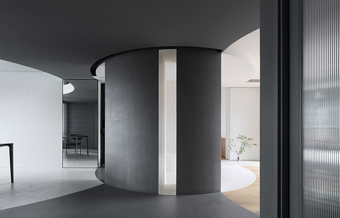
▼室内一览,overview © 立明
主视觉
Subject Vision
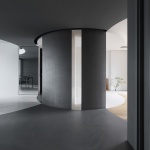
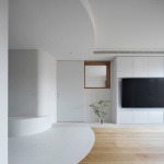
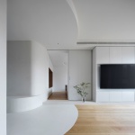
具体操作中,我们以空间营建的手法强调结构导向,创造出可同时承载待客、娱乐、用餐、休闲等功能的完全开放性公共空间。圆弧墙体以分隔餐厨与客厅区域,弱化固有的边界印象,是灵动独特的视觉存在。由入口圆心处延展出三条不同半径的弧形,通过弧线引流构成三条不同的空间的指向性,其代表着一家三代共居的生活空间。墙体缝隙实现视线与光线双重互通,同时成为孩子们可任意穿梭游玩的奇趣场地。
In the specific operation, we use space construction to emphasize structural orientation and create a completely open public space that can simultaneously host hospitality, entertainment, dining, and leisure functions. Circular arc wall separates kitchen, dinning room, and living room, and weakens their inherent boundaries, visually embodying the highlights and uniqueness of our case. In the specific operation, three arcs with different radii are displayed at the center of the entrance circle, and the directivity of the three different spaces is formed through the arc drainage, which represents the living space where three generations live together. Wall mullion realizes the mutual interconnection of sight and light, and becomes a funny place where children can freely shuttle and play.
▼主视觉,subject vision © 立明
场地分析
Site Analysis
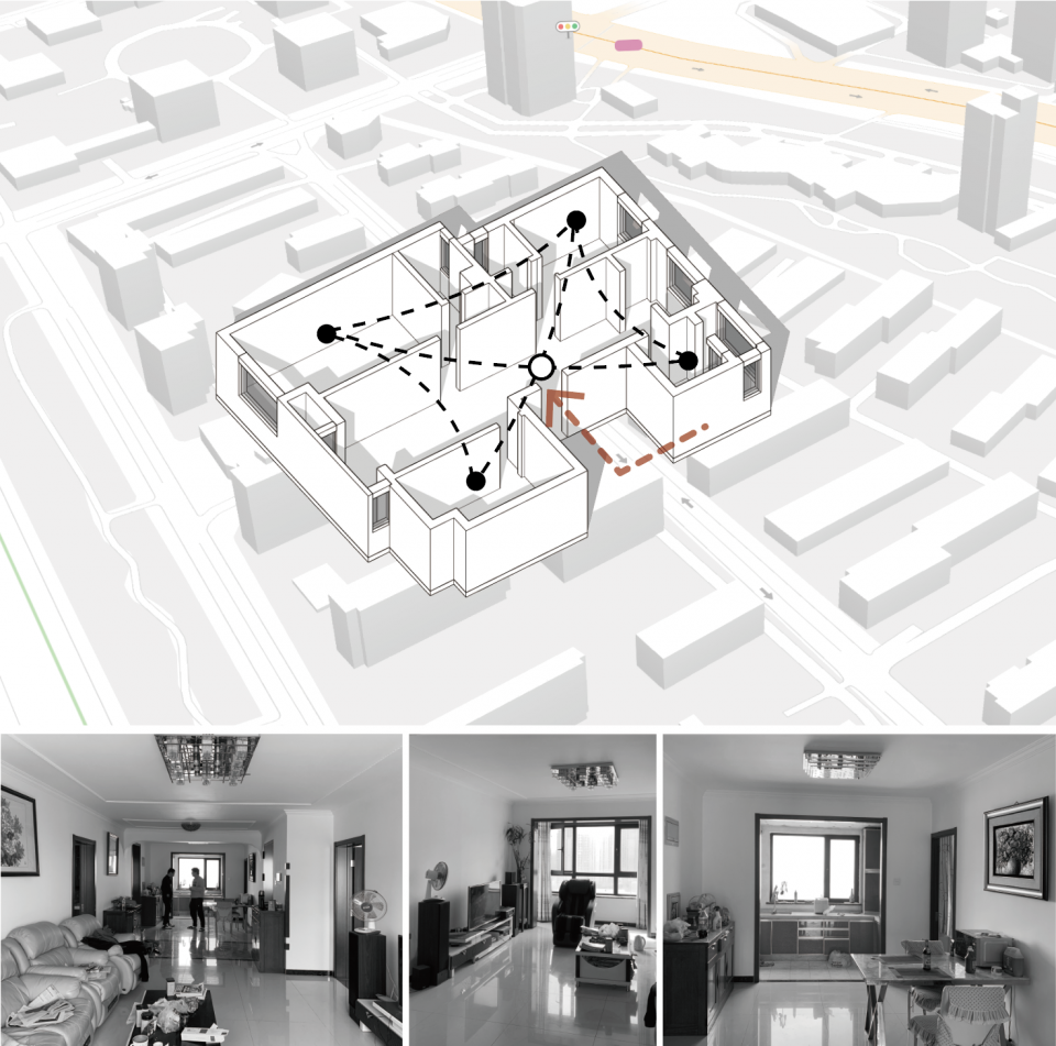
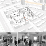
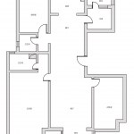
位于北京市朝阳区北苑东路地区,原始户型为常规的四室一厅,从空间分节来看,各房间相对独立,主室为入口室,四间室与主室统合相连,动线类型为中心强调型。细碎且独立的房间状态加剧六口人居住场景的距离感,而过多的预设墙板阻断视线沟通,原本的户型状态无法与三代共居的日常需要相匹配。
Located in the Beiyuan East Road area of Chaoyang District, Beijing, the original house type was a conventional four-bedroom, one-bedroom house, with each room relatively independent from the other. The state of the separate rooms aggravates the distance of the living scene for a family of six, while the excessive pre-designed wall panels block the communication of sight lines, making it impossible to match the daily needs of three generations living together.
▼场地分析,site analysis © 戏构建筑设计工作室
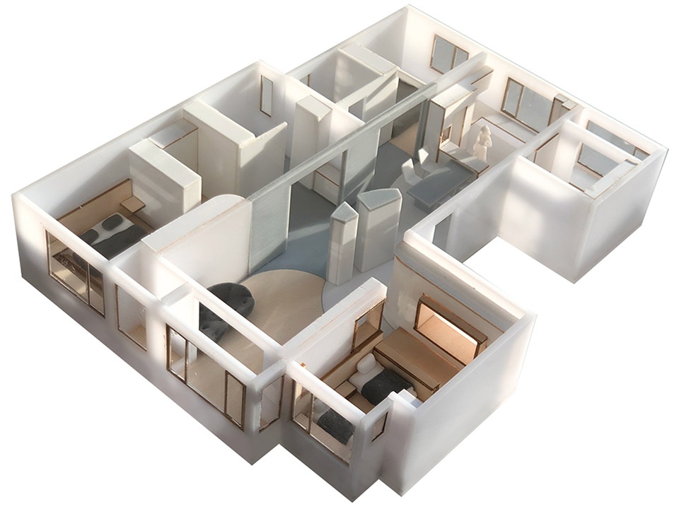
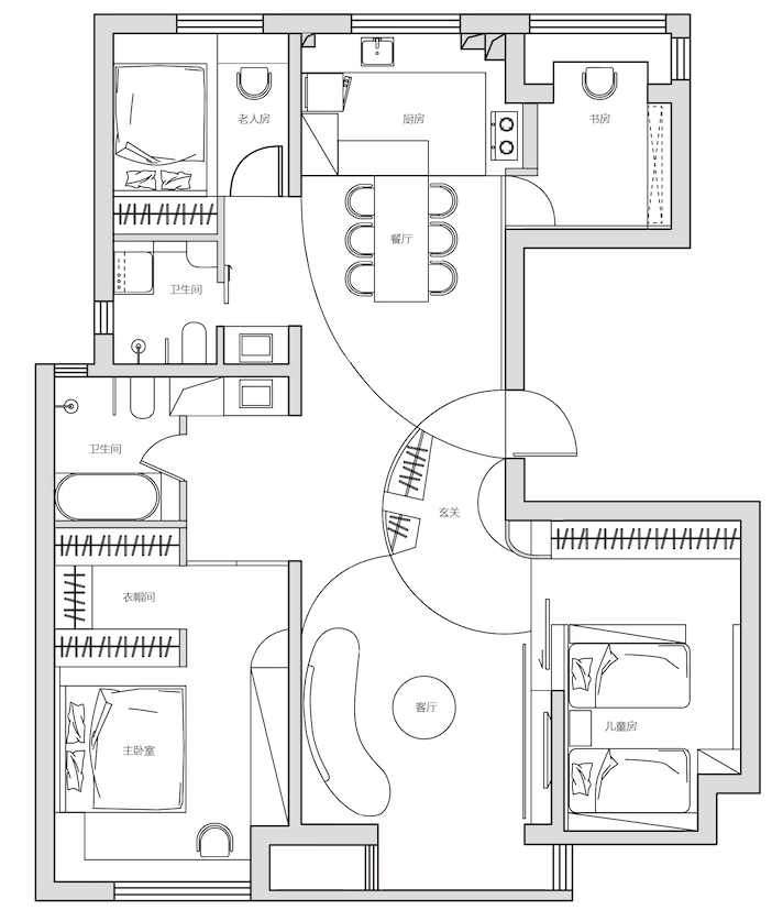
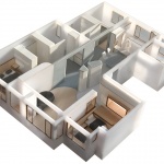
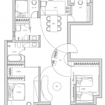
改造后入口邻接最近的间室通过弧型墙体插入其中,统合成为新的结构类型,以回游穿越型动线连接各个区域,家庭成员各自拥有足够宽敞舒适的生活场景,三代共居的理念得以传递。
After the renovation, the closest rooms adjacent to the entrance are inserted through the curved wall, which unifies the new structure and connects each area with a back-and-forth movement, so that each family member has a spacious and comfortable living environment and the concept of three generations living together can be passed on.
▼模型图,model © 戏构建筑设计工作室
概念演示
Concept Demo
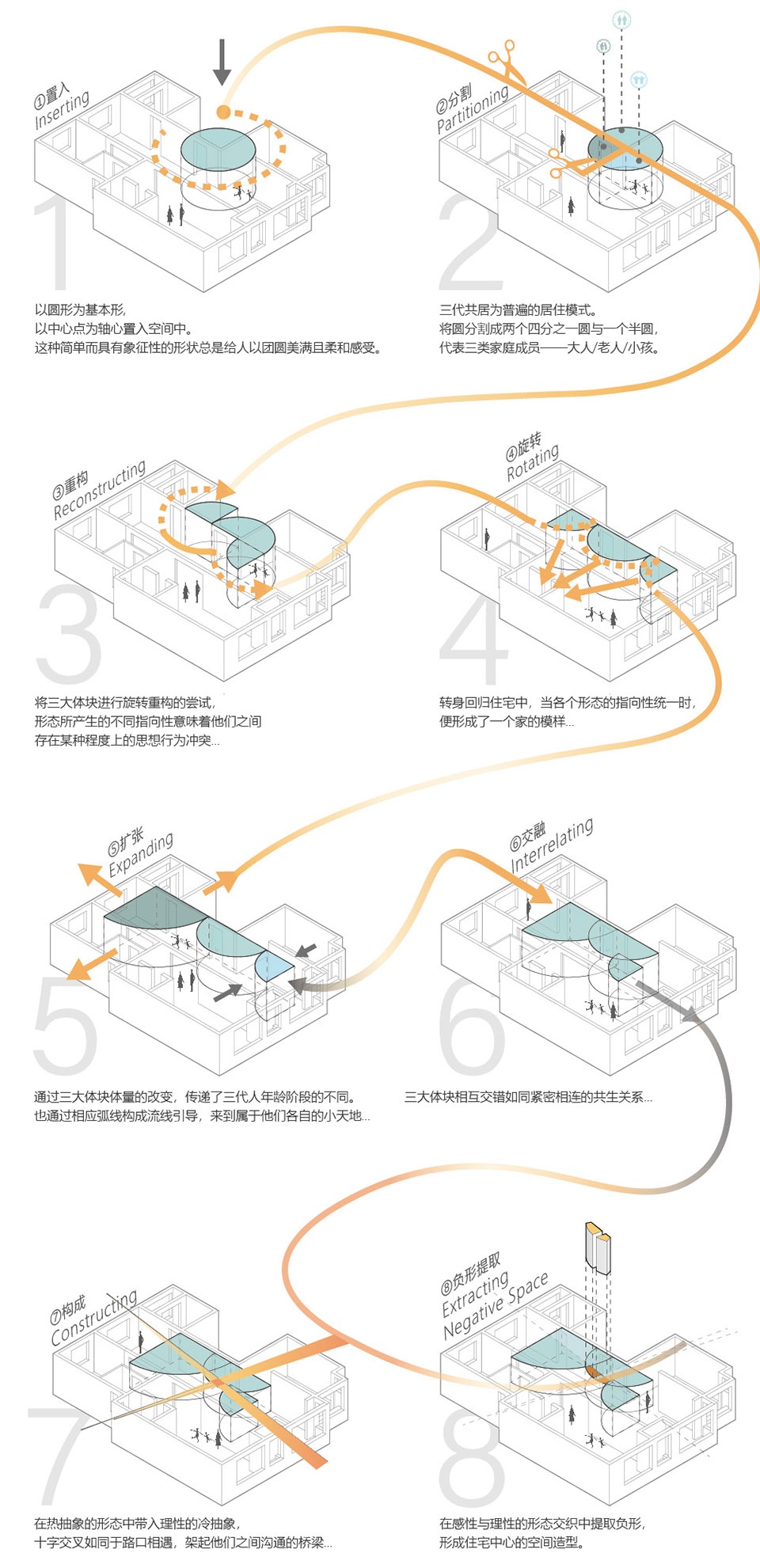
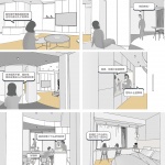
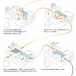
圆形自古以来都给予我们团圆美满的视觉联想,因此我们以圆形为基本型置入空间中,将其切分构建出大中小三个体块,彼此之间相互排斥却又相互融合与构建,在空间中建立某种特殊的次序将其组织与串联。“法则并非源于自然而是人类心灵的建构”,亲密关系的形成与关键纽带的存在密不可分,此方案的空间构成理念同样遵循情感逻辑走向。由北至南指向老中幼三代各自活动区域,以弧线引导相应动线的同时,构成客餐厅结构界线。我们试图于空间中心位置构建三代共居的情感桥梁,弧形轮廓中的切口设计,作为一家六口情感沟通的概念载体,由此产生的切口实现内外场景交互,成为共生相融家庭关系的结构表达。
Since ancient times, the round shape has always given us the visual association of reunion, so we use the round shape as the basic type and put it into space, and then cut it into three blocks, large, medium and small, which are mutually exclusive but mutually integrated and constructed, and establish a special order in the space to organize and connect them. “Law doesn’t originate from nature but is constructed by human’s thoughts.” The formation of intimate relationships is inseparable from the existence of key ties. The spatial concept of this project also follows the logic of emotion. From north to south, it points to the respective activity areas of the old, middle-aged, and young generations, and at the same time, the arcs guide the corresponding moving lines to form the structural boundary of the restaurant. We attempt to build an emotional bridge of three generations living together in the center of the space. The design of the incision in the curved outline serves as a conceptual carrier for the emotional communication of a family of six, and the resulting incision realizes the interaction between internal and external scenes, becoming a structural expression of symbiotic and harmonious family relationships.
▼概念过程演变,conceptual process evolution © 立明
玄关
Entrance hall
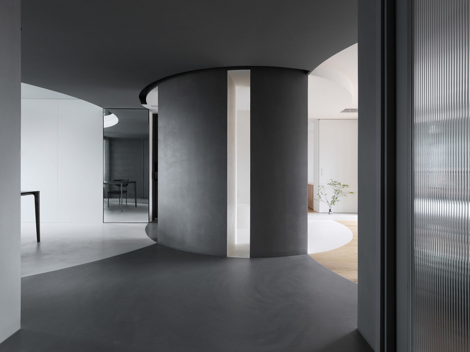
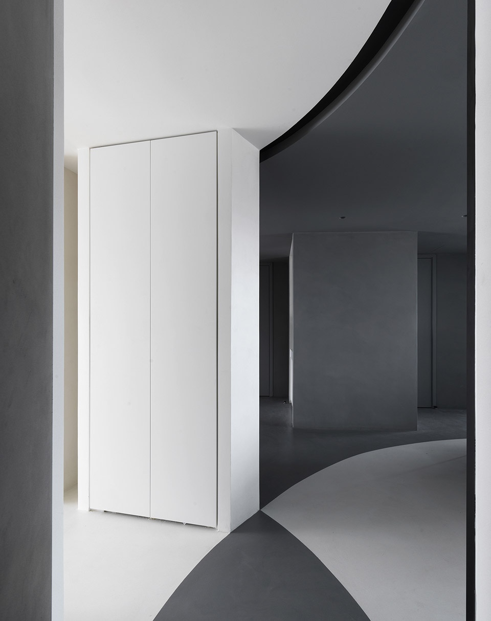
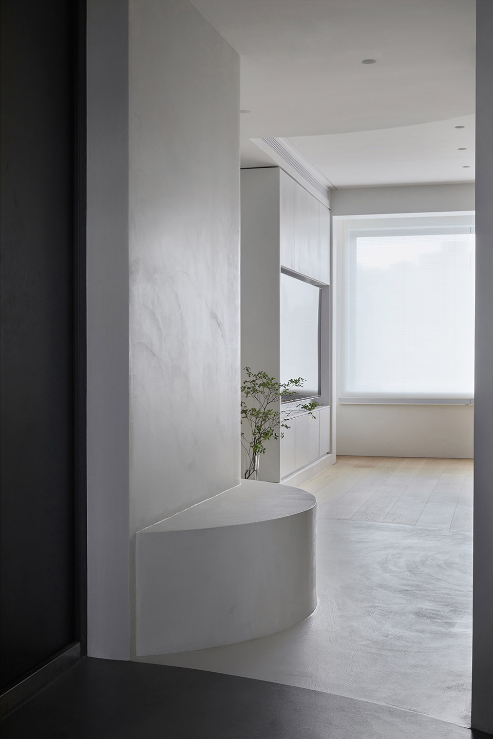
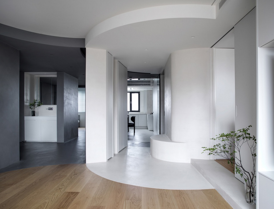
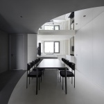
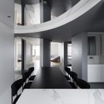
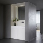
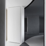
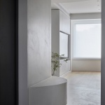
从玄关进入,可以完整看到整个空间的色彩形态构成,正对的圆弧柱体被设计为玄关柜,便于日常收纳。穿鞋凳由墙面延伸而出,延续弧形元素,是进入空间的过渡设置。镜面元素的运用打通视觉空间,反射作用下从任意视角均可看到重叠掩映的结构层次,是三代共居理念的具象表达。
▼正对的圆弧柱体被设计为玄关柜,the circular arc cylinder opposite is designed as a porch cabinet © 立明
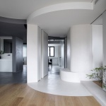
▼从玄关看向客厅,view from the hallway to living room © 立明
Entering from the entrance, you can see the form composition of the whole space, and the arc column is designed as the entrance cabinet for easy storage. The shoe putting stool extends out from the wall and continues the curved element, which is a transitional setting for entering the space. The use of mirrored elements opens up the visual space, and the reflective effect can be seen from any angle to overlap and conceal the structural layers, which is a concrete expression of the concept of three generations living together.
▼从餐厨区看向玄关,view from the dining area to the entrance hall © 立明
餐厨区
Dining area
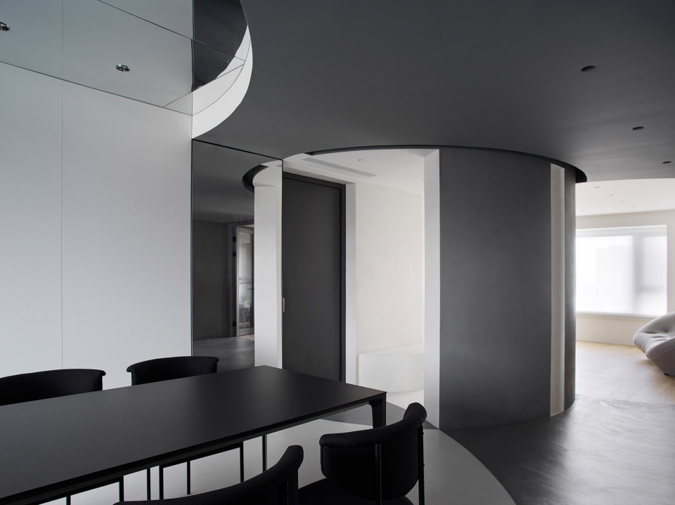
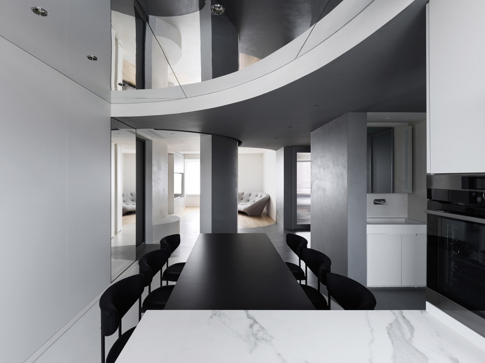
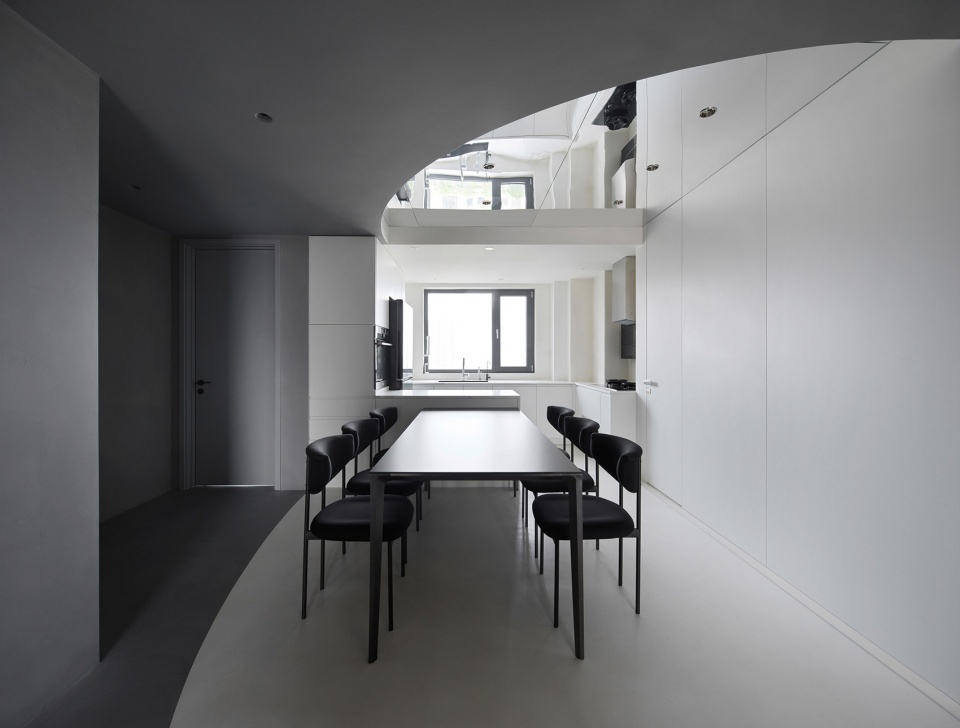
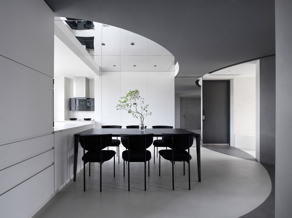
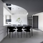
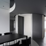
白色地面对应弧形吊顶形成开放式餐厨区域,浅色系运用呈现明亮跳跃的空间氛围。岛台加强厨房与餐区互动的流畅度,操作台面增加,烹饪与用餐场景融为一体。选用深灰色的餐桌座椅与周边灰色区域形成呼应,岛台式设计解决一家六口用餐需求。顶部与墙体的镜面材质拉伸视觉空间,弧线得以闭合。
The white floor corresponds to the curved ceiling to form an open kitchen area, and the use of light colors presents a bright and jumpy space atmosphere. The island enhances the flow of interaction between the kitchen and the dining area, and the increased number of worktops, which integrates the cooking and dining scenes. Dark grey dining table and chairs are chosen to echo the surrounding gray area. Island Design meets the dining demand for a family of six. The mirrored material on the top and walls stretch the visual space and close the arc.
▼餐厨区,the dining area © 立明
客厅
Living room
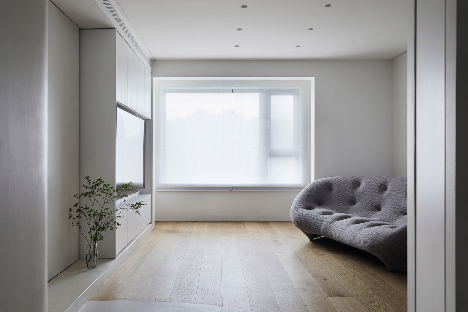
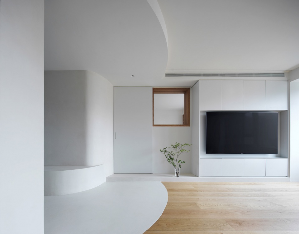
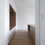
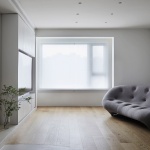
南侧客厅置入异型沙发,打破方正空间的秩序感,同时留出足够空旷场地以满足孩子们自由跑动的需要。客厅视角看向北侧,沉静私密的灰调空间与象征活力的白调区域形成对比。柜体电视墙提供储物功能,儿童房推拉门嵌入其中,门体闭合后窗框露出,视觉层次多样。
The living room on the south side has a shaped sofa, breaking the order of the square space and leaving enough space for children to run around freely at the same time. The TV wall of the cabinet provides storage function, and the sliding door of the children’s room is embedded in it, and the window frame is exposed when the door is closed, providing a variety of visual layers. From the perspective of the living room to the north, the quiet and private gray-toned space contrasts with the white-toned area that symbolizes vitality.
▼客厅,the living area © 立明
儿童房
Children’s room
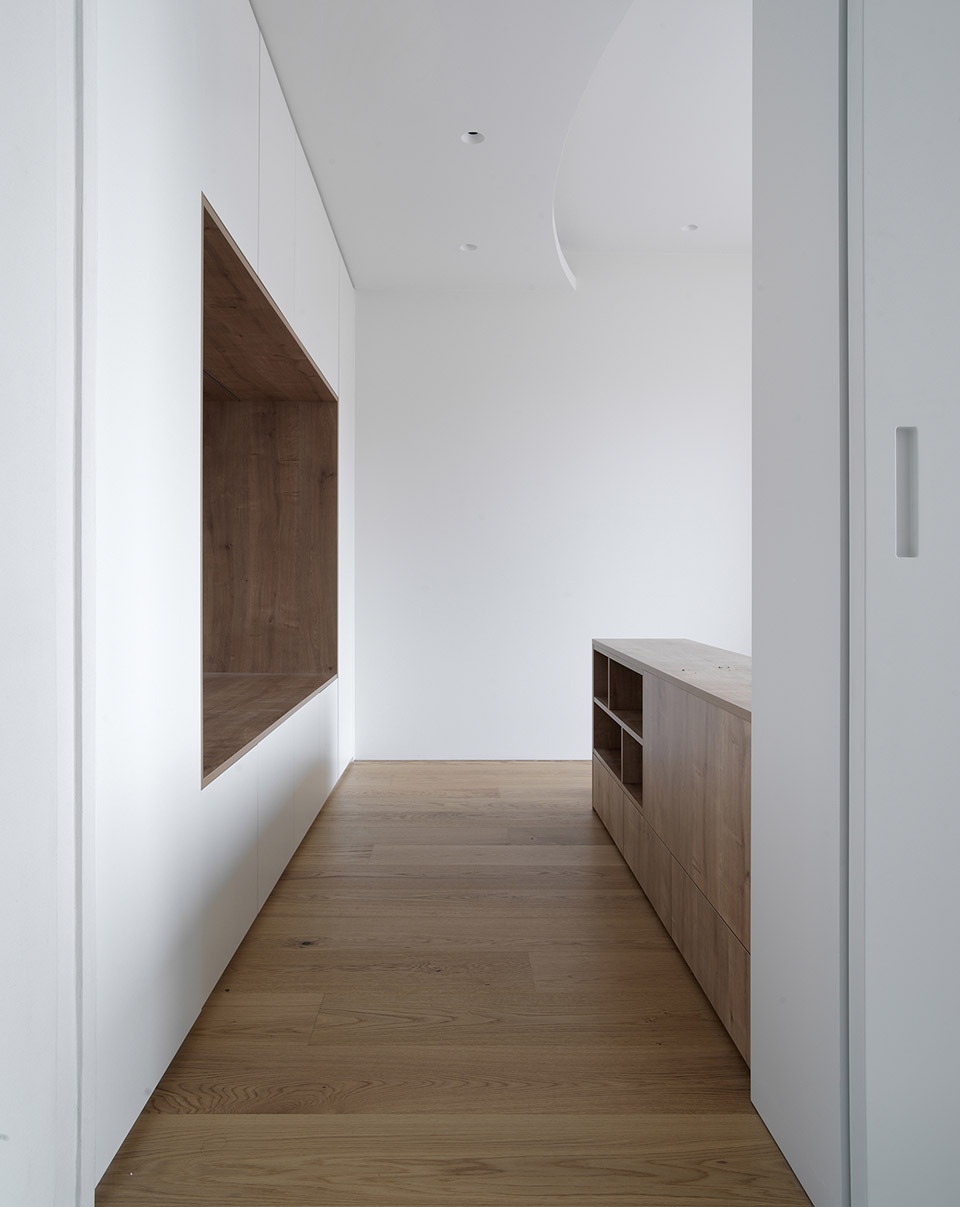
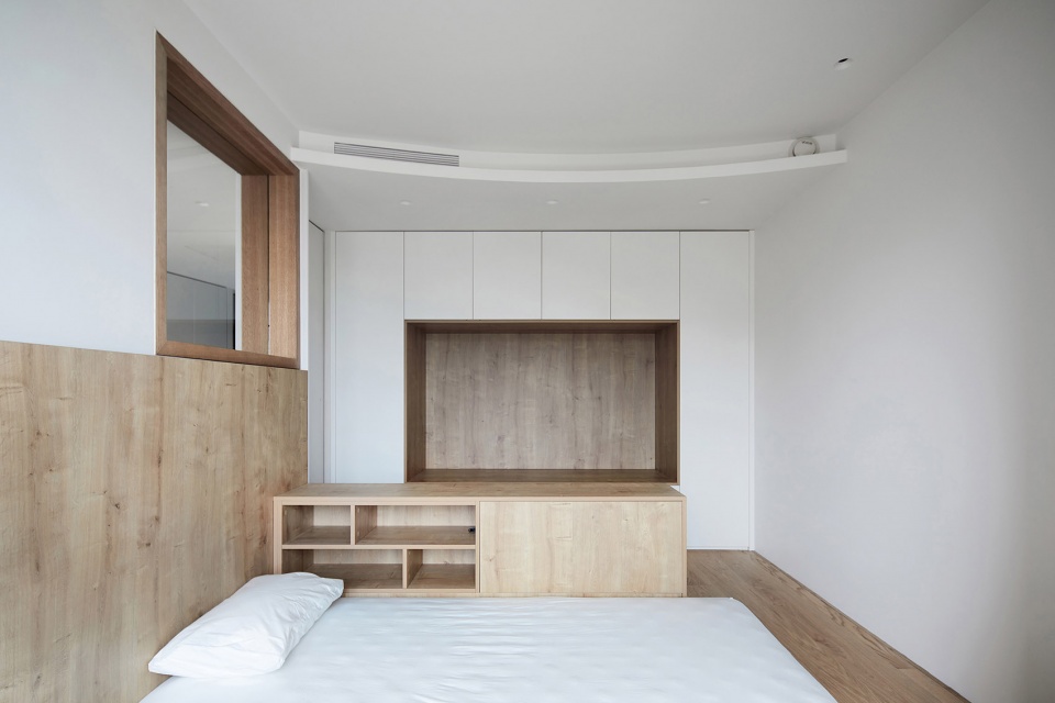
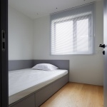
弧形流线引入儿童房内,整体以木色为主,材质相对自然而柔和。相对应的弧形吊顶划分出活动与休息区域,左侧衣柜内嵌入“活动仓”装置,景框设计描绘娱乐学习等功能化场景。休息区域预设床体,过道边界与窗边对称分布两组矮柜,作为主要的储物空间。
▼儿童房入口,entrance of the children’s room © 立明
The curved streamline is introduced into the children’s room, the overall wood color is dominant, the material is relatively natural and soft. The corresponding curved ceiling divides the activity and rest area, the left wardrobe is embedded with the “activity bin” device, and the frame design depicts functional scenes of entertainment and learning. The resting area is reserved for the future bed, and two groups of low cabinets are symmetrically distributed along the border of the aisle and by the window as the main storage space.
▼温馨的儿童房,the warm children’s room © 立明
主卧
Master bedroom
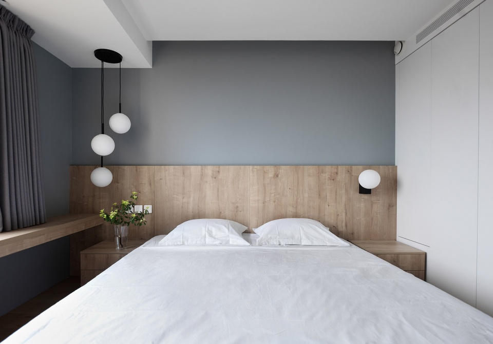
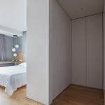
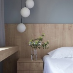
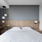
私密空间同样沿用木质元素,靠窗延伸出平台以提供梳妆、阅读功能,最大限度引入自然光线。步入式衣帽间承载收纳功能,柜体内部暗藏灯带提升使用便捷性。不规则球形吊灯是空间灵动的存在,暖光给予屋内温馨安静的质感。
Wooden elements are often used in the private space, with a window extending out to provide a platform for dressing and reading, bringing in maximum natural light. The walk-in closet carries the storage function, and the hidden light strip inside the cabinet enhances the convenience of use. The irregular spherical chandelier is a flexible space, and the soft and warm light gives the house a warm and quiet texture.
▼主卧,master bedroom © 立明
其他房间
Other service rooms
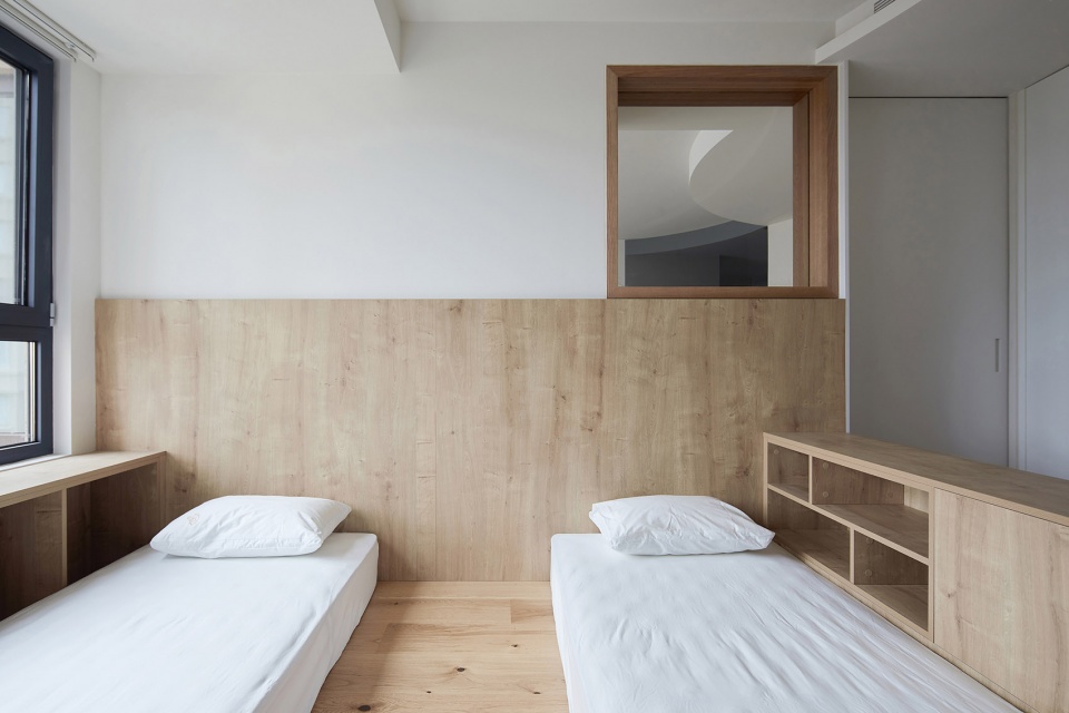
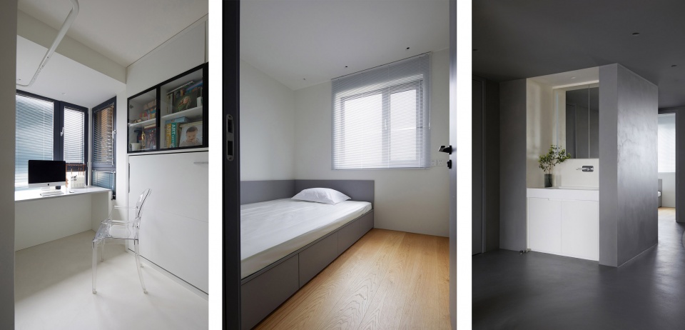
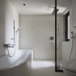
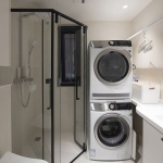
盥洗场景被单独隔出,镜柜延展视觉空间,三分离设计增强实用性。卫浴部分同时设置浴缸与浴房,提升使用舒适感。洗衣功能放置于次卫内部,旁边配备完整的操作台与洗衣池。北侧老人房与主卧呈对称分布,内部为榻榻米设计,床头柜体提供强大的储物空间。书房隐藏于墙板之中,收纳杂物的同时还可作为临时客房使用。
The bathroom scene is separated from the bathroom, and the mirror cabinet extends the visual space, and the three-part design enhances practicality. The master bathroom corresponds to the distribution of the master bedroom, and the bathroom part is equipped with a bathtub and a bathroom at the same time, enhancing the comfort of using. The laundry function is placed in the second bathroom, with a complete operating table and laundry sink next to it. The elderly housing on the north side is symmetrically distributed with the master bedroom, the interior is designed with tatami mats, and the bedside cabinet provides a strong storage space. The study room is hidden in the wall panel, and can also be used as a storage room, as well as a temporary guest room.
▼书房、老人房、卫生间,study & elder people’s room & bathroom © 立明
写在最后
Conclusion
《旋境》的设计过程是一次去繁就简的构成研究,通过引入圆形概念结构,梳理出三代共居场景的功能动线,彼此依托,相融共生。
设计师即是造梦师,他们要做的是要创造记忆,与业主共同连接创造起未来十年之间生活的点点滴滴。终有一天你的设计将被少数人铭记,而记忆只是我们的蓝图,前进则是唯一的道路。
The design process for Whirly Realm is a study in the composition that eliminates complexity and simplicity. By introducing the concept of a circular structure, the functional flow of three generations is created that is mutually supportive and symbiotic.
The designer is the dream maker. What a designer does is to create memories, to connect with the homeowner to create the moments that will define their life over the next decade. One day, your design will be remembered by a few people, but memory is just our blueprint, and moving forward is the only way.
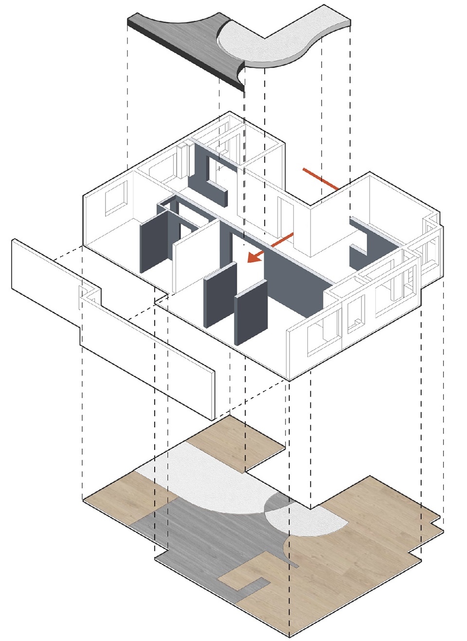
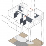
▼爆炸分析图,explosion analysis chart © 戏构建筑设计工作室
▼改造后平面图,plan after renovation © 戏构建筑设计工作室
项目名称:旋境
项目地址:北京市朝阳区北苑东路地区
项目类型:平层住宅
建筑面积:145㎡
设计公司:戏构建筑设计工作室 XIGO STUDIO
方案主创:刘阳
方案深化:王丹 张艺馨
图学表现:蔡晴 李柯锦
项目参与:史英杰 傅师 杨富达 罗爽
家具定制:GRANVISTA观境家居
设计时间:2019年4月-2019年7月
施工完成:2020年4月
撰文排版:石昭琪 刘阳 蔡晴
空间摄影:立明
学术顾问:朱力
联系微信:xigo-studio
公司邮箱:xigo_studio@126.com
More:XIGO STUDIO(contact:xigo_studio@126.com)
