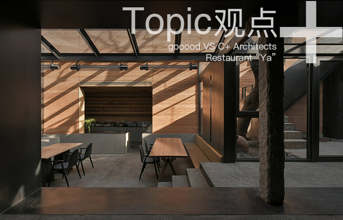
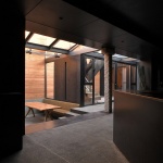
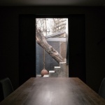
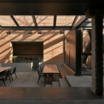
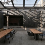
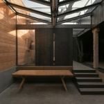
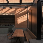
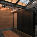
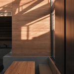
gooood对一些机会和条件合适的项目推出深度报道,希望对项目进行更为立体的表达和展现。本次专辑带来的是C+ Architects近期完成的崖餐厅的独家专访。 gooood与事务所创始合伙人,项目主创建筑师程艳春进行的深度对话。更多关于他们,请至:C+ Architects on gooood
gooood would dig into projects which are appropriate for deeper report, in order to present the project in a more comprehensive way. In this episode, we interviewed C+ Architects for their recently completed Restaurant “Ya”. gooood had an in-depth conversation with Cheng Yanchun, chief architect of this project. More: C+ Architects on gooood
出品人:向玲 | Producer: Xiang Ling
编辑:陈诺嘉,武晨曦,李诗蓉 | Editor: Chen Nuojia, Wu Chenxi, Li Shirong
▼视频,video ©C+ Architects
我们和建筑师合作时一直尝试实现某种进化,就是尽可能地把双方从传统的甲方乙方权力关系中解放出来,转变成一种一群拥有不同背景、审美、技艺、经验的人共同去实现一个作品的多方协作关系。更像是主持设计师成为了导演,我们则代表制作人、出品方。这样的方式下或许更能激发每个人的创造潜能。
——陈冰(崖 / under clouds 联合创办人,项目业主)
C+ Architects问答
Q&A with C+ Architects
▼餐厅一览,overall view of the restaurant ©许晓东
1. 崖餐厅是一家北京胡同里的云南特色餐厅,你们是如何在设计中体现云南特色的?
The Restaurant “Ya” is a Yunnan specialty restaurant located in the hutong of Beijing. How did you reflect the characteristics of Yunnan in the design?
在项目设计和实施的整个过程中,我们和业主讨论的话题没有泛泛停留在“如何设计一个好餐厅”的层面上,而是围绕着“云南地域文化、饮食文化的现代性表达”这一主题进行了深入探索。餐厅空间的物理存在本身就是信息传达中重要的一环。在提到云南时,很多人第一反应就是少数民族的各种形象和场景,所以日常里,人们会看到很多充满民族风情的云南餐厅,但这些都是明显被标签化了的云南,并不是真实的云南。我们想要实现的是:在保持云南餐厅本身特点的基础上进行突破,孕育出符合时代特征和“崖”自身气质的内容。
因此,设计一个什么风格的房子并不是我们追寻的目标,无论是设计一个像北京的传统建筑,还是一个像云南的地域建筑,在这里显然都是不适合的。随着设计不断深入,我们确定了餐厅的基调——“质朴”。“质朴”意味着纯粹的情感、真实的状态、自然的材料以及有分寸的表现,是“崖”诠释云南最好的答案。
刚接到这个项目委托的时候,我记起了北京建筑大学的同事金秋野教授曾经写过一篇关于阿尔瓦·阿尔托的文章,对其中一句话印象非常深刻:“与同时代的柯布西耶、密斯等人相比,阿尔托显得如此低调。他不向伟大领袖上书,也不去异国他乡造梦,只是作为一个人,思考一个简单的问题——阳光明媚的午后,该在一个什么样的房子里吃下午茶?”是啊,该在什么样的餐厅里?和谁?吃一顿什么样的食物?我们又将在这里度过一段什么样的时光呢?
During the whole process of project, the topics we discussed with the owners didn’t stop at the level of “how to design a good restaurant”, but conducted in-depth exploration around the theme of “the modern expression of Yunnan regional culture and food culture”. The physical existence of the restaurant space itself is an important part of information transmission. When referring to Yunnan, many people’s first reaction is the various images and scenes of ethnic minorities. So in daily life you can see many Yunnan restaurants full of ethnic customs, but these are obviously labeled Yunnan, which is not true Yunnan. What we want to achieve is to make breakthroughs on the basis of maintaining Yunnan restaurant features, and produce content that meets the characteristics of the times and the temperament of the “Ya”.
Therefore, it’s not our goal to design a certain style restaurant. Whether designing a traditional building of Beijing or a regional building of Yunnan is obviously not suitable here. With the deepening of the design, we determined the tone of the restaurant – “Pristine”. “Pristine” means pure emotion, true state, natural materials and decent expression. It’s the best answer for “Ya” to interpret Yunnan.
When we first received the commission for this project, I remembered that my colleague Jin Qiuye, professor at BUCEA once wrote an article about Alvar Aalto. I was very impressed by one of the words: “Compared with Le Corbusier, Mies and other architects of the same era, Aalto appeared so low-profile. He had never sought a political opportunity or had the ambition to go abroad for professional achievements, but just as a person, thinking about a simple question – what kind of house is appropriate for me to drink a cup of tea in a sunny afternoon?” Yeah, in what kind of restaurant? With whom? What food to eat? And what kind of time will we spend here?
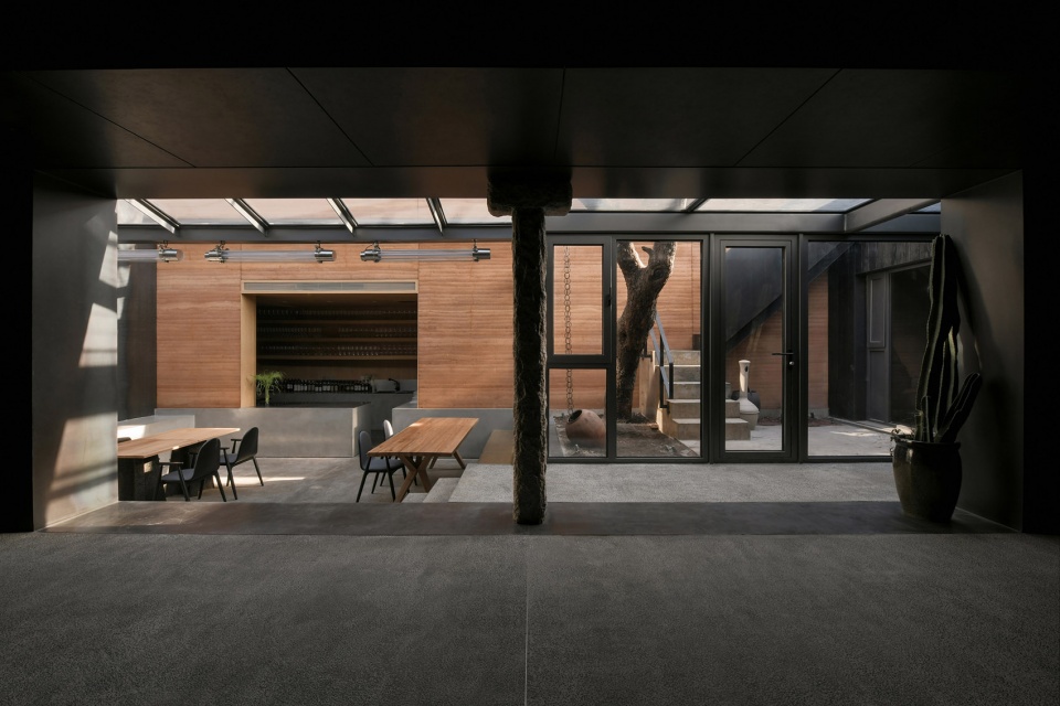
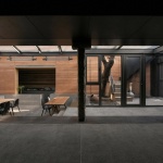
▼从室内就餐区看向庭院,view to the courtyard from the interior dining space ©许晓东
2. 餐厅的明暗对比很有意思,主要就餐区的空间深度感增加了幽暗暧昧的氛围,为什么选择将部分室内用餐空间置于这样一种氛围当中?另一侧就餐区的光线如何控制?
The contrast between the light and dark in the restaurant is very interesting. The depth of the main dining area increases the dark and ambiguous atmosphere. Why choose to put a part of indoor dining space in such an atmosphere? How do you control the light in the dining area on the other side?
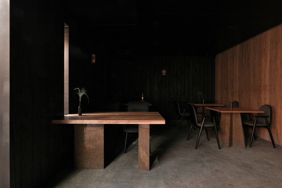
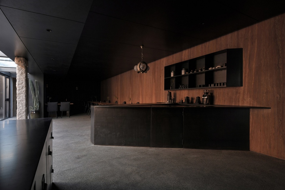
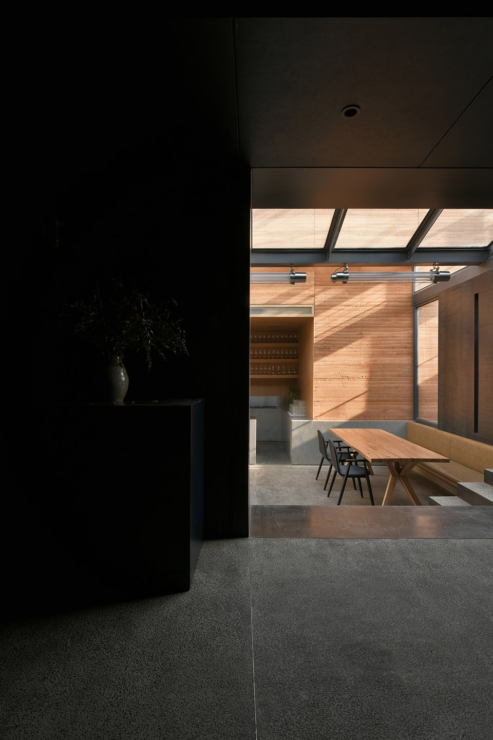
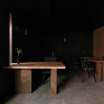
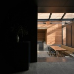
观察光线、时间以及生命的变化即是体验崖餐厅最好的方式。由于主要就餐区的空间几乎没有自然采光,房屋净高也只有2.5米,如何体现空间本身的特质并在其中创造出没有边际的感觉是我们思考设计的重点。刚进到这个有些低矮的空间里时,我脑海中第一个闪现的记忆是谷崎润一郎的《阴翳礼赞》。越是低矮的空间,越想在其中制造幽暗与模糊,同时展现出一种存在于明暗中的含蓄的美感。
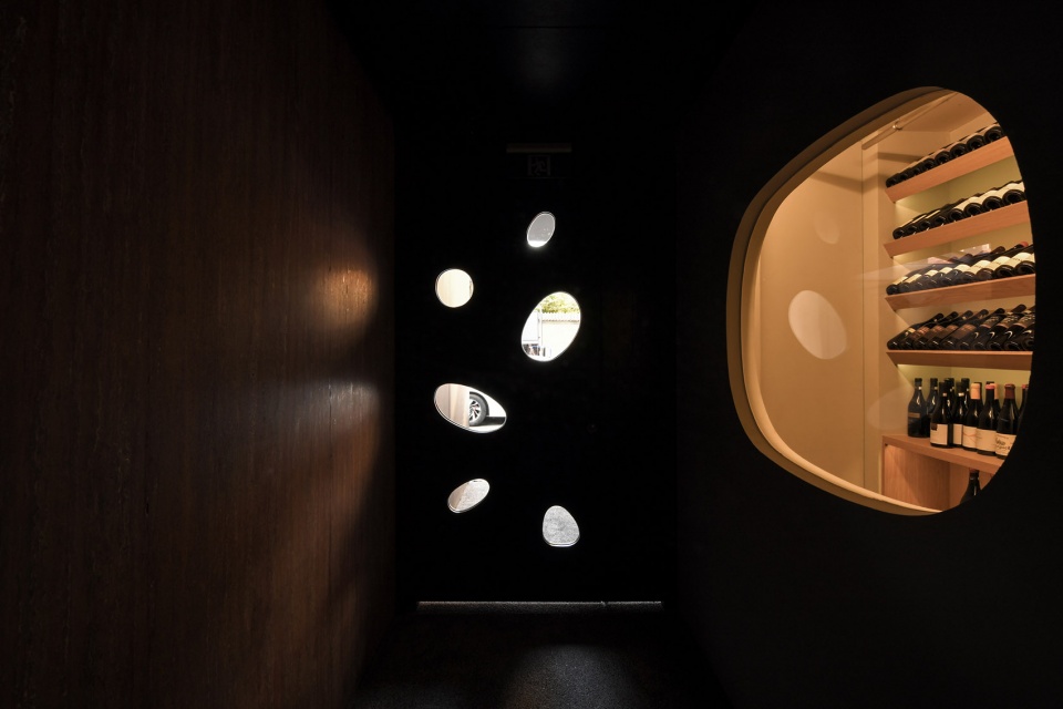
我们通过控制几种不同反射度的材料实现了这个想法,利用微弱的光线,提高空间的深度,从而达到一种暧昧的状态。主要就餐空间的洞口就是明暗交界的地方,里面是较暗的部分,过道是明亮的部分。人在幽暗的空间里往往更容易获得平静和安定,这也是对以前我在学习东方传统建筑时获取的经验的再现。
The best way to experience the Restaurant “Ya” is to observe the changes of light, time and life. Since the space in the main dining area has little natural light and the net height of the house is only 2.5 meters, how to reflect the characteristics of the space itself and create a borderless feeling in it has become a key issue. When I first entered this somewhat low space, the first memory that appeared in my mind was the essay In Praise of Shadows by Junichiro Tanizaki. The lower the space, the more I want to create a sense of darkness and blur, and show a subtle beauty that exists in the light and dark at the same time.
We realized this idea by controlling several materials with different degrees of reflectivity, using faint light to increase the depth of the space, thereby achieving an ambiguous state. The opening of the main dining space is the boundary between light and shade. Inside is the darker part, and the aisle is the brighter part. People are more likely to obtain peace and stability in the dark place, which is also a reappearance of the experience I have obtained while studying traditional oriental architecture.
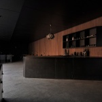
▼幽暗的室内就餐空间,interior dining space with limited natural light ©许晓东
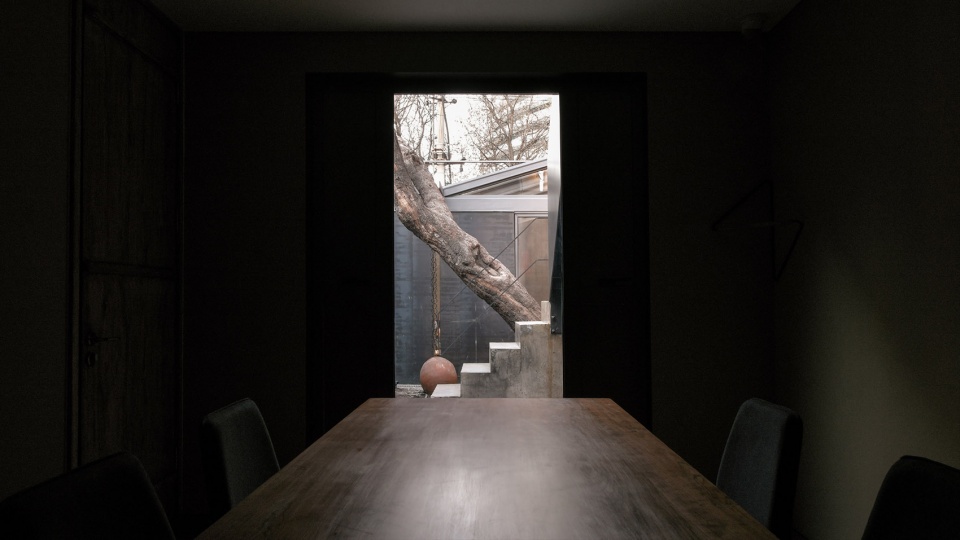
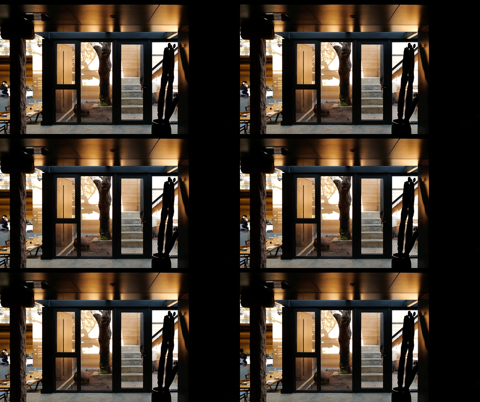
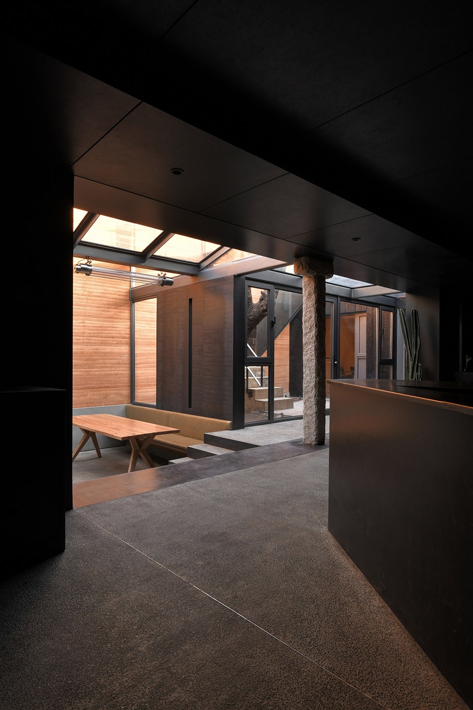
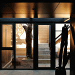
▼从幽暗的室内看向庭院,view to the courtyard from the dark interior ©许晓东
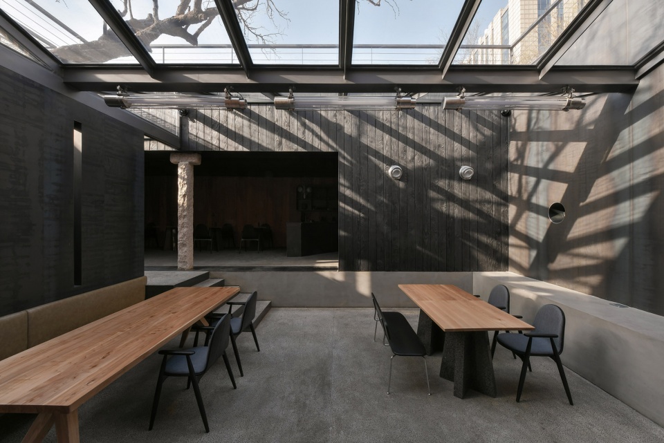
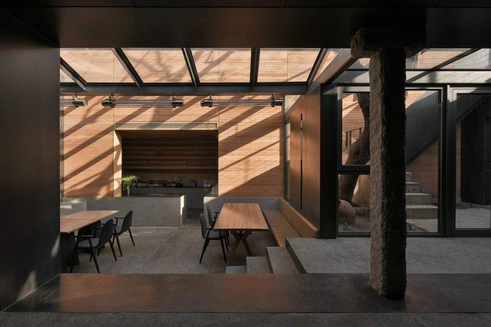
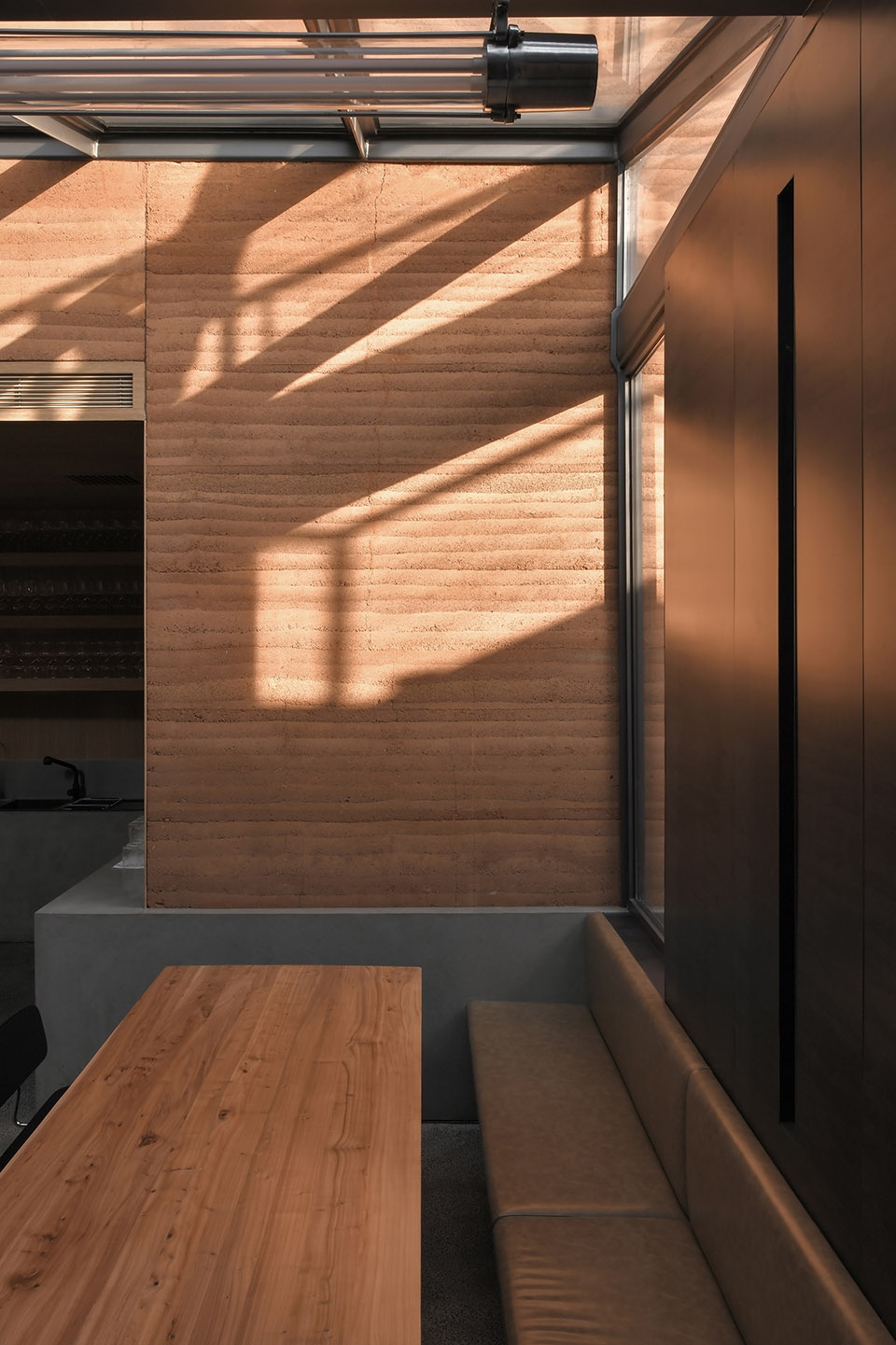
反观另一侧的下沉就餐区,一天中主要的就餐时间是从中午开始直到晚上,因此我们把最能体现光线变化的东侧夯土围墙变成了整个餐厅最重要的背景。由于北方的四季变化分明,尤其是一年又一年看着植物周而复始地生长,人对生命的轮回便也有了更为深刻的认知。
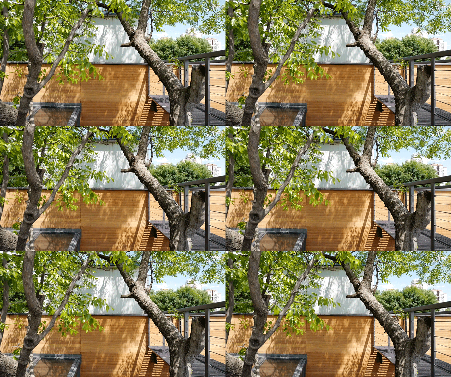
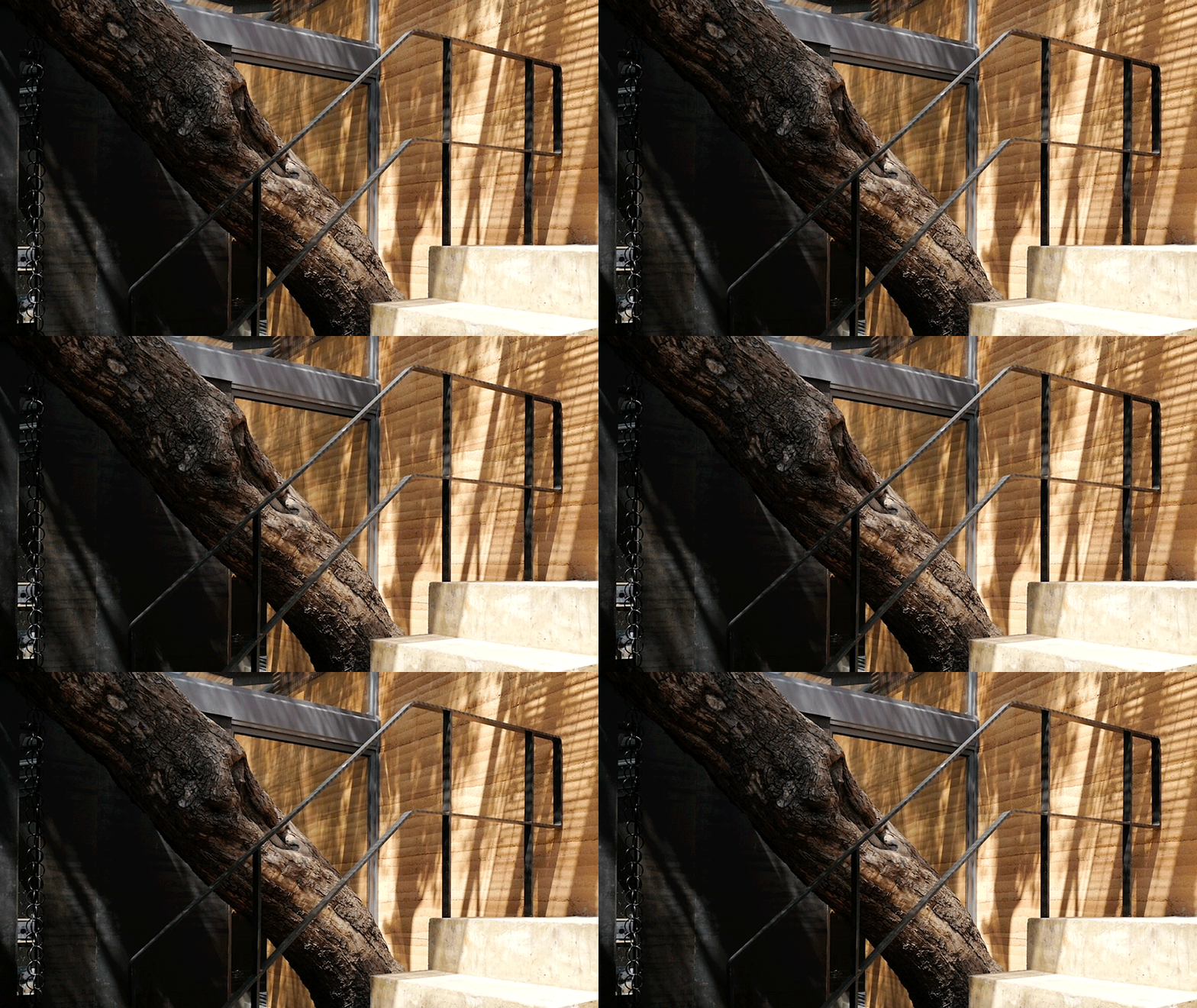
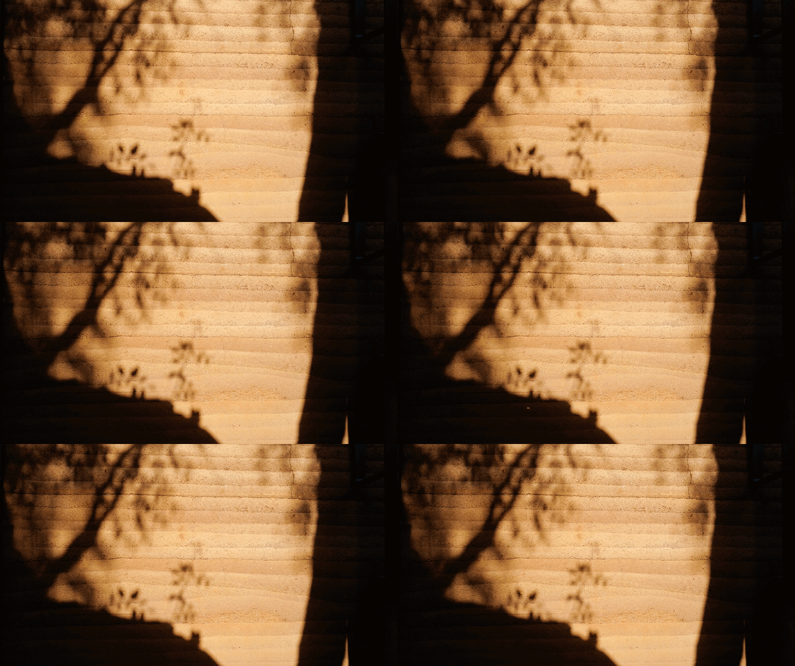
一天里,当太阳逐渐升至最高点,树枝摇曳的影子开始在墙面上微微晃动,并随着时间的变化慢慢移动位置,仿佛为墙体注入了生命;到了黄昏,夯土墙把金色的阳光连带自身的颜色反射到餐厅的各个空间,黑色的金属板上也会映射出朦胧的金色倒影,而此时正是晚餐刚刚开始的时段。入夜后,餐厅又变成了另外一种静谧的的氛围,室内的光线从天窗透出去,让夯土墙变成一个背光板,陷入沉寂的胡同中出现了一个温暖、动人的光墙,与周围大尺度商业办公楼的照明相比有着明显不同的表情。
Looking at the sinking dining area on the other side, the main dining time of the day is from noon to night, so we designed the east side rammed earth wall that best reflects the change of light as the most important background of the entire restaurant. As the four seasons in northern China change distinctly, particularly the plants grow and fall year after year, which makes people have a more profound awareness of the cycle of life.
Throughout the day, when the sun rises to its highest point, the shadow of the branches begins to sway slightly on the wall, and slowly moves its position with time, as if injecting life into the wall. At dusk, the rammed earth wall reflects the golden sunlight with its own color to the various spaces of the restaurant, and the dark metal plate also shows the hazy golden reflection, which is the time when the dinner has just begun. After nightfall, the restaurant has changed to another quiet atmosphere. The light in the room penetrates through the skylights, turning the rammed earth wall into a backlight. A warm and heart-touching light wall appears in the silent alley. Compared with the lighting of the surrounding large-scale commercial office buildings, it has the significantly different expression.
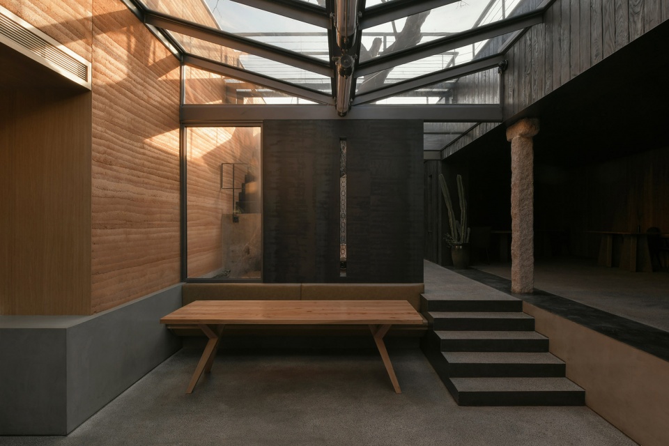
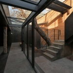
▼下沉庭院就餐空间,dining space in a sunken courtyard ©许晓东
崖餐厅里的风景一年四季之中也各有千秋。春夏时节,枣树枝叶茂盛,充当了遮阳幕帘的角色,斑驳的树影透过天窗落到地面与墙面上。到了秋天,树叶掉落,阳光照进餐厅,带给人一丝温暖。冬天下完雪,积雪在天窗上一点点融化,光线随之逐渐渗透进来,有种拨开云雾见日出的感觉。
The scenery in the Restaurant “Ya” also varies throughout the year. In spring and summer, jujube branches are lush, and act as shade curtains. Mottled tree shadows fall to the ground and walls through skylights. In autumn, the leaves fall and the sun shines into the restaurant, bringing a touch of warmth. In winter, when the snow melts on the skylight and the light comes in, there is a feeling of seeing the sunrise through the clouds and fog.
▼庭院,光影随时间变化,courtyard changing with seasons ©C+ Architects
3. 分享一下改造前胡同的状况?有哪些让您印象深刻的地方?
Please share with us the status of the hutong before the transformation. What impressed you?
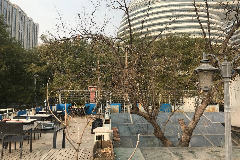
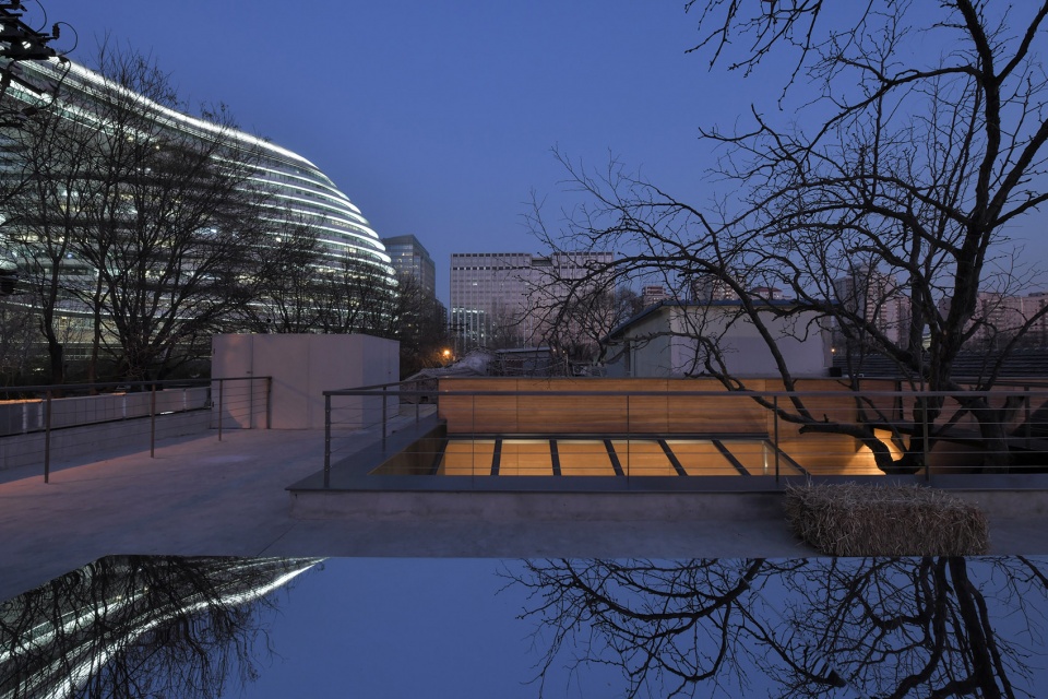
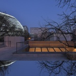
这个项目位于北京东城区的胡同深处,站在屋顶上看,北侧是尺度庞大的银河SOHO,南侧不远处是被传统民居环绕的智化寺。平时,很多居民会在餐厅旁边的小公园里活动。日常的生活气息之外,还能感受到“新”与“旧”的强烈对比。
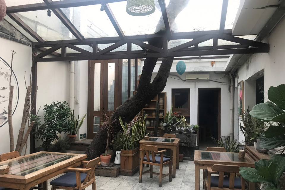
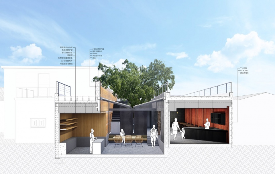
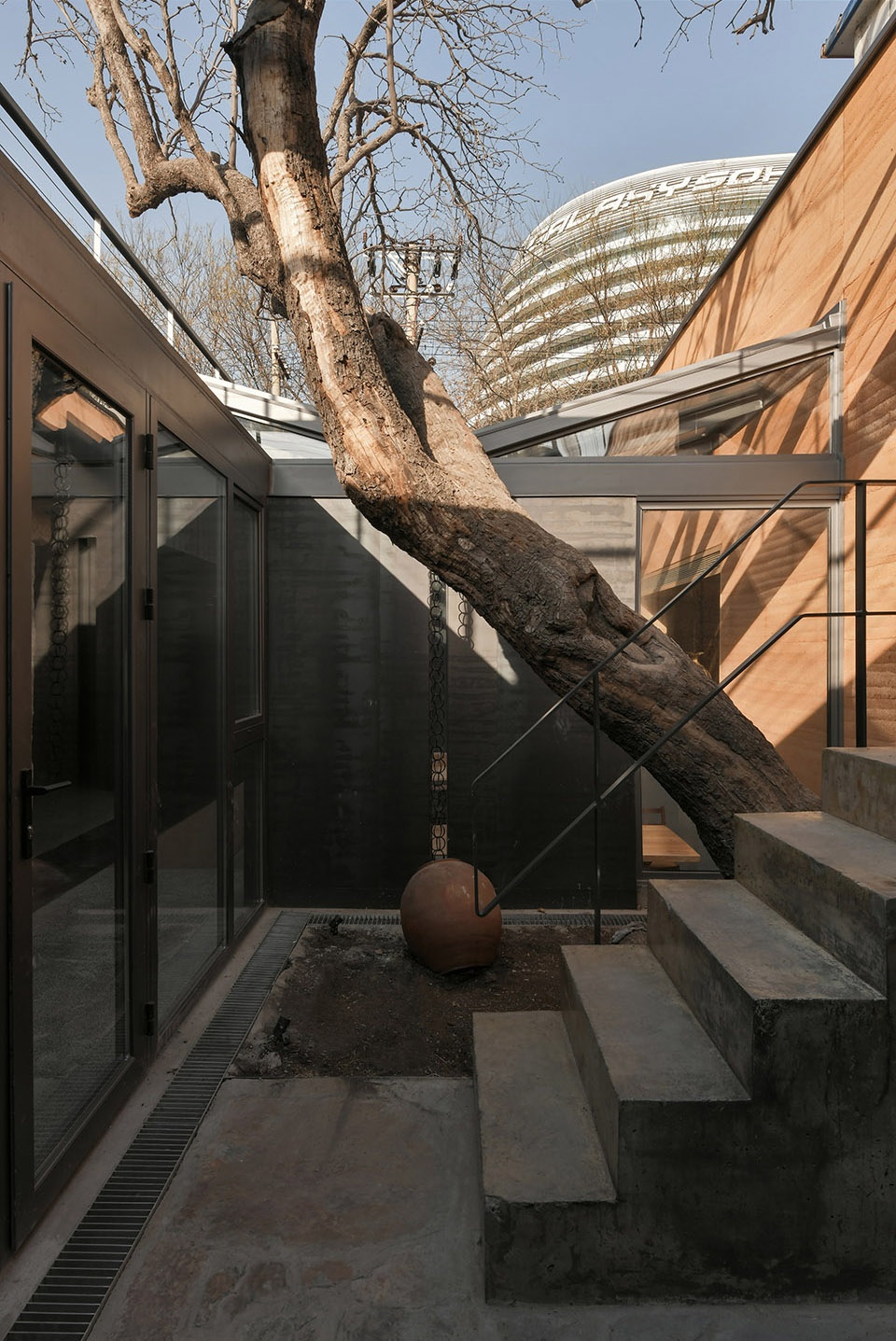
最开始踏勘现场时,我看到一棵近百岁的枣树,像是被五花大绑一样囚禁在了室内,处于一种非常不舒适的状态。所以项目设计启动后的第一件事,便是把庭院规划出来,让枣树重获自由,并以树为中心重新构建了整个餐厅空间的场景序列。
This project is located deep in the hutong of East District, Beijing. When you stand on the roof and look over, the enormous Galaxy SOHO is on the north side, and not far from the south is the Zhihua Temple surrounded by traditional houses. Usually, many residents take part in activities in the small park next to the restaurant. In addition to the daily atmosphere of life, you can also feel the strong impact of “modern” and “traditional”.
When I first visited the site, I saw a hundred-year-old jujube tree imprisoned indoors. It was in a very uncomfortable state. So the first thing after the project design started was to let the jujube tree regain its freedom by planning a courtyard, and then re-construct the scene sequence of the entire restaurant space with the tree as the center.
▼改造前建筑与周边环境,architecture and its surroundings before renovation ©C+ Architects
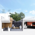
▼剖面图,以树木为中心重构餐厅空间序列,section, reconstruct the spatial sequence of the restaurant around the tree ©C+ Architects
4. 怎样让新的空间符合现代餐厅的需求,既利用了胡同的特色,又不致于对周边环境产生过多的影响?
How do you adapt the new space to the needs of modern restaurants? How to make use of the characteristics of hutong without causing adverse effects on the surrounding environment?
原来的建筑基础条件很不理想,给设计带来了很多新的挑战。由于原始房屋是屋主自己一点一点盖出来的,进场拆除的时候我们清楚地看到了几个不同时期的建筑结构互相衔接的状态。施工过程中,基本是一边建造一边修改设计,碰到问题时需要叫相关专业顾问到场共同商议和判断,然后根据现场条件做出最好的选择。调整工作在整个过程中不断反复出现,让项目的难度提升了很多。
为了保证主要就餐区望向庭院的界面的连续性,我们将中间的几段结构墙替换掉,用一个新的钢结构重新把房屋支撑起来,同时对原本就不稳固的结构进行了加固。扩大的洞口中间放置了一根石柱,既为餐厅加入了一种天然石材元素,又可以强调空间的中心性,获得一定的稳定感。
The conditions of foundation were very unsatisfactory, which brought new challenges to the design. Since the original house was built little by little by the owner himself, we clearly saw the connection between the building structures of several different periods after the demolition began. During the construction process, the design is basically modified while transforming. When problems are encountered, we need relevant professional consultants to discuss and judge on the scene, and then make the best choice according to the site conditions. The adjustment work appeared repeatedly throughout the process, making the project more difficult.
In order to ensure the continuity of the interface looking from main dining area to the courtyard, we replaced the middle sections of the structural wall and re-supported the house with a new steel structure, while reinforcing the originally unstable structure. A rough stone column is placed in the middle of the enlarged opening, which can not only add a natural stone element to the restaurant, but also emphasize the centrality of the space and obtain a certain sense of stability.
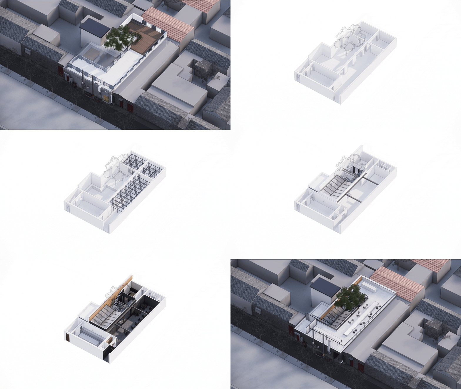
▼空间生成过程,generation of the space ©C+ Architects
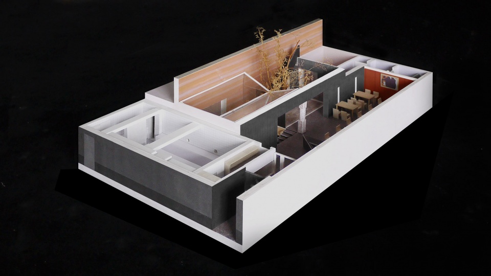
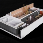
▼模型,model ©C+ Architects
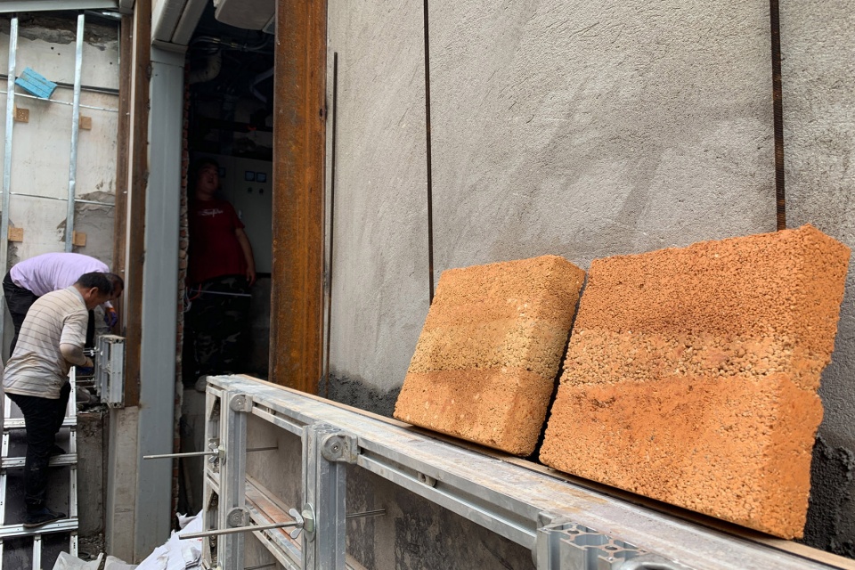
此外,在胡同里做项目要充分考虑和周边邻居的关系。例如夯土施工需要搭起两面模板并预留出工作界面,但实际上,我们只有朝向餐厅院子一侧的界面可以利用。为了处理这个问题,施工方先加固了原来分隔邻居家的院墙,以此来作为夯土墙的一侧模板,既解决了结构问题又节省了空间。
In addition, when doing projects in hutong, we must fully consider the relationship between neighborhood. For example, the rammed earth construction needs to build up two sides of the formwork and reserve the working interface, but in fact, only the interface facing the side of the restaurant yard can be used. In order to deal with this problem, the construction party first strengthened the courtyard wall that originally separated the neighbor’s house, and used it as a formwork on one side of the rammed earth wall, which not only solved the structural problem but also saved space.
▼夯土墙施工过程,construction process of the rammed earth wall ©C+ Architects
5. 纵向空间的分布和场地的既有地形之间有怎样的联系?为什么选择了向下深挖的做法?
What is the relationship between the vertical spatial distribution and the existing terrain of the site? Why choose to dig deeper?
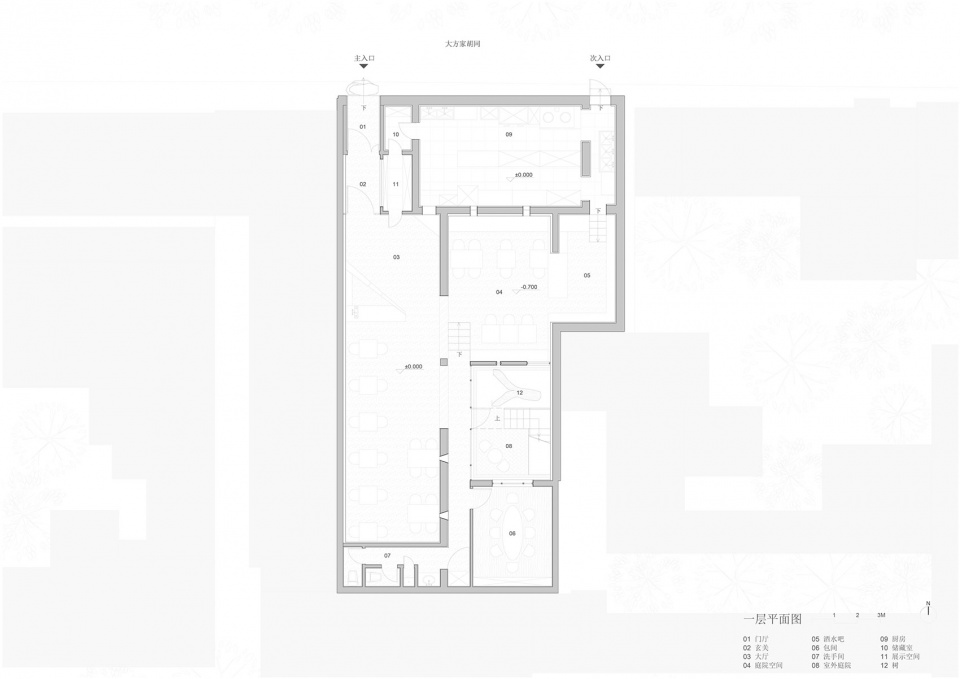
原本的房子地面标高是统一的,但我们在天窗对应的区域下挖了0.7米,刚好是普通餐桌的高度,希望让下沉区域的桌面和主要就餐区地面处在同一高度上,以此营造出不同的就餐氛围。平面上两个就餐区的布置呈对角线关系,通过高差变化让这两部分产生了视线上的互动。
餐厅名为“崖”,带有一定的紧张感和趣味性,我们也试图通过空间语言对“崖”作出回应。横跨庭院的“断桥”、两段式楼梯、就餐区的高差、屋顶平台等等,都是在对餐厅本身想要表达的信息进行呼应。
The ground elevation of the original house was unified, but we dug 0.7 meters under the area corresponding to the skylight, which is exactly the height of an ordinary dining table. I hope that the table in the sinking area and the floor of the main dining area are at the same height to create a different dining atmosphere. The arrangement of the two dining areas on the plan is in a diagonal relationship, and the height difference allows the two parts to interact visually.
As the restaurant is called “Ya (Cliff) ”, with a certain sense of tension and fun, we also tried to respond to the “Ya” through spatial language. The “broken bridge” across the courtyard, two parts of the staircase, the height difference of the dining area, the roof terrace, etc., are all echoing the information that the restaurant itself wants to express.
▼室外餐桌与室内地面平齐,形成视觉互动,the height of the outdoor dining table is the same as the ground level of the interior space, creating visual interaction ©许晓东
6. 楼梯是庭院中非常有特色的细节,下方是混凝土,上面是钢结构,为什么会这样处理?
The staircase is a very characteristic detail in the courtyard, with concrete underneath and steel structure above. Why present stairs in this way?
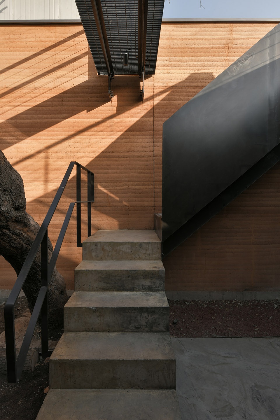
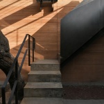
楼梯和“断桥”的设计,都是将其自身作为独立的构件来考虑的。楼梯分成混凝土和钢制两段。底部是浅色现浇混凝土台阶基座,和室内高差保持了意向上的统一。钢制楼梯和夯土墙之间有一段很小的距离,保护夯土墙体的同时还解决了排水问题,也能够让楼梯显得轻盈一些。一重一轻的两段楼梯为人们在登上屋顶的过程中提供了两种截然不同的体验。
天桥的基本构造是在夯土墙内预埋构件,然后通过两个支点来连接,与墙体也脱开了微小的距离。天桥及扶手都用了纤细的线性材料,和厚实的夯土墙形成视觉上的对比。同时,由于所有构件之间都是相对脱开的,我们可以清晰地分辨出每一个部分的构造。楼梯与从屋顶伸出的“断桥”一实一虚,都是让人意想不到的欣赏“崖”的场所。
The design of the staircase and the “broken bridge” are all considered as independent components. The staircase is divided into two parts made of concrete and steel. The bottom is a light-colored cast-in-situ concrete stepped foundation, which maintains the intentional uniformity with the indoor height difference. The upper steel stairs has a small distance from the rammed earth wall. While protecting the rammed earth wall, it also solves the drainage problem and can make the staircase seem lighter. The “heavy” bottom and the “light” upper part providing people with two very different experiences as they climb onto the roof.
The basic structure of the “broken bridge” is to pre-embed the member in the rammed earth wall, and then connect it through two fulcrums, it is also separated from the wall by a small distance. Slim linear materials are used for the “broken bridge” and the handrails, which form a visual contrast with the solid rammed earth wall. At the same time, because all components are relatively disconnected, we can clearly distinguish the structure of each part. The staircase – “valid”, together with the “broken bridge” – “invalid” are both unexpected places to appreciate the “Ya”.
▼楼梯细部,上下采用不同的材质,closer view to the staircase composed of two different materials ©许晓东
7. 你们是如何处理建筑与基地中的老树的关系的?庭院的天窗为什么采用了“V”形?
How do you deal with the relationship between the architecture and the old trees in the site? Why does the skylight of the courtyard adopt “V” shape?
儿时在北京平房里的生活给我了留下了许多美好的印记,年复一年的季节轮回让我感受到了生命的“共生”,也让长大后的我对北方的庭院和树抱有一种独特而又深刻的情感。记忆中家里的院子中有一棵大树,伸展开来的树冠几乎遮住了整个院子,很像宫崎骏导演的动画片《龙猫》里龙猫居住的那棵巨型樟树。后来树根甚至穿过围墙进到邻居家的院子并持续发芽抽枝,几年后又长成了一棵新树。
夏天,家里人就在围坐树下的阴影里喝茶乘凉;冬天当树叶掉光后,阳光穿过树枝照进整个院子。每天清晨,树上会传来燕子、喜鹊、麻雀等各种各样鸟类的叫声,偶尔还有啄木鸟,基本上我起床都不需要闹钟;到了晚上还能看到猫头鹰在树梢上停留。夏初的时候,经常会有邻居来串门,他们爬到树上摘些嫩芽做饭,树因此成为了邻里交往的媒介。即便现在回想起来,围绕着院子和树展开的场景也是一种特别理想的人与环境相互依存、对话的生活状态。
My childhood life in Beijing has left me with many beautiful impressions. Year after year, the change of seasons in my family’s yard has made me feel the “symbiosis” of life. After a long time, these experiences have made me have a unique and profound emotion for the courtyards and trees in northern China. There is a big tree in the yard of the house in my memory. The extended crown almost covers the entire yard, just like the giant camphor tree featured in the Studio Ghibli’s film My Neighbor Totoro. After that, the roots even went through the fence into the neighbor’s yard and continued to sprout. And a few years later it grew into a new tree.
In summer, the family drinks tea and cools in the shadow under the tree. In winter, when the leaves fall out, the sunlight can shine through the branches into the entire yard. Every morning, the sounds of various birds such as swallows, magpies, and sparrows are heard from the trees, and occasionally woodpeckers. Basically, I didn’t need an alarm clock to get up. At night, I could still see an owl staying on a branch. In early summer, when neighbors came, they climbed to the tree to pick up some buds and cooked, the tree became the medium of communication in the neighborhood. Even looking back now, the scene around the yard and trees is a particularly ideal state of life in which people and environment are interdependent and dialogue.
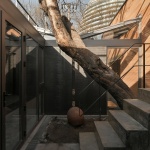
▼庭院中自由生长的枣树,jujube tree freely growing in the courtyard ©C+ Architects
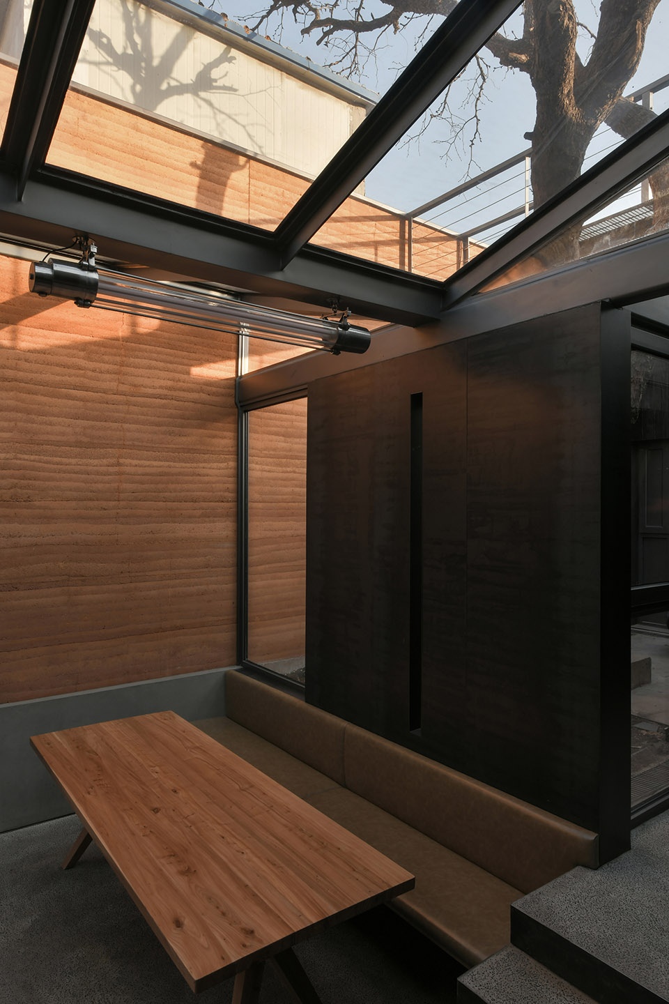
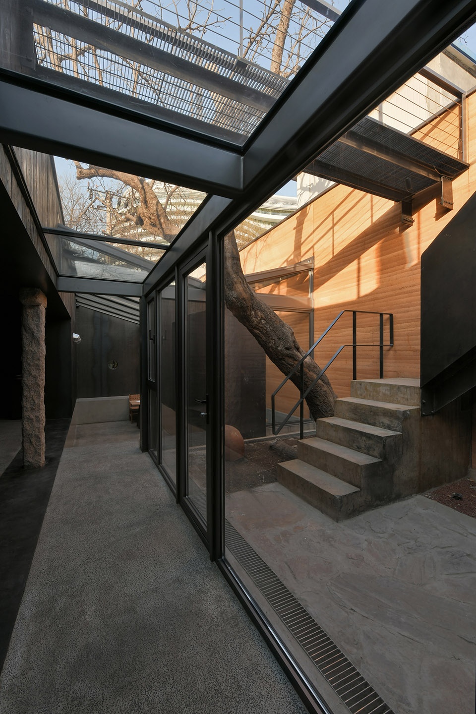
与崖餐厅相遇,让我重拾了过去的时光。在项目的设计中,大树周围的室内空间首先被打开,形成新的户外庭院。室内几个不同就餐区域,都能让人通过各种预留的洞口看到大树所在的院子。与此同时,我们经过反复推敲确定了下沉就餐区的“V”字形天窗设计方案,避开了主要树干生长方向,人站在屋顶上看过去也不会觉得突兀。
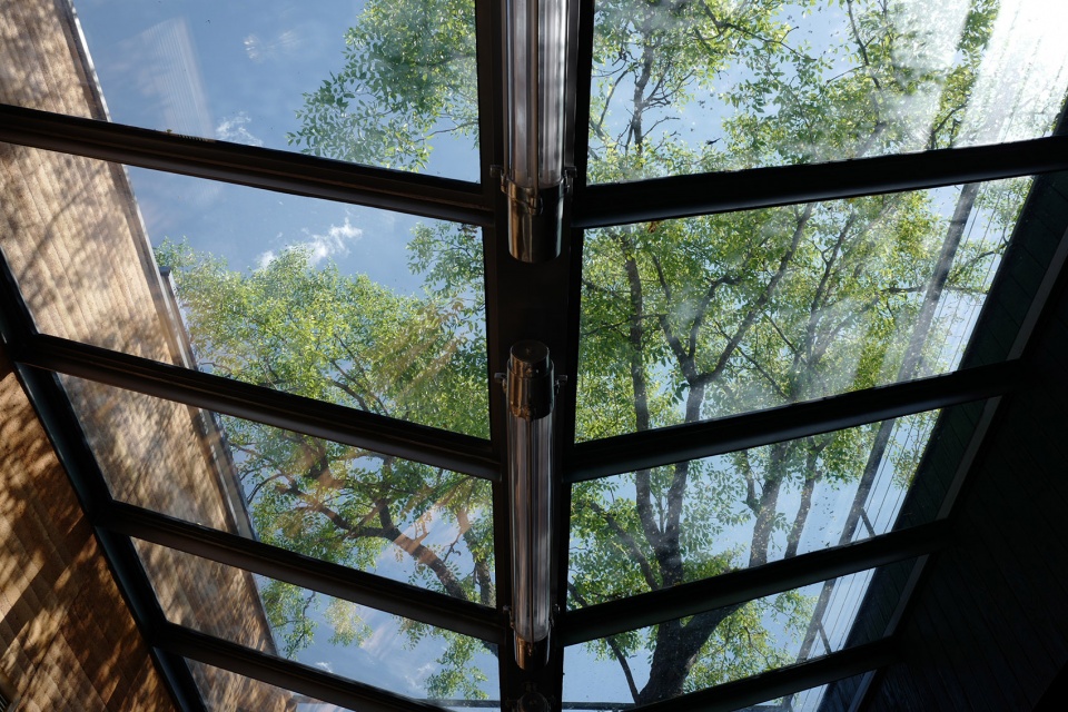
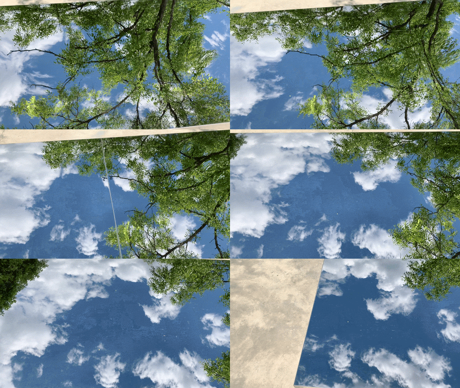
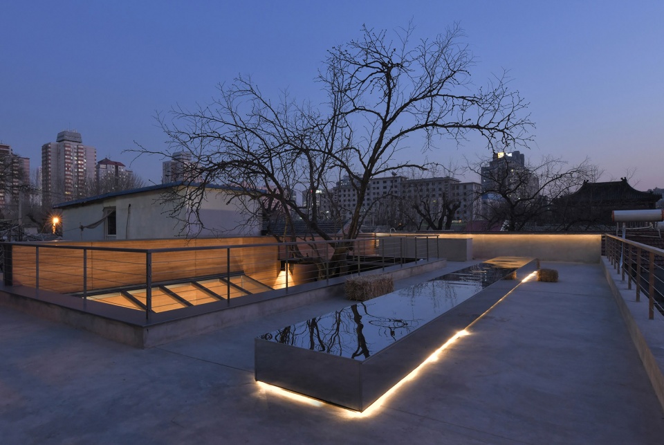
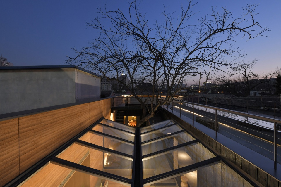
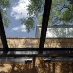
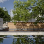
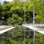
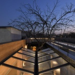
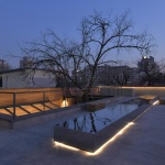
天窗的意向来源于在云南旅行时的印象,低矮的天空、清澈的湖水,这些云南的“原风景”是我想移植到这个建筑里的。“V”字形天窗里倾泻下来的天空,可以缩短人与蓝天白云间的距离感。下雨时,雨水随着天窗的角度汇聚到中间的凹槽,然后顺着落水链流到虚埋在庭院土地里的罐子中,让人感到一丝惬意和浪漫。玻璃天窗从室内把空间中的一切景象反射出来,将室内外的各种景象交织在一起,出现了许多戏剧性的场景交叠。从屋顶看过去,天窗又倒映出了天色和树影,像是漂浮的水池,傍晚灯光亮起,会透出点亮城市一隅的暖光。
Meeting with the Restaurant “Ya” made me regain the past. In the design of the project, the indoor space around the big tree was first opened to form a new outdoor courtyard. From several different dining areas, you can see the courtyard where the tree is located through various reserved holes. Also, we have determined the V-shaped skylight design of the sinking dining area, while avoiding the growth direction of the main tree trunks, people will not feel awkward while standing on the roof.
The intention of the skylight comes from the impression when I was traveling in Yunnan, the low sky and the clear lake water. These “original scenery” of Yunnan are what I want to transplant into this restaurant. The sky poured into the V-shaped skylight can shorten the sense of distance between people and the blue sky and white clouds. When it rains, the rainwater converges into the middle groove with the angle of the skylight, and then flows along the falling water chain into the pot half-buried in the courtyard, which makes people feel a little cozy and romantic. The glass skylight reflects all the scenes in the space from the interior, interweaving various scenes inside and outside, and there are many dramatic scenes overlapping. When viewed from the roof, the glass reflects the shadows of sky and tree, like a floating pool. In the evening, the warm light that illuminates the city is revealed.
▼新天窗向下凹,倒映天光和树影,the new skylight with V-shape reflecting the sky and the tree ©C+ Architects
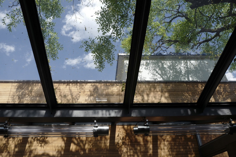
这次合作的结构工程师,有丰富的国内外大型公共建筑设计经验。巧合的是,他多年前还参与了餐厅对面银河SOHO的顶部结构设计工作,如今在一路之隔的胡同里又遇到了一个面积仅仅只有银河SOHO屋顶千分之一大的小玻璃屋顶。然而,面积虽然小,挑战却丝毫不减。我们希望屋顶天窗呈现出轻盈、通透的状态,在削弱天窗沉重感的同时,让下面的就餐者能够更直接地感受天空和伸出的枣树枝叶。由于正常的天窗型材里,无论再纤细的成品都无法满足我们的要求。最终,结构工程师将天窗金属结构杆件设计成“T”字形,玻璃安装在杆件形成的骨架上面,而T型钢下端的截面相对较薄,尽可能的减少了结构对人视线的干扰。
The cooperating structural engineer has rich domestic and foreign large-scale public building design experience. Coincidentally, many years ago, he was also involved in the roof structural design of the Galaxy SOHO opposite the restaurant. Now for him, there is another opportunity to design a small glass roof that is only one-thousandth the size of the Galaxy SOHO roof just across an alley. However, although the area is small, the challenges haven’t diminished. We hope that the roof skylight will be light and transparent, while weakening the skylight’s heavy feeling, so that the diners below can more directly feel the sky and jujube tree’s branches and leaves. Since no matter how thin the finished skylight product is, it still can’t meet our requirements. In the end, the structural engineer designed the metal structural members into a “T” shape. And the glass was installed on the skeleton formed by the members. The cross section of the lower end of the T-shaped steel is relatively fine, which minimizes the interference of the structure on people’s sight.
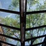
▼天窗细部,减少结构对视线的影响,closer view to the skylight, reducing the effect of the structure on people’s sight ©C+ Architects
8. 屋顶上的长方形不锈钢座椅装置表达了怎样的意象?
What kind of image does the rectangular stainless steel seating device on the roof express?
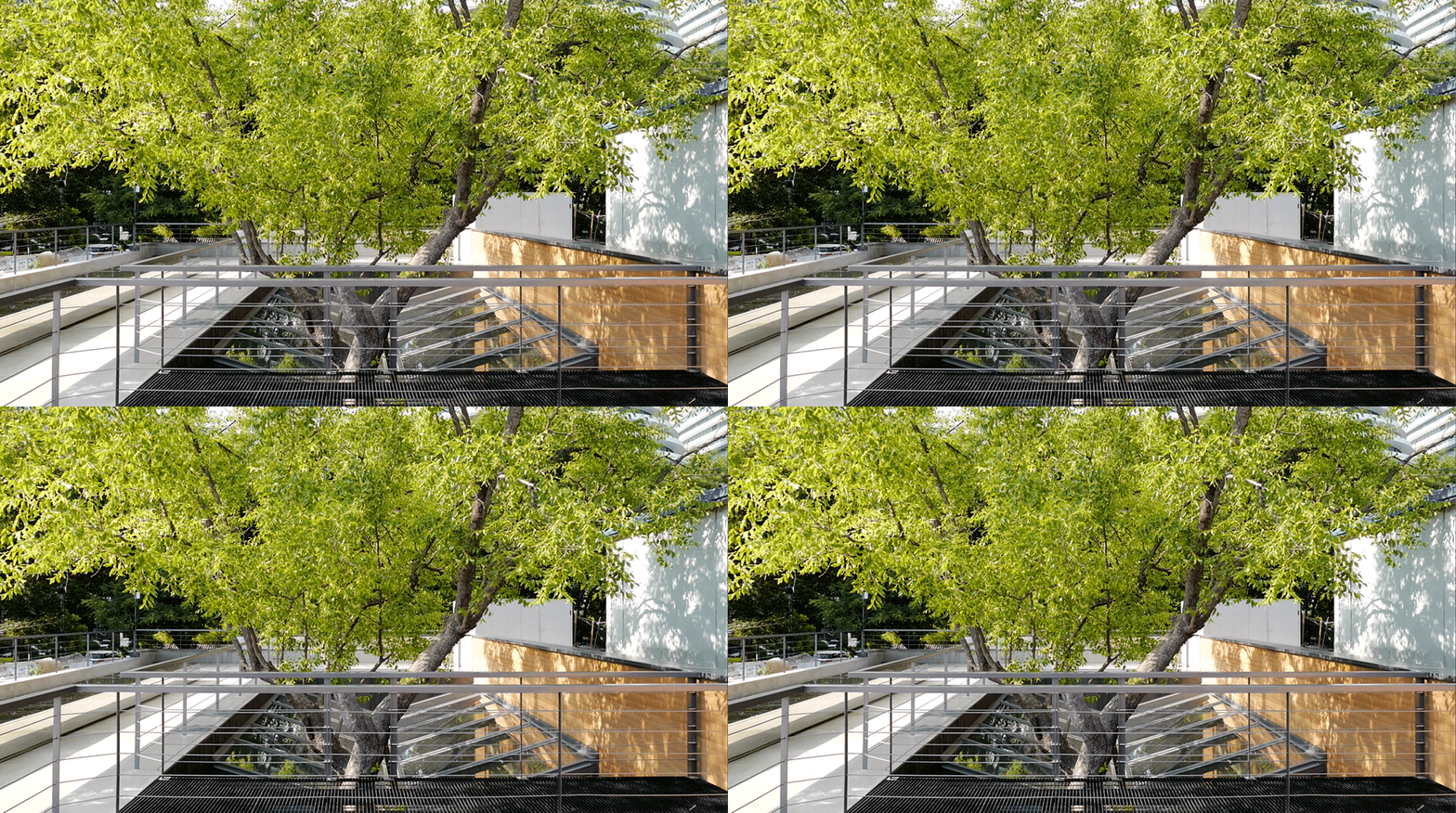
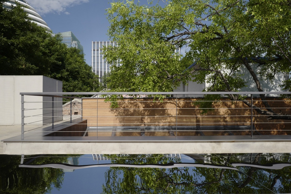
我们想在屋顶设计一个能与场地对话的装置,既能满足基本的休息功能,又可以制造出更多的视觉可能性。长长的镜面不锈钢体块可以从不同角度将周边的一切景象反射出来,天空、云朵、建筑以及树木等等,并且会随着天色变化而不断变换表情。晚上,底部暗藏的灯带让整个装置呈现出一种悬浮的状态,像是从未知世界飘来的一艘飞船。
We want to design an installation on the roof that can talk to the venue, which can not only satisfy the basic rest function, but also create more visual possibilities. The long mirror stainless steel body can reflect all the surrounding scenes from different angles, the sky, clouds, buildings and trees, etc., and will constantly change its expression as the sky changes. At night, the hidden light strip at the bottom makes the whole device appear to be in a suspended state, like a spaceship floating from the unknown world.
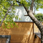
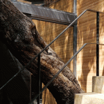
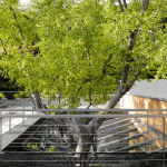
▼屋顶不锈钢长椅反射上方景象,different scenes reflected by the stainless steel bench on the roof ©上/中:C+ Architects,下:gooood
9. 如何选择餐厅的材料,又是如何处理材料的颜色及其表面质感的?
How to choose the materials, and how to deal with the color and surface texture of the materials?
云南,在各种层面上都是非常丰富的,很难单凭几个关键词概括清楚,就像没有一个建筑能完全代表中国建筑一样,这种丰富性不能通过某个具体的形式表达。然而,自然本身是最丰富的,因此,我们希望将自然材料本身的丰富性表达出来。组织材料就像在指挥一个交响乐团。崖餐厅的主要色调只有黄、红暖色系和黑、灰冷色系两种,在这两个颜色系统里,每一种材料都显露出了特有的质感和肌理变化。
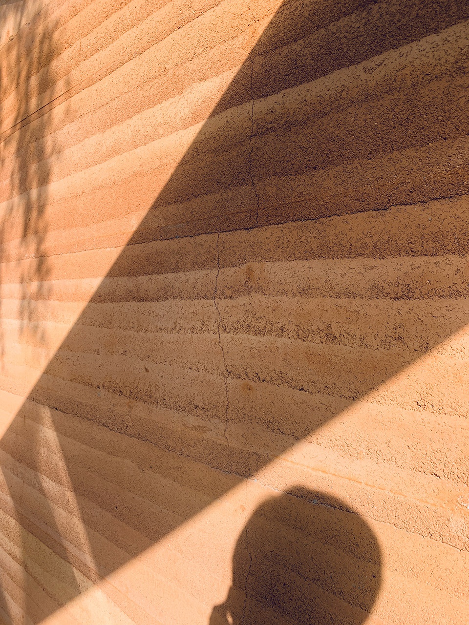
东、西两侧的长墙分别使用了橘黄色的夯土和深红色的洞石,用色彩划定了空间的边界。夯土墙的横向纹理是基于建造的逻辑而产生的,强调了水平感;红色石材的竖向纹理像一面瀑布,从天花板上倾泻下来,让人联想到日本艺术家千住博的作品。其中,夯土墙用的土是从云南运过来的,在施工前,夯土设计团队对于肌理尺度和颜色配比做了大量的研究工作,我们希望通过夯土本身丰富的色彩层次来构成整个餐厅中最重要的围合墙体。另外,夯土墙从室内一直延伸到室外,让内外空间产生了联系。
内部是各种冷色系的材质,例如水洗石地面、热轧钢板和烧杉板墙面等,有着不同层次的反光度。金属的反光最为强烈,水洗石其次,最弱的则是烧杉板,随着时间推移,这种细腻、微小的差别感可以被逐渐体验到。真实、质朴的材料被放在空间里,只做基本的防护,不做多余的装饰,不同材料之间的对比也提高了人对整个餐厅的认知深度。
Yunnan is very rich at all levels. It is difficult to summarize clearly with a few keywords. Just like no building can fully represent Chinese architecture, this richness cannot be expressed in a specific form. However, nature itself is the most abundant, so we hope to express the richness of natural materials themselves. Organizing materials is like conducting a symphony orchestra. The main colors of the Restaurant “Ya” are only yellow and red in warm colors, with black and gray in cool colors. In these two color systems, each material shows a unique texture.
The orange rammed earth wall on the east side and the deep red travertine stone wall on the west side helped to define the boundary of the space. The texture of the rammed earth wall is based on the logic of construction, emphasizing the horizontal feeling. The vertical texture of the red stone resembles a waterfall pouring down from the ceiling, reminiscent of the work of Japanese artist Hiroshi Senju. The soil used for the rammed earth wall was transported from Yunnan, before construction, the rammed earth wall design team did a lot of research work on the texture scale and color ratio. We want to form the most important enclosed wall in the entire restaurant through the rich color layers of the rammed earth itself. Besides, the wall extends from the interior to the exterior, so that there is a connection between the inside and the outside, and the space is continuously extended.
Various cool-color materials are used in the interior, such as washed stone floors, hot-rolled steel plates and shou sugi ban wall surfaces, with different levels of reflectivity. The reflection of the metal is the strongest, the washed stone is the second, and the weakest is the shou sugi ban. Over time, this delicate and tiny difference can be gradually experienced. The authentic and pristine materials are placed in the space, with only basic protection and no extra decoration. The comparison between different materials also enhances people’s understanding of the entire restaurant.
▼庭院橘黄色的夯土墙与室内冷色材料形成对比,contrast between the orange rammed earth wall in the courtyard and the cold-colored materials in the interior ©许晓东
10. 这个项目在材料的选择上投入了大量精力,甚至可以说十分苛刻,这与C+ Architects的设计理念和追求有着怎样的联系?
This project has invested a lot of energy in the selection of materials, and it can even be said “very harsh”. How does this relate to the design concept and pursuit of C+ Architects?
我们为崖餐厅选用的材料都经过了很长时间的推敲,原则是尽可能让材料本身的特点自然呈现,让其与环境进行直接的接触。即使经过时间的洗礼,这些材料也不会失去魅力,反而因为腐蚀、氧化、磨损而变得更加动人。
The materials we have selected for the Restaurant “Ya” have gone through a long period of time. The principle is to let the characteristics of the materials themselves appear as natural as possible, and directly contact the environment. Even after a long time, these materials will not lose their charm, but become more attractive because of corrosion, oxidation, and wear.
▼耐久的夯土墙,墙面树影摇曳,rammed earth wall with shadow of the tree ©C+ Architects
餐厅地面采用了水洗石的做法。早前在日本旅行时看过杉本博司的江之浦测候所地面水洗石的处理,再加上我们已经设计过一次相同材质的墙面,所以这次希望挑战一下,做出比测候所更好的地面。从粒径到颜色,我们对几十种不同的小石头进行了实验比较和筛选。既要考虑美观也要照顾人走在上面的感觉和保证家具的稳定性,选样过程漫长以致于业主和施工伙伴都已经开始考虑备选方案了,好在大家最后还是没有放弃并且做出来了。
此外,我们前前后后找了十几家供应商提供墙面烧杉板样品,最终确认了一个相对符合设计要求的。烧杉板是常见于乡村的材料,如何将之处理的更有现代感是非常重要的。特别是质感的微妙变化代表着不同的表情,做到精准表达需要花费大量的时间。材料本身的情感与空间的氛围两者紧密相连,我们希望将各种质朴的材料汇集于“崖”,通过克制的加工手段把场所想要展现出的气质尽可能自然且真实地传达出来。
Washed stone was adopted on the restaurant floor. I have seen the treatment of the washed stone on the ground of Enoura Observatory designed by Hiroshi Sugimoto when I was traveling in Japan, and we have designed a wall of the same material once, so this time I hope to challenge and make it better. We have compared and selected dozens of different gravels from size to color. It is necessary to consider the aesthetic factors, to take care of feeling of people walking on it and to ensure the stability of the furniture. The sample selection process is so long that the owner and construction partners have begun to consider alternatives. Fortunately, we didn’t give up and made it.
In addition, we have looked for more than a dozen suppliers to provide samples of shou sugi ban, and finally confirmed one relatively meets the design intention. The shou sugi ban is a common material in the countryside, so it is very important how to treat it in a more modern way. Especially the subtle changes in texture represent different expressions, and it took a lot of time to achieve precise expression. The emotion of the material itself is closely connected with the atmosphere of the space. We hope to gather all kinds of pristine materials in the “Ya”, and use the restrained processing methods to convey the temperament that the place wants to show as natural and authentic as possible.
▼室内就餐区,地面使用水洗石,interior dining space with washed stone floor ©许晓东
11. 项目背后还有哪些故事,欢迎分享。
What other stories are behind the project, please share with us.
在日本留学期间,我认识了几个关系很好的云南朋友。回国后的几年里,几次收到他们的邀请去云南考察项目,也让我有机会在云南的城市和乡村里体验了当地的风土人情。然而由于种种原因,最终都没有促成实际的项目,没想到最后是在北京和远方的云南产生了更为紧密的联系。
还记得以前,从北京去到东京留学后,我首先感受到的就是和熟悉的故乡比起来很不一样的天空,经常坐在自己的屋子里看着天空中大片的云从城市的上空快速飘过,似乎伸手就能摸到。当第一次去到云南,当地的天空让我产生了一种似曾相识的异样的感觉。由于高海拔的原因云南的云很低,天空晴朗的时候,云更像是直接从头顶飘过,这是云南给我的最直接的也是最深刻的印象,也正是这个印象促使我为崖设计了“V”字形的天窗。
直到第一次联络我们时,崖餐厅的业主对C+ Architects已经持续关注了近3年。他们认真看了我们之前的每个项目,整个团队都去了我们给独立家具品牌“失物招领”设计的店铺考察。“失物招领”这个项目选择了水洗石作为外立面装饰,这是一种老房子里经常会用到的传统材料,自然、真实,又能唤起人们珍惜过去的美好事物的情感,与失物招领家具本身所传递的信息非常契合。同时,我们与施工方一起挑战了新的做法,将大片的水洗石墙面无缝粘接,使得店铺最终呈现出了一种现代的美感。业主从中看到了我们对于细节把控的执着和耐心,也觉得“崖餐厅”项目是一个很好的合作机会。在了解与信任的前提下,双方的沟通一直保持了顺畅,彼此间也有很多共同的语言,我们从中获益良多。
While studying in Japan, I met some good friends from Yunnan. In the years after returning to China, I received their project invitations and visited Yunnan for several times, which also gave me the opportunity to experience the local customs. However, due to various reasons, none have reached cooperation. Unexpectedly, it was in Beijing that a close relationship with Yunnan in the distance was created.
I still recall that after going to Tokyo, the first thing I noticed was the very different sky than my familiar hometown. I often sat in my apartment and watched the large clouds in the sky drifting quickly over the city within reach. The first time I went to Yunnan, the local sky made me feel déjà vu. Because of the high altitude, the cloud in Yunnan is very low. When the sky is clear, the cloud is more like floating directly over the head. This is the most direct and profound impression that Yunnan has shown me, and it is this impression that prompted me to design the V-shaped skylight for the “Ya”.
Until the first contact, the owner of the Restaurant “Ya” has been paying close attention to C+ Architects for nearly 3 years. They took a serious look at each of our previous projects, and visited the store we designed for the furniture brand “Lost&Found” with entire team. The “Lost&Found” Store chose washed stone as the facade decoration. This is a traditional material often used in old houses, natural and authentic. And it can awake people’s emotions of cherishing the beautiful things of the past which is very consistent with the message conveyed by the brand. At the same time, we challenged the new approach with the construction party, seamlessly bonding large pieces of washed stone walls, so that the shop finally showed a modern beauty. Since the owner saw our perseverance and patience in controlling details, and felt that the Restaurant “Ya” was a good opportunity for cooperation. Under the premise of understanding and trust, the communication between us has been smooth and there are many common languages. We have also benefited a lot from the entire cooperation.
▼失物招领,北京朝阳合生汇店(点击这里查看更多),Lost&Found Store in Hopson One, Beijing (click HERE to view more)
12. 通过该项目的收获有哪些?
What are the gains from this project?
顾问的专业配合和团队的共同建筑理想是必不可少的。虽然这个项目体量不大,但花费的时间、精力以及各个专业团队的配合却一点儿不少,丝毫不亚于一个大型公共建筑项目。在这个过程里,所有参与者如果没有一致的目标是不可能把对项目最初的想象贯彻始终并实现完整的。创造与突破永远伴随着困难与挫折,当克服了重重阻碍,看到人们在崖餐厅里渡过一段饱含情感的重要时光,也就实现了我们设计时最本真的愿望。
The professional cooperation with consultants and the common architectural ideal of the whole team are essential. Although this is not a big project, the time and energy spent and the cooperation of various professional teams are no less than a large-scale public building project. In this process, if all participants don’t have a consistent goal, it’s impossible to implement and complete the original imagination of the project. Creation and breakthrough are always accompanied by difficulties and frustrations. When we overcome many obstacles and see people spend an important time full of joy in the restaurant, we have realized our most authentic desire in design.
▼夜景,night view ©许晓东
更多关于崖餐厅
More about Restaurant “Ya”
▼视频,video ©gooood
“崖”——过去与未来的相遇之地
Restaurant “Ya”, a place where the past meets the future
位于北京大方家胡同的“崖”,是C+ Architects为Under Clouds餐饮品牌设计的一间云南菜餐厅。掩映在民居、庙宇和商场写字楼之间,新与旧、传统与现代的气息并存。在项目设计和实施的整个过程中,建筑师与业主的探讨始终围绕着“云南文化的现代性表达”这一主题展开。从场地的解读到就餐环境的重新定义,从建筑结构加固到室内空间重构,从材料选择到食物呈现,经过一年多时间的打磨,承载了众多参与者丰富情感的“崖”,于2020年元旦诞生。
Located in Dafangjia Hutong, Beijing, “Ya” is a Yunnan cuisine restaurant designed by C+ Architects for the “Under Clouds” catering brand. It hides among the residential houses, temples and office buildings, where the characteristics of old and new, traditional and modern coexist. During the whole process of project, the discussion between the architects and the owners always revolved around the theme of “expression of modernity of Yunnan culture”. From the interpretation of the site to the redefinition of the dining environment, from the reinforcement of the structure to the reconstruction of the interior space, from the selection of materials to the presentation of food, after more than a year of polishing, Restaurant “Ya”, carrying the rich emotions of many participants, was born on New Year’s Day in 2020.
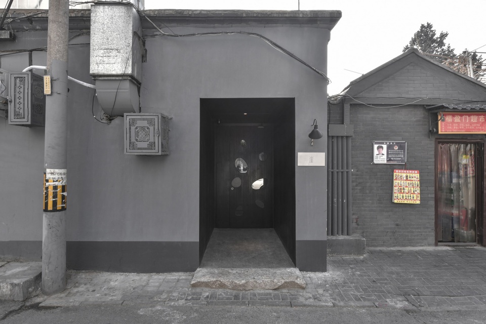
▼餐厅外观,external view of the restaurant ©许晓东
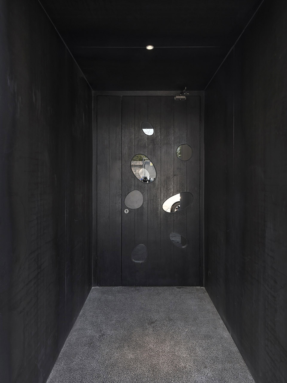
▼入口,entrance ©许晓东
餐厅所处的合院里有一棵逾百年的枣树,被曾经的改造工程围在了室内。考虑到北京传统民居中,树木作为重要的元素,不仅是联系人与场地的纽带,也象征着生命的延续。因此,为了让枣树恢复昔日自然的生长状态,整栋房屋可以自由地呼吸,建筑师开放出一个庭院,并以树为中心重新构建了空间场景序列。
借用“崖”的“高边”之本意,设计强调了空间的视觉趣味性。东侧就餐区下沉70公分,与西侧就餐区域及庭院形成了竖向上的互动。通往露台的户外楼梯分成两部分:底部是浅色现浇混凝土台阶基座,和室内高差保持了意向上的统一;上面是一段钢楼梯,与从屋顶伸出的“断桥”一实一虚,皆为让人意想不到的欣赏“崖”的场所。下沉就餐区上方是T型钢做骨架的“V”字形天窗,避开主要树干生长方向的同时,更把代表云南的强烈、真实且具有力量感的“原风景”引入到“崖”里。就餐者抬头仰望,可以感到近在咫尺的蓝天白云;从屋顶看过去,天窗倒映了天色和树影,像是漂浮的水池,傍晚灯光亮起,又会透出点亮城市的暖光。
“崖”作为一个社交空间,以建筑语言为媒介,展现了人与时间、环境的亲密关系。东侧植入的一整面现代夯土墙,寓意着云南土地的再生。每日变幻的光影在墙上流动,随着时间慢慢沉淀。墙体延伸到室外,与天窗一起将风景自然地引入到建筑内部。室内高差分界线处的洞口像一个取景窗,将庭院和夯土墙的画面完整呈现出来,调动了西侧就餐区客人的视线。
此外,建筑材料的加工和厨师对食材的烹饪方法不尽相同。在保留原始质感的基础上,通过克制的处理让细节变得更加动人,再以现代美学的方式呈现出来。东侧橘黄色的夯土墙和西侧深红色的洞石墙色彩温暖、肌理丰富,将使用了烧杉板、热轧钢板以及黑色水洗石等深色材料的餐厅包裹起来,跳跃与沉稳的色彩相互交织,产生了细腻的层次感,让空间气氛变得幽静深远。
▼庭院,枣树被保留并恢复自然生长状态,the jujube tree in the courtyard was remained and could grow naturally ©许晓东
In the restaurant, a hundred-year-old jujube tree was enclosed by the former reconstruction work. Considering the traditional houses in Beijing, trees as an important element not only connect people with the site, but also symbolize the continuation of life. Therefore, in order to restore the jujube tree to its natural growth state, and allow the entire house to breathe freely, the architect opened a courtyard, and re-constructed the sequence of spatial scenes with the tree as the center.
Borrowing the original meaning of the word “Ya (Cliff) ”, the design emphasizes the visual interest of the space. The dining area on the east side sinks 70 centimeters, forming a vertical interaction with the west dining area and the courtyard. The outdoor staircase leading to the terrace is divided into two parts. The bottom is a light-colored cast-in-situ concrete stepped foundation, which maintains the intentional uniformity with the indoor height difference. The upper part is a section of steel staircase, together with a “broken bridge” on the roof are both unexpected places to appreciate the “Ya”. Above the sinking dining area is a “V” skylight with T-shaped steel frame, which avoids the growth direction of the main trunk, and also introduces the original scenery representing Yunnan’s strong, real and powerful sense into the “Ya”. When the diners look up, they can feel the blue sky and white clouds within easy reach. When viewed from the roof, the glass reflects the shadows of sky and tree, like a floating pool. In the evening, the warm light that illuminates the city is revealed.
As a social space, the “Ya” shows the close relationship between people, time and environment by using architectural language. A modern rammed earth wall implanted on the east side symbolizes the regeneration of the land in Yunnan. The ever-changing light and shadow flow on the wall, slowly settling over time. The rammed earth wall extends to outdoor, and together with the skylight, naturally introduces the scenery to the interior space. The opening at the indoor high-difference boundary line looks like a framing window, which fully displays the pictures of the courtyard and the wall, mobilizing the sight of guests in the western dining area.
In addition, the processing of construction materials is similar to the attitude of the chef handling the food. On the basis of retaining the original texture, the details are made more attractive through certain adjustments, and then present in a modern aesthetic way. The orange rammed earth wall on the east side and the deep red travertine stone wall on the west side are warm and rich in texture. These two walls embrace the restaurant that uses dark-colored materials such as shou sugi ban, hot-rolled steel plate and black washed stone. The colors are intertwined with each other, making the space atmosphere quiet and profound.
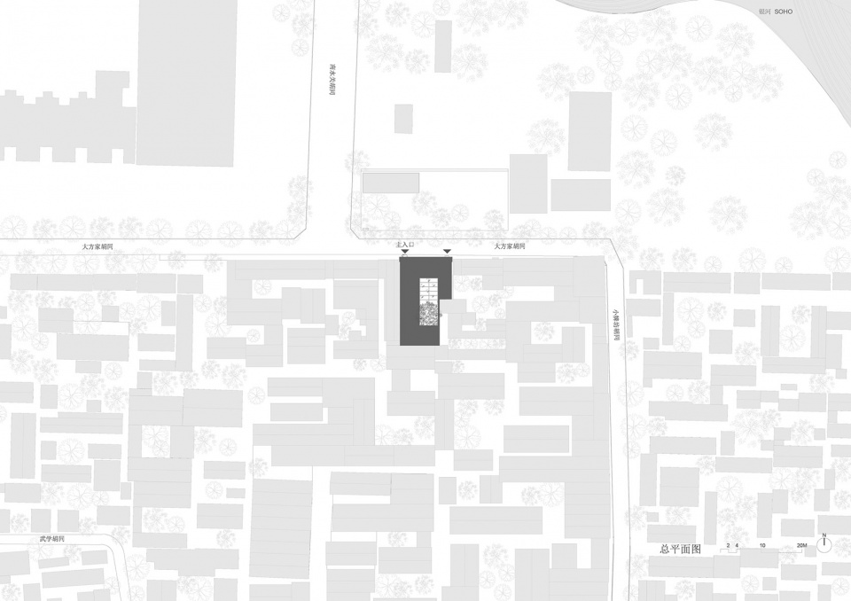
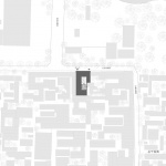
▼总平面图,master plan ©C+ Architects
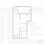
▼一层平面图,first floor plan ©C+ Architects
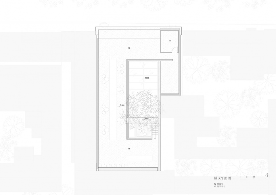
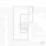
▼屋顶平面图,roof plan ©C+ Architects
业主寄语
Message from the client
陈冰(崖 / under clouds 联合创办人)
在北京的胡同做一个云南菜餐厅,是对这次工作(崖的创建)最简单的陈述。
当站在这里(大方家胡同8号)时,如果我们把思维的感知拓宽一些,一定会有一些回避不了的疑问:在过去和未来之间;在土地和城市之间;在传统和现代之间,甚至在个体自我实现和群体同谋共力之间……如何去创建这个餐厅?我们的工作,可以被认作是所有参与者对这些疑问的回应——试试大家能做出的最优方案会是怎样。这些是最初在和设计方沟通时,谈到的我们关于这个餐厅的想法。
我们和建筑师合作时一直尝试实现某种进化,就是尽可能地把双方从传统的甲方乙方权力关系中解放出来,转变成一种一群拥有不同背景、审美、技艺、经验的人共同去实现一个作品的多方协作关系。更像是主持建筑师成为了导演,我们则代表制作人、出品方。这样的方式下或许更能激发每个人的创造潜能。
基于前述,我想起了负责统筹的驻场建筑师在完工时,同我谈到整个项目中她的感悟,能生动描绘这个过程,大概是:这个餐厅让她感受到了两种思维模式的实践过程,最终“合成”了这个餐厅。一个是主持设计的程艳春以学院派的严谨和理性,如何一步步从一张空白的纸上推导出餐厅的设计方案,解决各类问题;一个是代表业主方的我将最初“我们的餐厅,你们的生活”这一让人觉得模糊的感受,如何通过一次次讨论一块块分解具现出来,结合餐厅实际所需,和建筑师们的方案“严丝合缝”。我很喜欢她的这个说法,算是很贴切地描述了我们和程艳春代表的建筑师们合作的状态以及方式。
最初之时,我们通常只有一些模糊的愿望,完成之后,我们才得到这个清晰的餐厅。最终,餐厅融合我们所有人工作的意义才得以体现,并且被人喜爱。
设计方:C+ Architects
主持建筑师:程艳春
设计团队:徐丽媛、田宇婷、周琪睿、陈立康
夯土墙二次设计与施工:土上建筑
结构设计:张锦斌
项目类型:休闲建筑,胡同改造
时间:2018年11月-2019年12月
地点:中国,北京
建筑面积:250平方米
摄影:许晓东,C+ Architects
Design Firm: C+ Architects
Architect in Charge: Cheng Yanchun
Project Team: Xu Liyuan, Tian Yuting, Zhou Qirui, Lee Kang Chan
Secondary Design and Construction of Rammed Earth Wall: Onearth Architecture
Structural Design: Zhang Jinbin
Program: Hospitality, Hutong Renovation
Dates: November 2018-December 2019
Location: Beijing, China
Area: 250 sq.m.
Photographs: Xu Xiaodong, C+ Architects
More: C+ Architects 。更多关于他们:C+ Architects on gooood
