感谢 罗秀达(联系邮箱:luoxiuda@163.com)予 gooood 分享以下内容。更多请至: Luo Xiuda on gooood
Appreciation towards Luo Xiuda (contact:luoxiuda@163.com) for providing the following description:
项目介绍
Project Introduction
该项目位于北京市朝阳区,使用面积约90平米,是为三口之家设计的居所,男屋主喜欢收藏文玩与喝茶,女屋主喜欢烹饪和购物,小朋友喜欢打篮球和弹钢琴。
This project is positioned in Chaoyang District of Beijing, with valid space of about 90㎡, suitable for families of three, whose host favors tea and articles for amusement, the hostess likes cooking and the kid likes playing basketball and the piano.
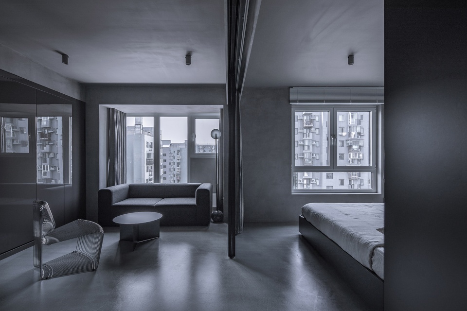
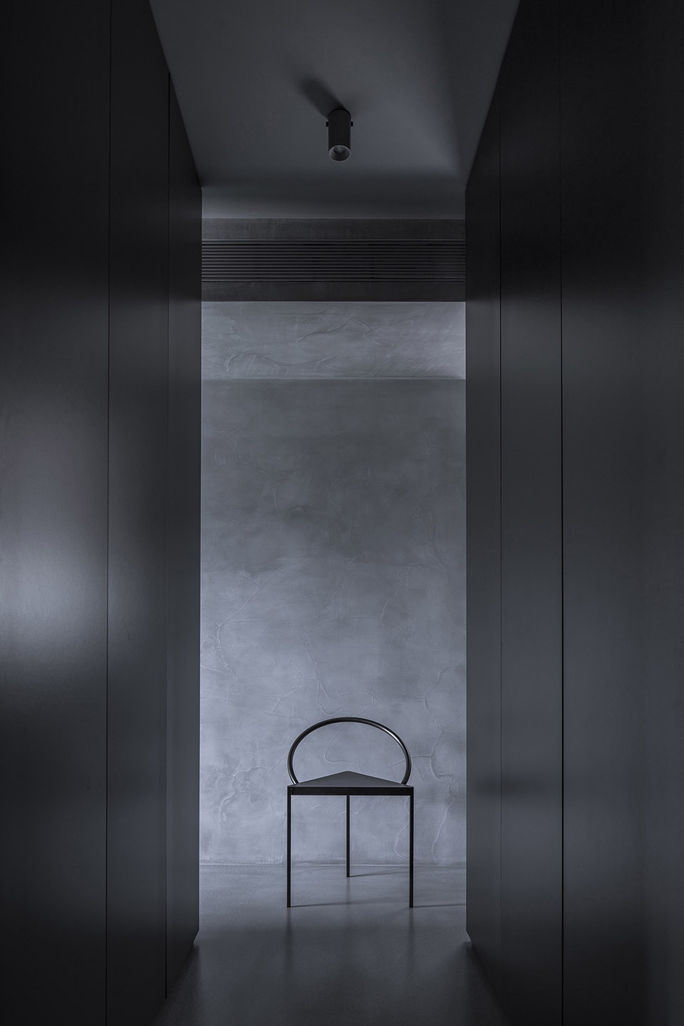
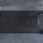
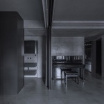
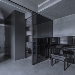
▼室内空间一览,overall view of the interior ©金伟琦
设计理念
Designing Idea
自由是每个人向往的一种美好状态,生活在喧嚣拥挤的都市中,我们时常感受到压抑与束缚,此时,家作为重要的场域,能否滋养我们,尤为重要。
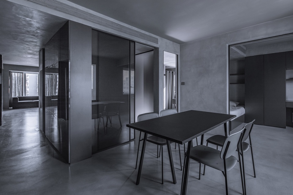
设计师希望这个空间内,光与空气自由流动,人与空间和谐舒展,以打造出一个色调冷静克制的居所,希望它,能给屋主一家带来宁静舒适的感受。通过空间内隔断的开合模式,转换不同的生活场景,最大程度保留空间的灵活性,如何平衡开敞与私密性,是本项目的挑战。
Freedom is a universal and ideal status for every single soul. This crowed city has been giving us excessive senses of depression and boundary. Home is somewhere that makes tremendous difference in if it furnishes us in this island of soul.
The designer wants to achieve free flow of lights and air, harmony and cosy of human and space under the roof. He wants to deliver a feeling of calm and restrain to the owner. Through the switch of partitions in the space, the home transfers between different life scenes, so as to maintain the flexibility of the space as much as possible. One of the challenges of the project is the balance between openness and privacy.
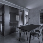
▼以隔断分隔的室内空间,interior space defined by partitions ©金伟琦
改造前
Before refurbishment
是一套三室居所,走廊空间浪费面积比较多,也将各个空间的连贯性打破,厨房为瘦长条形状,空间局促,走廊将餐厅与厨房隔开,餐厨空间关系不够紧密,从起居室到主卧室的动线较远,空间互动性较差。
This was a house with three rooms, the space of the hallway of the house was not sufficiently used and continuity between room spaces were not perfect. The kitchen used to be in shape of a strip, with limited space. The hall separates the canteen and the kitchen, making the space for canteen and kitchen not well compacted due to the longer distance and poor interaction.
▼改造前平面,走廊打破空间连贯性,plan before renovation, corridor break the continuous of the space ©罗秀达
改造后
After refurbishment
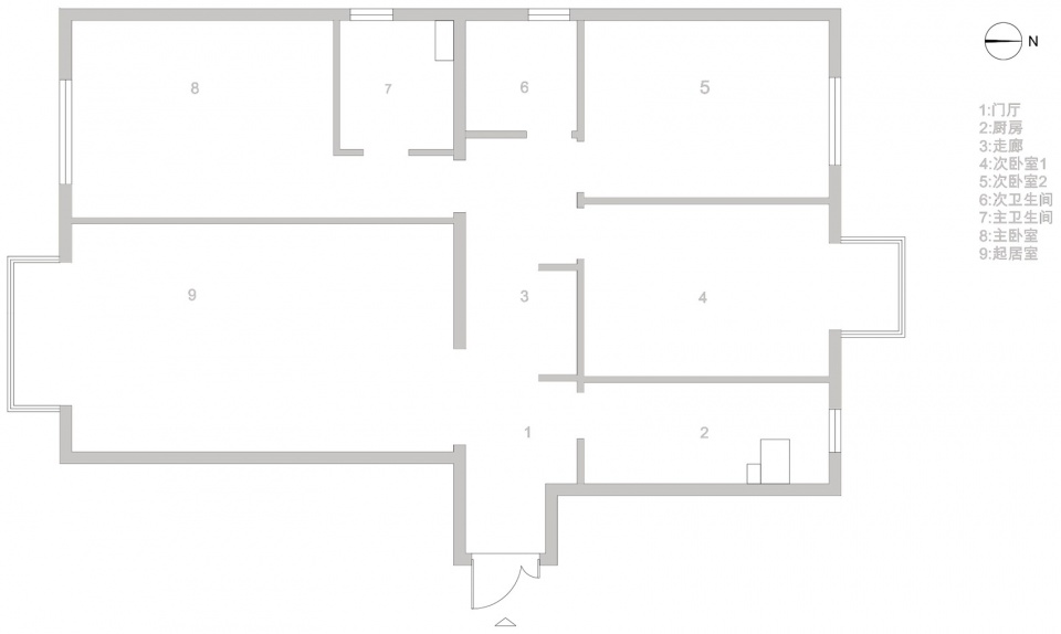
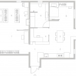
消除走廊概念,将非承重隔断全都移除 2:改造成全新的开敞式空间,通过开合玻璃隔断,转换不同的生活场景。3:玄关柜围合出书房空间,同时餐厅与次卫生间共同为书房提供采光。4: 主卧室内增加衣帽间。5:起居室内放置了钢琴,美妙的旋律可流动到每个空间,这里也设计了一整面储物柜,柜里隐藏了壁挂电动折叠床,方便亲朋留宿。6:扩大次卫生间面积,整合家务操作、收纳、洗漱、洗浴等功能。
Delete the hallway and all the non-bearing partitions. 2. Reform the whole room into an open space. Transfer scenes of life with sliding glass partitions. 3. Form the study with gateway cabinets and the canteen and bathroom will supply illumination for the study. 4. A cloakroom is set for the master bedroom. 5. A piano is set in the living room for music to be heard all around the house. A whole wall of cabinet is set in the living room is also set in the living room, which contains a wall mounted electric folding bed for visitors. 6. The secondary washroom is expanded and integrated with the functions of household operations, storage, washing and bathing, etc..
▼改造后平面,消除走廊概念,plan after renovation without corridor ©罗秀达
玄关
Gateway
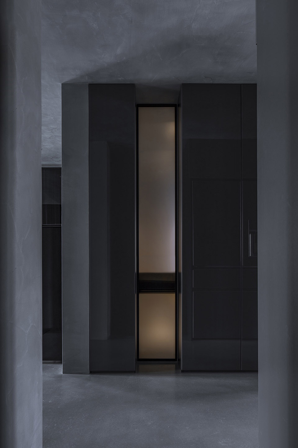
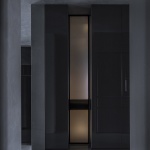
入户门面对是一组储物柜,空出一条做玻璃隔断,让一些光连接内外空间,透气些。顶面、墙面、地面材料统一,凸显质感。
The cabinet is set at the gateway, with a bar of sliding door and allows sun shines as well as airflow. The wall, the roof and the floor are of the identical materials and a feeling of quality is hereby demonstrated.
▼门厅,对面的储物柜中部空出玻璃隔断,entrance facing the cabinet with a bar of glass sliding door ©金伟琦
起居室
Living Room
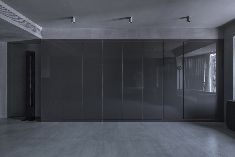
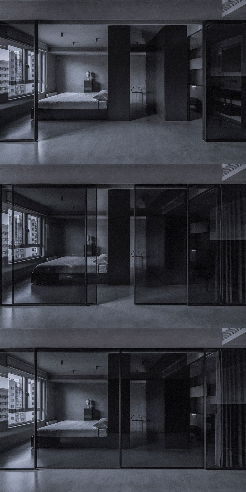
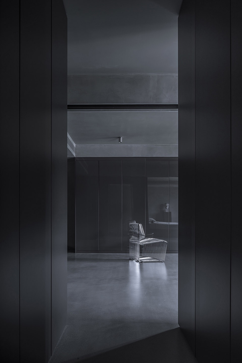
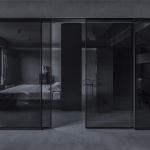
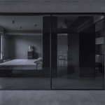
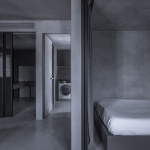
设计师将卧室与起居室的隔断墙移除,取而代之的是玻璃隔断,4扇移门重新组织了空间的节奏。视线与光线自由在空间中穿透。起居室与主卧主卫之间的关系,设计师用布帘叠加玻璃的方式,阻隔视线。衣帽间与主卫之间增加了不透视线的玻璃隔断。整面的储物柜,隐藏了壁挂床,玻璃柜门与其它材质形成对比。
The designer removes the wall between the living room and bedroom. The four sliding doors reconstructed space tones of the space, allowing views and lights go all around the house. As to the space relationship between the living room and master bedroom and master toilet, the designer takes coupling of cloth curtains and glass to block the views. A piece of nontransparent glass is set between the cloakroom and the master toilet. The wall of cabinet hides wall mounting bed, leaving a clear sight effect to the room. At the same time, different materials of the glass cabinet door and other surfaces form a contrast.
▼客厅,living room ©金伟琦
▼客厅一侧的连续衣柜,continuous cabinet on the one side of the living room
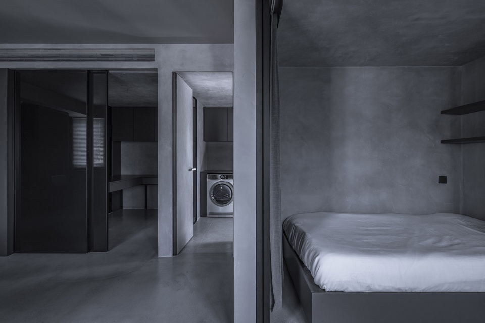
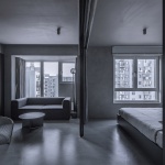
▼主卧与客厅通过玻璃滑门分隔,the master bedroom is defined be glass sliding door from the living room ©金伟琦
主卧室
Master bedroom
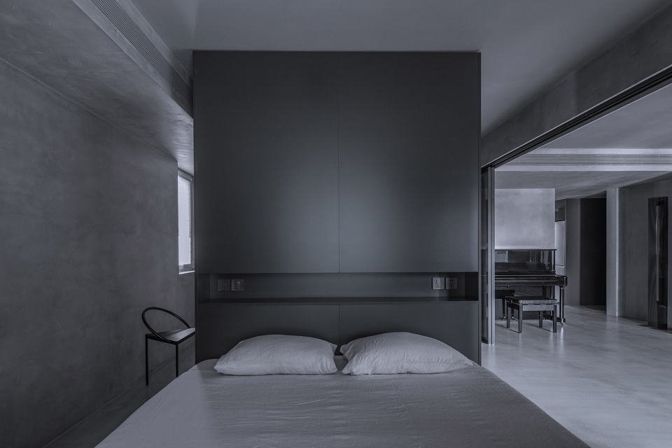
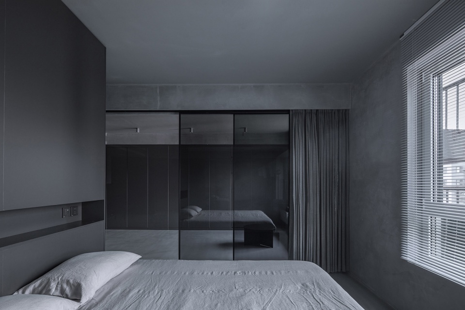
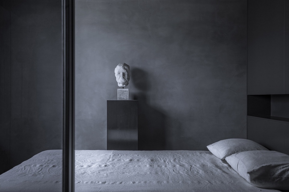
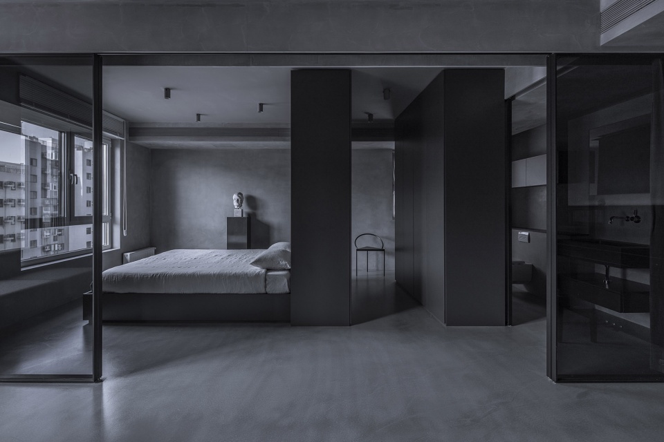
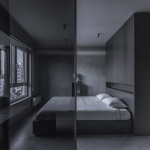
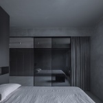
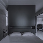
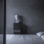
主卧套间以中轴线的方式布置,床、衣帽间、主卫一次排开,两侧是走道,床头与衣帽间共用一组衣柜,插座与开关整合在衣柜背面与侧面。床品布艺与窗帘布艺,设计师均选用天然棉麻材质,柔软的材质与硬朗的材质形成鲜明对比。搭配一些艺术品点缀空间。
The suite of master bedroom is organized by central axial line. The bed, cloakroom and master toilet are in a line, leaving two sides as walkways. The bed and cloakroom share the same cabinet. The socket and switch are integrated on the back and sides of the cabinet. As to the fabrics for the curtain and bed, the designer selects natural cotton and linen materials, forming vivid contrast between soft and rough textures.
▼以中轴线方式布置的主卧室,the master bedroom organized by central axial line ©金伟琦
▼从主卧看向客厅,view to the bedroom from the master bedroom ©金伟琦
▼主卧细部,closer view to the master bedroom ©金伟琦
衣帽间
Cloakroom
衣帽间的两组衣柜,分别与床与主卫分别形成了双环游动线。一些光打在衣帽间的衣柜上,呈现出柔和的状态。
The two sets of cloakroom form a double-ring lines with the bed and the master toilet. With lights shining on the cloakroom, it demonstrates the scene of serenity.
▼衣帽间位于主卧和主卫之间,形成双环游动线,the cloakroom located between the master bedroom and master toilet creating a double-ring line ©金伟琦
▼衣帽间,the cloakroom ©金伟琦
主卫生间
The Master Toilet
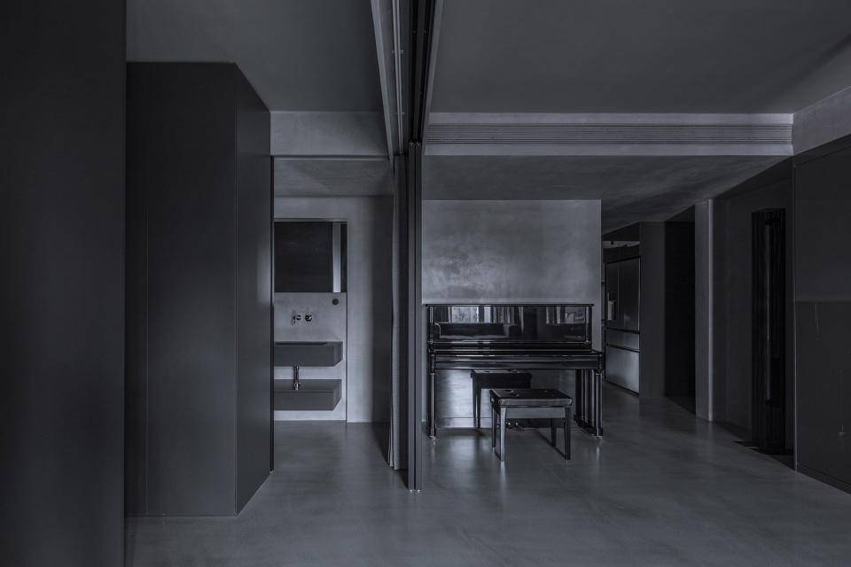
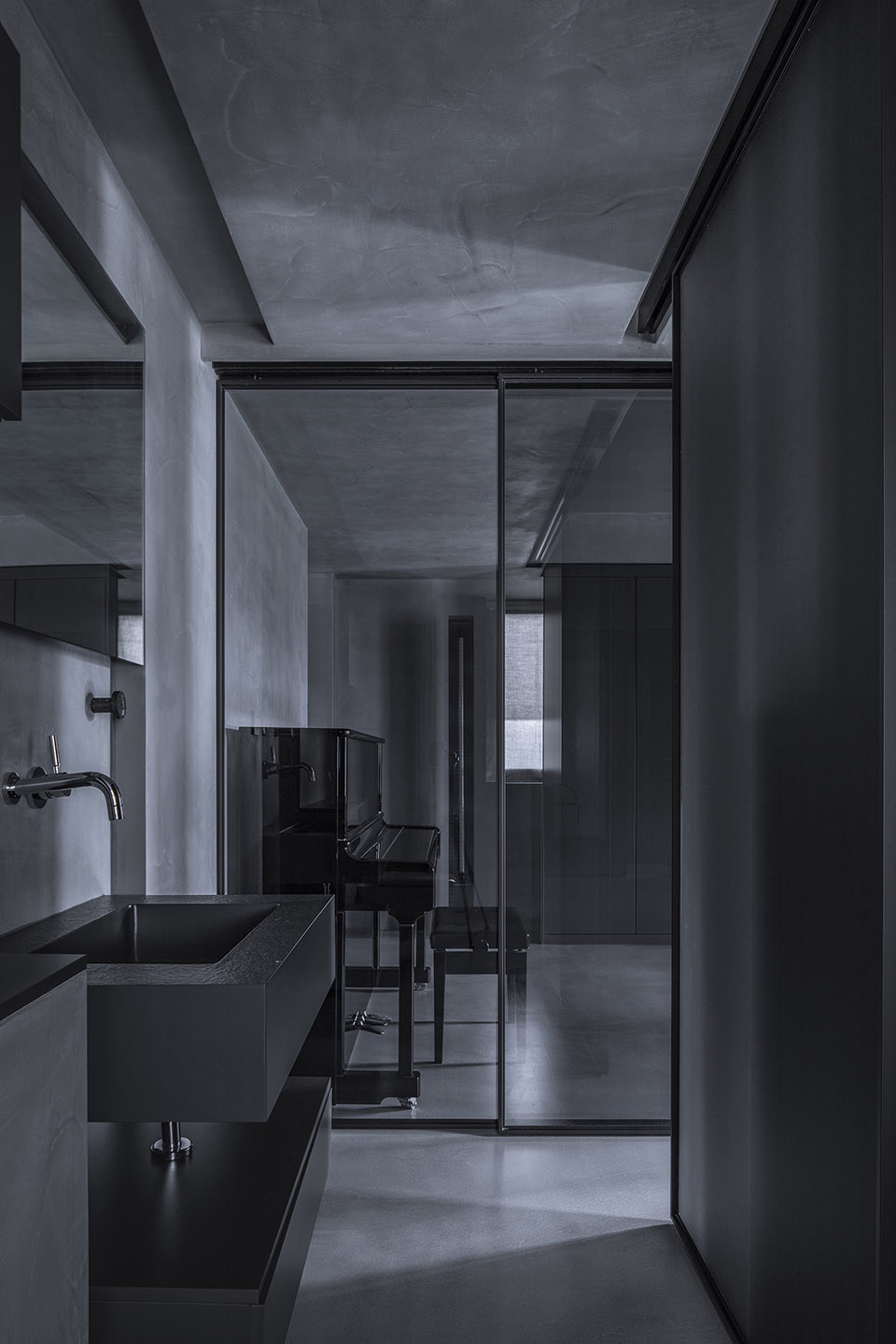
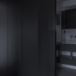
设计师和将主卫设计在靠墙一侧,可通过布帘与移门来围合主卫空间。主卫的材质与整屋的材质统一协调,柜体洁具都采用壁挂方式,五金暗藏入墙,简洁干练。透过玻璃隔断,隐隐看到钢琴区域,空间关系清晰又含蓄。
The designer sets the master toilet at the wall and enclose the toilet with cloth curtain and sliding door. The materials of the master is uniform with the whole house, with all the cleaning appliances mounted on the wall, hardware are hidden within the wall, delivering simple and concise aesthetics. Looking beyond the glass partition, the piano section is vaguely visible. The overall space relationship of the house is clear and implicit.
▼衣柜后方的主卫生间,the master toilet behind the cabinet ©金伟琦
▼从主卫生间看向客厅,view to the living room from the master toilet ©金伟琦
餐厅
The Canteen
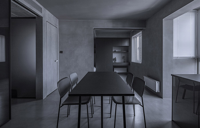
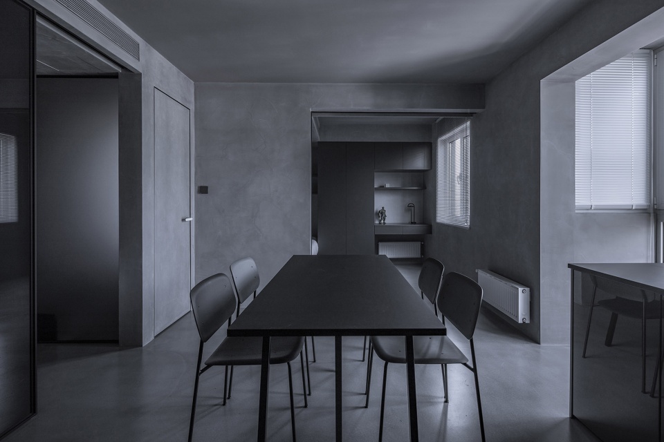
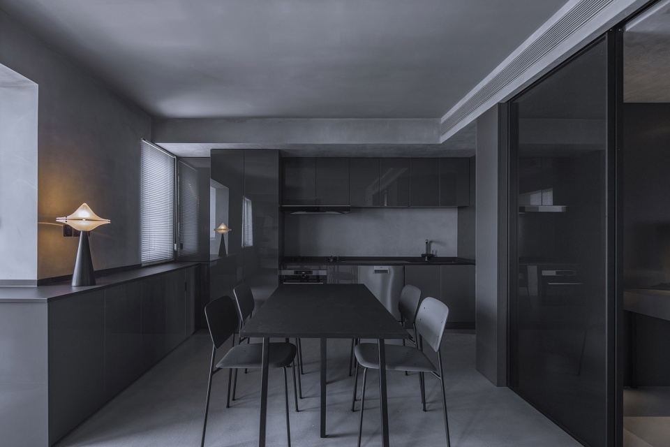
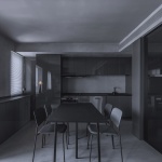
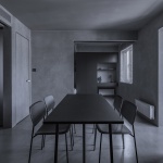
餐厅作为中心,周边自通八达,书房,儿童房,厨房,围绕布置。选择一些细腿的家具,显得通透柔美些。
The canteen is the center of the house, which leads to the study, kid’s room and kitchen around it. With fitting of thin-legged furniture, the house looks more clear and mellow.
▼餐厅,与不同的生活空间相通,dining space connecting to different functional rooms ©金伟琦
厨房
The Kitchen
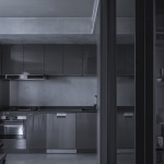
S形橱柜布置,收纳空间充足。隐约看到书房内一些收藏品,体现了男屋主的爱好。
The kitchen cabinet is set in the shape of S, with abundant space for storage. The collections of the study are visible, as a demonstration of the bobbies of the host.
▼厨房,可以隐约看到书房内的藏品,kitchen room with a glimpse to the collections int the study ©金伟琦
儿童房
The Kid’s Room
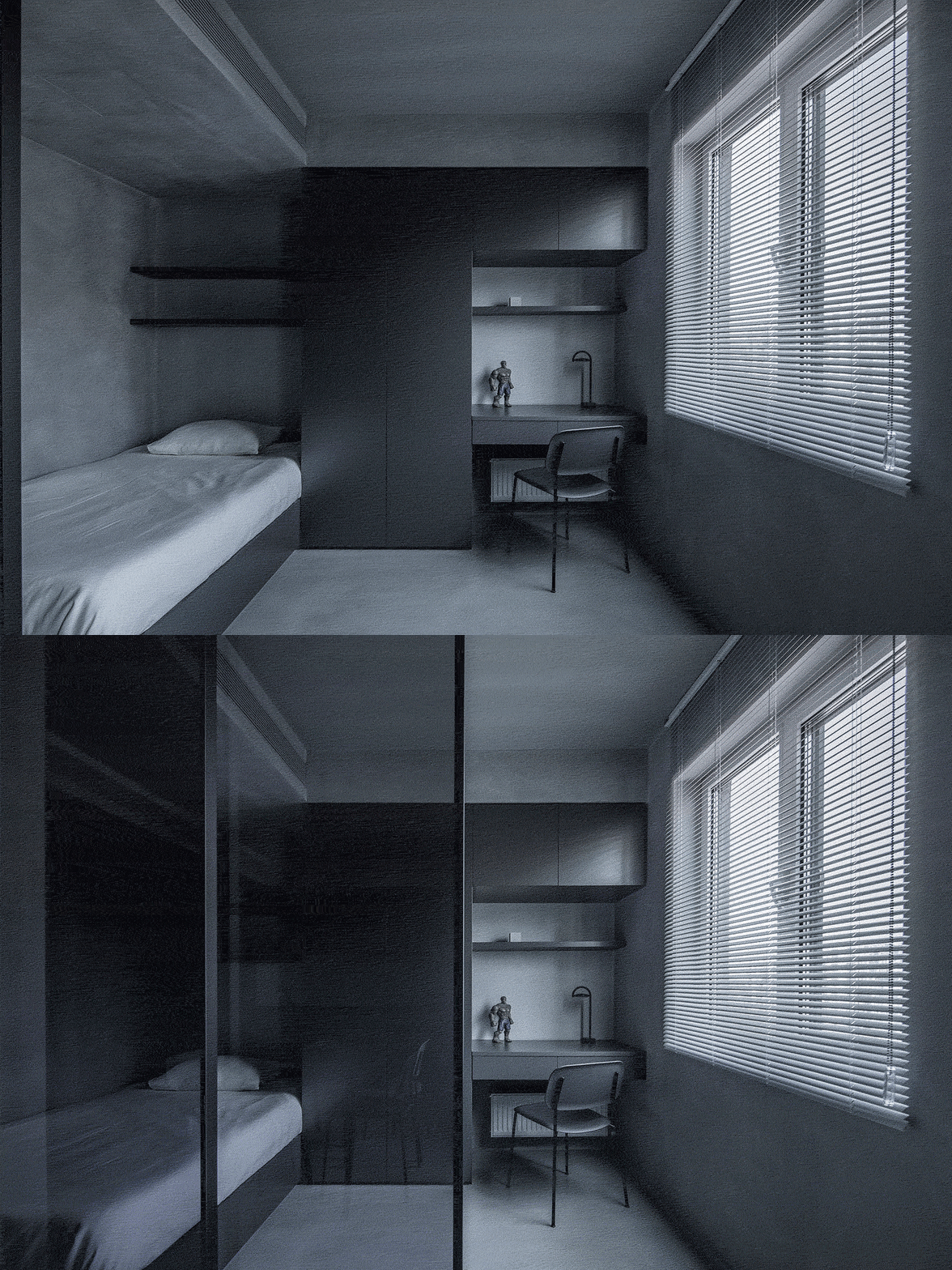
儿童房的材质,色调,空间处理与整体一致,通过移门与布帘围合出空间的私密性。
Materials, color and space of the kid’s room are in conformity with the whole house and the privacy of the room is formed through sliding door and curtain.
▼儿童房位于餐厅尽头,the kid’s room located an the end of the dining space ©金伟琦
▼滑门提升房间私密性,sliding door increase the privacy of the room ©金伟琦
书房
The Study
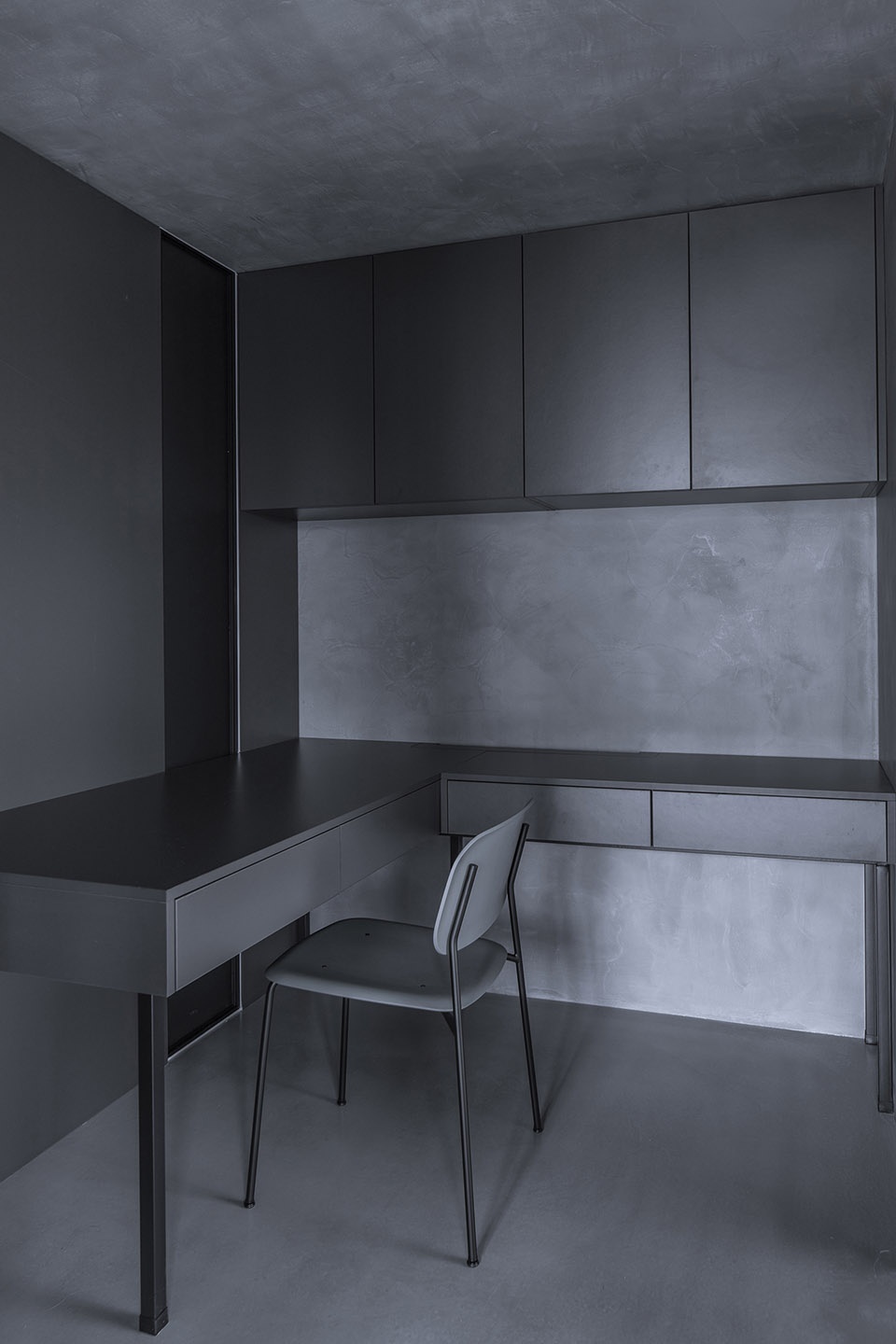
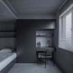
设计师将插座隐藏至书桌内,L形书桌,男屋主可同时使用电脑与喝茶。
The designer hides the socket within the desk. The L-shaped desk provides space for the host to use computer and enjoy tea.
▼书房,study ©金伟琦
次卫生间
The Secondary Toilet
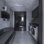
卫生间的自然光线透过玻璃隔断到书房内,超大操作台面,清洁类家电及电源收纳在一侧储物柜中。
The natural light of the toilet penetrates the glass partition and enters the study. It has a large operation platform. The aleaning appliances and power sources are stored in a cabinet on its side.
▼次卫生间,the secondary toilet ©金伟琦
设计师:罗秀达
施工图深化:何沙
施工:黄其斌
摄影:金伟琦
主要材料:磐多磨、灰色玻璃隔断、意大利进口灰色喷漆玻璃柜门板、MYLANDS乳胶漆
全屋定制:班尔奇
panDOMO: 墨简装饰
推拉门:和玺木门
MYLANDS乳胶漆:宅匠
家具:HAY、concept101
灯具:本土创造、FLUA
窗帘:幔宅布艺
洁具:卡斯科KASKADE
Designer: Luo Xiuda
Deepening of construction drawing: He Sha
Construction: Huang Qibin
Photograph: Jin Weiqi
Major Materials: panDOMO, Gray Glass Partition, Gray Sprayed Glass Cabinet Door Panel Imported from Italy, MYLANDS Latex Paint
Whole house customization: Ban Erqi
panDOMO: Mojian Decoration
Sliding Door: Hexi Wooden Door
MYLANDS Latex Paint: Zhai Jiang
Furniture: HAY, concept101
Illumination: BENTU, FLUA
Curtain: Manzhai Cloth
Sanitary Appliance: KASKADE
More: Luo Xiuda on gooood
