非常感谢 K-studio 将项目介绍和项目图片授权gooood发行。更多请至:K-studio on gooood
Appreciation towards K-studio for providing the following description:
Perianth酒店包含38间客房,其设计受到了以下几个因素的影响:原建筑的历史、鲜明的Art Deco建筑风格,以及希腊这座古老城市中的现代生活方式。
The design of the 38 rooms is directly inspired by the history and character of the original Art Deco building, and by the contemporary life of the ancient city in which it is located.
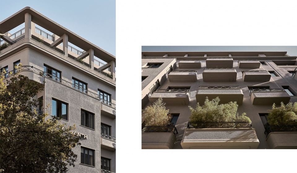
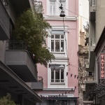
▼酒店外观,The Perianth exterior view ©Claus Brechenmacher
项目的主要挑战在于要重新设计原始建筑的布局。该建筑最初是为了容纳商店、办公室和公寓住宅而设计,其结构完全依附于当时的功能需求,因而在布局上呈现出不规则性。本次改造的目的是通过创新性的方法来重新组织空间,使其能够发挥新的作用。建筑在不久之前曾经历过一次改动,其内饰被完全剥离,只保留了外立面和结构部件——这也成为了本次设计的一个重要决策因素。
The main challenge of the project lay in the re-working of the layout of the building. Originally built to house retail space, offices and apartments in an era that gave little thought to the future legacy of buildings, the structure was arranged to suit the use intended at the time. The resulting irregularity of the building’s structure required an innovative approach to re-organising the layout so that it’s new use would work within it. More recently the building interior has been stripped back leaving only the façade and structural elements to provide the clues to its history and to direct our design decision making.
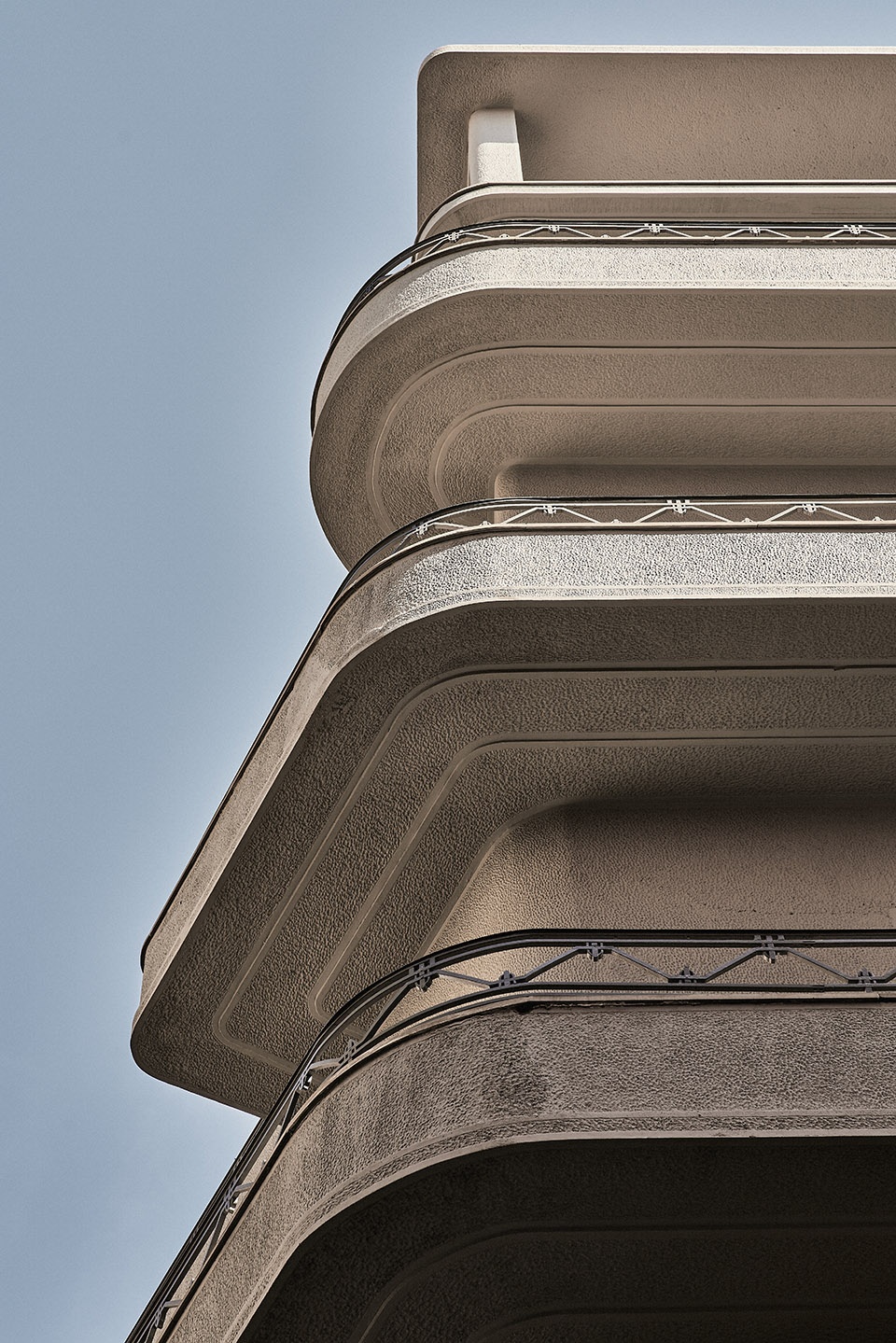
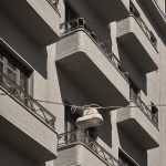
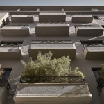
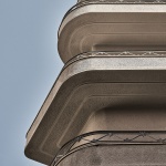
▼建筑立面细节,facade detailed view ©Claus Brechenmacher
位于低楼层的房间拥有较高的天花板,上方楼层的层高较低,但房间面积更大,从而形成了一定的补偿效果。最顶部的楼层后退于主立面,带来更宽敞的阳台和更开阔的城市视野。围绕着原始的立柱和开口,建筑平面被重新设计,形成一个非常规的空间系统,并在其中置入了新的公共区域,使建筑的质量得到了最大程度的改善。考虑到既有建筑的内饰已经基本拆除,项目团队尽可能地保留了所有遗留下来的事物,并将其作为具有历史价值的重要元素展示给使用者。
The rooms of the lower floors benefit from higher ceilings but as you rise through the building the number of rooms on each level decreases as they increase in floor size to compensate for less lofty ceiling heights. The top floor is then set back from the front of the building, which allows for larger balconies as well as more extensive views across Athens. We reinvented the floorplans, working around the columns and openings to create an unconventional system of rooms and communal space that maximises the qualities of the building and minimises its restrictions. As the building had already been internally stripped we worked to retain whatever remained and to showcase them as valuable and vital elements of historical value.
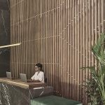
▼接待空间,reception ©Claus Brechenmacher
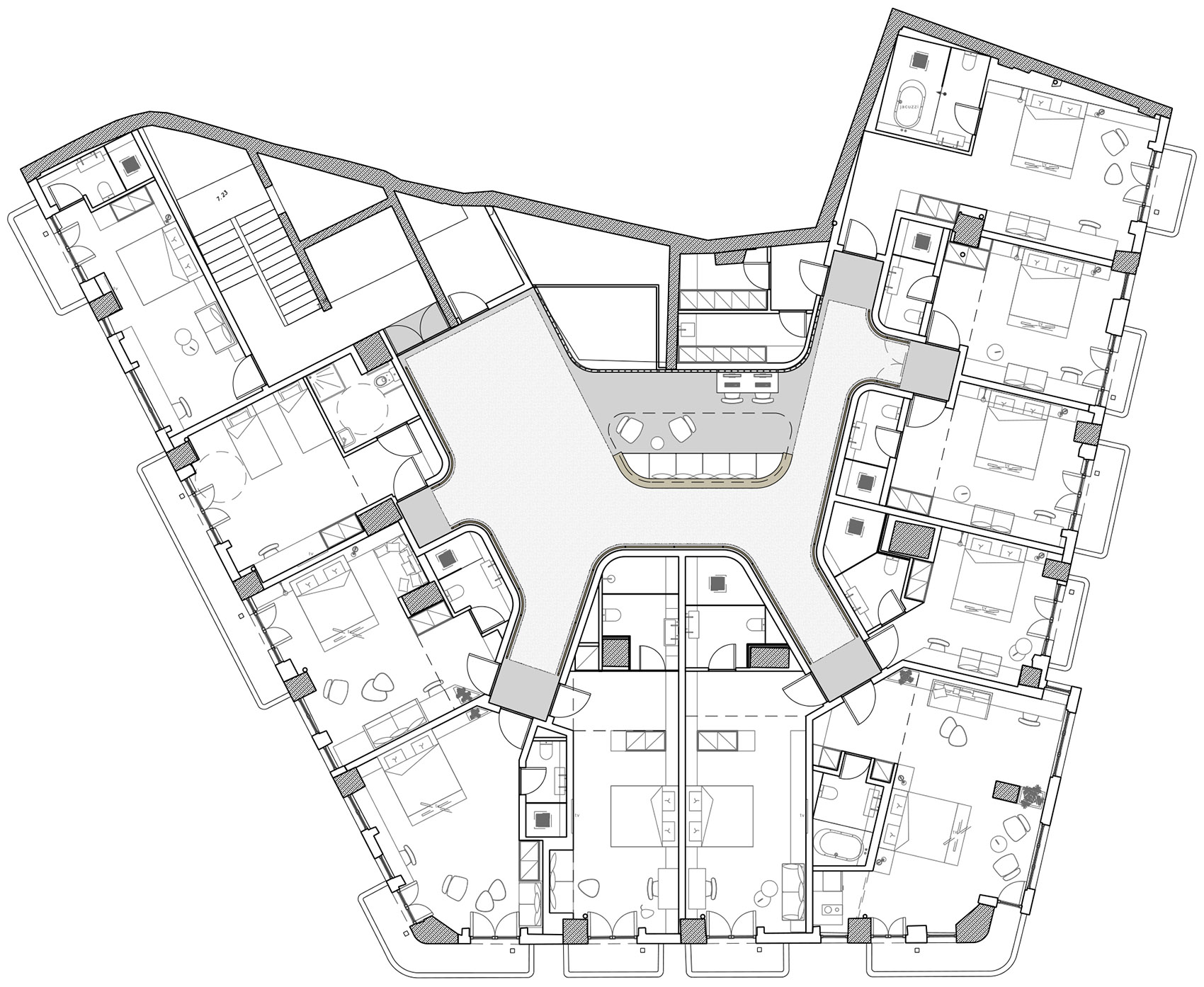
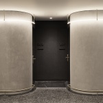
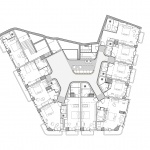
此外,这些遗留的元素还对部分空间的设计决策起到了指导作用。例如,每个楼层的交通路径都与建筑立面的曲线形成相互呼应的关系。设计的主要思路是创造一条较宽的“主路”,并在此基础上延伸出数条“小巷”,每条小巷与2-3个房间相连,且位置较为隐蔽,保证了客房的私密性和隔音。通过这种创新性的设计,传统的酒店走廊被赋予了类似于雅典城区的布局模式,并自然地衍生出数个“邻里广场”。这些“广场”作为特定的功能空间分布在每个楼层,涵盖了餐厅、休息室、健康中心和办公空间等。
▼平面图,plan ©K-studio
Moreover, we used them as our guidelines for design decisions made elsewhere, for instance, the main circulatory route of each floor has been designed to mirror the curve of the building’s façade. Our Athenian-inspired concept was to create a wider main ‘avenue’ from which smaller side ‘alleys’, each leading to 2 or 3 rooms, were set back, creating privacy and acoustic separation for guests. The creative interpretation of the traditional hotel corridor to mimic the urban layout of central Athens leads naturally to the creation of ‘neighbourhood squares’. These communal spaces serve specific purposes on each floor, from dining room and lounge to wellness centre, to work hub.
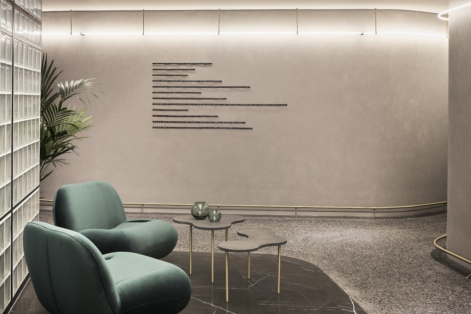
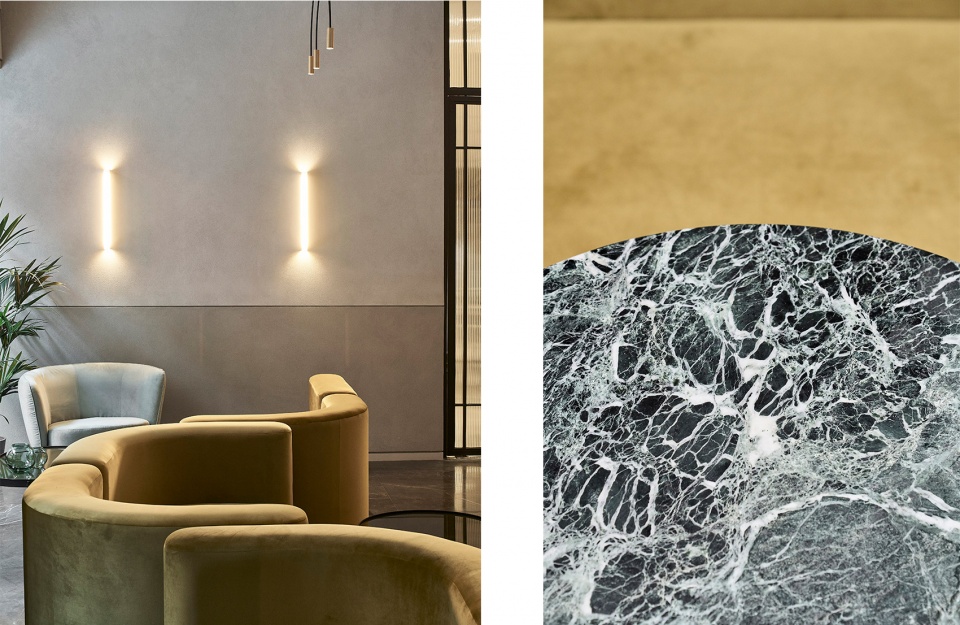
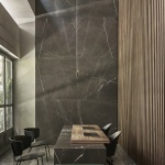
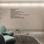
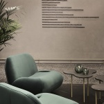
▼公共区域,communal space ©Claus Brechenmacher
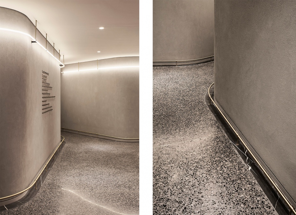
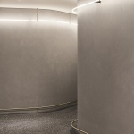
▼交通路径与建筑立面的曲线形成相互呼应的关系,the main circulatory route of each floor has been designed to mirror the curve of the building’s façade ©Claus Brechenmacher
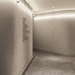
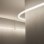
▼走廊细节,corridor details ©Claus Brechenmacher
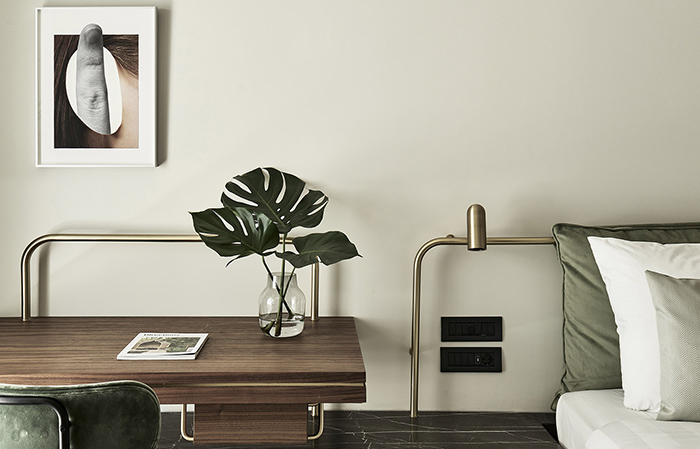
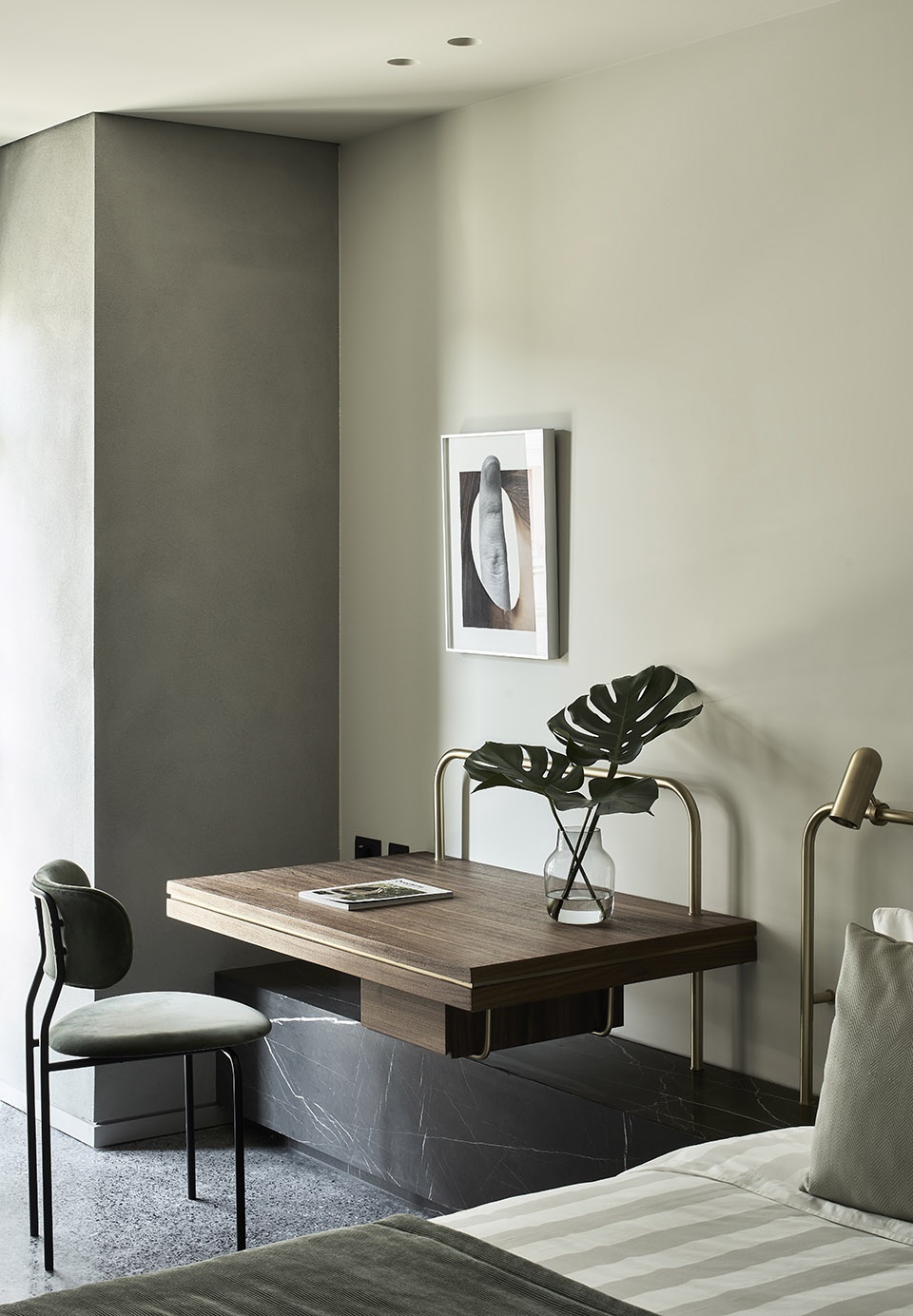
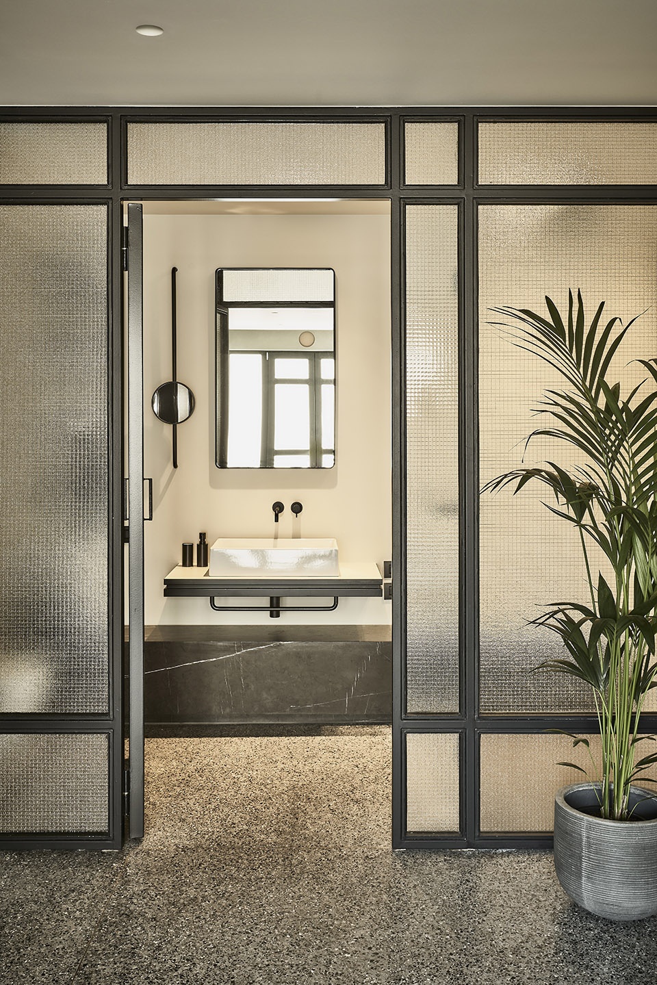
原本不规则的结构格局使每个房间都呈现出不同的特点。倾斜的墙壁、余留的角落和变化的天花板高度均得到了创造性的介入和处理,为空间增添了轻松和舒适的感觉。改造后的房间变得开敞而通透,淋浴间和储物设施也被巧妙地融合在墙壁结构当中,与内部空间形成无缝融合。室内设计的灵感源于建筑充满现代感的流线轮廓,并借鉴了立面和阳台的弧形元素。房间的墙面延续了外立面的质感,将建筑的外观特征融进内部空间。
The restrictions of the irregular structural grid also means that each room has its own unique character. Obliquely angled walls, left over nooks and crannies of space and varying ceiling heights have been dealt with creatively to remove any sense of awkwardness or feeling of tightness. Instead rooms are open and airy with playfully carved out shower rooms and storage facilities that sit seamlessly within the space. The interior design is directly inspired by the streamlined modernity of the architecture, with the curves and repetitive patterns of the façade and balconies. The traditionally rendered façade has been introduced within the rooms, wrapping the outer facing walls and bringing a hint of the external identity of the building inside.
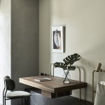
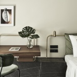
▼客房内部,guest room ©Claus Brechenmacher
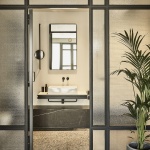
▼浴室,bathroom ©Claus Brechenmacher
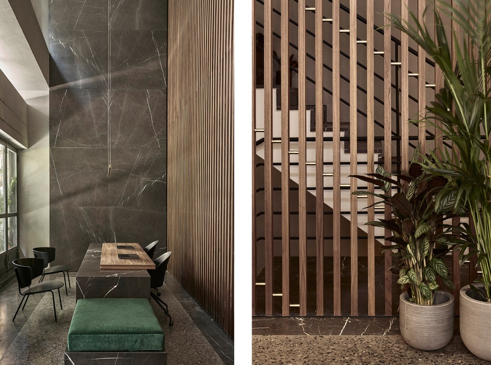
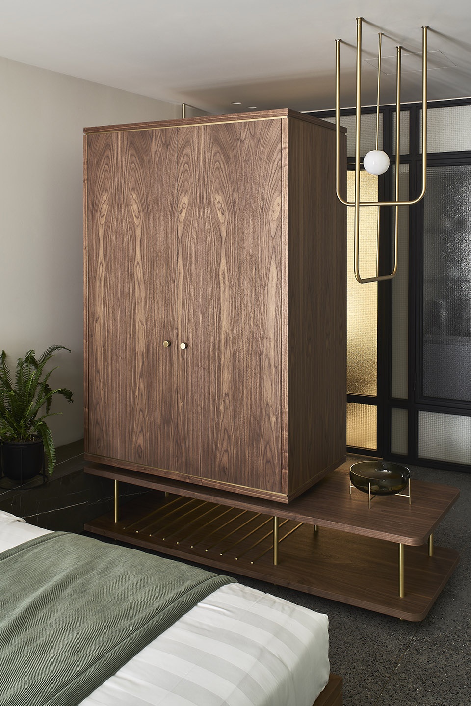
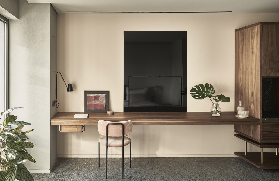
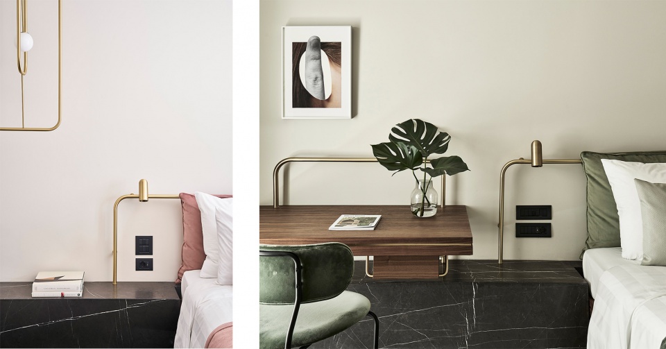
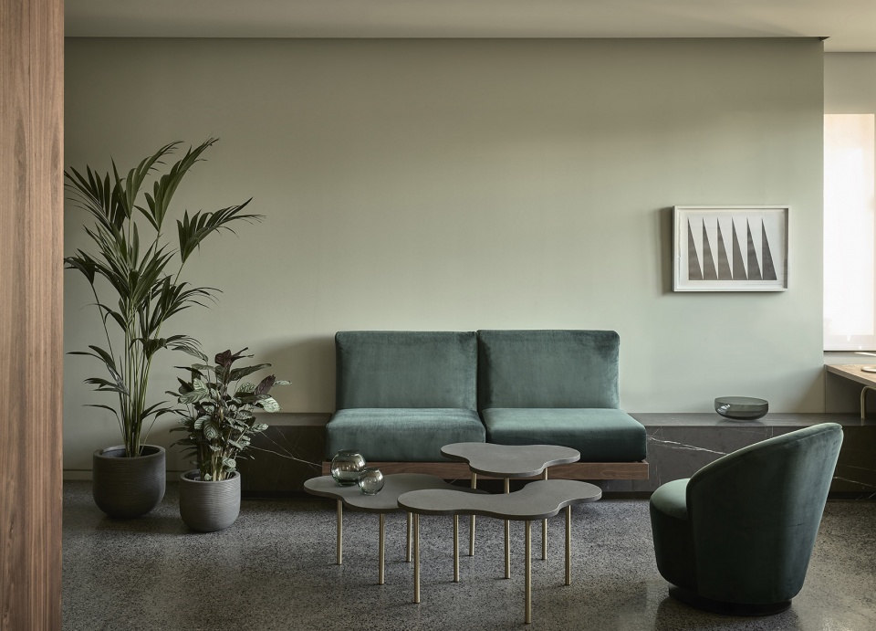
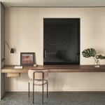
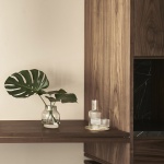
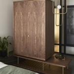
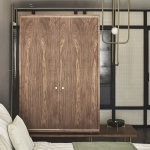
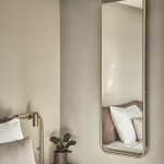
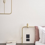
色彩和材料的搭配也源自于立面的灰色主调:水磨石地面为空间带来清凉和轻盈的感觉;质地更加厚重的美国胡桃木增加了空间的温度和深度;粉红色的天鹅绒布料则带来与建筑风格相得益彰的独特魅力。大胆而简洁的家具搭配以定制的黄铜装饰,对空间的氛围起到了强调和补充的作用。
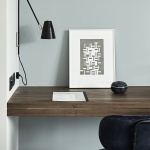
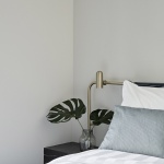
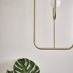
The characteristic grey of this pigmented render was the starting point in putting together the palette of colours and materials in the rooms. The terrazzo flooring brings a cool lightness to the space; the classically heavier American walnut adds warmth and depth and the blush-pink velvet upholstery introduces a touch of glamour in keeping with the style of the building. The palette is amplified and complimented by a selection of bold, brutalist pieces of furniture and custom-designed brass accents.
▼胡桃木增加了空间的温度和深度,the classically heavier American walnut adds warmth and depth ©Claus Brechenmacher
▼室内色彩和材料细节,palette of colours and materials of the rooms ©Claus Brechenmacher
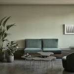
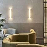
▼休息区域,lounge area ©Claus Brechenmacher
设计在保留建筑历史特征的同时兼顾了清晰而高效的布局,并通过平衡旧空间的朴素感和新空间的优雅气质,为客人们带来量身定制的难忘体验。
Guests enjoy the tailored experience of staying in a building with a history and character that has been respectfully preserved by the clarity and apparent simplicity of its new layout and spatial distribution and enhanced by balancing the austerity of the old with the elegance of the new.
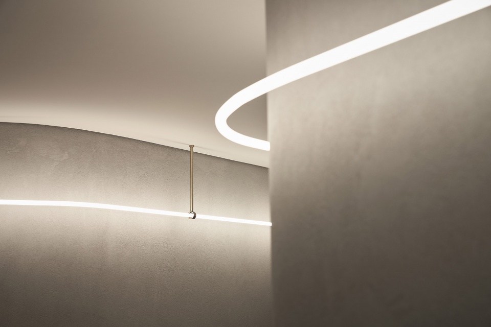
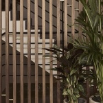
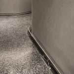
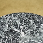
▼公共空间材料细节,communal space details ©Claus Brechenmacher
▼城市肌理,urban texture ©Claus Brechenmacher
More: K-studio。更多请至:K-studio on gooood
