非常感谢 NBBJ 予gooood分享以下内容。更多请至:NBBJ on gooood
Appreciations towards NBBJ for providing the following description:
已有30年历史的联合广场一直是西雅图城市天际线中独一无二的存在。为了满足城市主要租赁者的不断增长的商业需求——包括寻找新型的工作、合作和联系模式——项目团队对建筑内所有的公共空间进行了重新定位,将前卫而大胆的设计融入到制造技术当中,同时将人的体验作为设计的核心。
At 30 years old, Two Union Square remains a one-of-a-kind icon in the Seattle skyline. To meet the rapidly-changing business needs of the city’s premier tenants — who seek new modes of work, collaboration and connection — the design team repositioned all of the public spaces in the building with a design that is boldly current, incorporates design complexity in fabrication techniques and is centered on the human experience.
▼基于当今流动从业者对新型工作、合作及联系模式的追求,该项目旨在对联合广场的公共空间(从主厅到低楼层的零售空间)进行重新定位,从而为租户和公众创造新的工作和社交场所。Because today’s workforce seeks new modes of working, collaborating and connecting, Two Union Square features repositioned amenities — from the main lobby to lower-level retail spaces — that create new work and social destinations for tenants and the public alike. ©Kevin Scott
本次更新依然由该建筑的原始设计者担任,旨在恢复建筑从过去、现在到未来的统一叙事。最初的建筑定义了当时的建筑风格,但在建成后的时间里经历了一系列改造和干预,导致了空间上的不连贯和利用上的不足。2015年,建筑的拥有者提出了新的设计愿景和任务,以回应来自流动从业者的不断发展的组织和文化需求。
The original firm that designed the building set out to restore a unified narrative of Two Union Square — its past, present and future. While the building defined the architecture of the era, in the time since its completion, a series of disparate modifications created spatial discontinuities and underutilized public spaces. In 2015, the building owner issued a design brief that called for a new vision that embodied the evolving organizational and cultural needs of a mobile workforce.
▼在新型办公室的建造热潮中,设计团队与联合广场的所有者进行了合作,期望通过更新和改善建筑内的公共空间来刺激金融和科技公司的发展。To retain Seattle’s financial and tech firms amidst a construction boom of new office buildings, the design team worked with the owners of Two Union Square to reposition all of the building’s public spaces. ©Kevin Scott
考虑到西雅图作为高科技中心的飞速发展,发挥联合广场的独特属性就变得至关重要,具体表现在以下几个场所:
-主厅的大楼梯和不规则的石砌装置墙
-带有圆形天窗的壁炉大厅和作为连接空间的零售广场
-优美的水景庭院和人行道交界空间
Given Seattle’s meteoric growth as a high-tech hub, it was critical to leverage distinct attributes of Two Union Square, primarily:
-The grand staircase arriving at the main lobby and fractal stone installation
-The fireplace lobby with a skylight oculus and connecting retail court
-The landscaped cascading courtyard and pedestrian connection
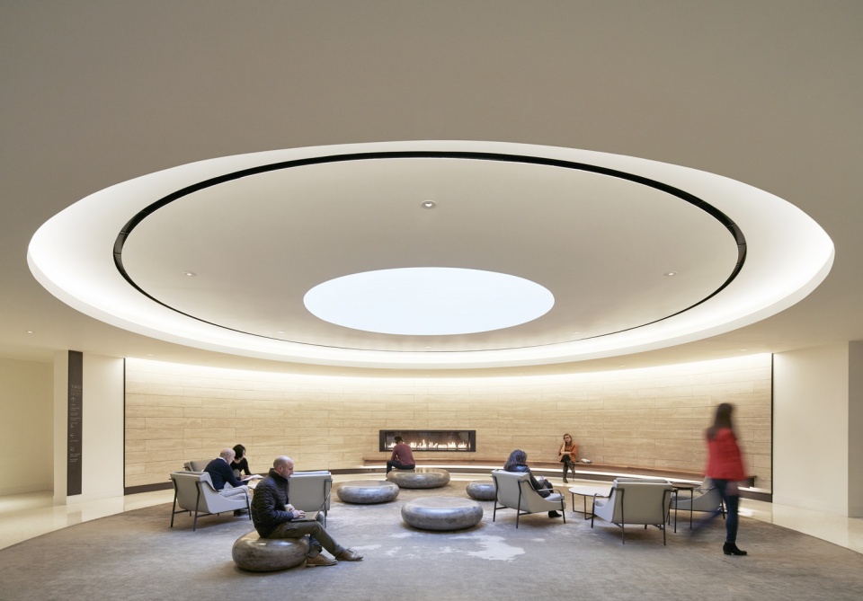
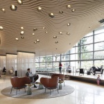
▼公共大厅能够同时满足交谈、单独工作以及小组讨论的需要。大厅内还包含一个壁炉休息室,搭配以定制家具和被内嵌式LED灯环绕着的圆形采光天窗。Conversations, solo work and meetings with colleagues all find a home in the public lobbies — including the fireplace lounge — which features custom furniture and a daylight oculus encircled by indirect cove LEDs. ©Kevin Scott
要为56层的建筑赋予亲切感并非易事,但在该项目中,设计团队通过调整功能空间的尺度和比例实现了这一目标。多种照明系统的结合、日光和景观视野的引入有效地提升了整体空间给人的舒适感和幸福感。
A sense of intimacy is not easy to accomplish in a 56-story building, yet Two Union Square’s repositioning achieves this by the modulation and scale of the program elements. The integration of lighting systems, access to daylight and views to the landscape contribute to the overall feeling of wellbeing.
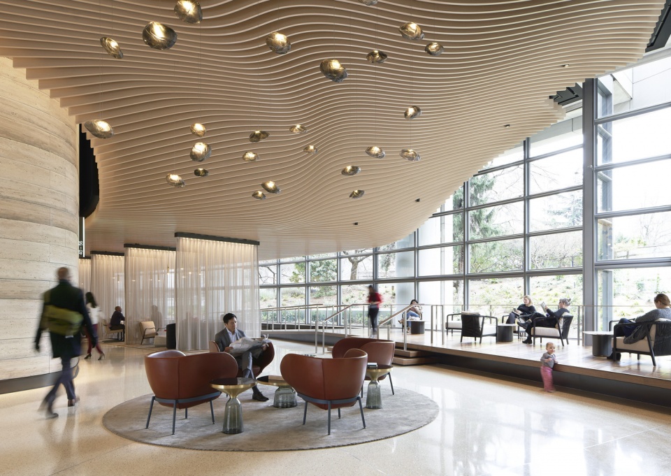
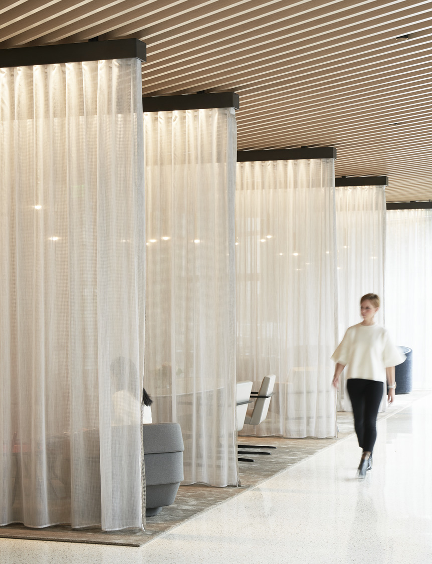
▼租户与访客可以在一系列富有吸引力的体验中探索不同的休息区域,与阳光和自然景观的接触能够为其健康带来有益的影响。Greeted with a range of inviting experiences, tenants and visitors can explore different lounge areas, while access to daylight and views to the landscape also promote wellbeing. ©Kevin Scott
▼休息区的内饰模仿了建筑的形态,为个人工作或私人交谈提供了安静的空间。Showcasing furnishings that mimic the shapes of the building, additional lounge areas offer quiet spaces to work individually or host more private conversations. ©Kevin Scott
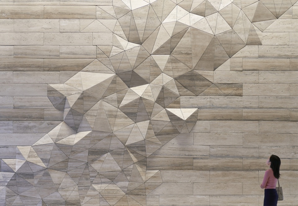
位于不规则石砌装置墙附近的大楼梯成为了关键性的停留点,租户和访客可以在这里享受片刻的宁静。同时,封闭的电梯大厅安装了木质覆面的顶篷,并通过一面玻璃墙引入了南北通透的视野。
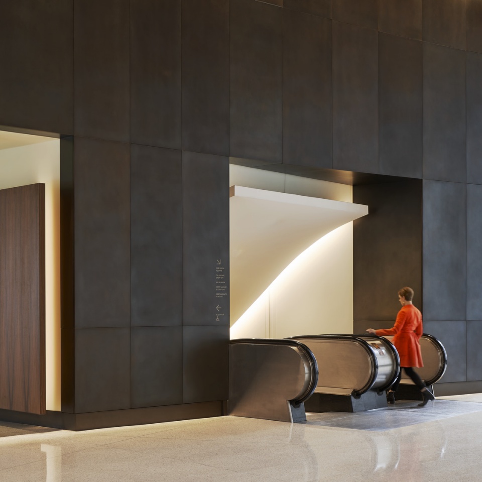
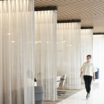
The grand staircase that arrives at the fractal stone wall installation creates a pivotal moment of pause — a place for tenants and visitors alike to take a quiet moment out of their day and reflect. Meanwhile, the enclosed elevator lobbies feature lowered wood-clad canopy ceilings punctuated with full north-south views to the exterior.
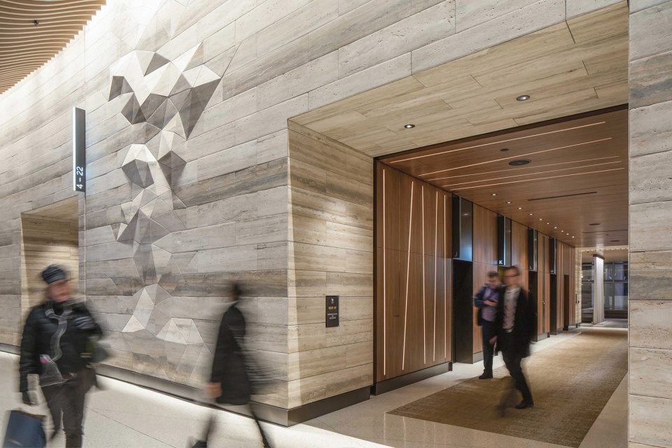
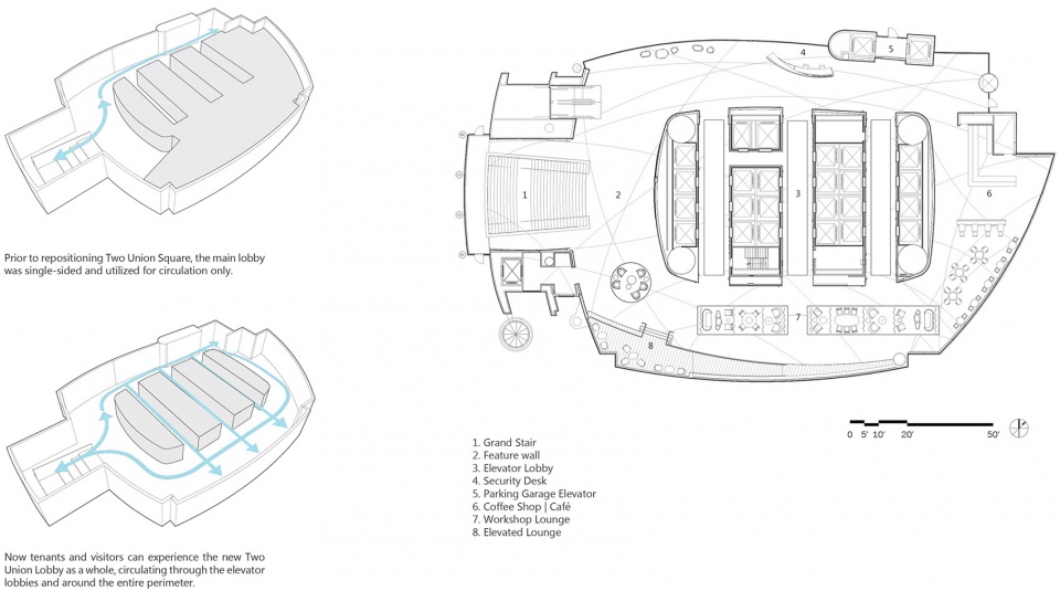
▼原先的大厅仅作为交通空间使用,如今则可以被租户们当做一个整体化的场所来体验,同时借助电梯组和连通整个楼层的路径到达会面和工作的地点。Previously the main lobby was used for circulation only, but now tenants can experience the main lobby as a whole, circulating through the elevator banks and around the entire perimeter to find places to meet and work. ©Sean Airhart
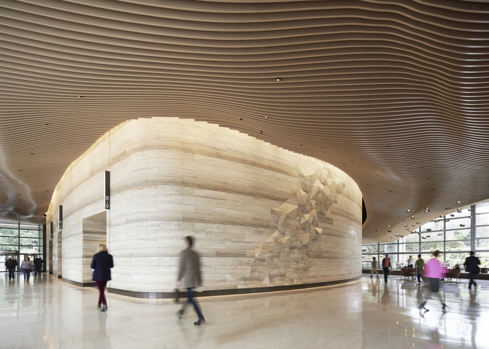
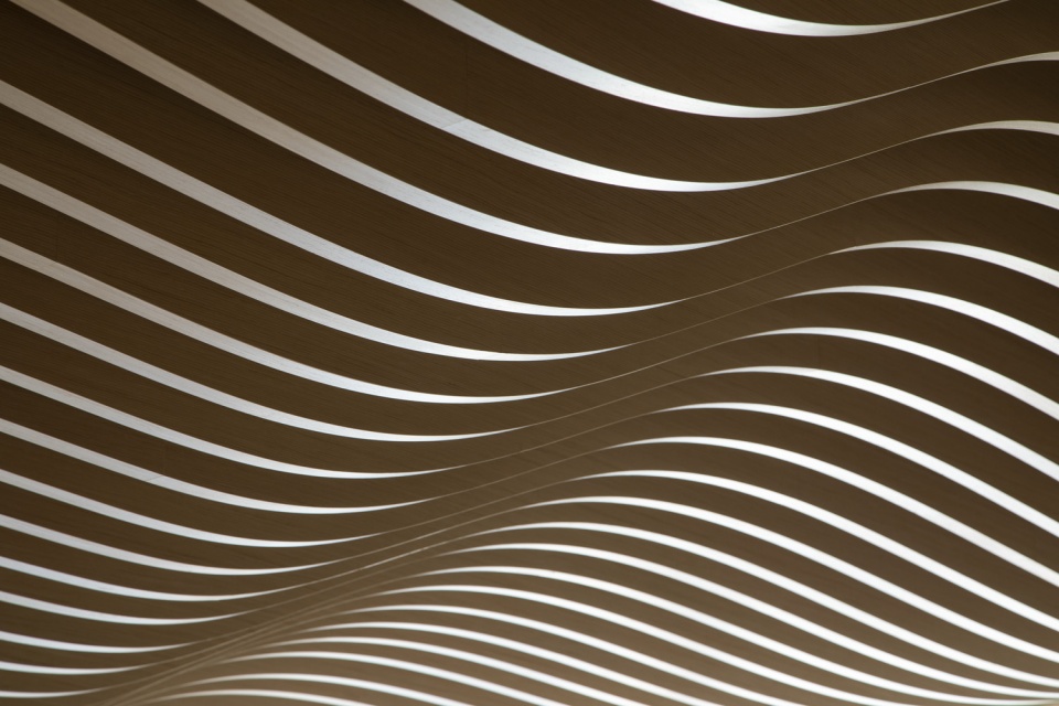
▼木材、石材、青铜和水磨石元素的组合呼应了当地的自然风貌:海浪、地质活动和森林的生长,营造出充满生命力的空间氛围。Engaging spaces for tenants and visitors are brought to life by honoring the region’s natural forces — ocean waves, tectonic activity and forest growth — through an elemental palette of wood, stone, bronze and terrazzo. ©Kevin Scott
设计元素直观地参考了当地的自然肌理:利用计算机塑形的主厅木制天花板模拟了风和海浪的运动,石灰岩装置墙的形态则受到了太平洋西北地区地质运动的启发。这些元素共同为租户和访客创造出安静放松的工作、休息和社交空间。设计者站在使用者的角度,将这些空间打造为地标式的社交场所:从协同工作到短暂的会议碰面,再到休息放松,创造人性化的体验是所有这些空间的设计初衷。
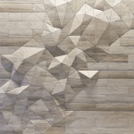
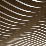
Design elements directly reference natural motifs found in the region, from the computationally-designed main lobby’s wood ceiling, emulating the motion of wind and waves, to the fractal travertine wall inspired by the Pacific Northwest’s tectonic activity — creating a variety of calming spaces for tenants and visitors to work, recharge and connect. The spaces are envisioned as social landmarks through the tenant’s perspective — agile venues for collaboration, one-off meetings, and respite — all of which are centered on the human experience.
▼设计元素直接参考了当地的自然肌理:主厅的木质天花板模拟了风和海浪的运动,石灰岩装置墙的形态受到地质运动的启发,同时为租户和来访者创造了宁静的工作、休息和社交空间。Design elements directly reference natural motifs found in the region, from the main lobby’s wood ceiling, emulating the motion of wind and waves, to the fractal travertine wall inspired by tectonic activity — while creating a variety of calming spaces for tenants and visitors to work, recharge and connect. ©Sean Airhart
该项目的业主、Washington Holdings公司主席兼CEO Craig Wrench表示:“能够同时拥有高留存率和10%-20%的租金增长率是一件很不寻常的事情。我们曾经只能满足其一,如今却能二者兼备。如果不是因为大楼公共空间的更新,我敢说我们绝不可能达到这种“锦上添花”的局面。 ”
As the client, Washington Holdings President and CEO, Craig Wrench says: “It’s unusual to have a high rate of retention and a 10%-20% increase in rental rates. We’ve had periods where we have one of these, but recently we’ve had both. I seriously doubt we could have this happy ‘double whammy’ without the update to the public space in the building.”
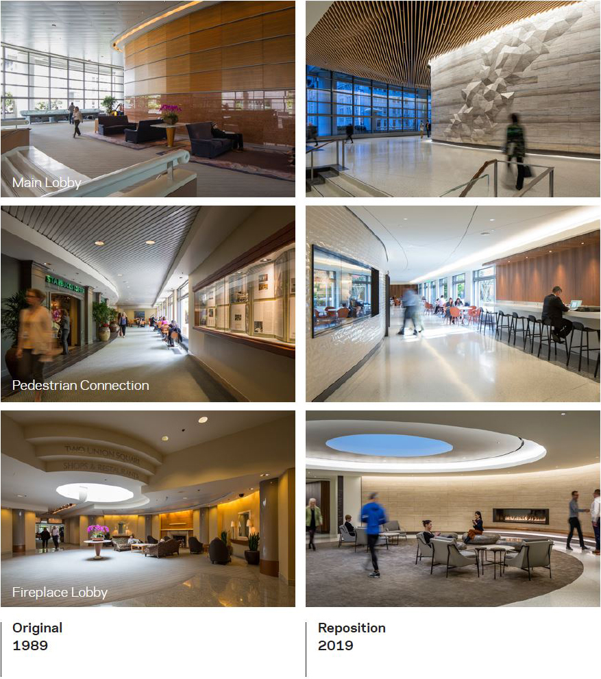
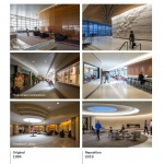
▼空间更新前后对比:自30年前首次开放以来,联合广场在经过对公共空间的全面改造后呈现出崭新的生命力。After it first opened its doors three decades ago, Two Union Square is now reborn with a complete transformation of its public spaces. ©Sean Airhart
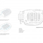
▼平面图示意,Floor Plan Diagram ©NBBJ
More:NBBJ。更多请至:NBBJ on gooood

