非常感谢 Michaelis Boyd 对gooood的分享。更多关于:Michaelis Boyd on gooood.
Appreciation towards Michaelis Boyd for providing the following description:
奢侈零售品牌“Muse By…”在卢森堡的旗舰店已于近日完工。该旗舰店由建筑和室内设计事务所Michaelis Boyd负责设计。值得一提的是,这也是该事务所完成的首个旗舰店项目。本项目要求设计团队以Muse By…强大的品牌个性为基础,创造出一个既能与现有的客户群产生共鸣,又能吸引新客户的空间。
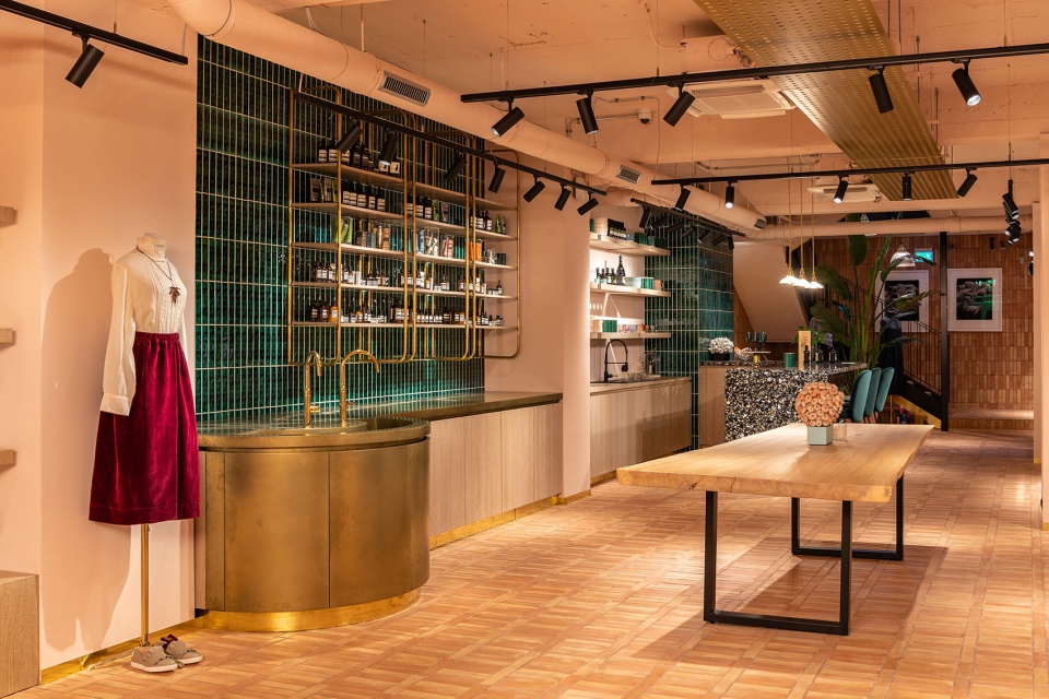
在这个旗舰店中,零售空间分布在上下两层空间中,每层都展示了各种高端的成衣、鞋类和配饰等。项目以高品质的材料为重点,以现场的情况为依据进行定制化设计,平衡了服饰的柔软触感和工业元素特有的冷硬感,从而创造出一个清新且极具感染力的室内空间。在材料的选择上,整个室内空间都采用手工制作的陶土砖,再辅以绿色的釉面砖、彩色的水磨石、华丽的地毯、木饰面和拉丝黄铜配件,营造出一个舒适的商业氛围。
Leading architecture and interior design studio Michaelis Boyd have recently completed their first flagship boutique in Luxembourg for luxury retail brand, ‘Muse By…’. Michaelis Boyd were tasked with building on the brand’s strong identity to realise a space that would resonate with its existing customer base, while attracting new customers.
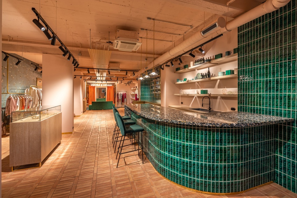
The retail space is spread over two floors, each showcasing high-end ready-to-wear clothing, footwear and accessories. The design concept balances soft and industrial elements with a focus on premium materials and bespoke solutions to create a fresh and impactful interior. Handmade terracotta tiles are used throughout and are complemented by green glazed tiles, colourful terrazzo, sumptuous carpet and timber finishes and brushed brass hardware.
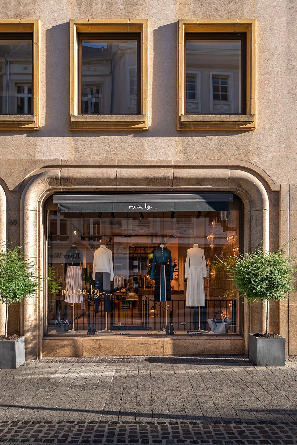
▼旗舰店外观,exterior view of the flagship boutique © Gavrii Lux
设计详述 | Design details
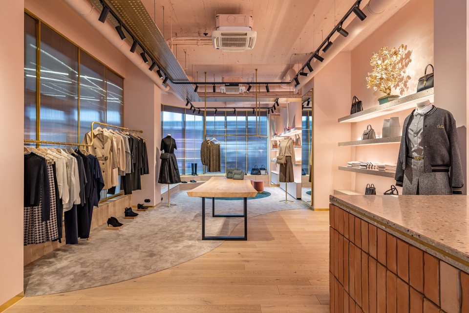
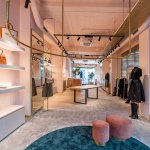
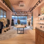
设计团队在首层设计了一系列特定的空间。这些空间在材料和纹理上具有一定的关联性,因此当顾客们穿梭于其中的时候,便能感受到一种渐进的变化。一踏入店门,首先映入眼帘的便是由手工制作的陶土砖铺就而成的地板;向商店里面走,陶土砖地板逐渐过渡为橡木地板;然后随着空间的深入,橡木地板又逐渐转变为柔软的地毯。
The ground floor design seeks to create designated zones characterised by specific materials and textures that change and evolve as customers journey through the store. Handmade terracotta tiles lead from the front entrance, transitioning into oak floorboards further into the space, before melting into soft carpet towards the rear of the store.
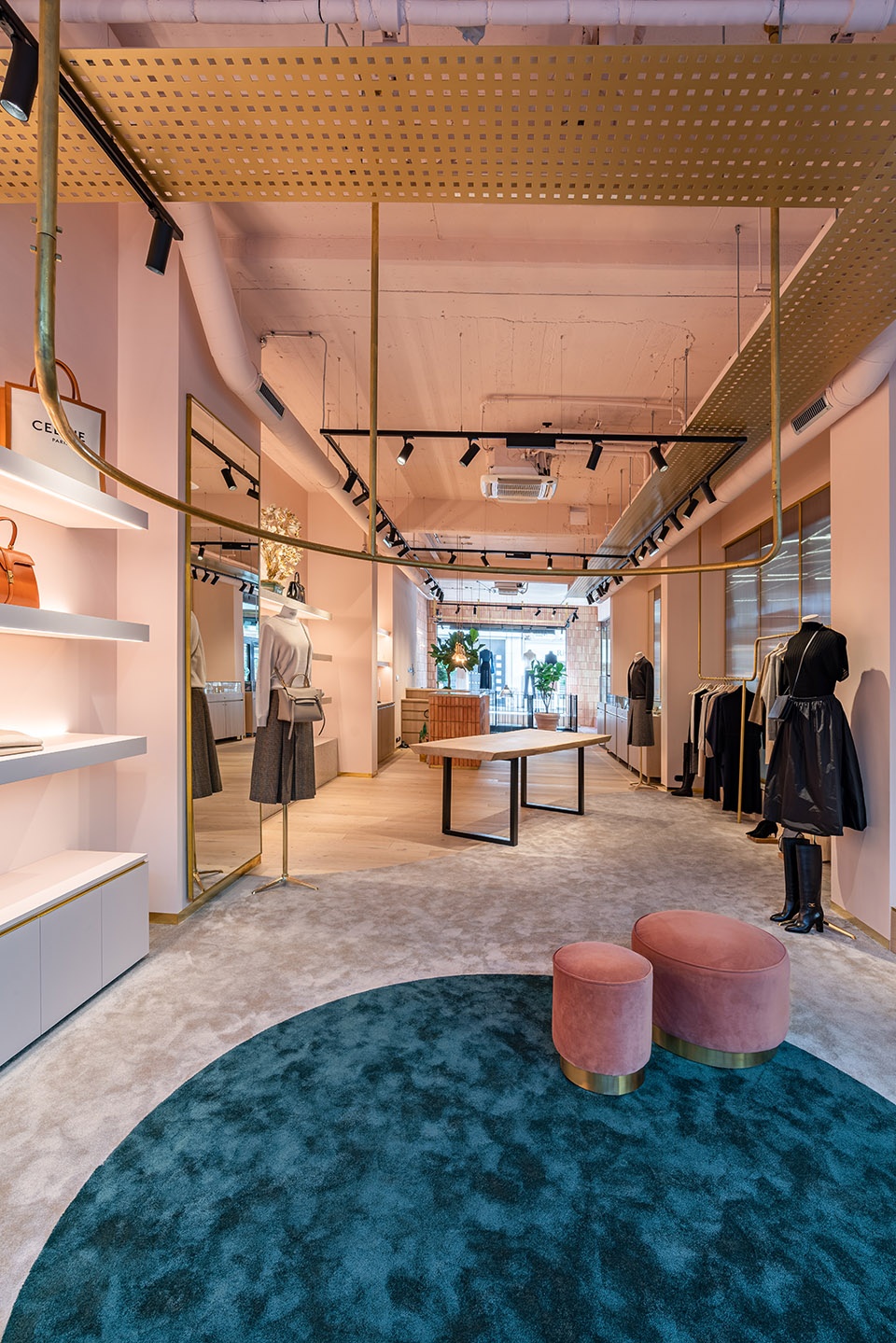
▼旗舰店首层概览,overview of the ground floor of the flagship boutique © Gavrii Lux
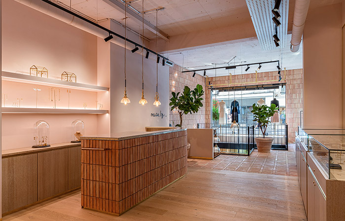
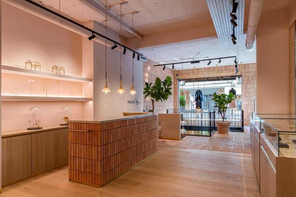
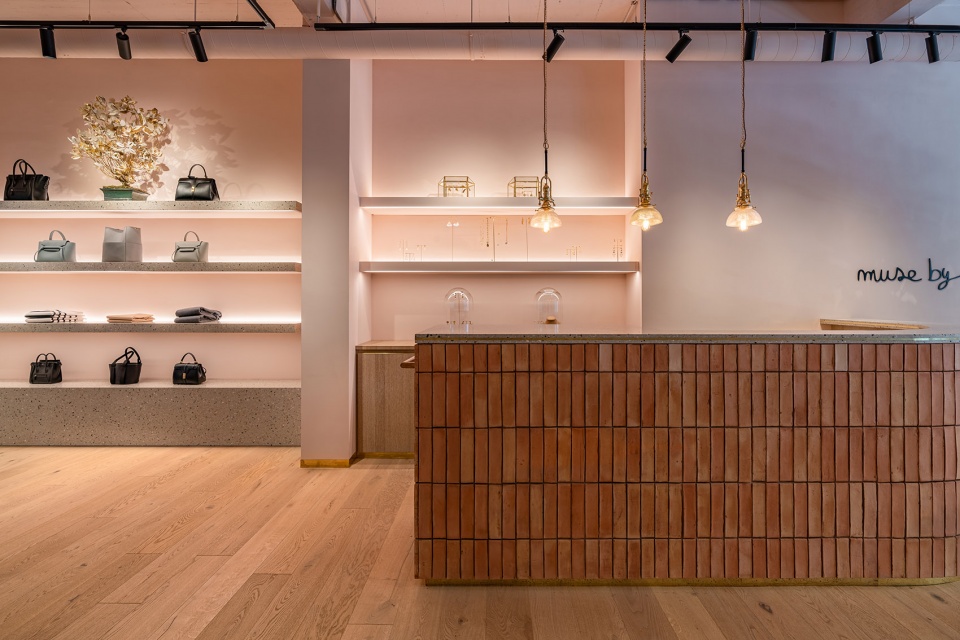
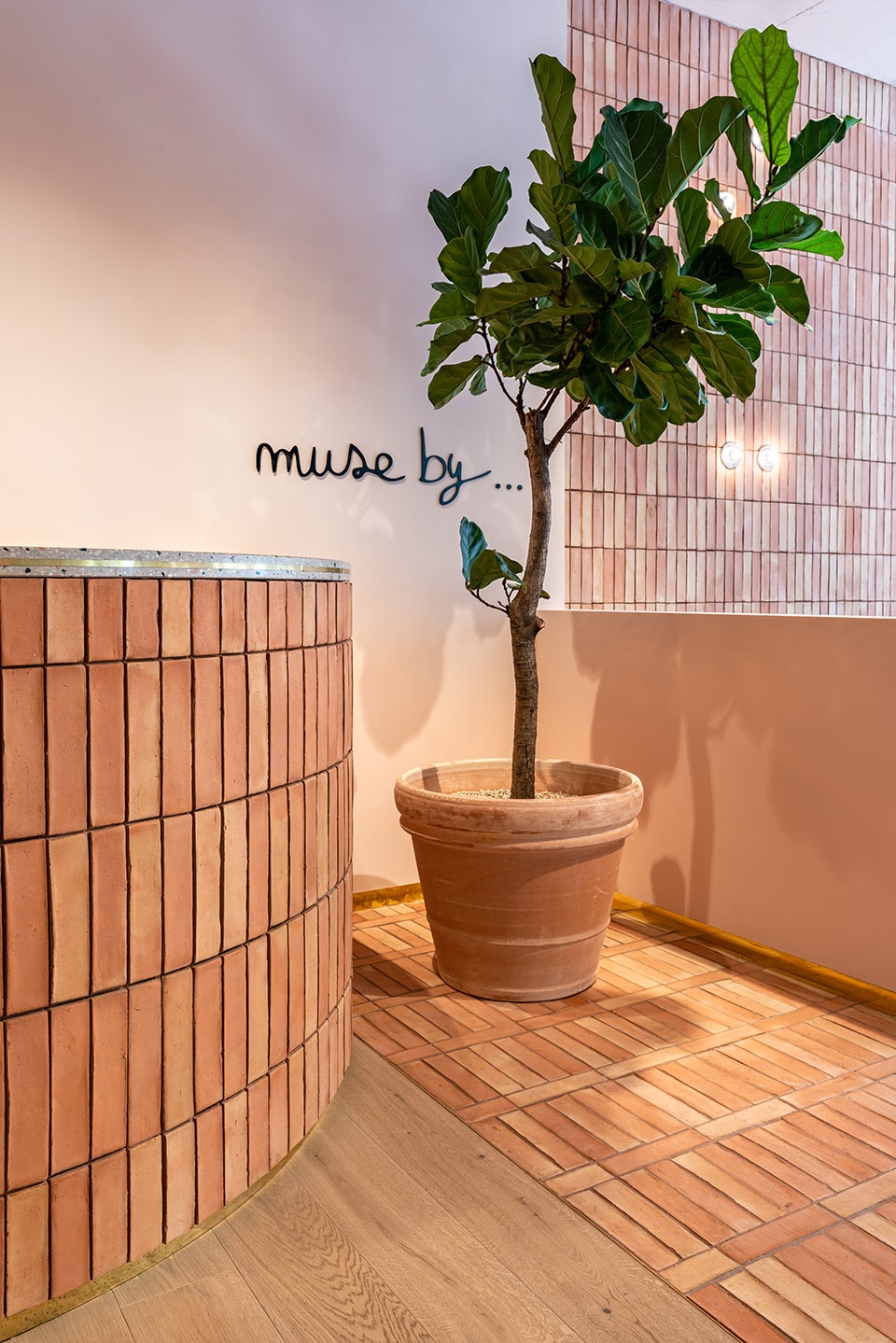
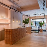
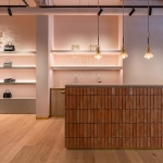
商店的入口区域采用一系列温暖的材料打造成,不仅营造出一种热情的氛围,更形成了一种强烈的视觉冲击。弧形的收银台采用水磨石台面和手工制作的陶土砖立面贴面。陶土砖随着地面一直延续到临街橱窗立面的内饰面上,在玻璃的配合下,为商店空间增添了几抹温暖感。
▼首层空间局部,陶土砖随着地面一直延续到临街橱窗立面的内饰面上,partial interior view of the ground floor, the handmade terracotta tiles extend to the interior veneer of the shopwindow facade © Gavrii Lux
▼陶土砖和玻璃橱窗为商店空间增添了几抹温暖感,the terracotta tiles and shop window add to the warmth of the space © Gavrii Lux
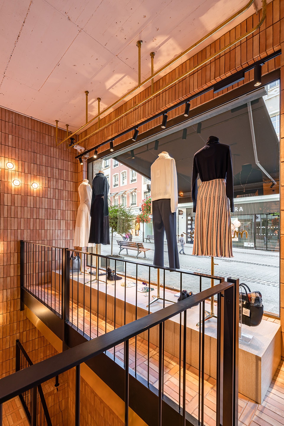
▼橱窗细节,details of the shop window © Gavrii Lux
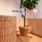
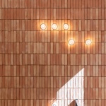
The entrance area creates an immediate visual impact through an interesting mix of warm and welcoming materials. A curved till point topped with a terrazzo worktop is clad in handmade terracotta tiles, which also wrap up the back wall and are accentuated by small glass wall lights from Bocci and add to the warmth of the space.
▼首层空间局部,partial interior view of the ground floor © Gavrii Lux
▼弧形的收银台采用水磨石台面和手工制作的陶土砖立面贴面,the curved till point topped with a terrazzo worktop is clad in handmade terracotta tiles © Gavrii Lux
▼收银台细节,details of the till point © Gavrii Lux
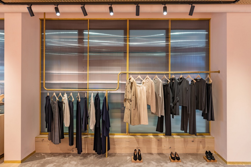
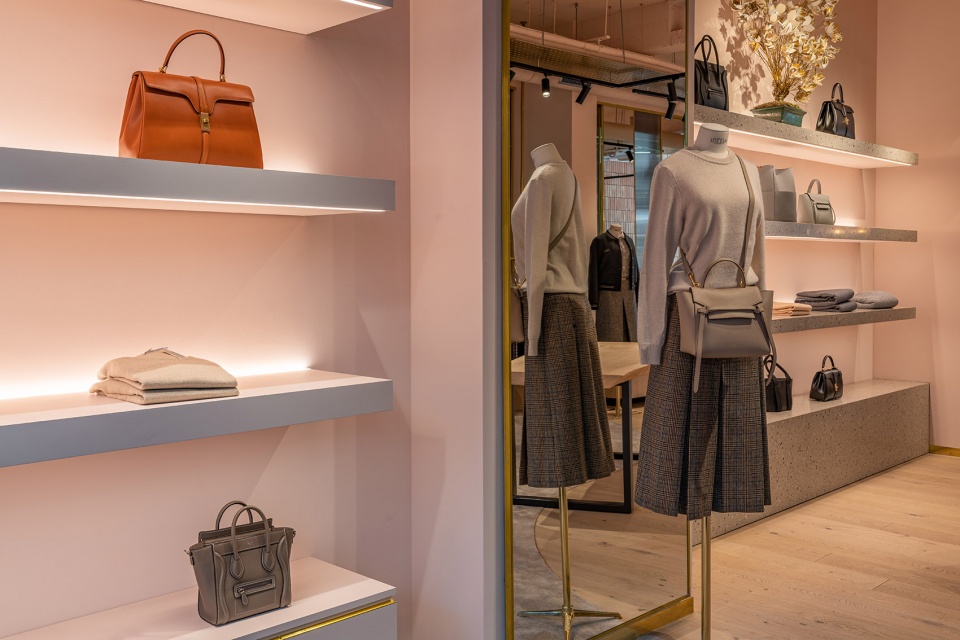
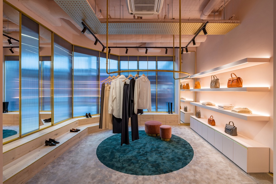
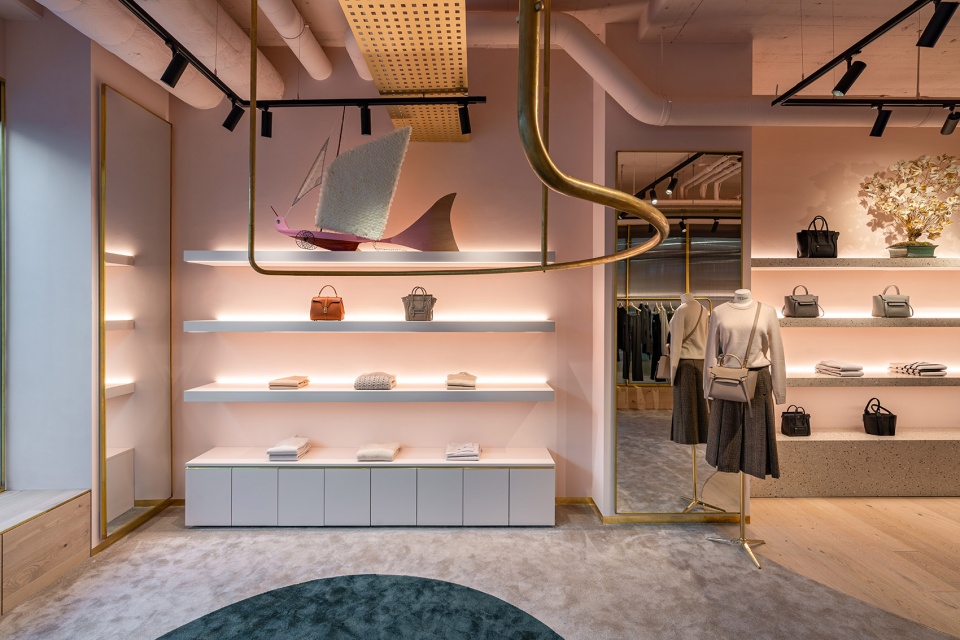
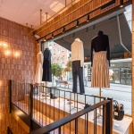
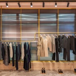
旗舰店通过定制的细木工和家具构件来突出商品。在商店空间中,用于展示服饰的人体模特被固定在定制的木制底座上,悬挂式拉丝黄铜杆件上挂着一系列精致的成衣,展示搁板空间也通过温暖的背光突出了商品的品质。定制的展柜采用极简主义风格,由木材、玻璃镶板和黄铜细节构成,将顾客们的视线引到其内所展示的珠宝上。经过展柜再向里走,所有外墙上的窗户都被带有黄铜装饰的半透明碳酸聚酯板所取代,在保证了自然光线的前提下也创造出一种贴心的空间私密性。
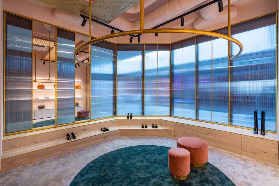
Bespoke joinery and custom hardware work together to highlight and display merchandise. In the shop window, mannequins sit upon bespoke timber plinths, with undulating hanging brushed brass rails which display clothing from above, and backlit floating shelves highlight goods with a warm glow. Custom cabinets are deliberately minimalist, made from timber, glass panelling and brass details to lead the gaze towards the jewellery contained within. Behind the cabinets, and throughout the space, external windows have been concealed inside by semi translucent polycarbonate screens with a brass trim, creating privacy whilst allowing natural light in.
▼外墙上的窗户被带有黄铜装饰的半透明碳酸聚酯板所取代,external windows have been concealed inside by semi translucent polycarbonate screens with a brass trim © Gavrii Lux
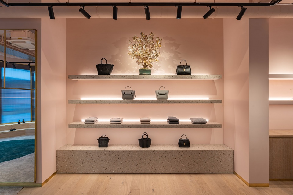
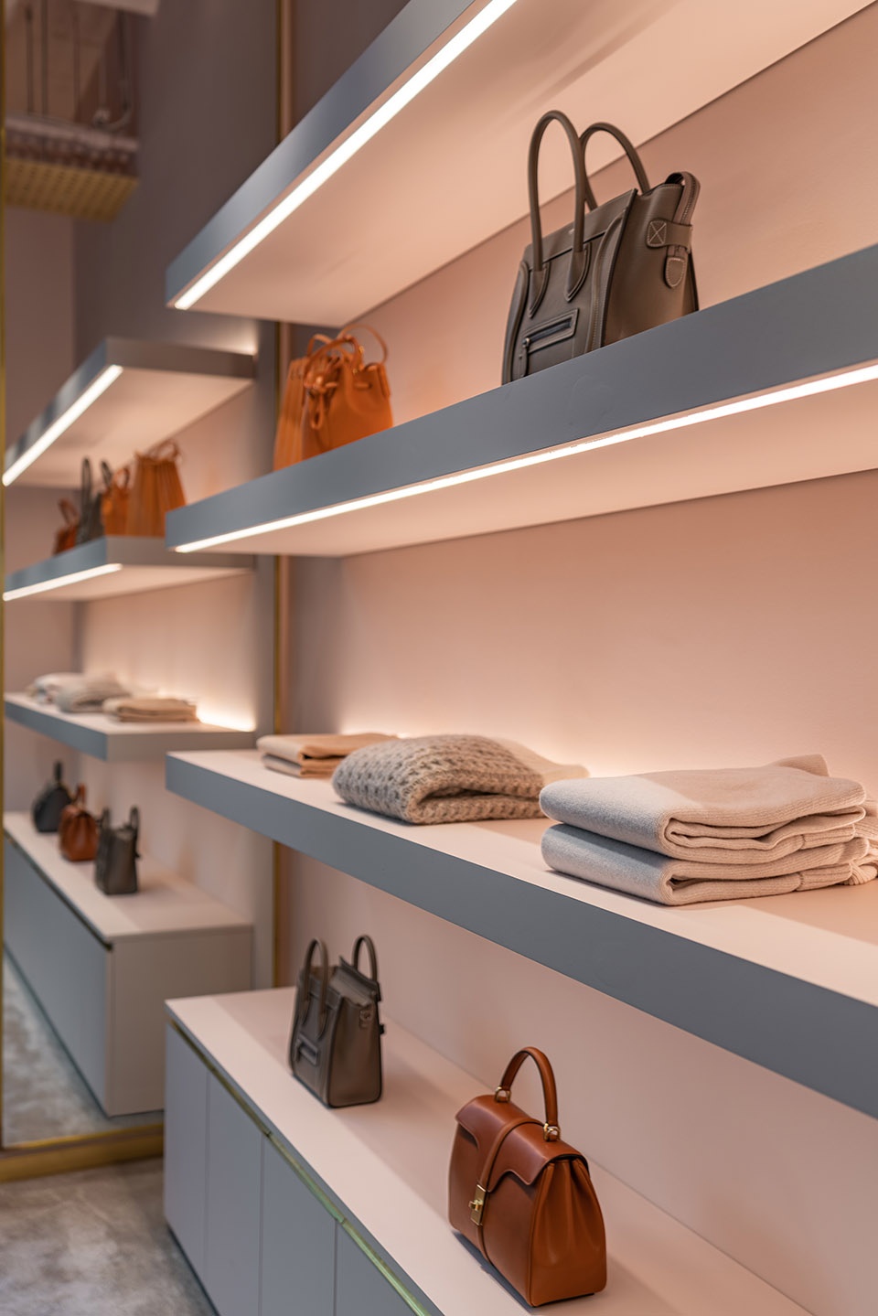
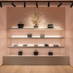
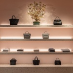
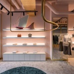
首层空间的第二部分是搁板式展示空间。所有的搁板和最底部的基座式展台均由灰色的水磨石制成。水磨石内还混有赤土色、绿色和象牙色的大理石小碎片,不仅完善了整个空间的色调,更在视觉上平衡了浅粉色的墙壁。
The second section of the ground floor includes a central shelving bay and plinth made of grey terrazzo, speckled with terracotta, green and ivory marble chips that feed into the existing colour scheme and complement the light dusty pink walls.
▼首层的搁板式展示空间,所有的搁板和最底部的基座式展台均由灰色的水磨石制成,the central shelving bay and plinth made of grey terrazzo © Gavrii Lux
▼首层的搁板式展示空间,温暖的背光突出了商品的品质,the central shelving bay, backlit floating shelves highlight goods with a warm glow © Gavrii Lux
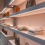
▼搁板式展示空间细节,details of the central shelving bay © Gavrii Lux
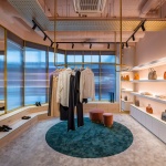
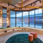
鞋类展示区位于首层空间的最里面。这里铺设着灰褐色的地毯,地毯的中央位置设有一个绿色的圆形图案,从而呼应了其正上方的半圆形悬挂式衣架。定制的橡木台阶沿着空间外墙排列,打造出一个简单而高效的鞋类展示区。
The shoe zone to the rear of the store has a soft taupe carpet with a circular cut of green sitting within the carpet, creating a zone which highlights the curved semi circular hanging rail directly above. A mix of bespoke oak low levelled steps follow the perimeter of the building creating a simple yet effective showcase for footwear.
▼鞋类展示区,灰褐色地毯中央位置的绿色圆形图案呼应了其正上方的半圆形悬挂式衣架,the shoe zone, the soft taupe carpet with a circular cut of green sitting within the carpet creates a zone which highlights the curved semi circular hanging rail directly above © Gavrii Lux
▼鞋类展示区,定制的橡木台阶沿着空间外墙排列,the shoe zone, a mix of bespoke oak low levelled steps follow the perimeter of the building © Gavrii Lux
▼鞋类展示区局部,partial interior view of the shoe zone © Gavrii Lux
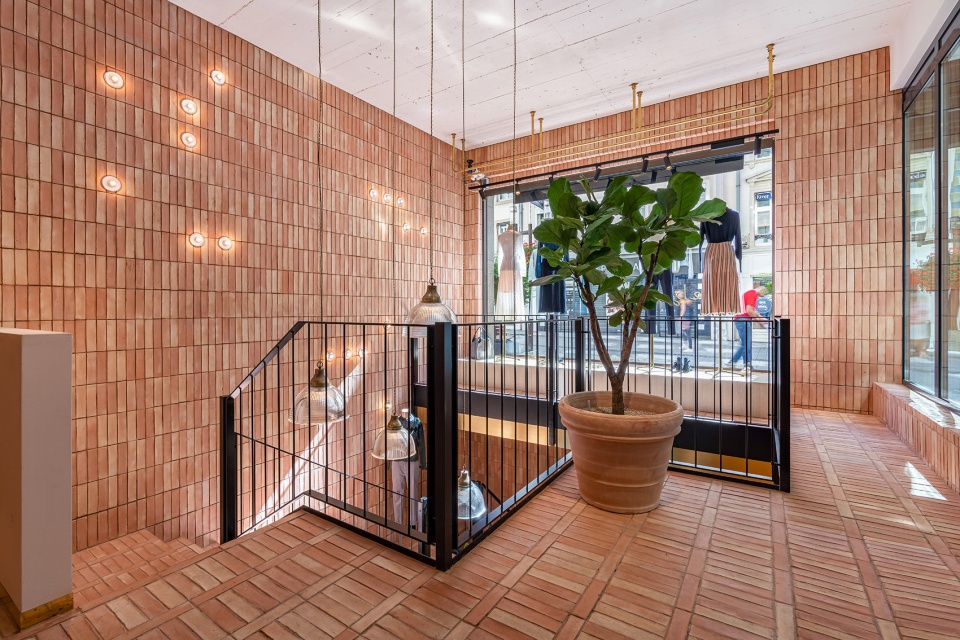
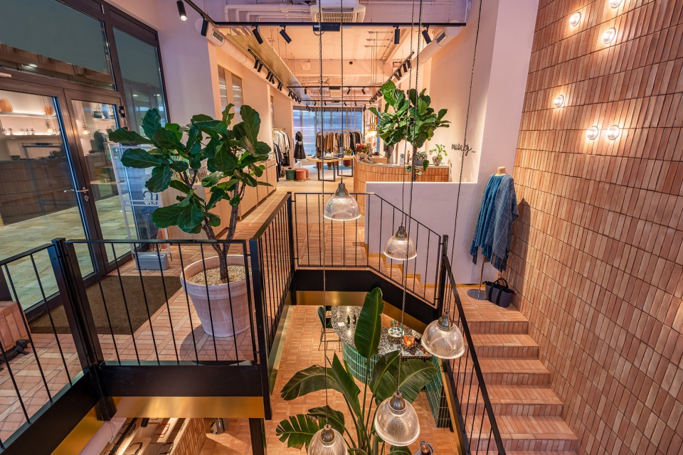
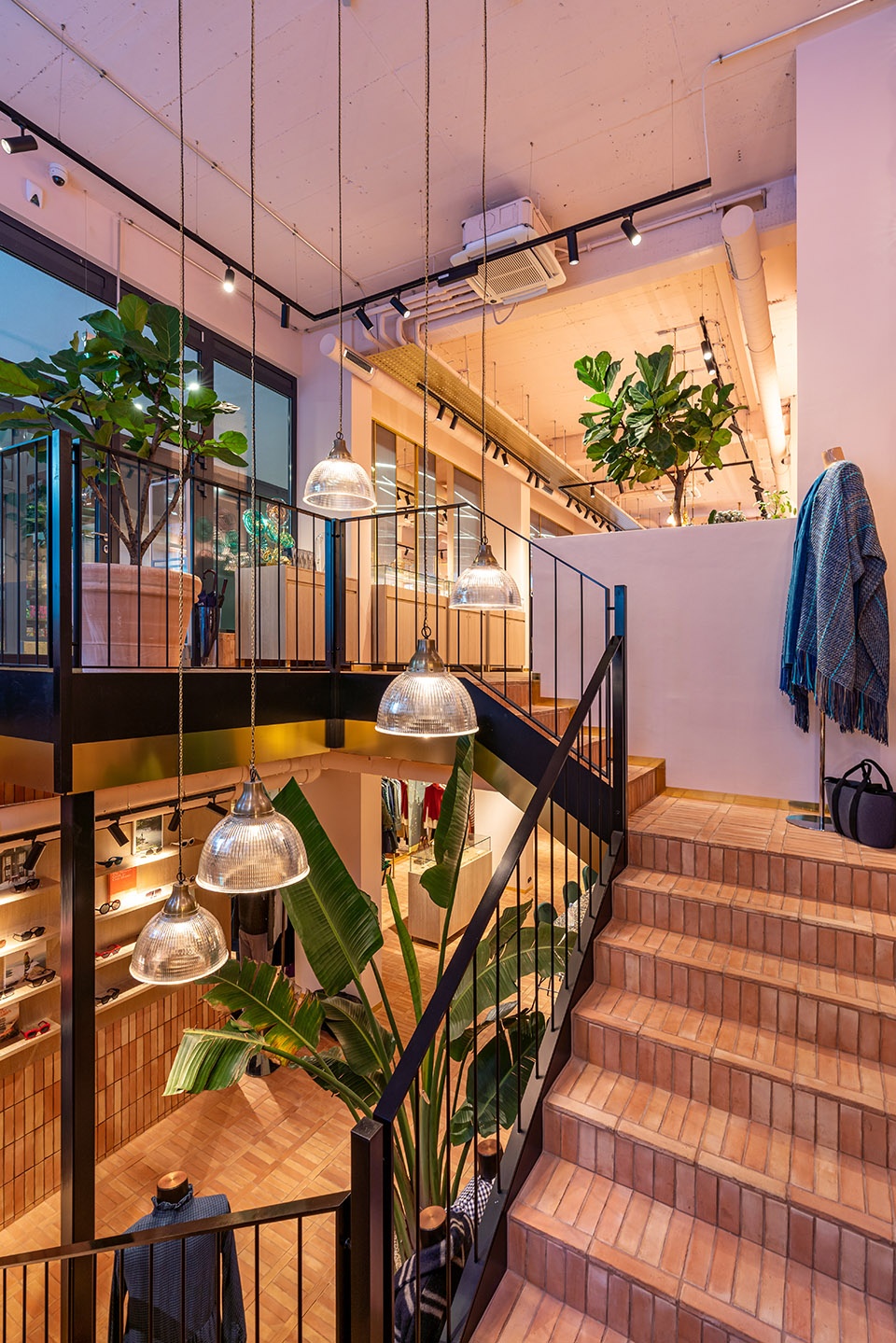
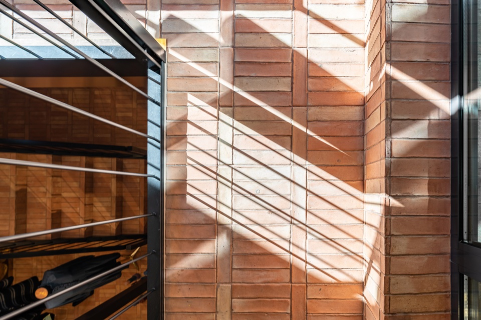
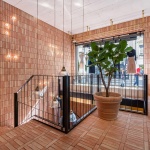
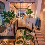
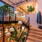
设计团队刻意将上下两层的天花板暴露在人们的视野之中。天花板上的管道系统和悬挂式的灯具为旗舰店平添了些许工业感。商店主入口的另一侧、紧邻着透明玻璃橱窗的是一个向下的楼梯空间。这个楼梯空间不仅通过挂在铜链上的吊灯将光线引入了地下一层,更让顾客对地下一层充满了好奇心。楼梯空间的墙体和楼梯本身都采用陶土砖贴面,配合着黑色钢制栏杆和黄铜细节,将顾客引向下层的商业空间。一迈进地下一层,首先映入眼帘的便是一个展示着墨镜的墙面。墙面的下半部分采用陶土砖贴面,上半部分则设置着木制的饰面和展示搁架以突出商品。
▼紧邻着透明玻璃橱窗的是一个向下的楼梯空间,beside the transparent shop window is a staircase space © Gavrii Lux
▼楼梯采用陶土砖贴面,配合着黑色钢制栏杆和黄铜细节,the staircase with a black steel balustrade and brass detailing, cladded in terracotta tiles © Gavrii Lux
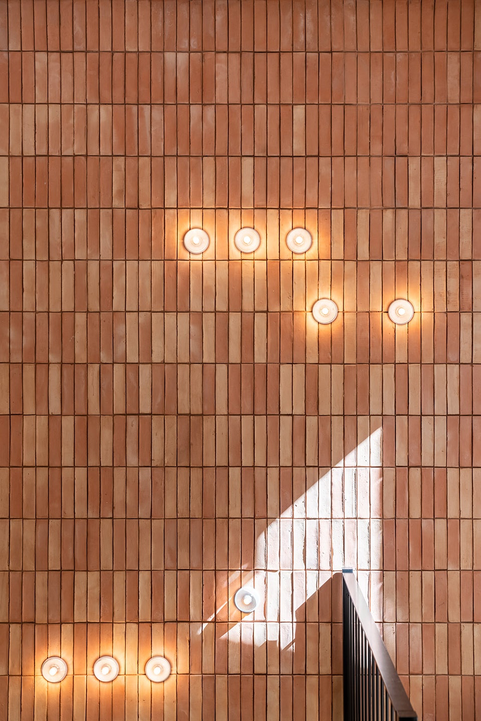
▼楼梯空间的墙体采用陶土砖贴面,the existing walls are cladded in terracotta tiles © Gavrii Lux
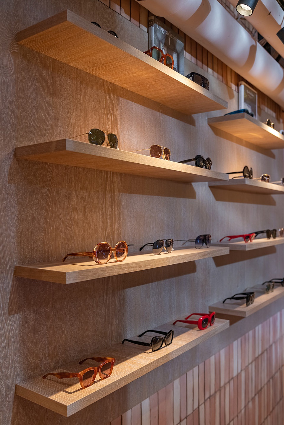
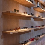
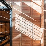
The ceilings on both floor levels have been purposely left exposed, revealing ductwork and suspended track light fittings which lends the space an industrial look. A staircase with a black steel balustrade and brass detailing leads down to the basement floor. Michaelis Boyd created a void to draw both light and the customer’s gaze down into this level. The existing staircase and wall are clad in terracotta tiles, while pendant lights suspended on brass chains in the void illuminate the space below. As you desend the stairs, you are welcomed by a wall of sunglasses, which is clad in terracotta with a timber backdrop and shelves.
▼地下一层墨镜墙细节,设置木制的饰面和展示搁架,details of the wall of sunglasses, which is clad in terracotta with a timber backdrop and shelves © Gavrii Lux
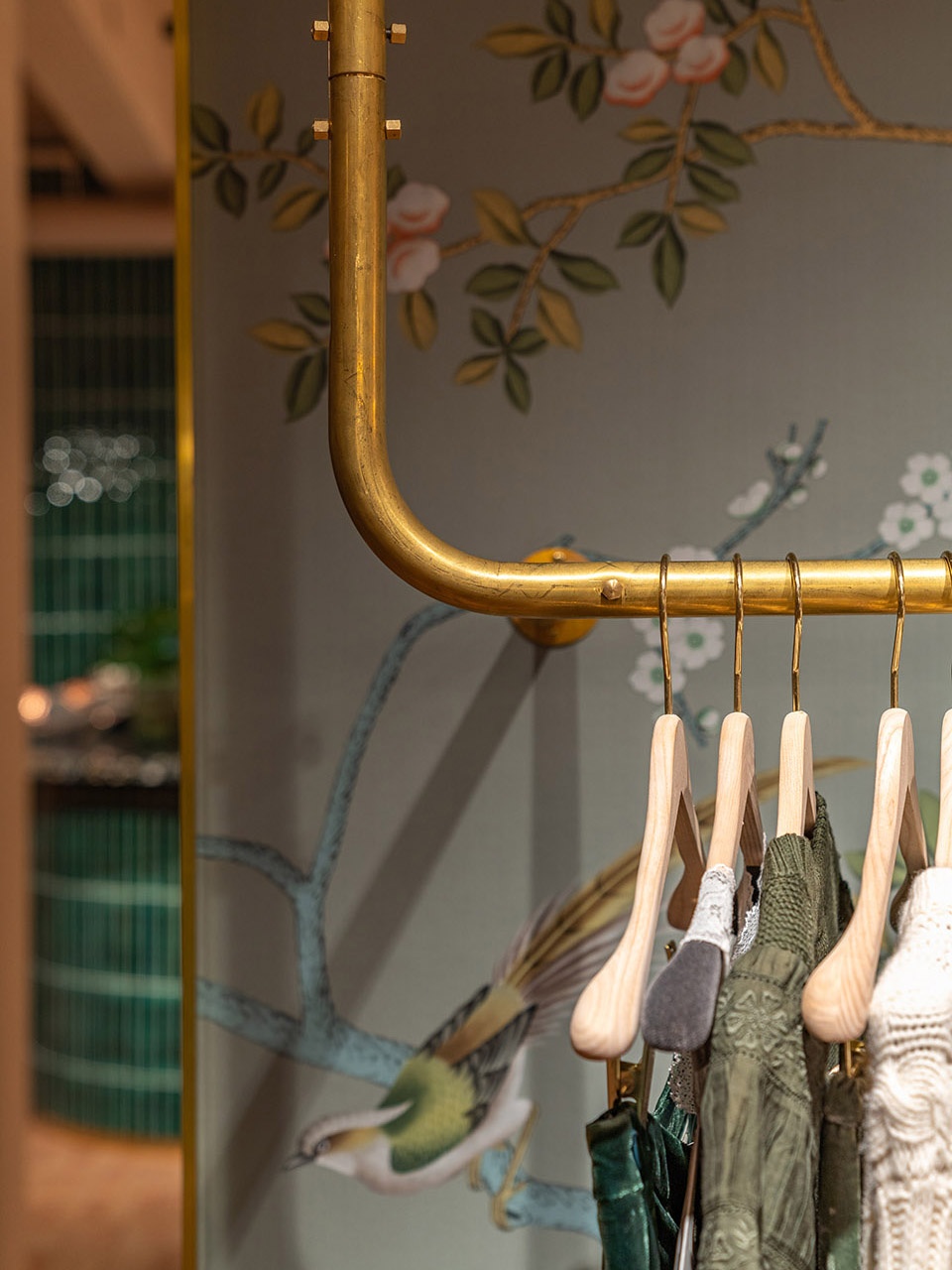
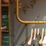
陶土砖地板和自然风格的De Gourney墙纸构成了整个地下空间的材料色调。值得一提的是,De Gourney墙纸不仅与黄铜的吊杆形成了鲜明的对比,更为空间增添了女性的魅力和质感。在功能区的布局上,地下一层就像首层空间一样,设置着一系列特定的区域以展示不同的产品。
The material palette throughout the basement consists of terracotta flooring and nature-inspired De Gourney wallpaper. The wallpaper adds a touch of femininity and texture to the space, contrasting with the brass hanging rails. As at ground floor level, the basement design creates designated zones showcasing different products.
▼地下一层空间概览,overview of the basement space © Gavrii Lux
▼地下一层空间概览,陶土砖地板和自然风格的De Gourney墙纸构成了整个地下空间的材料色调,overview of the basement space, the material palette throughout the basement consists of terracotta flooring and nature-inspired De Gourney wallpaper © Gavrii Lux
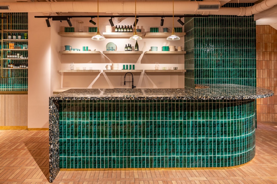
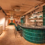
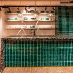
再向里走,首先经过的是右手边可以为顾客们提供香槟的豪华咖啡吧台。吧台采用混有小石块的深灰色水磨石台面和手工制作的绿色釉面瓷砖贴面,深绿色的天鹅绒高脚凳沿着吧台的外侧排列。
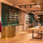
As you move through the space, you come across a luxurious café counter which serves champagne to customers. The counter is clad in handmade glazed green tiles by Otto Tiles with a worktop surface in dark grey terrazzo, peppered with earth toned chips. Dark green velvet barstools are positioned around the lip of the counter.
▼豪华咖啡吧台,the luxurious café counter © Gavrii Lux
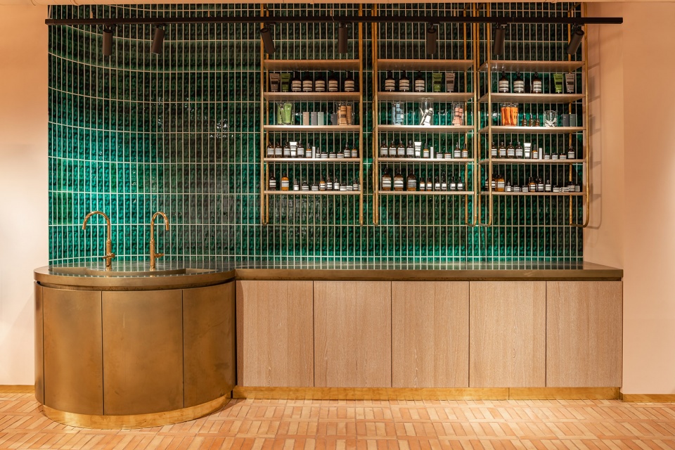
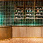
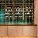
再往里走便是化妆品柜台。柜台采用定制的细木工柜门和未上漆的黄铜表面,随着时间的流逝,这种金属会自发产生一种绿绣,从而形成天然的覆层。柜台的上方是一系列由弯曲的黄铜壁挂式框架支撑着的木支搁板。柜台的背景则是一面釉面的绿色瓷砖墙。
Beyond the café area lies the cosmetics counter clad in unlacquered brass which will patinate over time. Above the counter sit a series of timber shelves, supported by a curved brass wall-hung frames. The backdrop to the counter is a wall of glazed green tiles with bespoke oak joinery below.
▼化妆品柜台,the cosmetics counter © Gavrii Lux
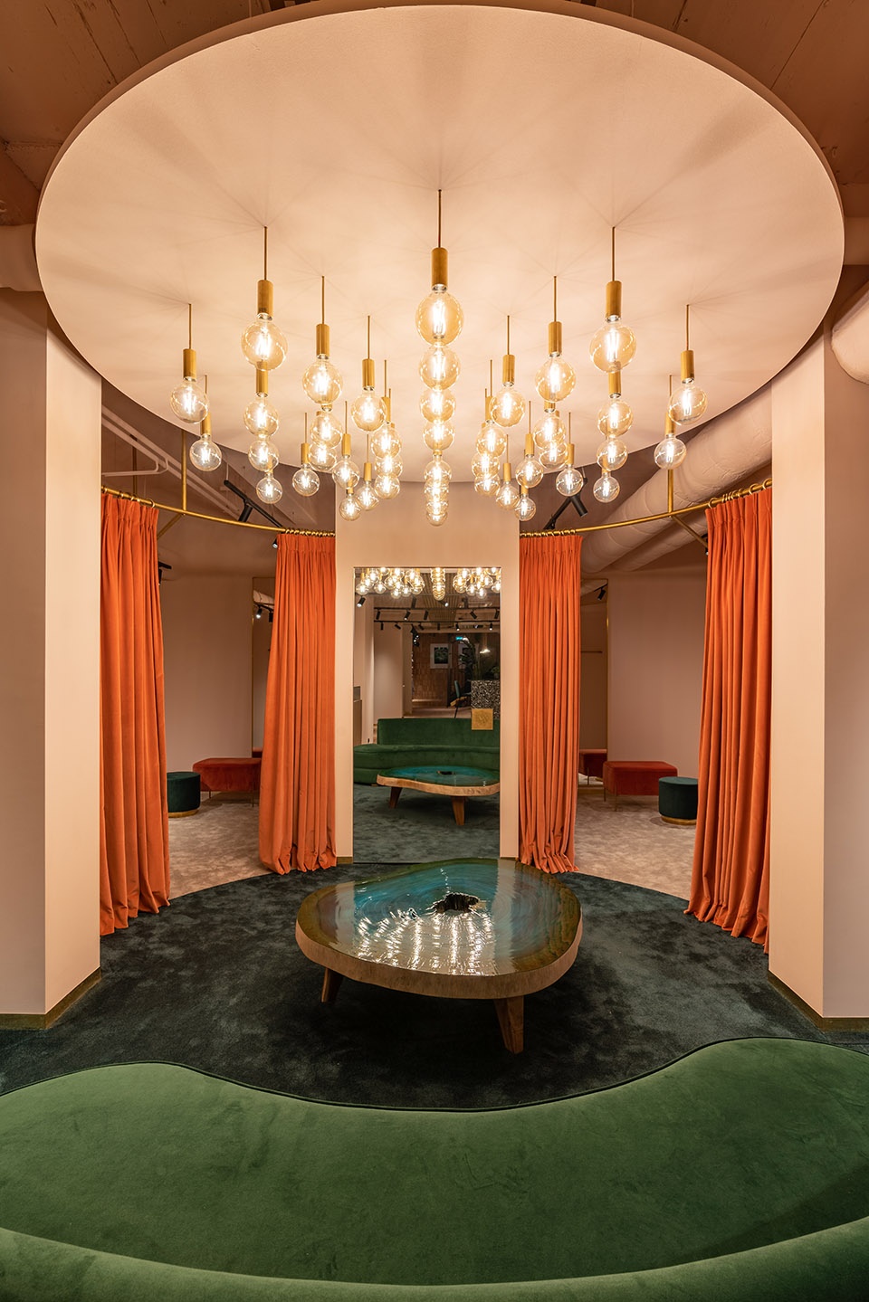
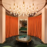
继续深入空间,地面的铺面由陶土砖变成了绿色的地毯。定制的弧形绿色天鹅绒沙发沿着绿色地毯的边缘排列。地毯区的上方悬吊着一系列白炽灯泡,这些灯泡以同心圆的形式排列,从而进一步限定了空间。丰富的材料和光环境营造出了一个迷人的地下室空间氛围。悬挂在弯曲黄铜导轨上的粉色天鹅绒幕帘将试衣间与公共区域分隔开来,确保了顾客的隐私。
The terracotta tiles merge into a green circular carpeted area which forms the changing area zone. A bespoke curved green velvet sofa follows the radius of the green carpet. Above hangs a series of filament bulbs arranged in concentric circles further defining the space. Rich materials and lighting in the basement changing area provide a touch of glamour. Customers enter the dressing room via a pink velvet curtain suspended from a curved brass rail which makes the space feel enclosed and intimate.
▼试衣间区域,地板采用绿色地毯铺面,the fitting room with the green circular carpet as the pavement © Gavrii Lux
建筑和室内设计事务所Michaelis Boyd将工业元素与丰富的材料和颜色结合在一起,打造出一个既温馨又富有创意的奢侈品牌旗舰店。
Combining industrial features with a rich material palette, Michaelis Boyd have created a welcoming and inspiring retail interior fit for the flagship of a luxury brand.
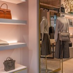
▼地下一层空间细节(左),首层空间细节(右),space details of the basement floor (left), details of the ground floor (right) © Gavrii Lux
Photography: Gavrii Lux
Location: 60 Grand Rue, L-1660, Luxembourg
Size: Ground 214 Sqm, Lower Ground Floor 100 Sqm
More: Michaelis Boyd 更多关于:Michaelis Boyd on gooood.
