感谢 ATMOROUND 对gooood的分享。更多关于他们,请至:ATMOROUND on gooood
Appreciation towards ATMOROUND for providing the following description:
世宗自治城是一个新开发的位于首尔周边的城市。设计希望创造一个自省的场所,让人们逃离城市中的冰冷生活。设计师希望帮助人们洗去日常的疲劳,在这个空间中体验与自我对话的时光。
First, Sejong Metropolitan Autonomous City is a newly developed city around Seoul area. We wanted to provide a place where people can escape from the cold city life to be able to reflect on themselves. We wanted to provide people the opportunity to clear out their tiring daily routine and to experience a time to face themselves through this place.
▼视频,video ©Park woo-jin
项目提供清空大脑、直面自身的宝贵经验。时光以另一种方式在空间中流逝。
We provide precious experience to clear your mind and to face yourself. Time flows differently here.
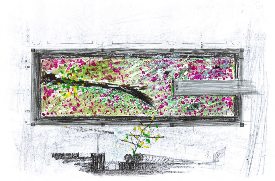
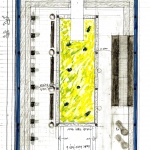
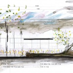
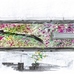
▼设计草图,design sketch ©ATMOROUND
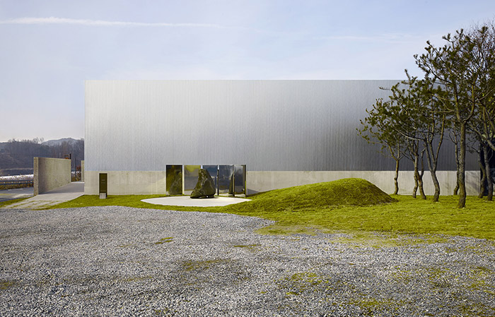
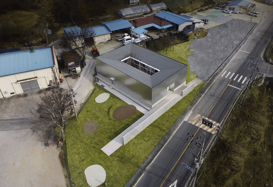
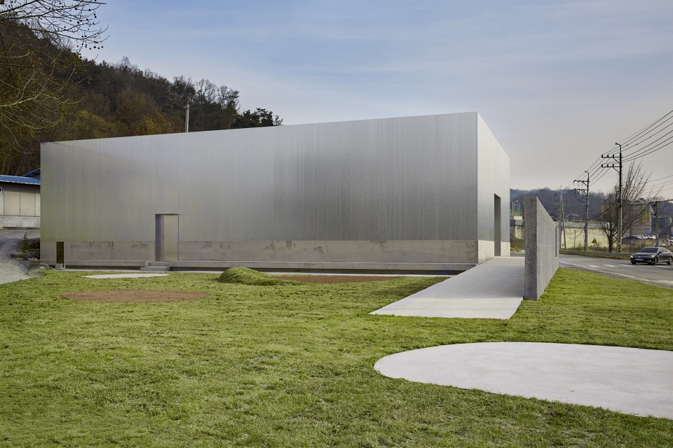
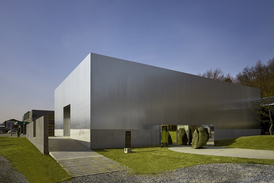
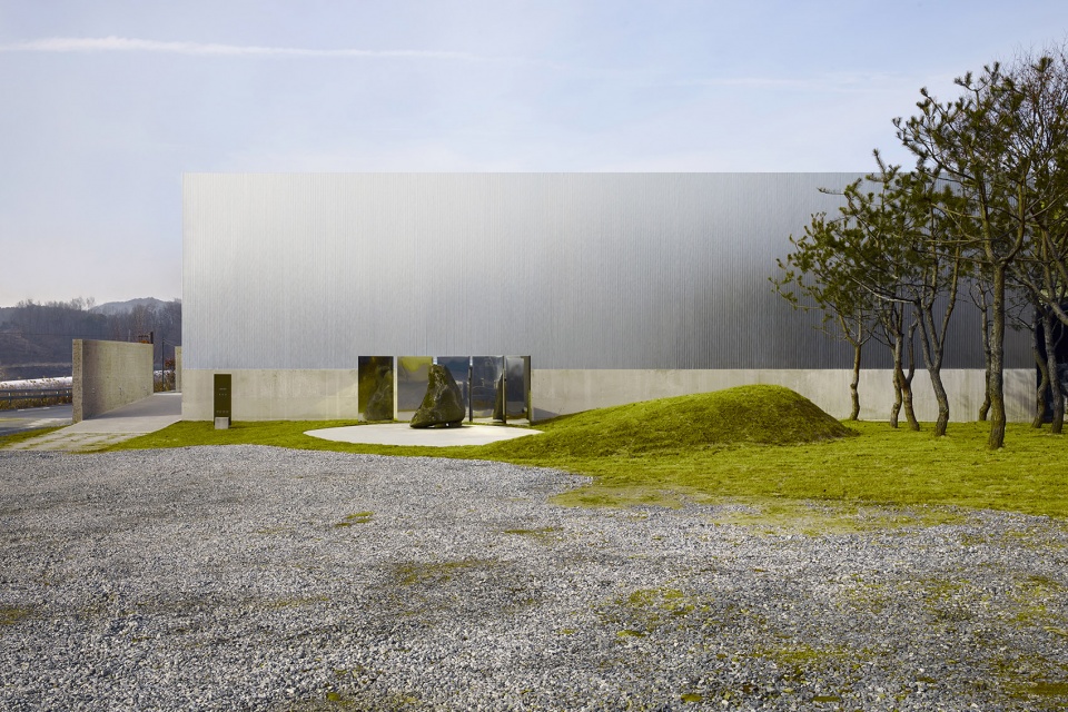
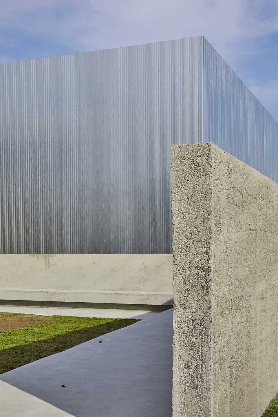
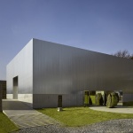
项目外观为一个简洁的金属正方体,形态优雅,与生活区保持了一段距离。顾客购买咖啡,就是购买他们花在咖啡上的时间。在这个概念上,项目希望为顾客提供一段独特的时间体验。
The simple square metal mass exterior and site being located not too close to the living area display ‘refinement.’ Second, the whole project started from wanting to provide special time to customers. We considered that people buying coffee is like purchasing the time they spend in the café.
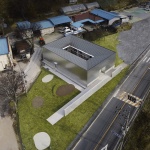
▼项目鸟瞰,与居住区保持一定距离,aerial view of the project keeping some distance from the residential area ©박우진
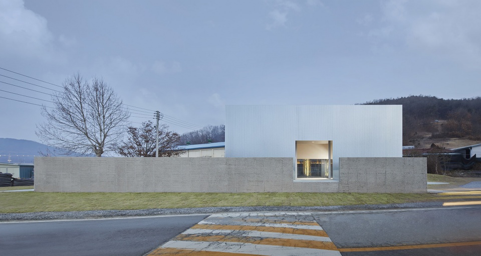
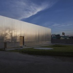
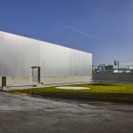
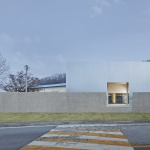
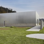
▼项目外观,external view of the project ©박우진
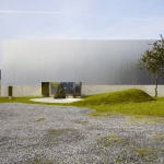
▼项目为一个简洁的金属盒子,external view of the project of a metal box ©박우진
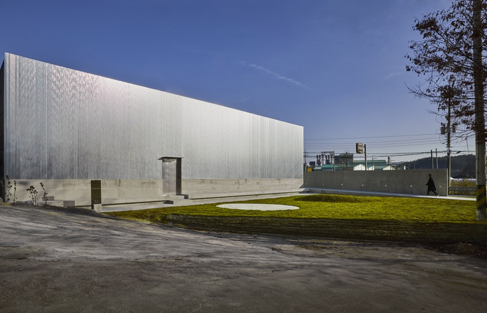
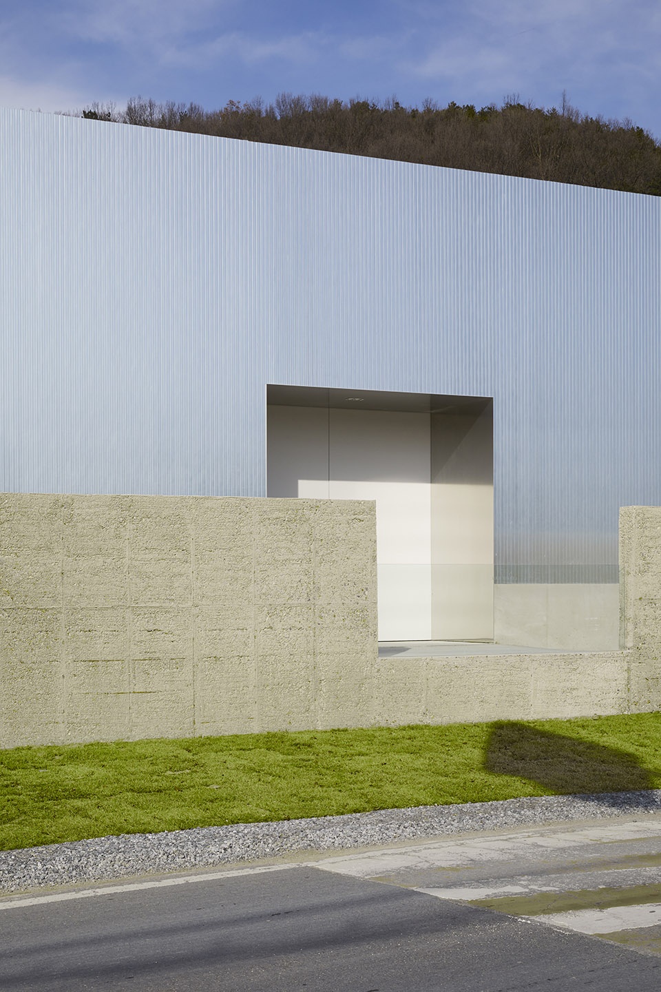
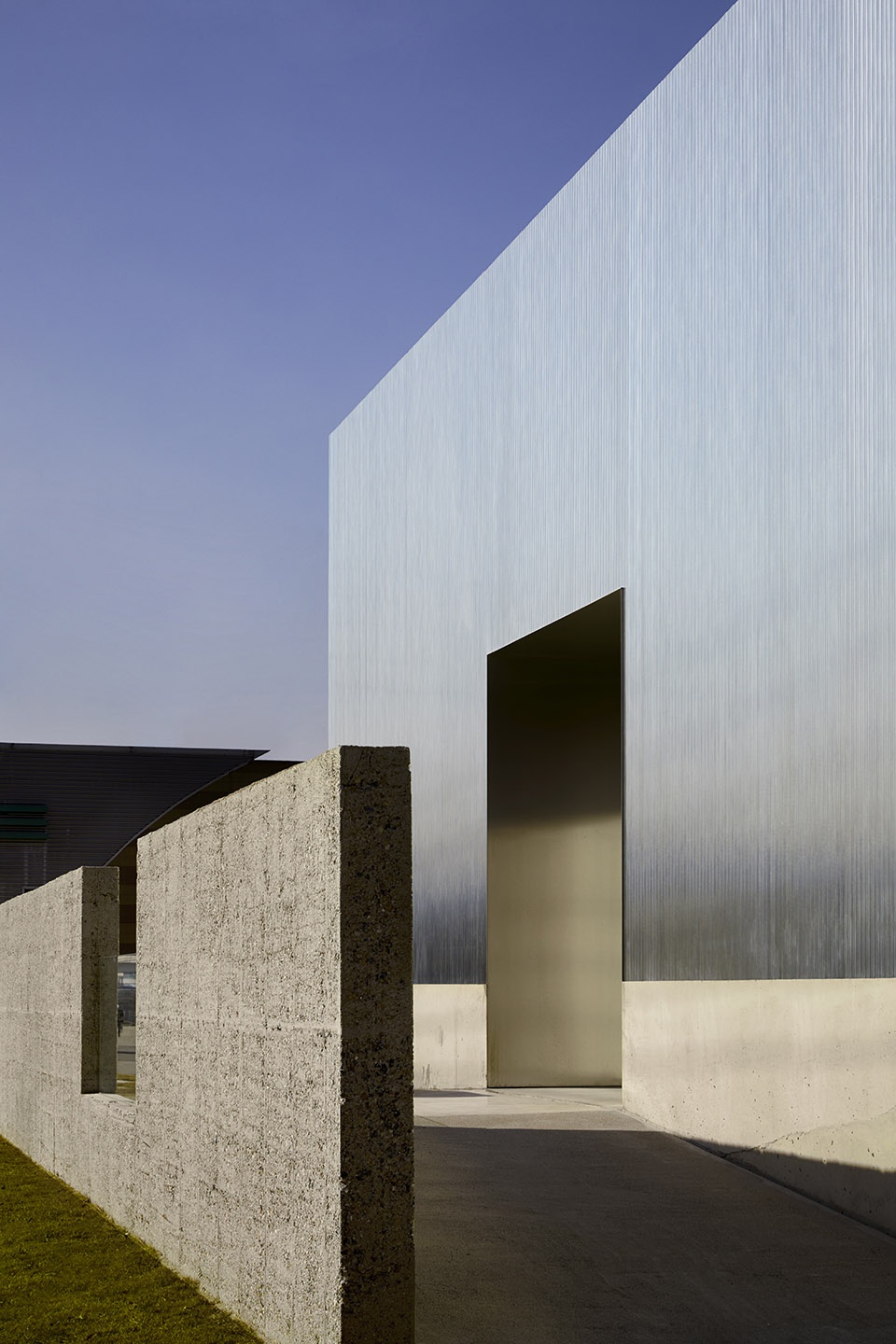
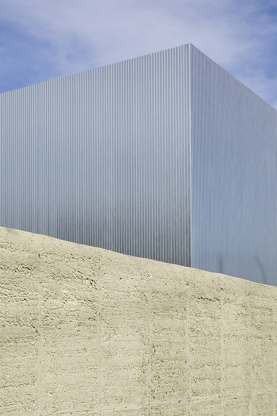
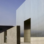
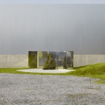
粗糙的纹理和简洁的形状共同塑造了建筑优雅的外观。立面上没有开窗,让人们无法想象室内的光景。钢材立面阻断电波,导致室内的手机信号很差。然而,业主希望保留这一缺陷,让人们可以更好地集中精神。
The rough texture and the simple shape of the building lead to ‘refinement’. There are no windows on the outside which makes it hard to figure out what’s inside. The steel as a finishing material interrupts airwaves resulting bad cell phone connection. However, clients wanted to leave this interruption intentionally to help people focus on themselves.
▼简洁的立面不设开窗,simple facade without windows ©박우진
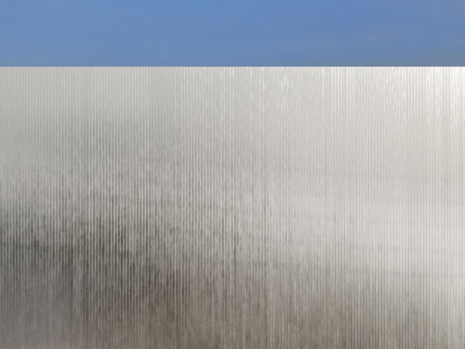
▼立面细部,粗糙的金属表面,details of the facade with rough metal material ©박우진
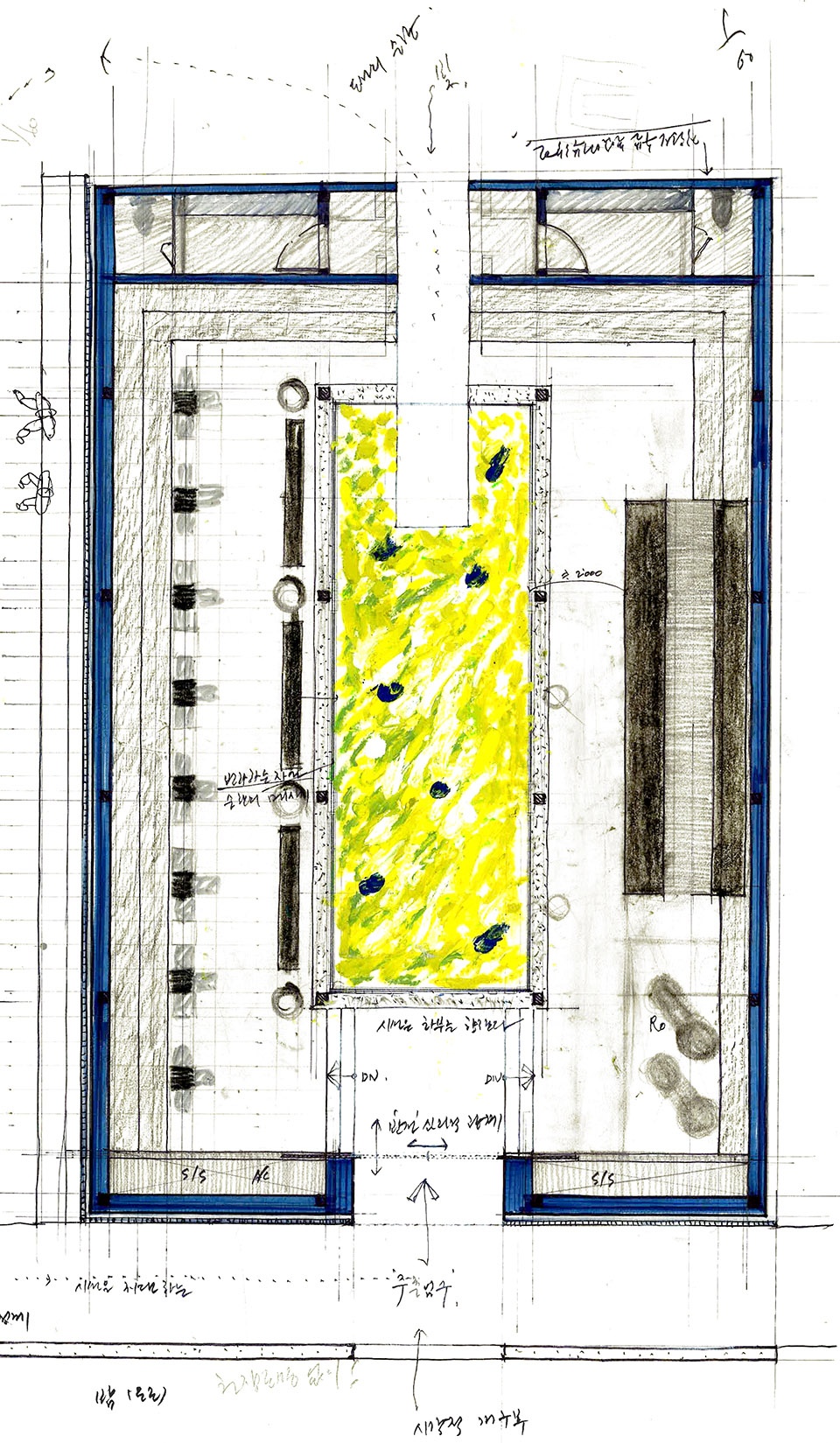
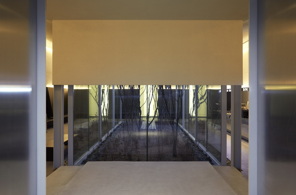
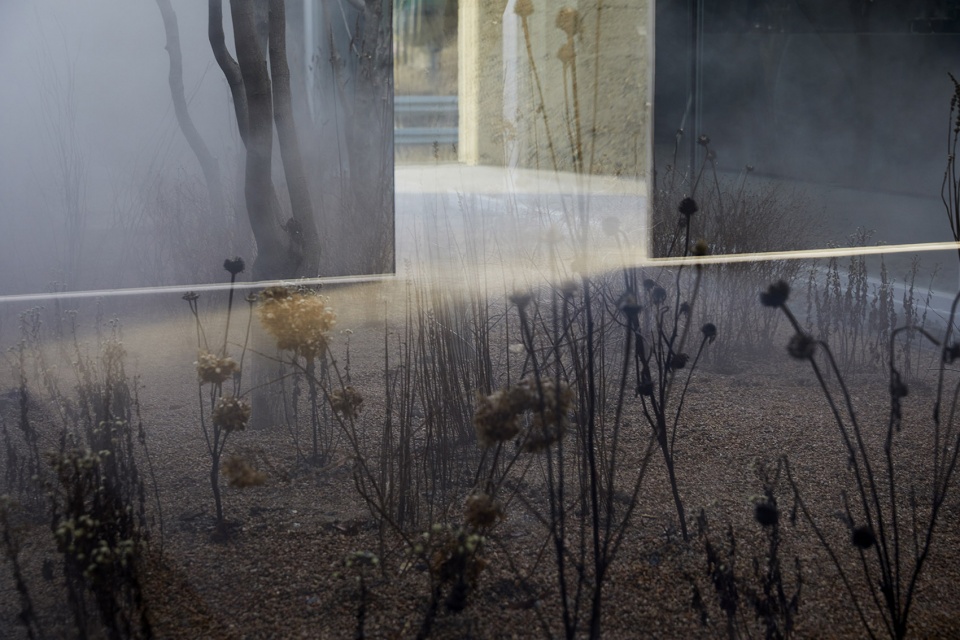
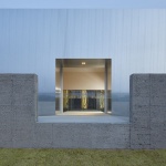
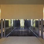
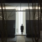
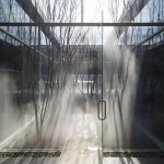
打开门后,空间中部是一个庭院。人们首先看到地面,然后意识到本来应该在室内的庭院变成了一个没有顶棚的室外空间。对角线让空间拥有了更强的向心力。
When the door opens, in the middle is the courtyard. The first thing to notice is the floor but it is noticeable that this courtyard turns out to be an outdoor area with no ceiling. The diagonal line adds more focus to the center.
▼进入空间后可以看到位于空间中部的庭院,courtyard in the center of the space could be seen from the entrance ©박우진
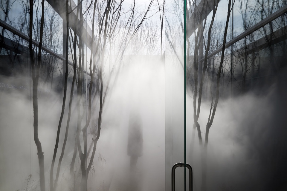
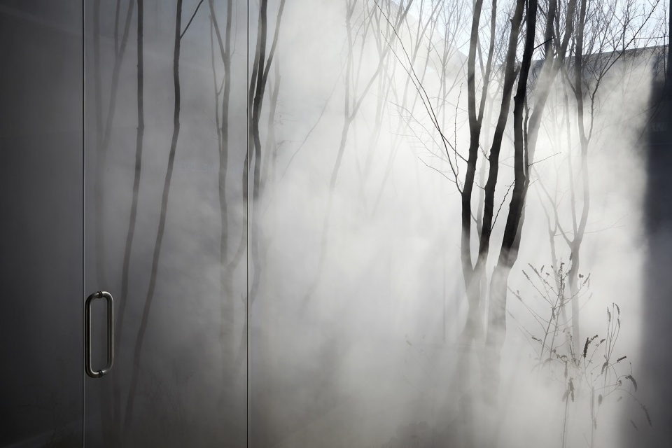
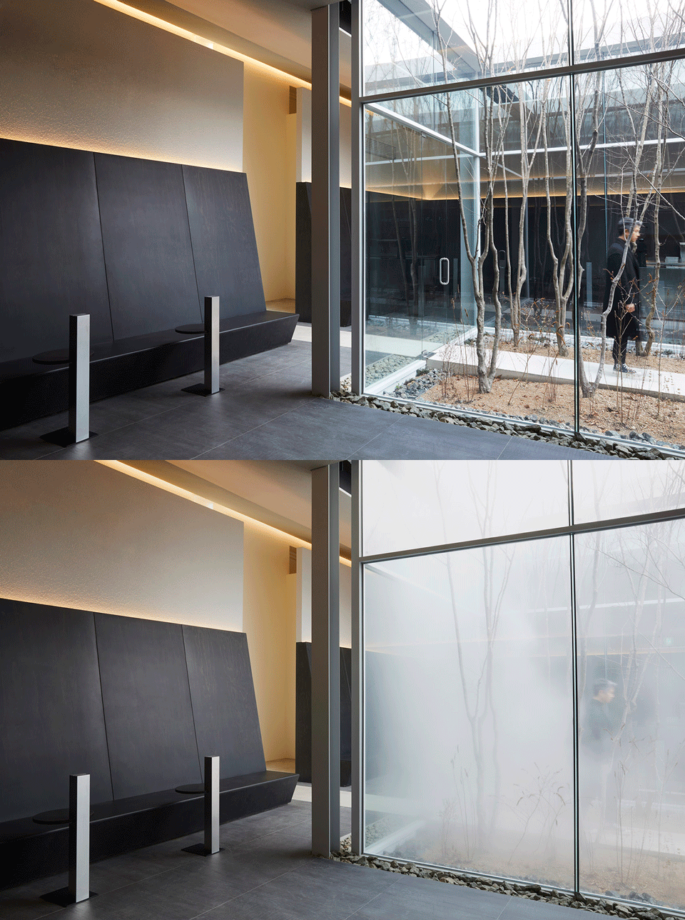
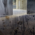
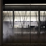
设计希望在人与精神之间建立一种情感的联系,咖啡店周围的雾气便起到了这一作用。雾气中包含了多种多样的感情。它们模糊边界,不仅能让事物看上去更加简略,更能帮助人们专注于自己的内心。
We wanted to create an emotional connection between the people and the clearing of their mind. This connection was made possible by fog surrounding the café with fog. There are varied emotions that fog has. It blurs the clear line not only showing more simplified image of things but also helps people to focus more on their inner selves.
▼庭院中的雾气酝酿丰富的情感,various emotions generated in the fog ©박우진
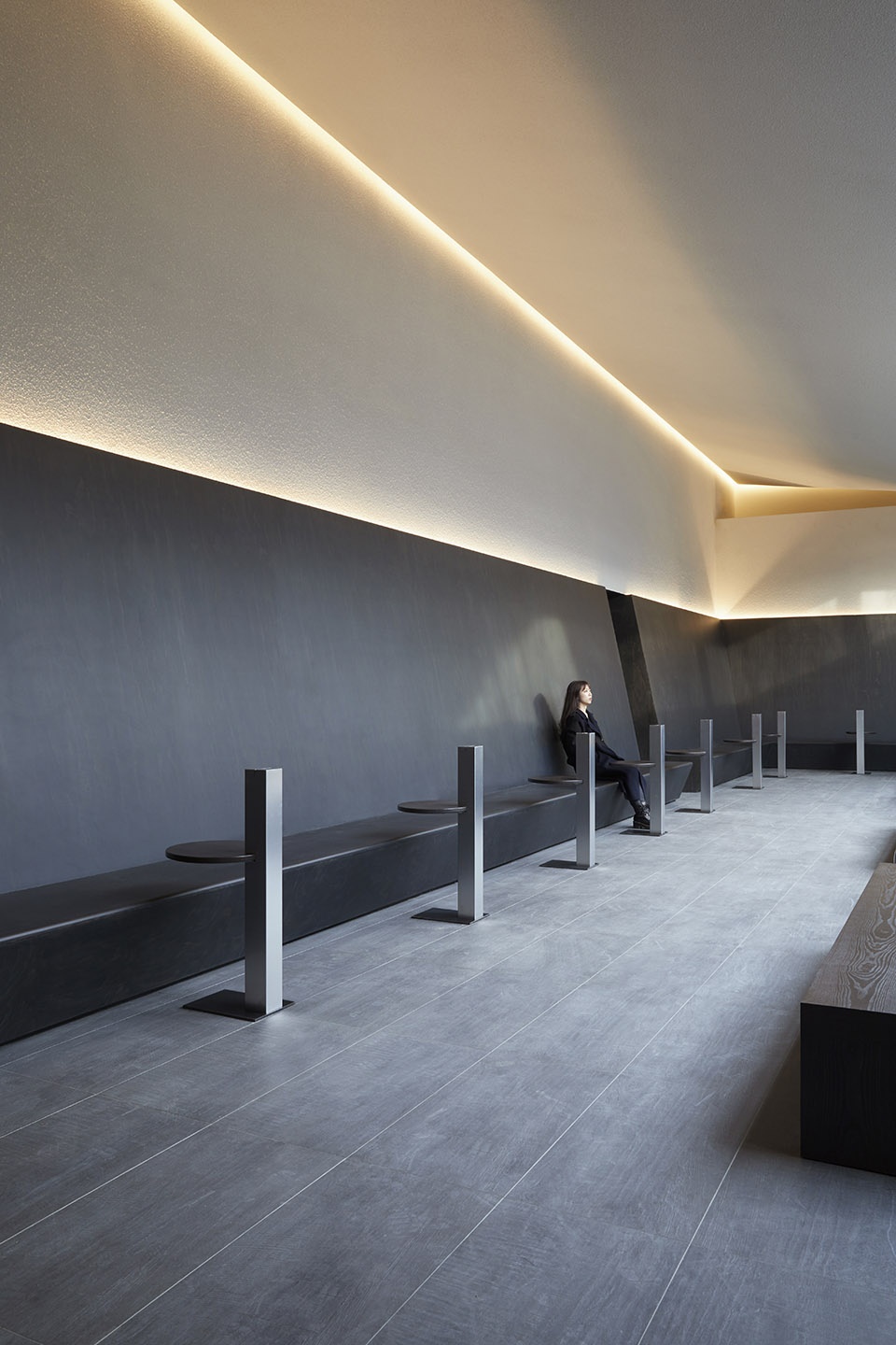
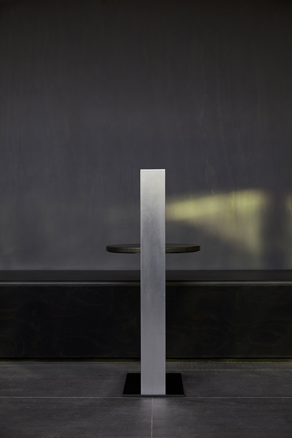
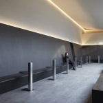
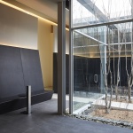
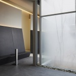
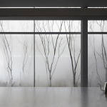
墙的表面同时也是椅背,顾客坐在这里可以看到位于项目中部的庭院。墙面微微向后倾斜,促使人们把注意力集中在庭院里的植物、天空和雾气上,从而直面自己的内心。植物与天空随时间和季节变化形成不同的景象,暗示着生命的不断循环。
The surface of the wall works as a back of the chair and customers can see the courtyard is in the middle. This wall is slightly leaned backwards to help customers gaze the plants in the courtyard, the sky and the fog. Customers can face themselves while gazing this view. Different images of plants and sky as time and season change is a metaphor for cycle of life.
▼靠墙的座椅,可以直接看到庭院,seats beside the wall with direct view to the courtyard ©박우진
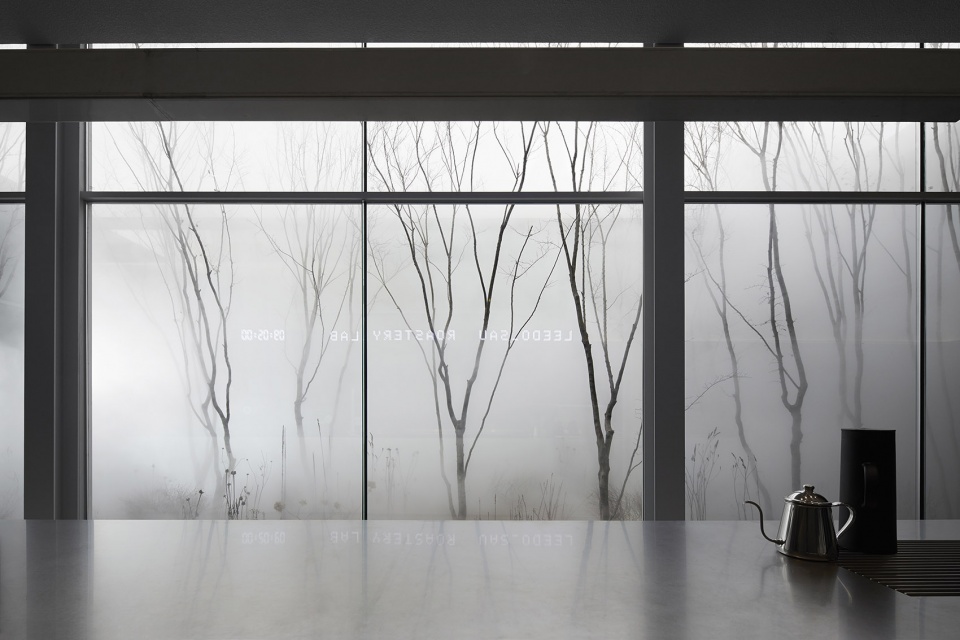
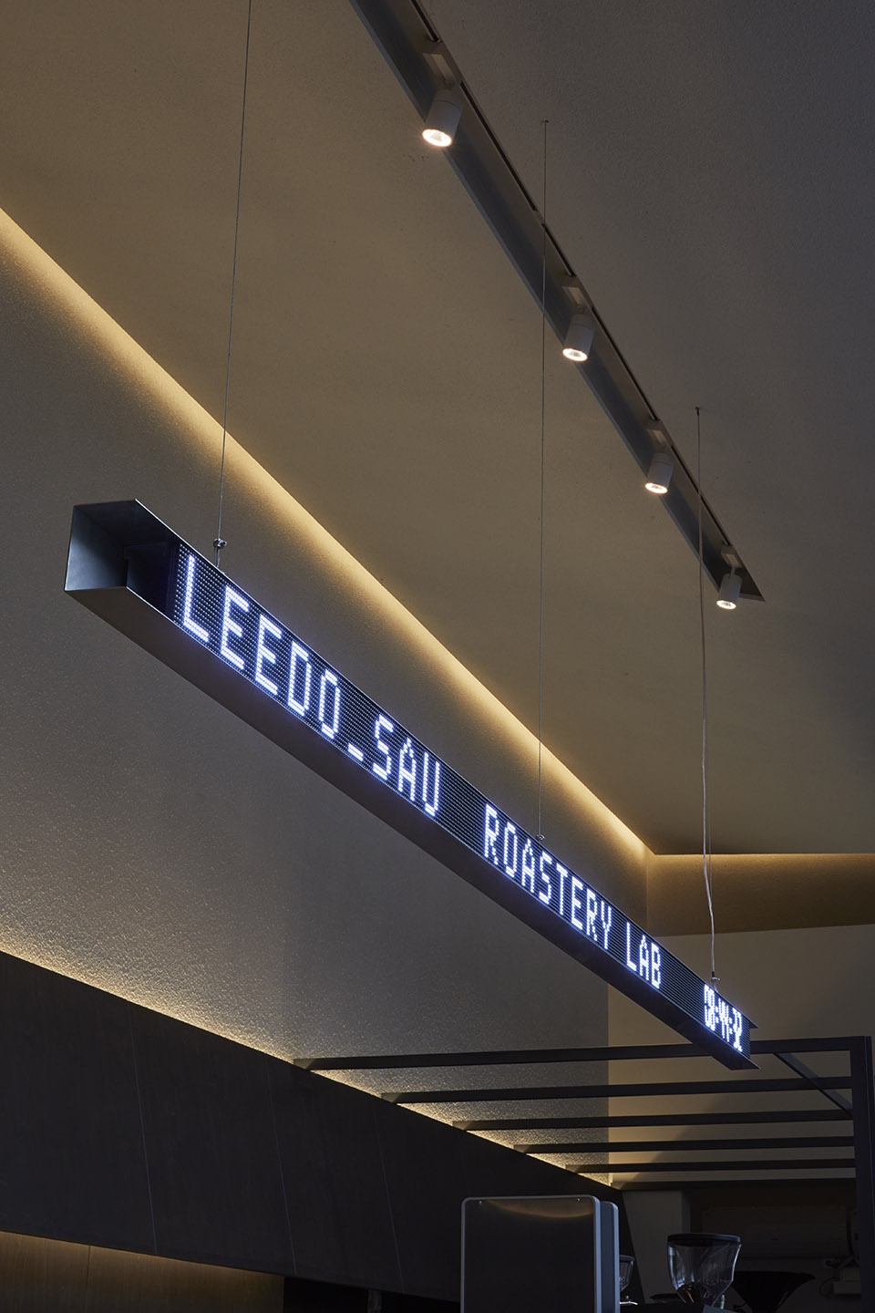
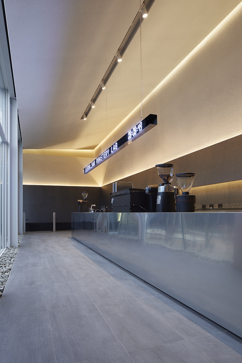
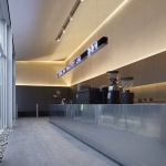
庭院对面的LED屏幕帮助顾客找到咖啡吧的位置,右侧为一个时钟,告诉顾客现在的时间。项目展示了时间的流逝与生命的循环,这里的时间与外部世界同步。现代的LED屏幕与咖啡厅的环境形成鲜明对比,创造出迥异的空间感受。
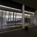
Across the courtyard, LED screen helps customers to locate the coffee bar but it also shows time with the clock on its right. This design portrays the flow of time and the cycle of life. It also shows that time flows the same as the outside world, but the modern LED screen gives clashing image with the atmosphere of the café creating disparate feelings.
▼玻璃上倒映LED屏幕,LED screen reflected on the glass ©박우진
▼吧台上方的LED屏,LED screen above the bar ©박우진
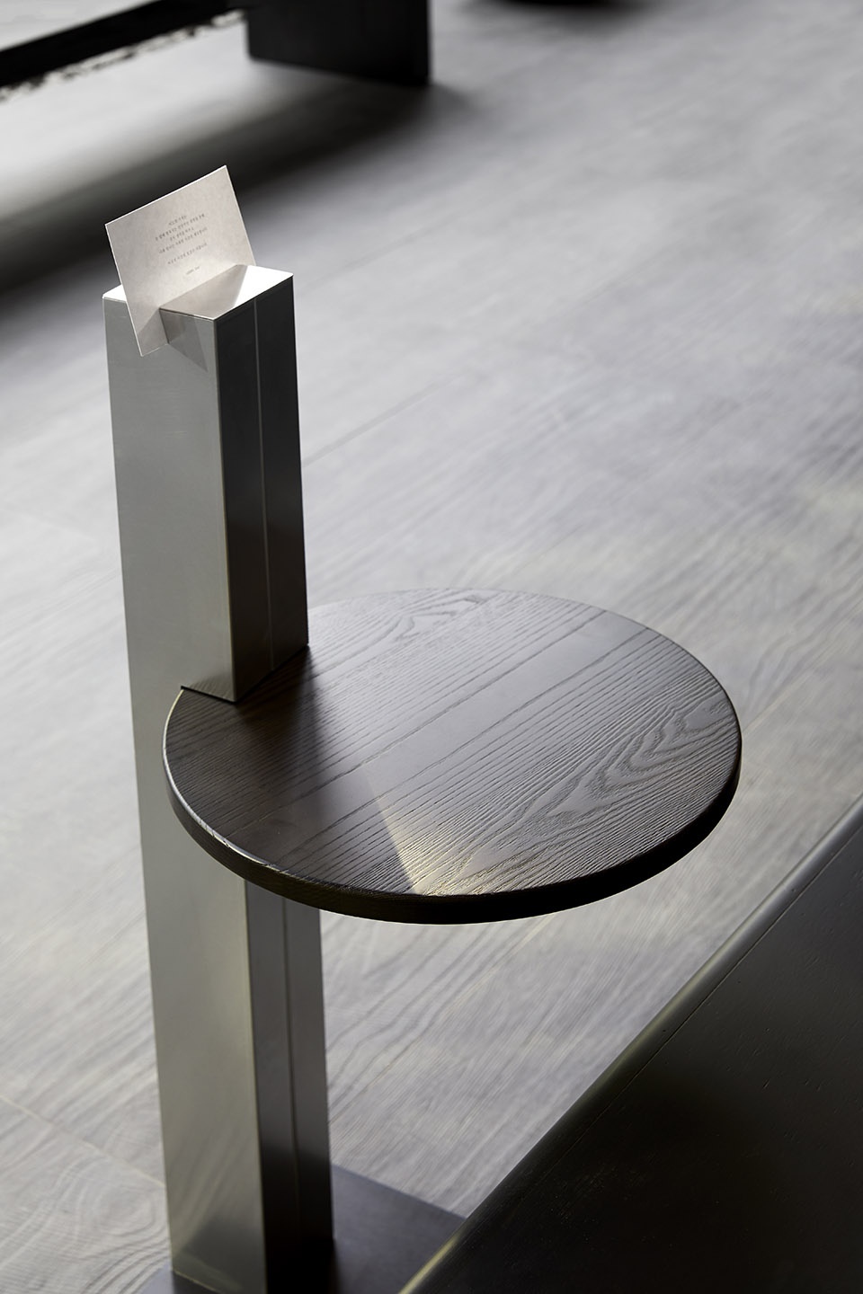
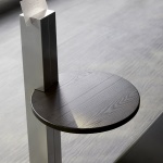
室内设计和材料也十分干净简洁。为了让设计统一,木制椅子被涂成了黑色,其间放置了颜色相近的石块。不设置电源插座也是设计的一部分,与其他方式共同提高顾客的集中力。
Interior design and the finishing material are also very much clean and simple. To add coherence to the design, we have colored the wooden chair black with ink and placed similar color of stones in between the benches. The absence of plugs for charging electronic devices is also part of the design to help customers concentrate more on themselves.
▼被涂成黑色的椅子,与设计氛围统一,chair painted black to add coherence to the design ©박우진
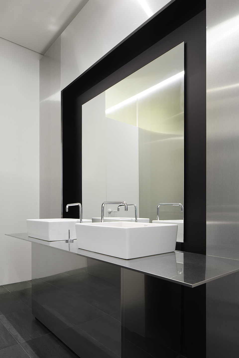
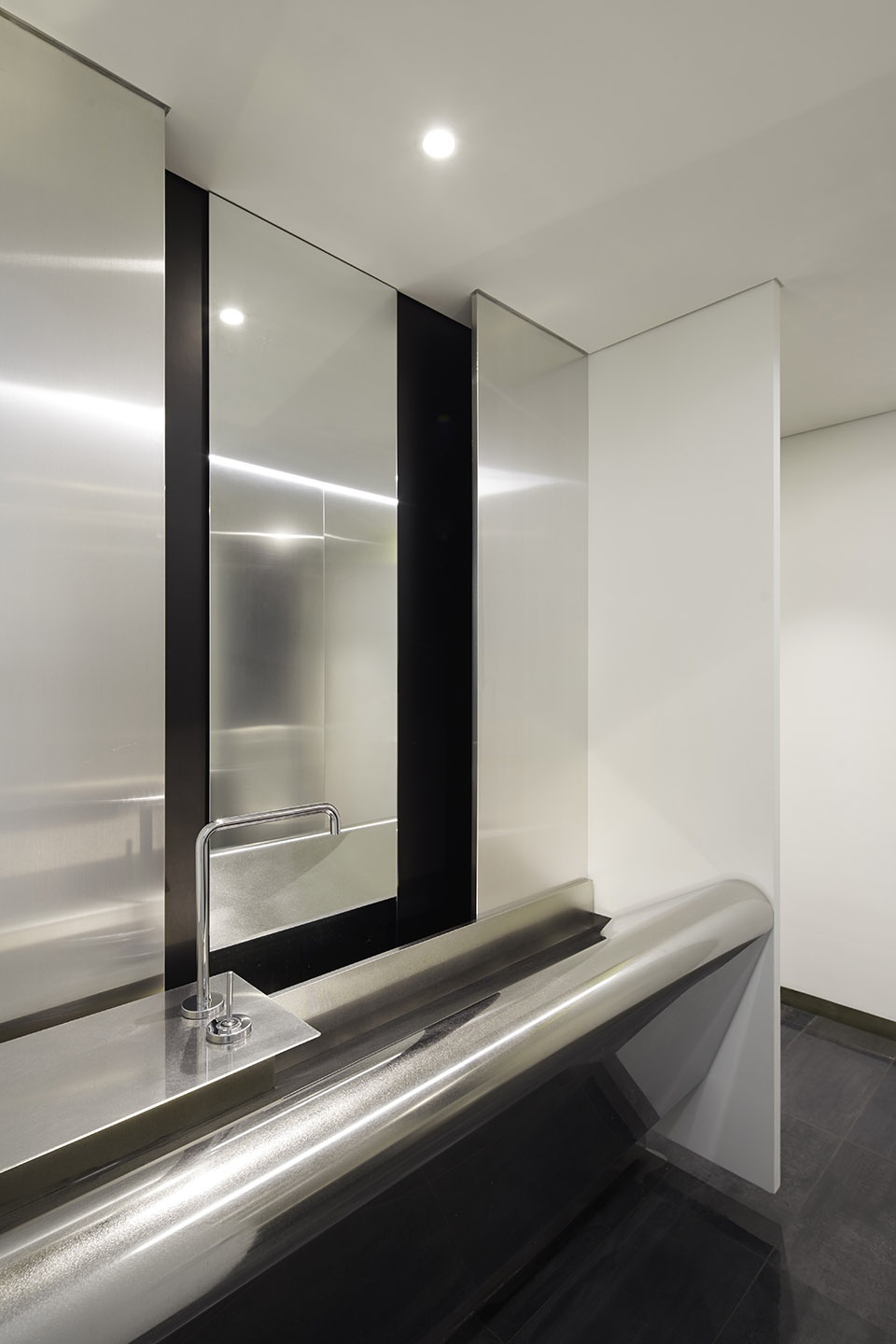
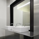
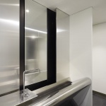
▼卫生间,toilet ©박우진
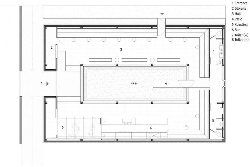
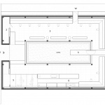
▼平面图,plan ©ATMOROUND
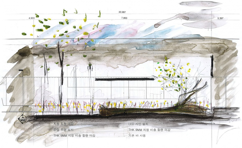
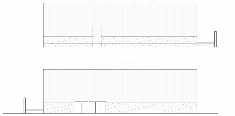
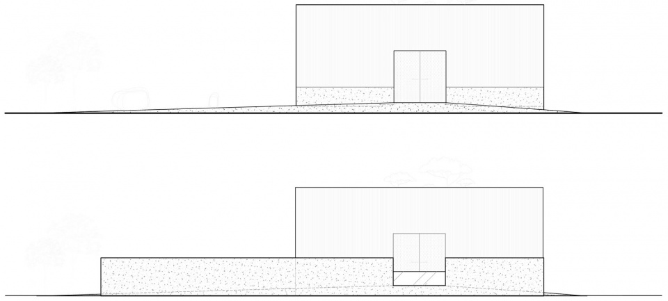
▼立面图,elevation ©ATMOROUND
Project name: LEEDO SAU
Architecture Firm: ATMOROUND
Website: https://atmoround.com/
Contact e-mail: info@atmoround.com
Architecture Firm Instagram: @atmoround_official
Completion Year: 2020
Gross Built Area: 296m2
Project location: 4-8, geumnammyeon hwang-yongli, Sejong Metropolitan Autonomous City, South Korea
Photographer’s Instagram: @vdpwj
Video credits: Park woo-jin
Video link: https://youtu.be/CuA25eMswbs
Lead Architects: ATMOROUND
Design Team: ATMOROUND
Clients: LEEDO coffee
Engineering: ATMOROUND
Landscape: Anmadang the lab ( www.anmadangthelab.com)
More: ATMOROUND,ATMOROUND on gooood
