gooood对一些机会和条件合适的项目推出深度报道,希望将项目更立体的表达展现。
今次gooood就SO – IL (SO – IL on gooood)作品: 加州大学戴维斯分校-曼内蒂舍然博物馆,九问SO – IL主持建筑师。
编辑团队:向玲,王耀华(特邀编辑),苏昕,陈曼颖(实习), 凌犀(实习) / Editors: Xiang Ling, Wang Yaohua(Guest Editor), Su Xin, Chen Manying (Editor Intern), Ling Xi (Editor Intern),
鸣谢:SO – IL / Special Thanks to SO-IL
摄影:Iwan Baan (版权归属SO–IL 和Bohlin Cywinski Jackson)/ Photograph by Iwan Baan, courtesy of SO–IL and Bohlin Cywinski Jackson
加州大学戴维斯分校 曼内蒂舍然博物馆 – 美国博物馆设计的新方向
SO – IL和Bohlin Cywinski Jackson为21世纪设计的艺术博物馆
THE MANETTI SHREM MUSEUM AT UC DAVIS – POINTS TO A NEW DIRECTION IN MUSEUM DESIGN IN U.S.
SO – IL and Bohlin Cywinski Jackson Design an Art Museum for the 21st Century
加州,戴维斯市(Davis, CA)—— 三年前,加州大学戴维斯分校(UC Davis)交付给SO – IL 事务所(位于纽约)和Bohlin Cywinski Jackson事务所(位于三番,西雅图和宾州)一个委托——设计一个既能吸引非传统的参观者,又能够适应时代不断更新的当代艺术博物馆。
在加州中央峡谷广袤的平原和连绵麦田之中的场地里,曼内蒂舍然艺术博物馆(Jan Shrem and Maria Manetti Shrem Museum of Art)工程目前已经接近完工。在马上要到来的11月13日开幕典礼上,游客将会看到一种全新的博物馆建筑——一个室内外结合,模糊了展示空间与教学空间传统界限,并进一步延伸了使用灵活性的博物馆。
Davis, CA – Three years ago the University of California, Davis, gave the architects SO – IL of New York City and Bohlin Cywinski Jackson of San Francisco, Seattle, and Pennsylvania the mandate to design a contemporary art museum that would engage nontraditional museum visitors and accommodate continual reinvention.
Construction is now nearing completion on the Jan Shrem and Maria Manetti Shrem Museum of Art, set amid expansive views of the flat plains and farmland of California’s Central Valley. At the Grand Opening on Nov. 13, visitors will encounter a new kind of museum architecture, one achieved by integrating outdoors and indoors, blurring the usual hierarchical relationship between exhibition and teaching spaces, and stressing flexibility.
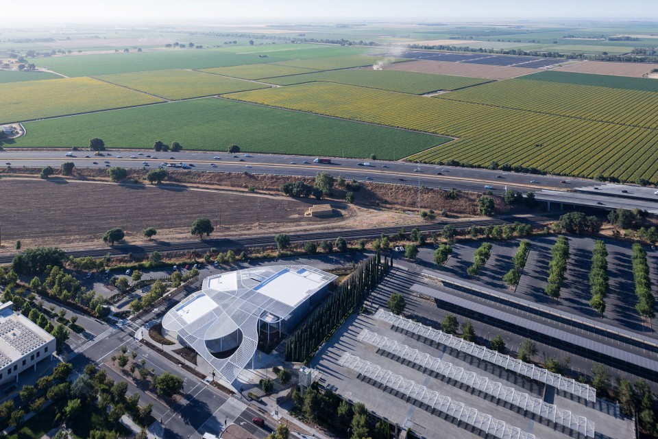
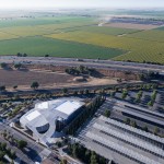
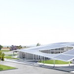
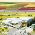
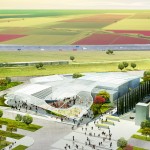
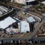
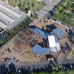
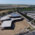
▽ 鸟瞰 Aerial View
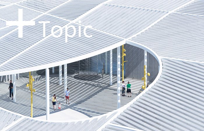
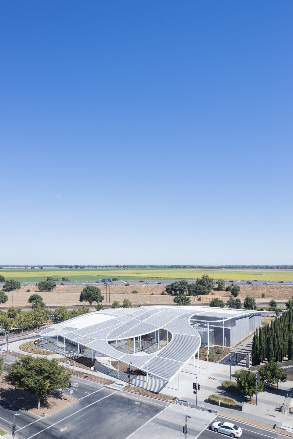
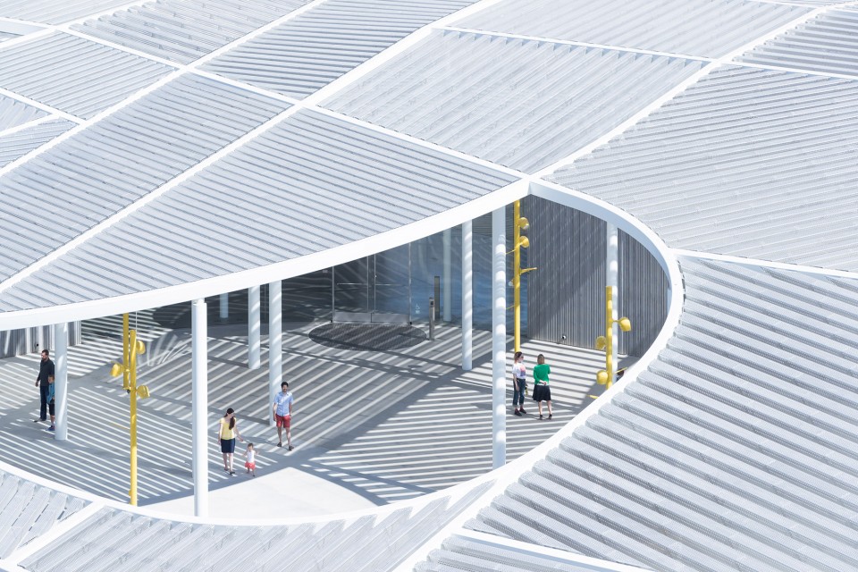
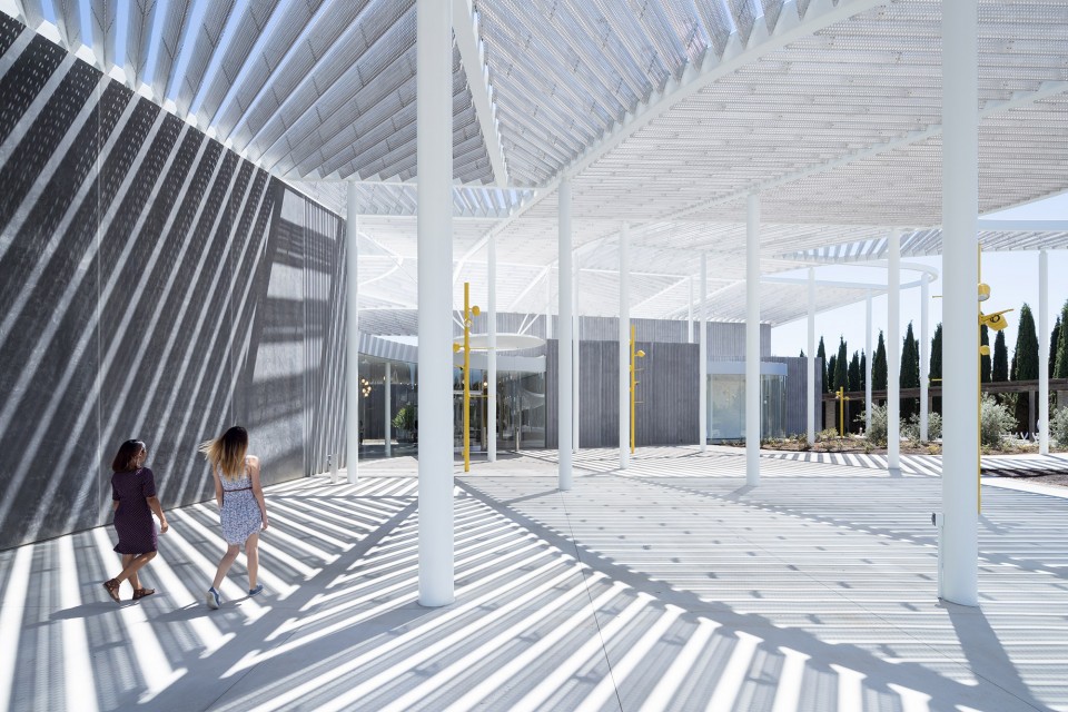
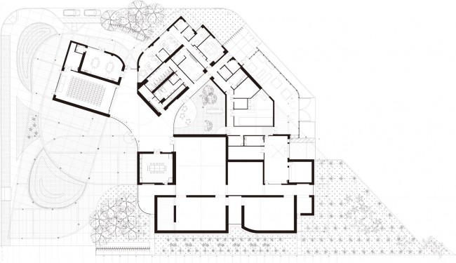
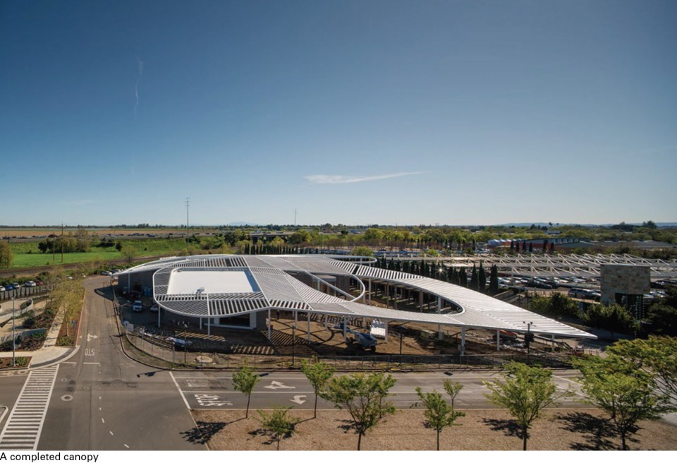
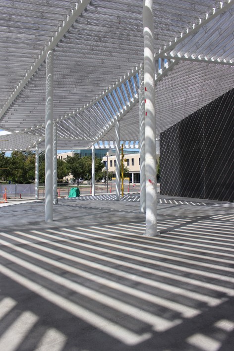
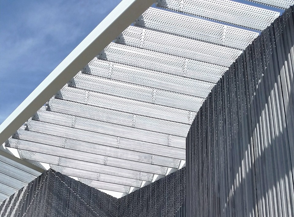
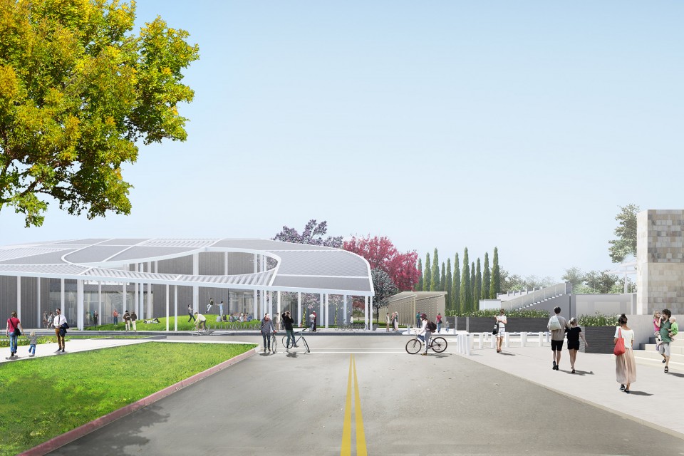
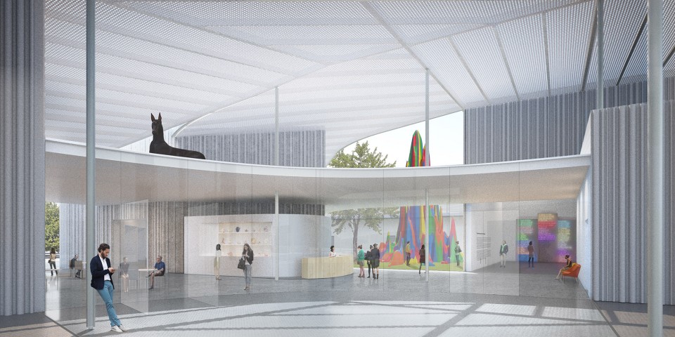
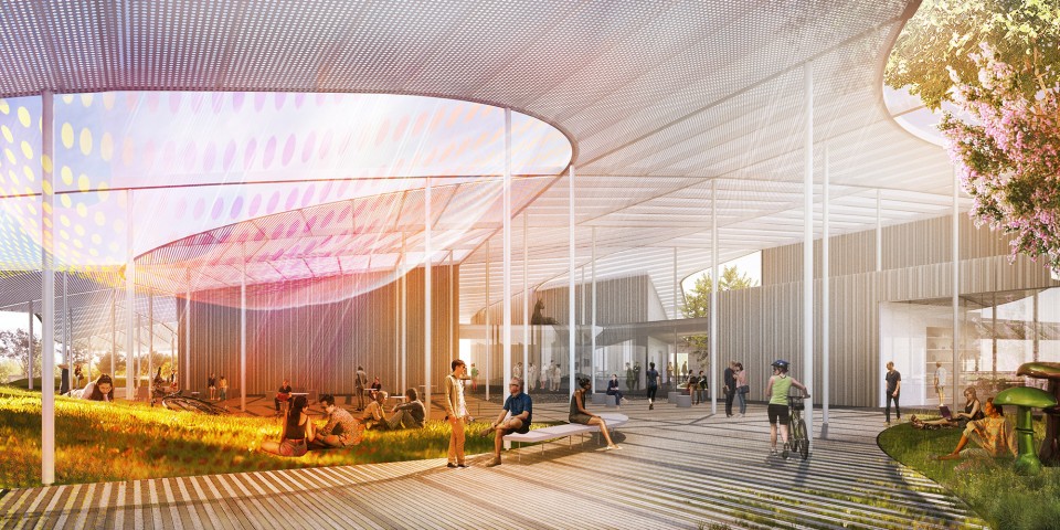
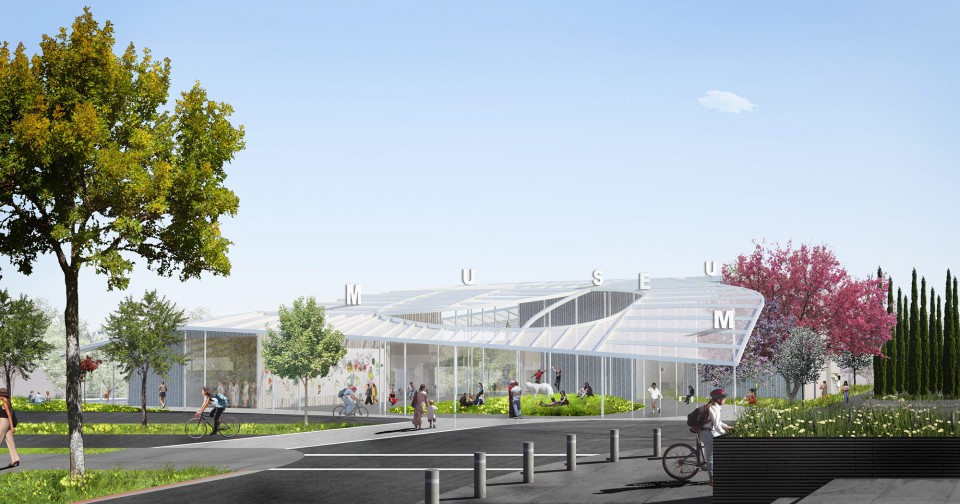
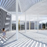
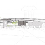
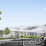
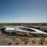
沿着八十号州际公路,人们可以清晰的看到本博物馆最显著的设计元素:一个被称作“大冠顶(the Grand Canopy)”的精细纹样屋顶扫过整个博物馆上方。“大冠顶”中的阵列穿孔三角梁下是一片连续的地面室内空间。该空间从入口广场开始,延伸至玻璃前厅,并继续连接到画廊,艺术创作空间和艺术展现空间。在流动的室内空间中心,一个内庭打开屋顶并面向天空。在本博物馆中,有超过3300平方米的面积是完全向公众开放的。
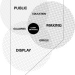
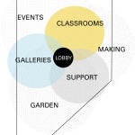
A sweeping, intricately patterned roof cover dubbed the Grand Canopy, the museum’s design signature, is visible along Interstate 80. Its perforated triangular beams top a continuous ground level interior that begins in the entry plaza and continues into a glass lobby that connects three pavilions, for galleries, art making and operations. Within the fluid interior, a central courtyard opens up to the sky. More than 35,000 square feet are available for public access.
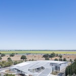
▽ 西北向鸟瞰 Aerial view from the Northwest
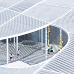
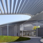
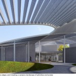
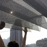
▽ 透过大冠顶的环向内看View through the canopy’s oculus
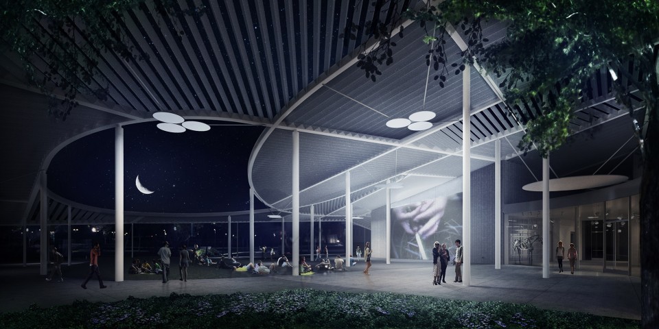
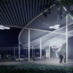
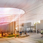
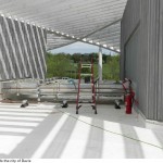
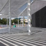
▽ 大冠顶下活动广场 Events Plaza, under the Grand Canopy
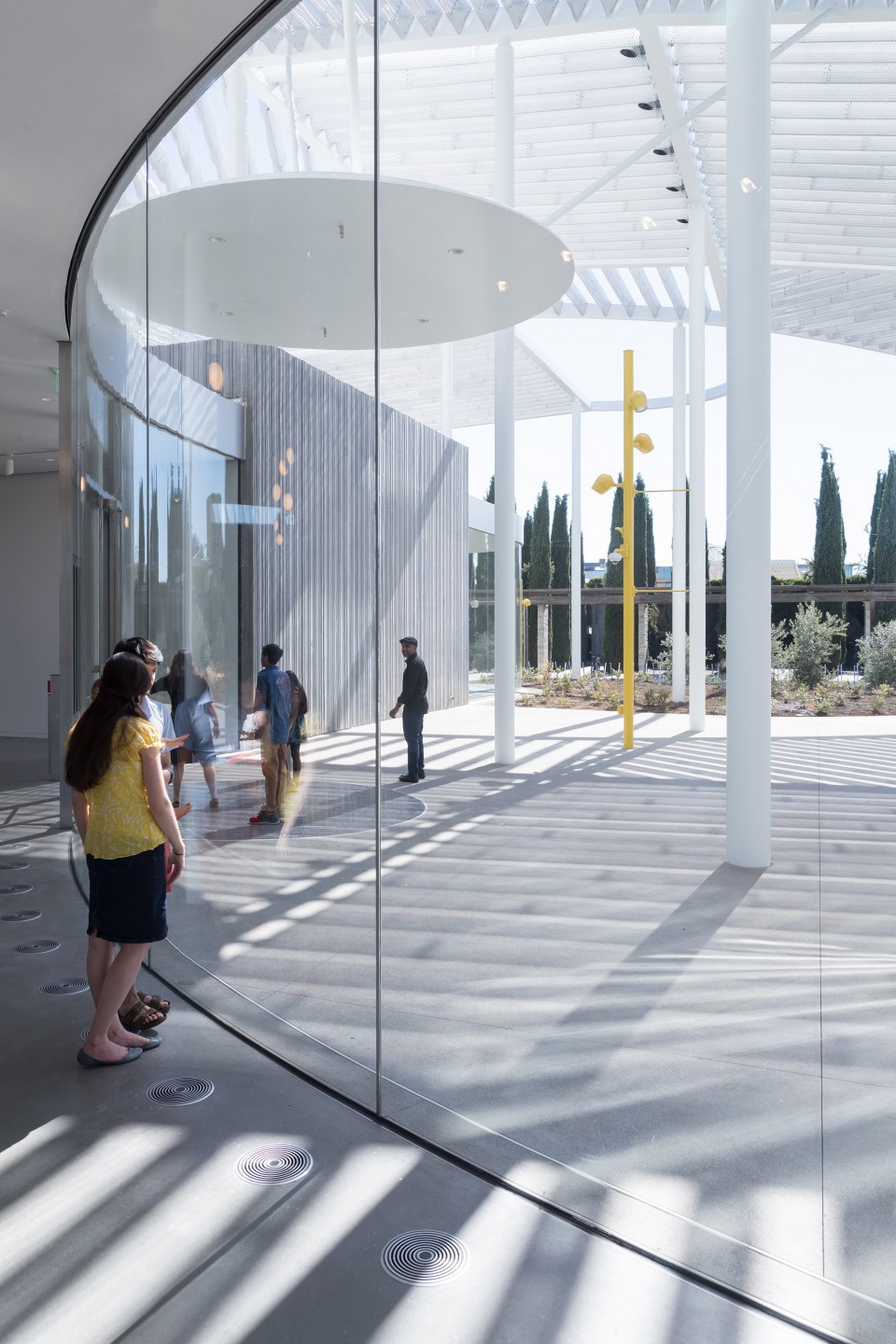
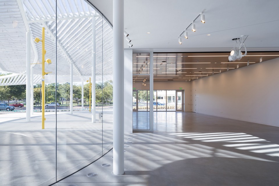
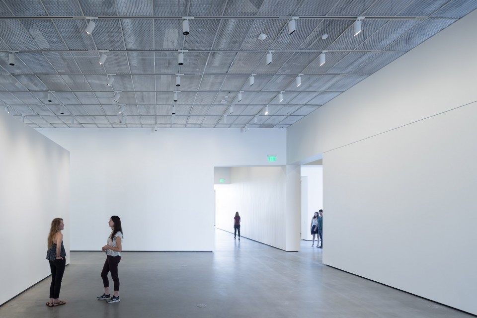
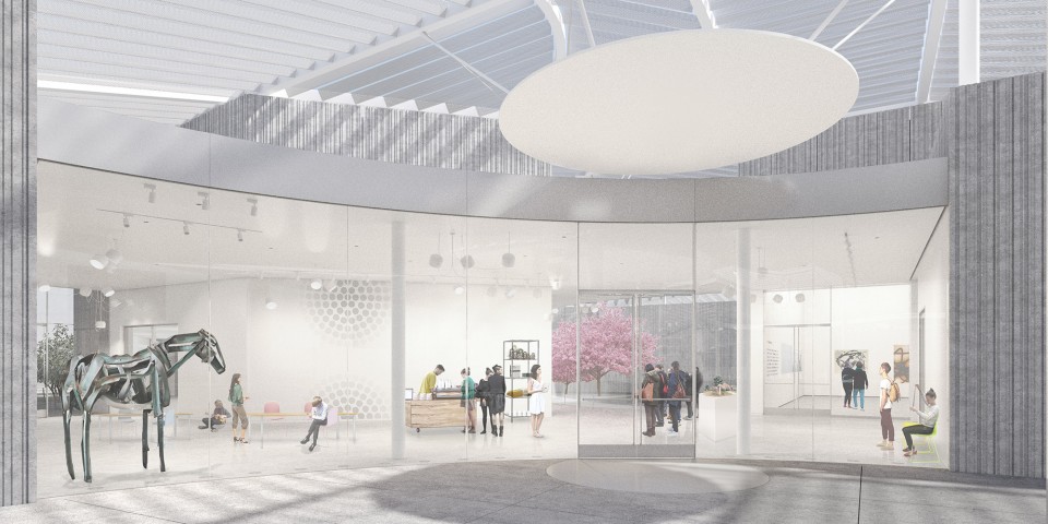
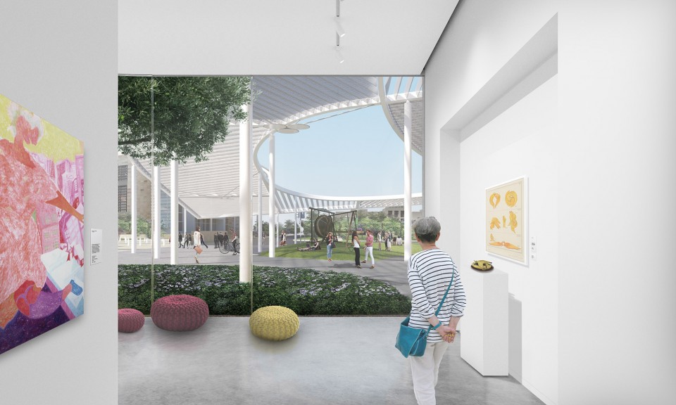
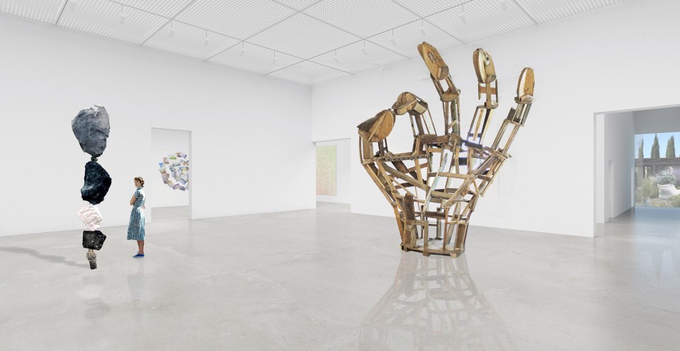
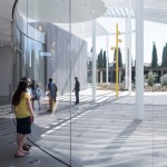
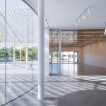
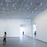
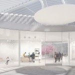
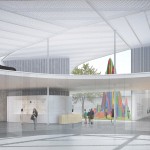
整个博物馆的开放性和渗透性在大小不同尺度都得到表达:策略性的空间朝向,清澈连续的玻璃曲墙和屋顶穿孔铝材的材料质感。按下按钮打开一道玻璃门,开放的玻璃前厅立即延伸进室内。主要画廊的5.2米高金属网天花,把人们的视线引向其上方高达9.2米的尖顶,并暗示着画廊天花和屋顶之间的机电空间。
The qualities of openness and porosity are expressed in ways large and small, from the materiality of the perforated aluminum canopy to the strategic orientation and insertion of smooth, clear, curved glass walls. The open lobby contracts or extends with the push of a button controlling a glass garage door, while a metal-mesh, 17-foot ceiling in the primary gallery reveals allows visitors to sense the pitch of the canopy at 30 feet, giving a hint of the space between gallery ceiling and roof filled with duct work, wiring and other back-of-house requirements.
▽ 从大厅看活动广场 Lobby viewing into the Events Plaza
“为了测试一个面向当代艺术的博物馆的潜在可能性,建筑师提供给我们一整套新工具,”瑞秋缇格(曼内蒂舍然博物馆的创始总监)说,“我们的画廊可以在非常精确的范围内进行调整;室外墙面可以转化成荧幕;包含全天候学习隔间和免费无线网络的公共空间;以及可以适配各种大学课程(不仅仅是艺术)的教室。”
加州大学戴维斯分校建立曼内蒂舍然博物馆,是为了给学校多样化的人群提供一个“中央论坛”:超过三分之一的本科生是他们家族中进入大学的第一人。并且,加州大学作为一个从六十年代起培养了一代有影响力的艺术家(包括韦恩·蒂埃博,罗伯特·阿内森,布鲁斯·瑙曼,威廉T.威利,曼努埃尔·内里,罗伊德福雷斯特和鲁斯·霍斯廷)的平台,曼内蒂舍然博物馆将根据其独特的资源对当代艺术概念进行探索。
“Our architects have given us a toolbox for testing new ways of using a museum devoted to contemporary art,” says Rachel Teagle, founding director, Manetti Shrem Museum. “We have galleries that can turn on a dime; outdoor walls that transform into screens; public spaces with 24/7 study units and free Wi-Fi access; and rooms in which to hold university courses on all kinds of subjects, not just art.”
UC Davis established the Manetti Shrem Museum to provide this kind of central forum for its diverse population: more than a third of the undergraduate body are the first in their family to attend college. The Manetti Shrem Museum will also explore contemporary art and ideas from the perspective of serving as a unique repository of works of art created by a generation of influential artists who worked and studied at UC Davis beginning in the early ‘60s. These ‘UC Davis’ artists include Wayne Thiebaud, Robert Arneson, Bruce Nauman, William T. Wiley, Manuel Neri, Roy De Forest and Ruth Horsting.
▽ 从大厅看社区教育中心 Lobby viewing into the Community Education
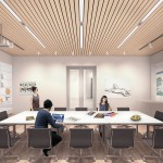
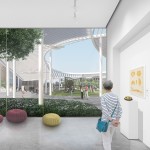
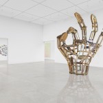
▽ 室内展厅 Gallery interior
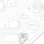
坐落于加州大学戴维斯分校主干道,老戴维斯路,博物馆是一个显著的校园门户。博物馆一侧面向罗伯特玛格丽特表演艺术中心(Robert and Margrit Mondavi Center for the Performing Arts),另一侧面向西方吸引校园停车区的人流。
总预算3000万美元的曼内蒂舍然博物馆,是美国第一个基于“设计-建造(design-build)”模式实现的主要艺术博物馆。Whiting-Turner Company, Folsom是该博物馆的施工团队。
Located on a main UC Davis thoroughfare, Old Davis Road, the museum is a visible portal onto the campus. To the front it faces the Robert and Margrit Mondavi Center for the Performing Arts and to the west it catches those flowing to and from campus parking.
Designed and built for $30 million, the Manetti Shrem Museum is the first major art museum in the U.S. realized on a design-build basis. The Whiting-Turner Company, Folsom, is the contractor.
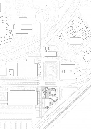
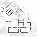
▽ 总平面和地面层平面 Site Plan & G F Plan
访 谈
Interview
1.
这个项目从最初的中标概念,到最后的建成结果,几乎一模一样,这种概念的高完成度你们是怎么样达成的,设计和建造的过程中是否有过修改或者说妥协?
This project is almost the same from the beginning of the competition to the final completion. How do you achieve this high consistency through the whole process? Is there any modification or compromise during the design/construction process?
整个项目过程当然有不同位置不同程度的改动。竞赛阶段是在三个月内完成的,显然没有人能在这么局限的一段时间内解决建筑中各个方面的问题。我们主要的设计标志是“大冠顶”。由于“设计-建造”模式的特殊性,我们需要对每一个设计元素进行准确报价,在竞赛阶段我们采用的是直截了当的梁加上盖板的方案。然而,在接下来的发展阶段我们进一步优化了“大冠顶”——我们对主要曲梁进行合理化后减少了双曲梁的数量,并且对次梁采用三角穿孔铝板的处理。这个举动让我们更好地控制了主要视线方向上大冠顶的展示效果,获得更好的结构经济性,并且让光通过较深的整体结构面(而不是简单的盖板)而获得更细微和多变的光影效果。但是,你说的也是对的,这个项目的建成结果和中标时的概念一直保持高度的一致。我们所有的项目能达到如此的效果,是因为我们的设计意图通常是空间上和组织上的,并且我们通常对项目的“感受效果(experiential)”有着连贯一致的追求。这些项目通过对功能、类型学以及文化特殊性的细致考虑而推敲成型。所以在初步设计阶段就相对简单,我们可以顺利的把建筑实体和细节组合起来或者使用一些创新的方式去满足我们的追求。因此,只要我们知道这个项目想做什么和能做什么(例如预算的限制),项目的设计会自然而然的发展出来。
There were design changes here and there of course. The competition was done in 3 months, you cannot possibly resolve every aspect of the building within such a limited period of time. One major design development was the canopy. In the competition stage, because we needed to put a precise cost to everything owning it being a design-build process, we drew a straightforward beam and cladding scheme. However, during the subsequent development stage, we improved it by rationalize the geometry of the primary curved beams thus reducing the number of double curved beams and made the secondary beams with folded perforated aluminum panels of triangular cross-section. This enabled us to control better the presence of the canopy from prominent views around the site, make the structural elements more economical and achieve a more varied and nuanced shadow play under the canopy without the cladding but through a deeper structural layer. But you are right, the realization of the project stayed true to the original architectural intentions. All of our projects do so because our intentions are usually spatial and organizational, and we have usually a singular desire for the experiential. And they come out of the careful studies of the programmatic, typological and cultural specificities of the project. So the efforts in the design development stage are simply gathering architectural matters and details or inventing new ones to fulfill these desires. So if we know what the project wants to do and what it can do (economically speaking for example), it will do so naturally.
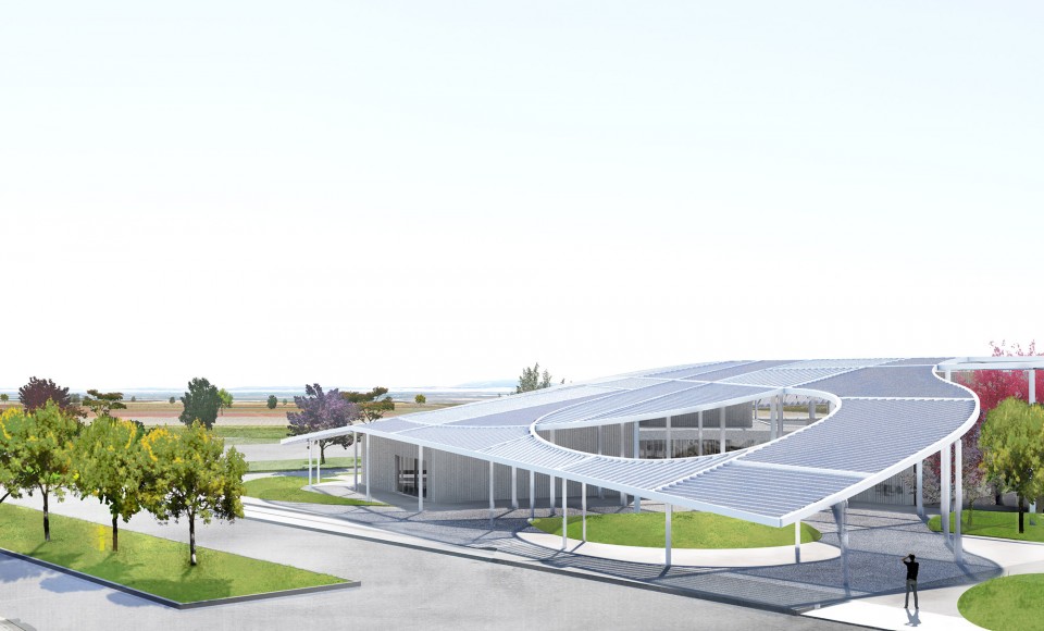
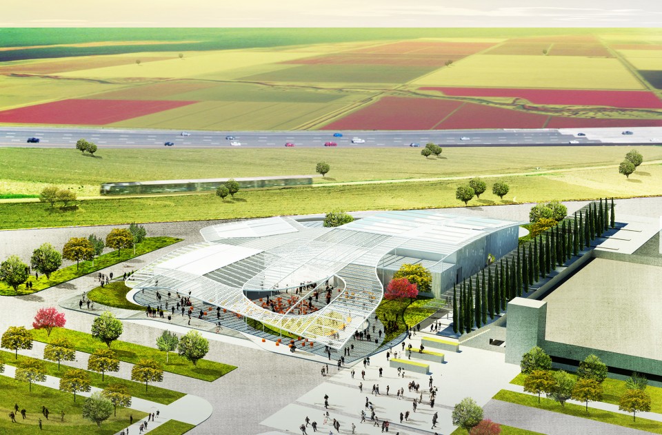
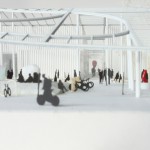
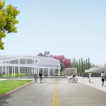
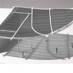
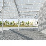
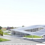
▽ 竞赛时的效果图 rendering for competition
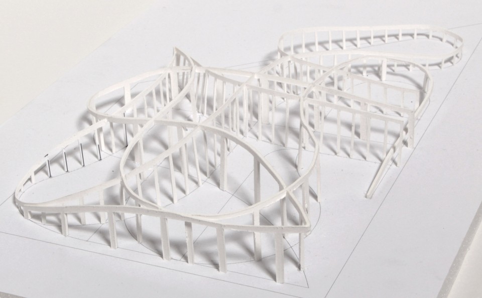
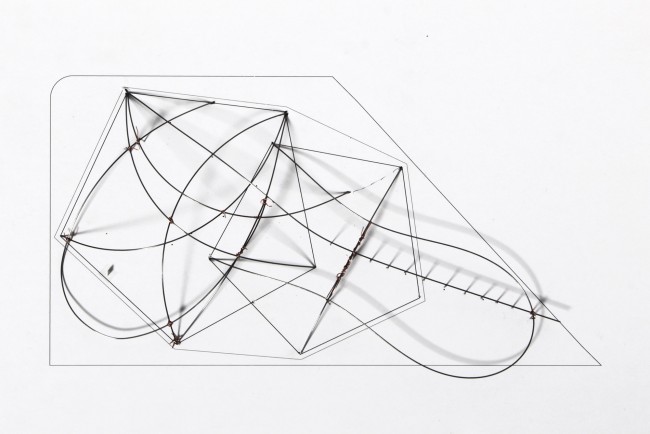
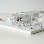
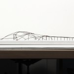
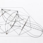
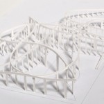
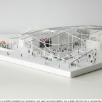
▽ 概念结构 concept model
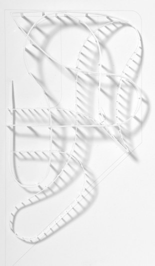
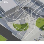
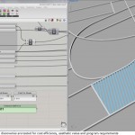
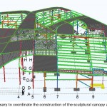
▽ 大冠顶深化过程 design process of the canopy
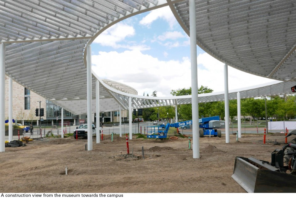
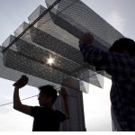
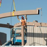
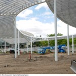
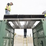
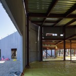
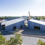
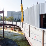
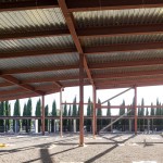
▽ 建造过程 construction phase
▽ 结构完工。极高的完成度。finished structure with high consistency
2.
项目介绍中提到了这个项目是美国第一个基于“设计-建造”模式实现的美术馆,通常“设计-建造”这种模式存在于小尺度的项目中(比如建筑装置,室内项目,家具等等),建筑师不光需要负责设计,同时还要亲自把设计建造出来。那么这种“设计-建造”模式运用在这样一个大尺度的建筑项目中,它意味着什么,是怎么样运作的?同时这种模式对你们的设计方式有何影响?
As mentioned in the project introduction, this project is the first major art project under “design-build” model in US. Usually, this model is used in small scale projects, such as installation, interior or furniture design, because this model requires Architects not only design but also realize the design. Then, what was it like using “design – build” model in this large scale project? How did it work? What had this model impacted on your design?
在这里有若干影响因素。没错,“设计-建造”模式在大型尺度项目中并不常见,而在文化项目中就更为少见。这是因为该模式强调预算控制先于质量控制。我们十分幸运,因为我们团队的施工方易于合作并且他们理解项目质量的重要性。并且,由于我们把“大冠顶”和玻璃幕墙等元素作为“设计-建造”模式的子项目而合并到整个项目中,我们因此而获得了更好的项目控制力。近些年我们常常听到由于施工造价超出预期而让客户们紧张,不得不选择“设计-建造”模式的故事。但是我相信如果建筑师理解设计和建造的花费,并且愿意参与到制造和完工的全过程而不仅仅是设计,最终一个开放的招标过程会获得一个更好的结果。
There are several elements at play here. It is true that a design-build process is not usual in large scale projects and even less for cultural projects. This is because the process is there to prioritize cost control over quality control. We were fortunate because the contractor of our team was collaborative and understood the importance of delivering quality and because we were able to embed the delivery of a few important elements such as the canopy and the glazing as mini design-build project by ourselves thus having a better control over them. We hear often stories of construction cost going through the roof these days and that makes a lot of clients nervous and opting for the design-build route. But I believe if the architect understands costs of things and construction, and is willing to work with the process of making and delivering not only designing, ultimately an open tendering process will yield to better results.
3.
项目中一个很重要的元素是被你们称为“大冠顶”的连续屋顶,它的纹理与基地远处的农田有种形式上的呼应,同时在你们的概念模型中,你们也多次把这个屋顶比喻为“lone hill”,把屋顶下的空间比喻为“valley”。在你们的设计过程中,“比喻”手法起到何种作用?你们是如何协调“抽象”与“具象”的?
One import element in this project is the “Grand Canopy” which corresponds the pattern and forms of the surrounding farmland. And in your concept models, you referred the canopy to “lone hill” and the space underneath to “valley”. During your design process, how did the process of “refer to” work? How do you deal with the “abstract” and the “actual”?
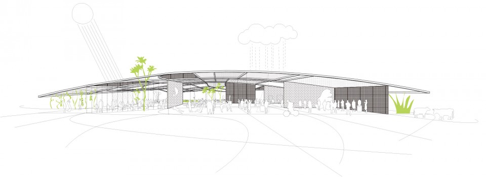
我们相信在当代建筑中是有一个位置留给隐喻(metaphor)和象征(symbolism)的。如果它们能和形式逻辑以及建筑建构结合起来,那么这个包含隐喻和象征的空间将会有无与伦比的力量。在这个项目中,“大冠顶”不仅仅是一个隐喻,它更是一个“机器(device)”:一个在场地内制造光荫的机器(在如此严苛的环境下,这点尤为重要),更是一个让封闭功能们在“大冠顶”下松散的交织在一起,并最终形成一个流畅的空间图解(spatial diagram)的组织机器。同时,功能上和组织上的感受并没因为使用功能(operative)的需求而受到限制。这些建筑“机器”和“媒介(medium)”们可以如胶合般结合成一个相似的,或者说有时看起来有一点奇怪但又内部自洽的客体(object)。这个客体将超越使用功能而展现出它的“灵晕(aura)”。这使得建筑可以连接到其场所的文化及自然的潜流(undercurrent)中。
We believe there is space for metaphor and symbolism in contemporary architecture. They can be incredibly powerful if they are synthesized with the formal logic and the tectonics of the building. In this project, the canopy is not only a metaphor but also a device for creating shade on site which is essential in such a harsh environment and an organizing device allowing enclosed programs to be loosely nested underneath resulting in a fluid spatial diagram. At the same time, the experience of the functional and the organizational doesn’t have to be limited to the operative. These architectural devices and mediums can gel into a familiar or sometimes a little bit strange but still coherent object that emits a certain aura that goes beyond the operative. It allows the architecture to connect to the cultural and the natural undercurrents of the place.
▽ 竞赛时的效果图 rendering for competition
▽ 大冠顶概念图 canopy concept drawings
4.
我注意到“包裹”“覆盖”这样的语言出现在你们不少项目中,比如Kukje Art Gallery和Blueprint at Storefront项目。在这个项目中, 可以理解“大冠顶”包裹或覆盖了建筑的体量与功能。请问你们是如何看待这种“包裹”“覆盖”的化零为整设计手法的?
I noticed that “warping” and “canopy” are two architectural language that frequently used in you designs like Kukje Art Gallery and Blueprint at Storefront. In this project, the “Grand Canopy” covers the massing and programs of the museum. How do you think of the “warping” or “canopy” language in your projects?
是的,无论项目的尺度如何,我们一直都追求一个能够阐述建筑边界和内部一致组织概念的建筑语言。在这样的处理下,“包裹”、“覆盖”或有时“铺盖(carpet)”可以有效的“搜集(collect)”各个部分达成统一,同时让各个部分仍然保持流动和开放的状态,以供多角度的理解和使用。
Yes, no matter what the scale of the project is we always strive for a singular expression that delineates a specific edge condition of the architecture and a coherent organizational idea. In doing so, the “wrap”, “canopy” or sometimes “carpet” can be effective as a tool to “collect” the parts into the whole while letting them remain fluid and open for multiple interpretation and usage.
.
.
5.
大冠顶对于空间界定是温和及模糊的,冠顶下的光影细腻而斑驳,我认为富有东方意境。请问过去在东方的工作经历如何影响了你们的设计?
The spaces are defined by the pattern of the grand canopy loosely, and the effect of light and shadow is very subtle, which I think is very similar to some oriental atmosphere. Did your past experience in eastern country affect on your design?
当然我们一方面对形式以及建筑逻辑感兴趣,我们另一方面同时也对氛围(atmospheric)和文脉(contextual)非常关注。这些包裹的空间变成了两方面相遇、调和、合成的产物。不是作为一个明确的界限,大冠顶作为一个充满自己特征和既有空间逻辑的不羁形体,意外地出现在场地里——被新建筑预期(anticipate),滤过(filter)并调和(mediate)在一起。我想你可以称之为“东方意境”。
While we are definitely interested in the formal and the logical of the architectural, we are also very much in love with the atmospheric and the contextual. These envelopes become the place where the two meet, negotiate and synthesize. So rather than an absolute edge, a uncompromising form abruptly arriving in a place with its own particularities and existing spatial logic, the new architecture anticipates, filters and mediates. I guess you can call that “eastern”.
.
.
6.
我注意到你们的大多数作品都是白色的,这个项目也不例外,为什么喜爱使用白色呢?
I noticed that most of your projects are white, as well as this one. Why do you favor white color?
色彩是困难的。它有它自己的规则,并且需要很多的知识才能运用色彩得当。如果运用不当,空间、材料和光的感受将会被都带走。即是是白色,它仍然有着无数种灰调,我们一直非常仔细的判断哪一种是正确的。
Color is difficult. It’s its own discipline. It requires a lot of knowledge to do it right. If not done right, it takes away from the experience of space, materiality and light. Even with white, there are infinite shades, and we are always very careful choosing the right one.
.
.
7.
大冠顶仅有40根钢柱支撑,请问是如何确定柱子的数量,为什么没有选择更多或者更少数量的柱子支撑?
The grand canopy is supported by 40 steel columns. How do you make the decision of the quantity of columns?
大冠顶的纹路是从场地条件和建筑的空间组织中生成的。而这些柱子亦是该纹路的结果。当然这些柱子是在和工程理性和设计形态见不断讨论中确定的。最终的结果是一个经济的结构和优美并功能性的形态之间的一个平衡。
The pattern of the canopy are delineated from the site conditions and spatial organization of the building. The columns are the result of such pattern. Of course it’s a constant back and forth between engineering rationale and formal design. The final version is a balance between efficient geometry and beautiful/functional form.
▽ 最初的结构概念模型 draft model
▽ 结构深化过程 developing process of the structure
8.
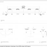
屋面使用到的立体三角穿孔哑光铝梁是被如何确定的,同时其穿孔密度,生产企业(远在中国)又是被如何确定的呢?
How did you make the decision about the triangular aluminum beams and its density of holes? And how did you decide to use the manufacturer in China?
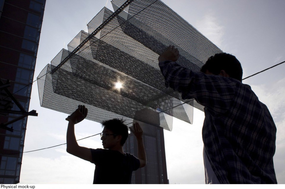
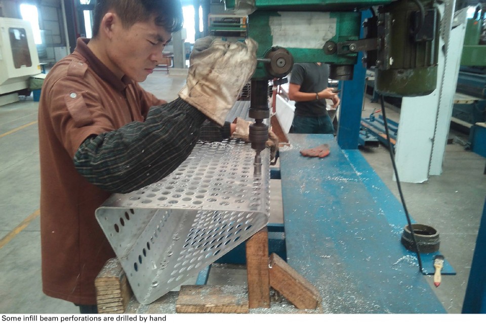
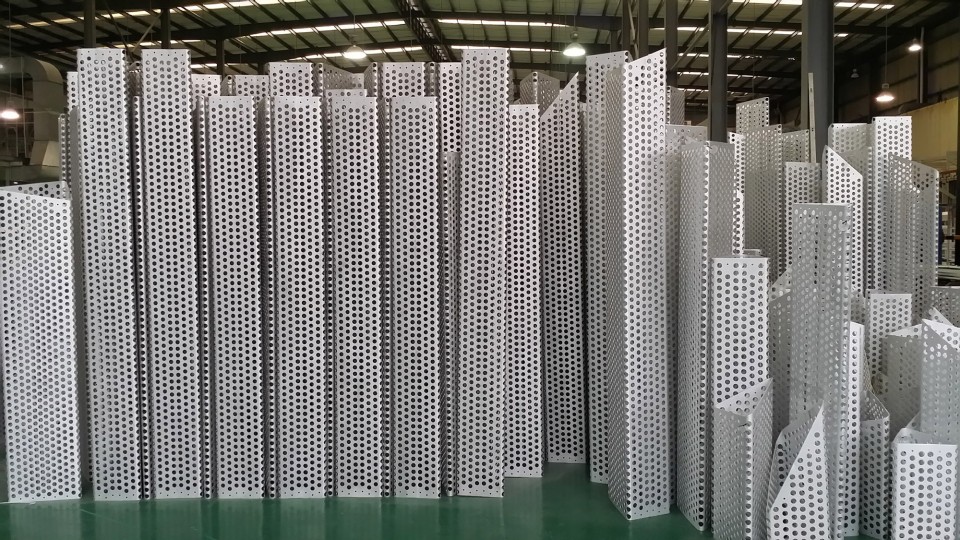
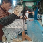
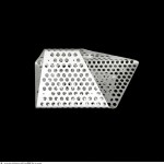
在最开始的竞赛方案中,我们仅对由交叉梁托起的平面穿孔板材进行提案报价。在这样的系统中是非常容易确定数量的。但是我们知道,为了获得一个更三维的光荫,我们需要加深“滤光层(filtering layer)”。这引导我们去探索一个几何形态剖面的梁。通过制作穿孔铝板的三角截面梁,我们一举两得。这是一个非常令人愉悦的结果——既解决问题又保证美观。我们常常和中国的生产商合作。他们的能力越来越强并且非常愿意投入新的实验并且客制产品。开始的时候我们对总体承包商怀着怀疑的态度,但是最终我们对国内生产商完成的结果出乎意料的满意。
In the original competition scheme, we priced only flat perforated panels supported by steel cross beams. It’s easy to quantify such system. But we knew that in order to achieve a more three dimensional shadow pattern, we needed to deepen the filtering layer. This led us to explore a geometric beam section. Triangle became the obvious choice because of its geometric efficiency and easy fabrication potential. By making the triangular beams with perforated aluminum panels, we killed two birds with one stone. It was delightful. Good solutions are beautiful too. We often work with Chinese fabricators. They are getting more capable and some are very willing to experiment and work with customized processes. The general contractor was suspicious in the beginning, but was happily surprised with the quality the Chinese fabricator was able to deliver.
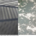
▽更三维的光荫的1:1草模 1:1 model for a more three dimensional shadow pattern
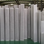
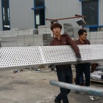
▽在中国工厂进行制作三角截面梁 triangular beams manufacturing in Chinese factory
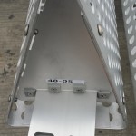
▽非标准化三角截面梁 non-standardized triangular beams
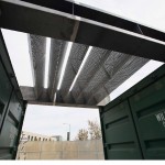
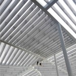
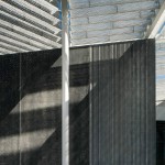
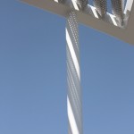
▽安装后效果,成功获得了更三维的光荫 three dimensional shadow pattern in the actual building
9.
建筑外立面上为什么会采用两种不同的混凝土肌理,又是如何决定其具体位置的呢?
You used two concrete of different textures on the facade, why is that? And how did you decide the location for the two different textures?
由于这个项目有限的预算,在外立面混凝土的设计上,我们与一个通常做基建工程的生产商合作。所以相较于取得一个“完美”饰面的混凝土,我们知道体现混凝土材质和“粗糙感”会是一个更好的选择。混凝土模具的花纹非常简单——不同间隔尺寸的条带。但是将它们以不同方式组合在一起的时候,它们出现了重复的效果。当光从大冠顶中穿过并洒在混凝土表面的时候,它将产生无限多元的纹理——这也是我们的目标。我们希望建筑变成自然元素舞台的背景,并成为在此处发生的人类活动的背景。
Because of the limited budget for the project, for the exterior concrete, we worked with a producer who typically make infrastructural elements. So instead of aiming for the “perfect” concrete, we knew that leveraging the textures and “roughness” would be a better direction. The pattern of the form-work is actually quite simple – stripes with varying spacing. But by putting them together in different combinations, it ceases to be repetitious. When the light filters through the canopy and falls onto these concrete surfaces, they create infinitely various patterns, which is our aim. We wanted the architecture to be the background for the play of natural elements and that becomes the background of the human activities that takes place here.
关于该项目的更多信息:
MORE INFORMATION FROM THE ARCHITECT:
大冠顶
Grand Canopy
大冠顶的表现力掩盖了其巧妙的功能 ︰ 它调整光线、 提供荫凉,创建一个迷你的种植环境并提供各种非正式的公众集会空间。
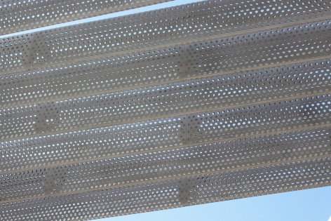
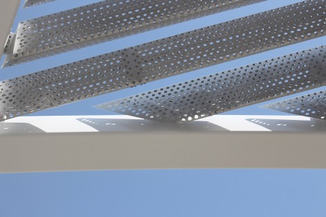
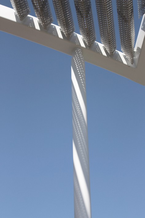
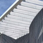
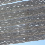
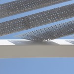
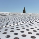
冠顶由952个三角穿孔亚光铝梁组成。阵列的梁融合进一个精细的纹样完型,并和中心峡谷错落有致的纹理和地形相呼应。梁阵中80%以上的梁有着不同的长度,而且在整个冠顶中几乎没有一处是重复的纹理。总长4400米的线性三角梁阵由仅仅40钢柱稳稳的撑起。
为了打开中心广场,并且创造一个沿着冠顶边缘悬挑的空间,尽可能多的钢柱被向内倾斜。而博物馆入口的立面由两部分组成:弯曲的钢化玻璃和线性非重复的垂直肋型预制混凝土墙。
沿着80号州际公路,大冠顶的背面逐渐升高至10.4米高,而从蒙德维中心方向剖面看,大冠顶最低可到3.6米。
The expressiveness of the Grand Canopy belies its ingenious functionality: it modulates the changing light, provides shade, creates a mini-environment for plantings and affords various informal stages for public gatherings.
The cover comprises 952 triangular, honed aluminum infill beams, fit into an intricate pattern that evokes the patchwork texture and topology of the Central Valley. Less than 20 percent are the same length, and there is almost no repetition in the patterning. Just 40 slender white steel columns support these 15,200 linear feet of beams, as well as 4,765 linear feet of steel.
As many columns as possible are pulled inward to open up the plaza and create cantilevered stretches along the roof’s perimeter. The building’s entry façade is glazing tempered in curved and straight segments flanked by walls of precast concrete with a nonrepeating vertical rib pattern.
Along the I-80 corridor, the rear of the Grand Canopy sweeps up as high as 34 feet; across from the Mondavi Center, its prow dips as low as 12 feet.
可持续性
Sustainability
智能化设计为曼内蒂舍然博物馆节省了巨大的开销,并使该博物馆获得了LEED绿色建筑铂金认证。大冠顶成为了调节场地内小气候的重要元素,而类似亭的形态使画廊与其他功能分开,进一步提高了能源效率。博物馆精心的设计,使得前厅和其他非画廊空间在温和的天气里可以向公共空间打开。而高效率的卫生设备同样带来了大量的用水节约。
Intelligent design has produced vast savings for the Manetti Shrem Museum, which is on course to be certified LEED platinum. The Grand Canopy serves as a modified environment over the site, and the use of the pavilion form helps achieve energy efficiency by separating gallery and other programs. The museum is designed so that in mild weather, the lobby and other non-gallery spaces can be opened to the outside. Water conservation is achieved via high-efficiency plumbing fixtures.
景观
The Landscape
精选的植栽加深了本项目的两个景观概念:景观成为一系列室外“房间”和建筑成为整体景观的一种延续。适合当地气候的原生植物搭配设计也更提亮了建筑本身:橄榄树的银边树叶与大冠顶的浅色调和谐融合,而植栽区域的形状又与大冠顶的曲线彼此呼应。在大冠顶所滤过的层层光线下,广场中的景观仿佛带领着人们走入林中空地。
Plant selections reinforce the sense of the landscape as a series of outdoor rooms and the building as an extension of the landscape. Drawing from species native to the region and appropriate for the local climate, plantings reinforce the building elements: the silver foliage of olive trees harmonizing with the light tones of the Grand Canopy and planted mounds echoing the canopy curves. With the Grand Canopy directing shifting rays of light, the landscape in events plaza mimics forest understory.
建筑设计团队
The Architectural Team
SO – IL 和Bohlin Cywinski Jackson作为联合建筑师与Whiting-Turner施工团队一起,在加州大学戴维斯分校的协助下完成了这个“设计-建造”的方案。
SO – IL的创始人之一,弗洛里安·易登伯格(Florian Idenburg,来自荷兰),曾形容曼内蒂舍然博物馆为“…不孤立更不排异,而是主动向外界开放并渗透自己;不想成为一个静态的神社,而是成为一个不断进化的公共事件。”他与刘静(来自中国),在伊利亚斯(Ilias Papageorgiou,来自希腊)的合伙下,共同领导SO – IL这个20人的建筑设计事务所,并着眼于未来的艺术,教育和创新空间。丹尼·董(Danny Duong)是本项目的项目建筑师。
以作品库克杰画廊(Kukje Gallery,韩国首尔,2012)和费雷杰艺术展馆(Frieze Art Fair,纽约曼哈顿,2012)而闻名的SO – IL建筑事务所,成为了建筑圈里的新宠。在2010年,SO – IL赢得了纽约现代美术馆著名的青年建筑师奖。而在2013年,SO – IL又获得了纽约建筑联盟所颁发的“新星的声音(Emerging Voices award)”大奖(该奖旨在认可影响未来建筑、景观和城市设计的杰出事务所)。在众多文化项目中,加州大学戴维斯分校的博物馆将成为目前SO – IL最大的建成作品。
SO – IL/Bohlin Cywinski Jackson/ Whiting Turner在2013年在三个候选团队组合中脱颖而出,赢得了这个美国本土第一个“设计-建造”类型的国际博物馆竞赛。其他最终轮团队包括WORKac/Westlake Reed Leskosky/Kitchell和Henning Larsen Architects/Gould Evans/Oliver and Company。
SO – IL and Bohlin Cywinski Jackson are associated architects with design-build contractor Whiting-Turner, working with UC Davis on the design-build program.
Florian Idenburg (Dutch), a founding partner of SO – IL, has described the Manetti Shrem Museum as “…neither isolated nor exclusive, but open and permeable; not a static shrine, but a constantly evolving public event.” He and Jing Liu (Chinese), in partnership with Ilias Papageorgiou (Greek), lead the 20-person architectural design practice that envisions spaces for art, learning and innovation. Danny Duong served as project architect.
Well known for the Kukje Gallery in Seoul, Korea (2012) and the Frieze Art Fair in Manhattan (2012), SO – IL is celebrated as a new voice within the field. In 2010, SO – IL won The Museum of Modern Art’s prestigious Young Architects Program and in 2013 received the Architectural League of New York’s Emerging Voices award, which recognizes distinct design voices with the potential to influence architecture, landscape design and urbanism. Amongst a range of cultural projects around the world, UC Davis’ museum will be SO – IL’s largest completed ground-up building to date.
SO – IL/Bohlin Cywinski Jackson/ Whiting Turner were selected for the project in spring 2013 as one of three finalists in an international architect competition, the first design-build competition in the country. Other finalists were WORKac/Westlake Reed Leskosky/Kitchell and Henning Larsen Architects/Gould Evans/Oliver and Company.
More:SO – IL , 更多请至:SO – IL on gooood
