感谢 Francesc Rifé Studio 对gooood的分享 。更多关于他们:Francesc Rifé Studio on gooood.
Appreciation towards Francesc Rifé Studio for providing the following description:
没有什么比解构一座被遗忘的建筑然后恢复其背后的历史更加美好且令人欣慰。——Francesc Rifé
“There is nothing more gratifying and beautiful than deconstructing a forgotten building to recover the history that underlies it.” –Francesc Rifé
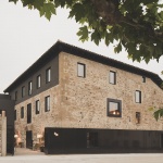
▼项目环境,context ©David Zarzoso
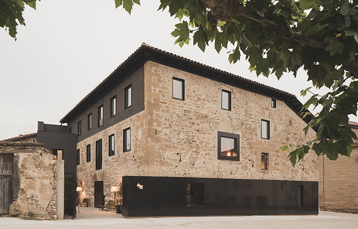
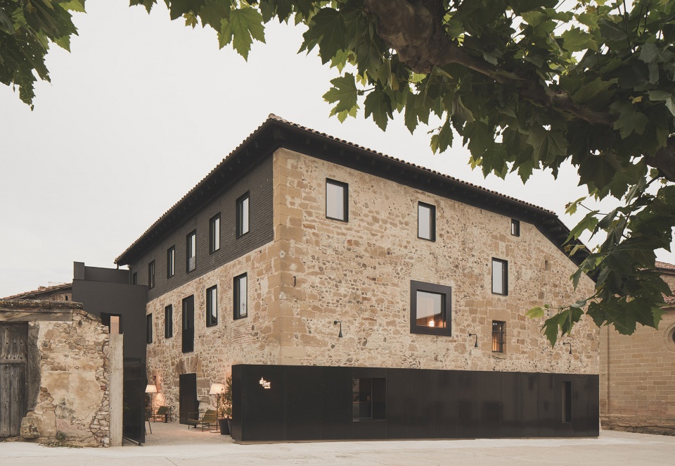
有些地方你选择逃离,有些地方则是你逃离的目的地。Mònica和Raül厌倦了他们在旅游城市Costa Brava的忙碌生活,决定在La Rioja找一个宁静的栖居之所。夫妇俩和他们的两个女儿在一个名为Grañón的迷人小村庄里找到了一座建造于18世纪的庄园,并决定将其打造为一间拥有11间客房的休闲酒店。在Francesc Rifé Studio的设计下,这座庄园成为了新的Casa Grande酒店,旨在为宾客带来家一般的轻松体验。
There are places you run away from and places to run away to. Tired of their hectic lives in a tourist town on the Costa Brava, Mònica and Raül decided to find a quiet place in La Rioja to simplify their lifestyle. The couple and their two daughters found an 18th-century manor house in Grañón, a tiny charming village where the Camino de Santiago passes through. The property had enough space to create a very relaxing and convivial hotel with only 11 rooms. Casa Grande Hotel is the affirmation of this idea turned by our studio into a scene that intends to make you feel at home.
▼酒店外观,Casa Grande Hotel exterior view ©David Zarzoso
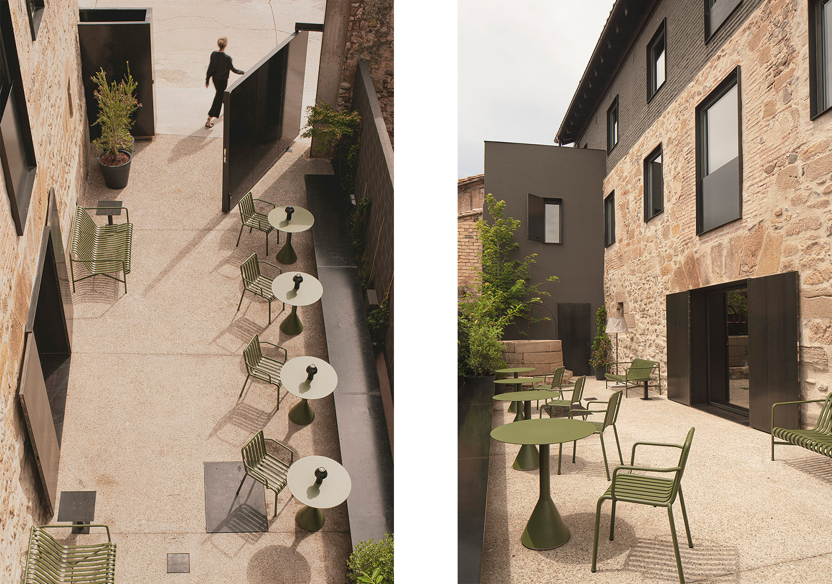
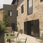
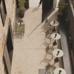
▼户外庭院,outdoor terrace ©David Zarzoso
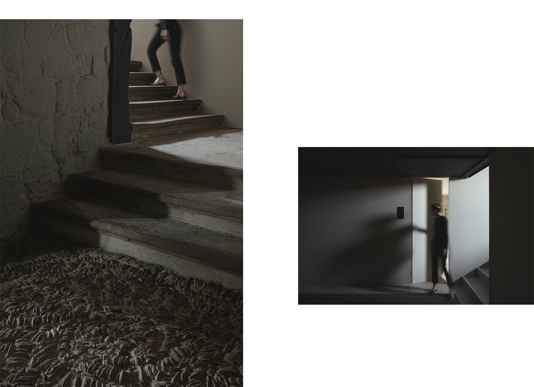
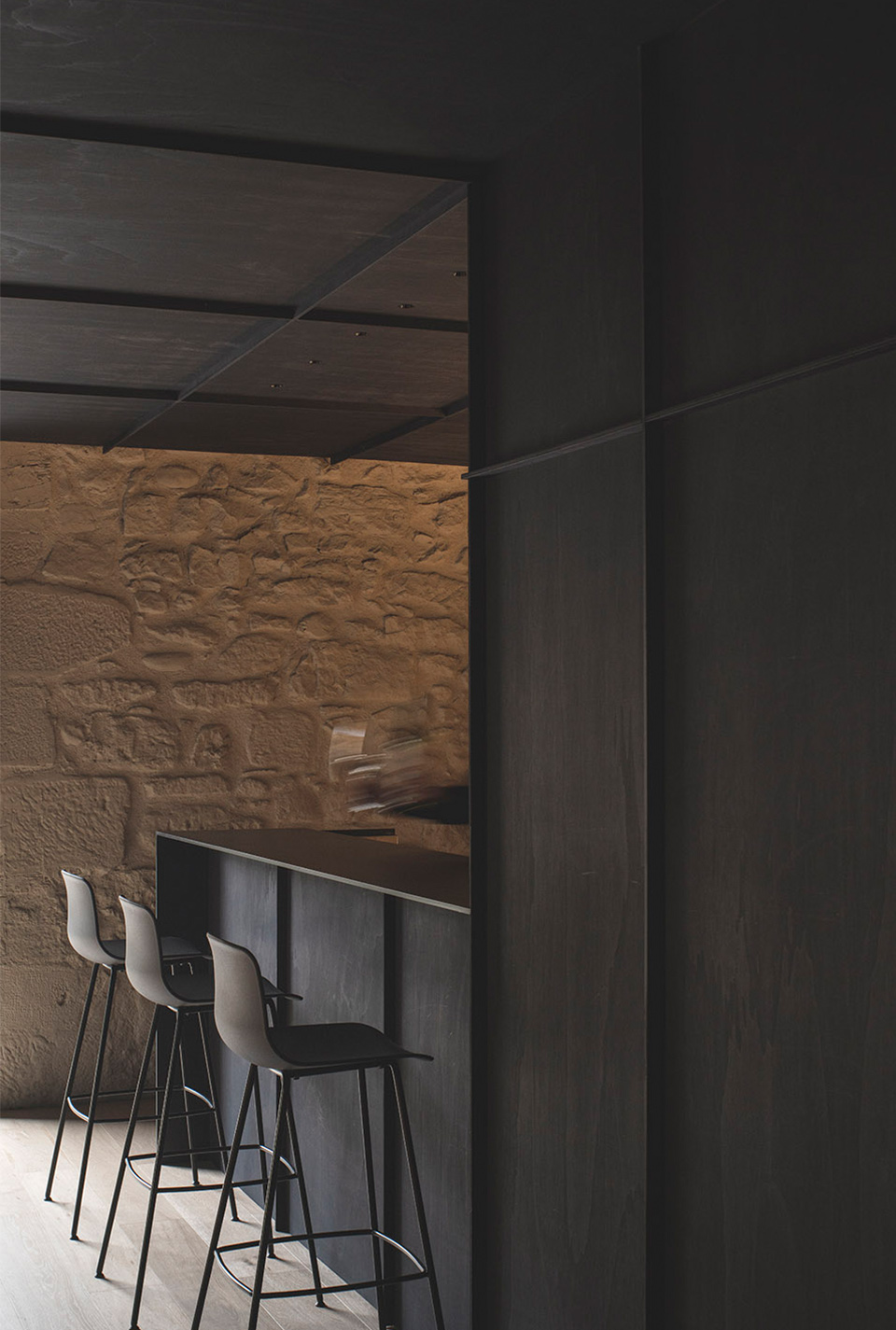
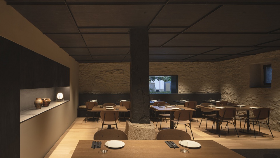
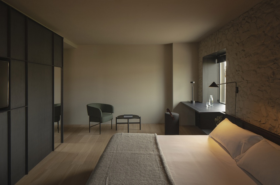
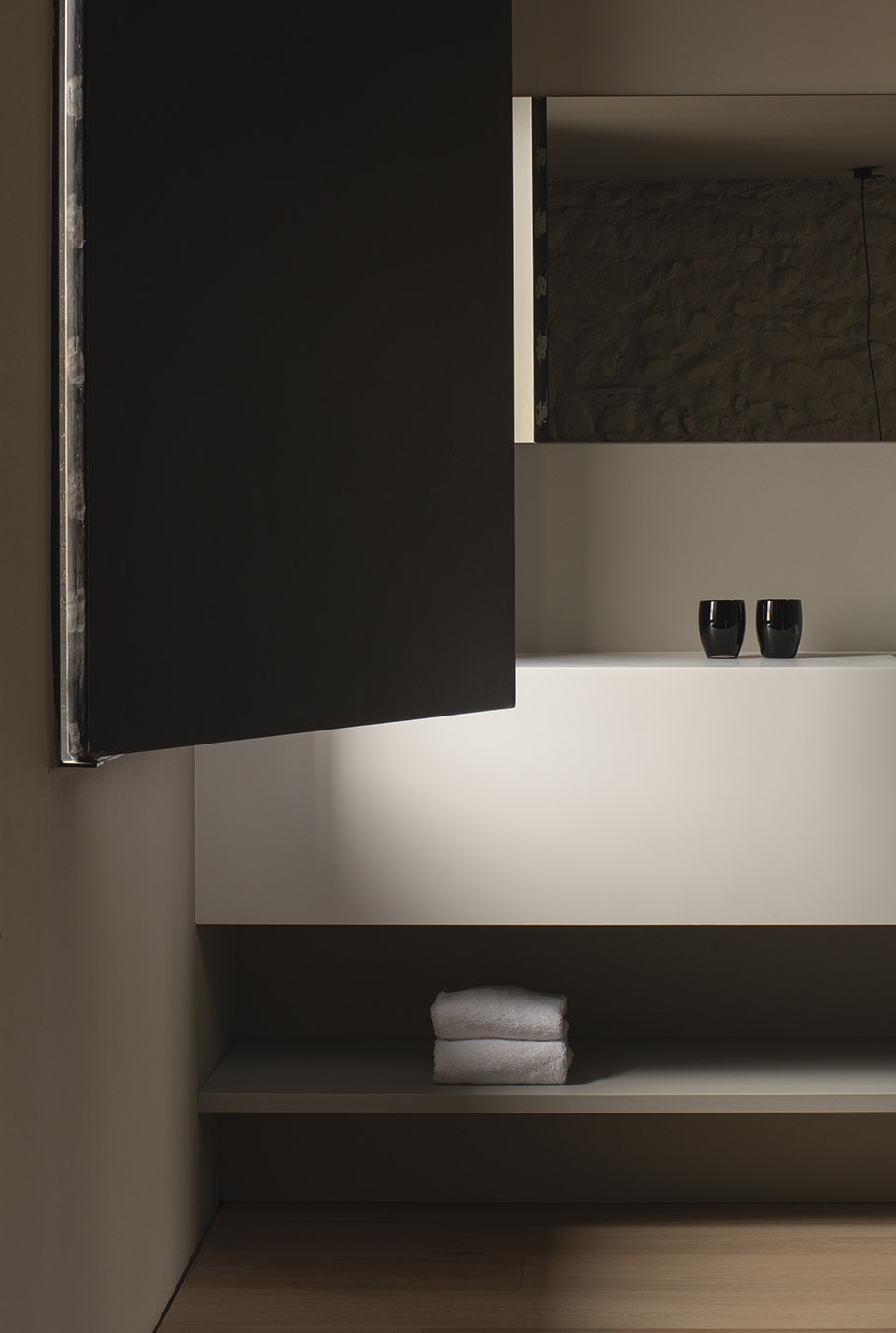
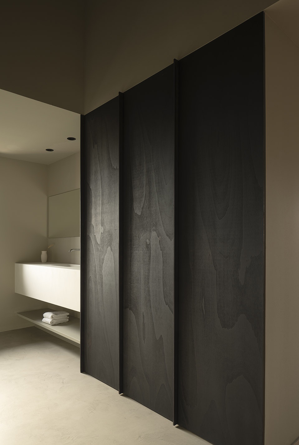
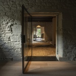
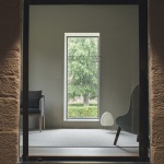
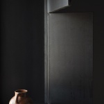
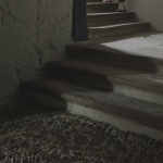
设计保留了原先的琢石墙并将其涂成浅灰色,使现代而内敛的材料与既有建筑的特点形成了和谐共存的关系。墙壁的色彩统一了空间的基调,为采光不佳的区域赋予了一定的亮度。另一方面,空间中还大量使用了黑色的杨木家具,与石材和天然镶木地板形成对比,同时还起到了整合灯具和隐藏技术设备的作用。类似的色彩搭配还与建筑中既有的深色立柱和横梁建立了情绪上的连接。
With a design in which a modern and sober collection of materials quietly co-exists with original features, the main purpose of the project has been the preservation of the ashlar walls on which a light grey monochrome layer has been applied to unify the tone. This technique also aims to provide a certain luminosity to rooms where the thickness of the walls often does not help the entry of natural light. On the other hand, and contrasting with the clarity of the stone and the natural oak floors, there is the black poplar wood that runs throughout the space integrating the lighting and hiding technical devices such as loudspeakers. This color is also emotionally linked with pillars and beams restored in a dark tone.
▼接待区,reception area ©David Zarzoso
▼交通空间,circulation ©David Zarzoso
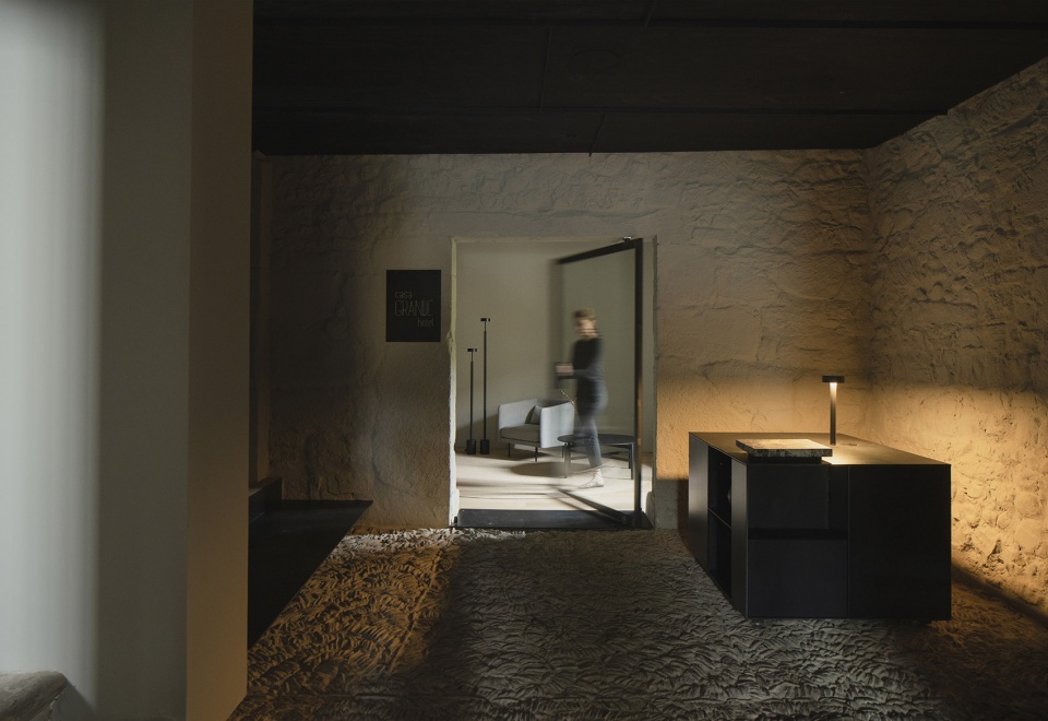
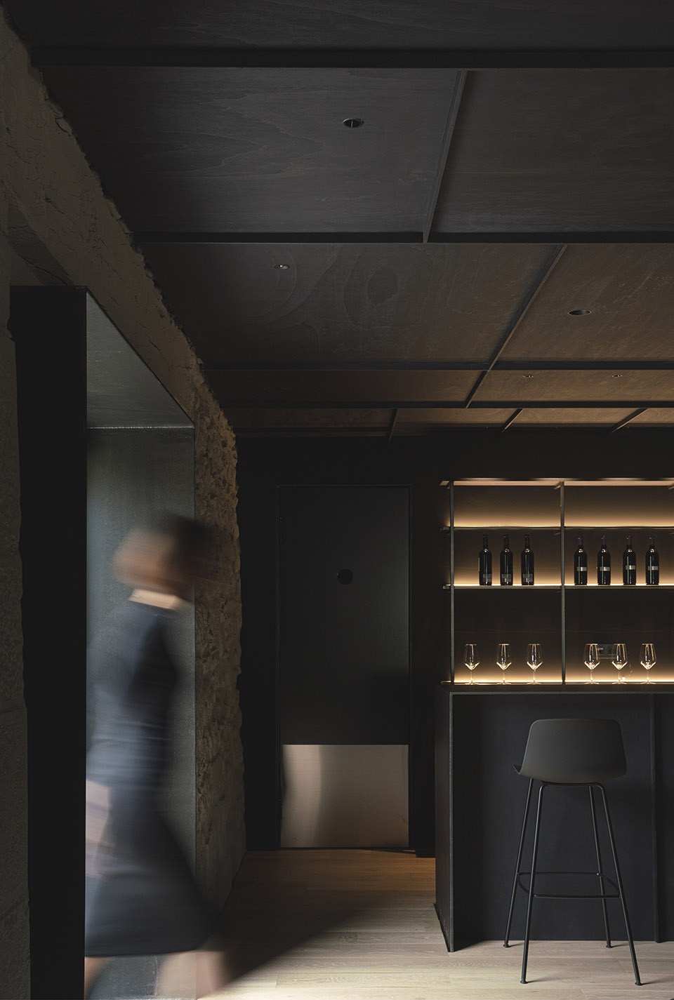
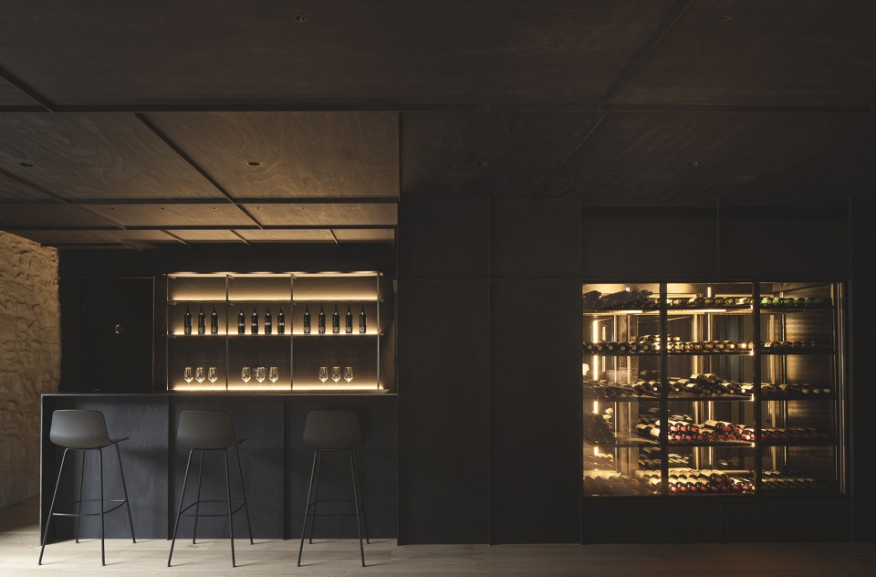
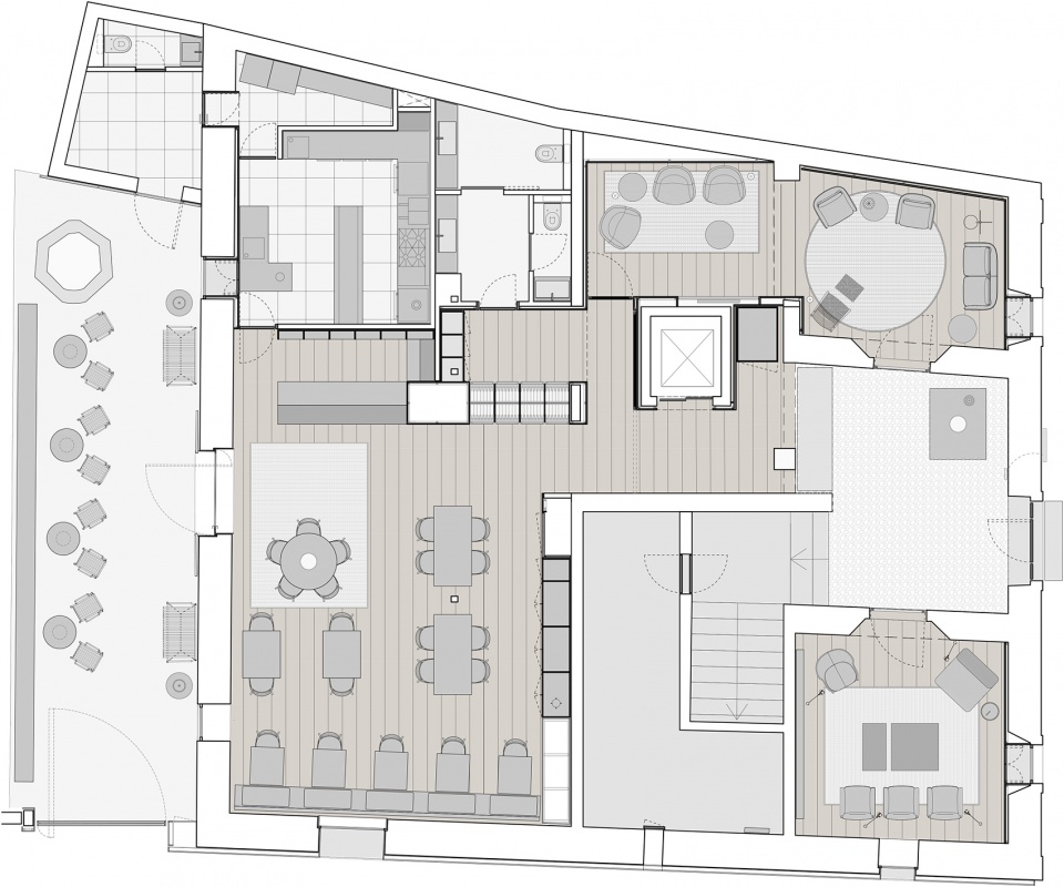
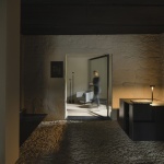
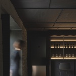
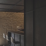
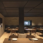
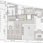
原先的入口空间并未被用作接待区,而是成为了仅供客人使用的大堂。真正的公共入口是一道大型的铁质旋转门,位于广场与后方露台之间。大堂内部设有大尺寸的金属家具,起到迎接客人的作用,两侧分别是图书馆和电视间,作为休息和娱乐场所。大堂的背后是带有小型酒窖的餐厅,此外还有一个吧台与厨房相连接。餐厅的简单菜肴与酒店的氛围相互协调,设有多种座位的露台则为酒店注入了新鲜的空气。
▼公共空间,public area ©David Zarzoso
The entrance that seemed to be the main reception of the hotel finally becomes a lobby for guests only, while a large iron pivoting door, that connects a square with the rear terrace, acts as the public access to the building. Inside, the lobby features a large metal welcome piece of furniture, and on both sides of it are the library and television rooms that work as spaces for rest and entertainment. Behind this, the restaurant interacts with a small cellar and with a counter bar next to the kitchen. The chef, Samuel Diez, has based the menu on regional dishes full of flavor but not complex, in harmony with the atmosphere of the hotel. A terrace, with different seating areas, works symbolically as the lung of the hotel.
▼一层酒吧和餐厅,bar and restaurant ©David Zarzoso
▼用餐空间,dining area ©David Zarzoso
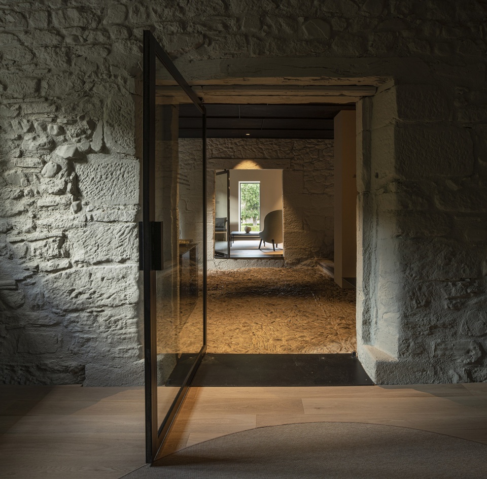
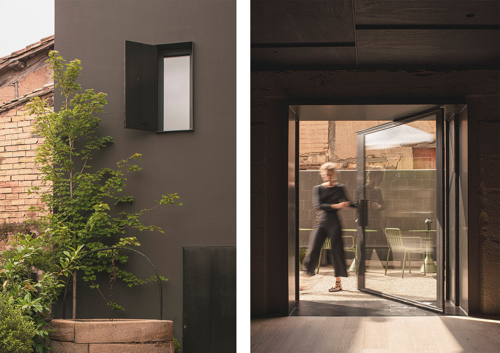
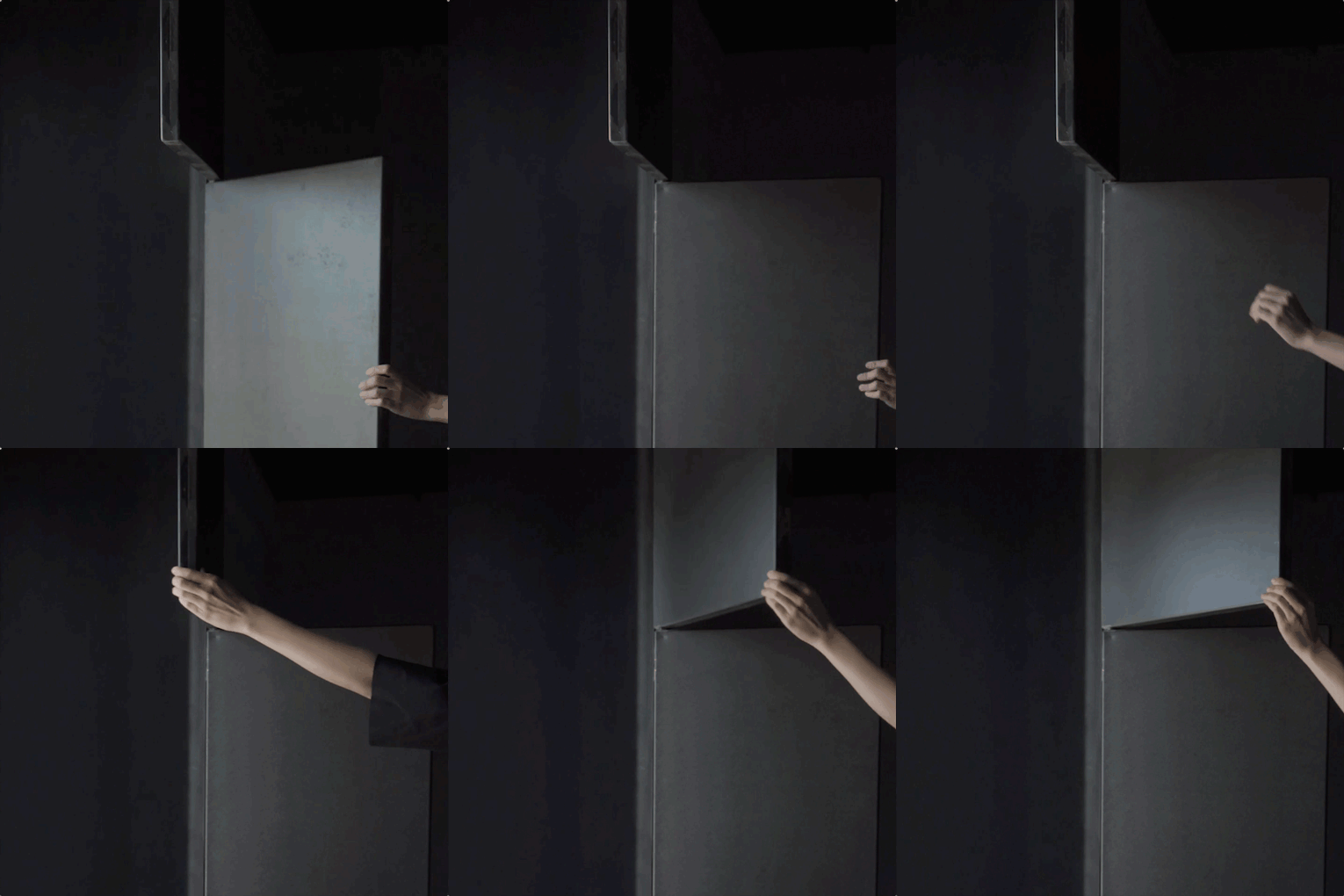
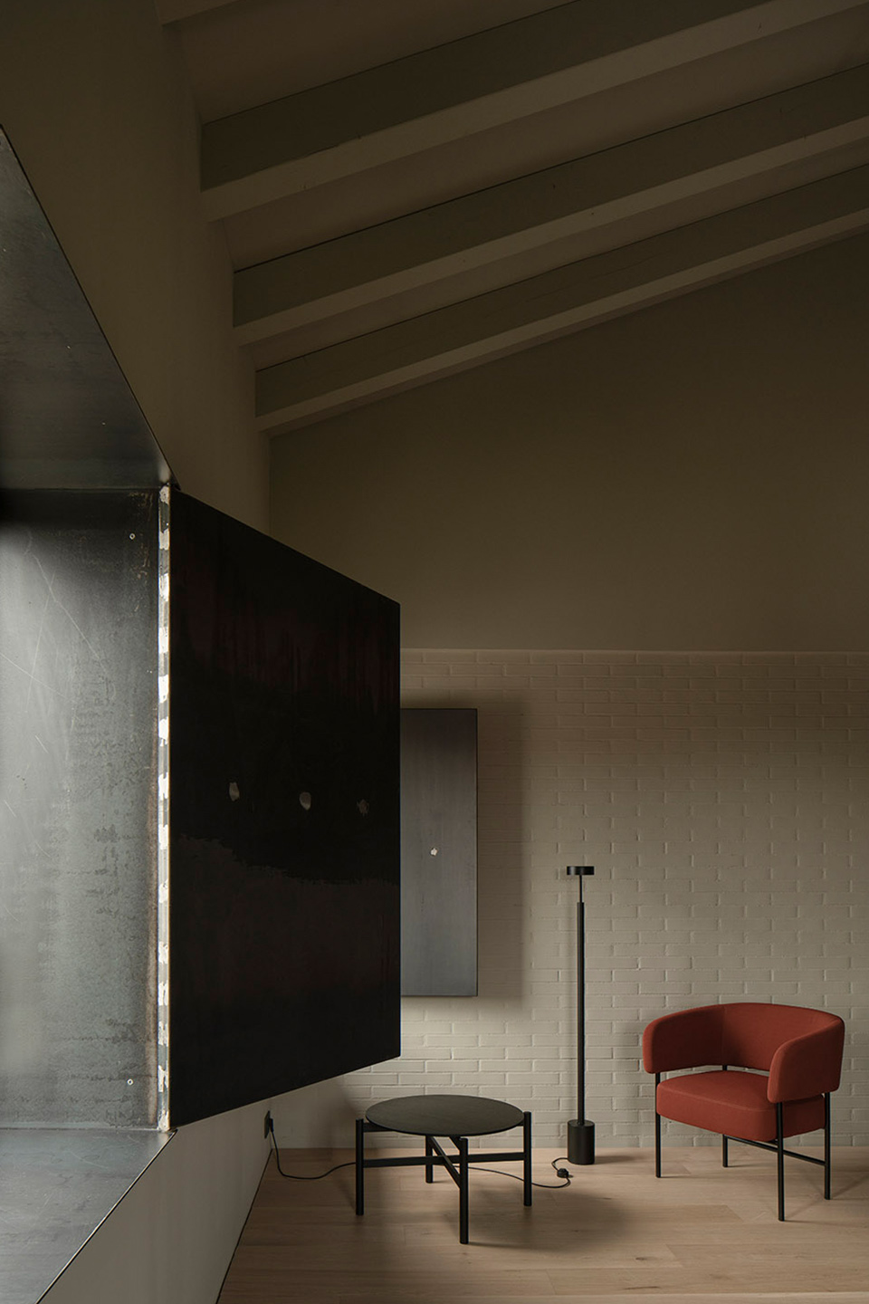
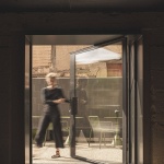
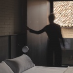
设计采用10mm宽的铁结构使外立面破旧的门窗得到加固,并以类似的处理方式增加了铝制的窗户。金属旋转门不仅为室内带来了光线,还为客房的设计提供了美学上的思路。金属构件以折叠的姿态与外立面融为一体,成为连接室内外空间的装饰性元素。
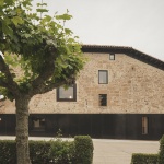
▼立面和开窗细节,facade and openings ©David Zarzoso
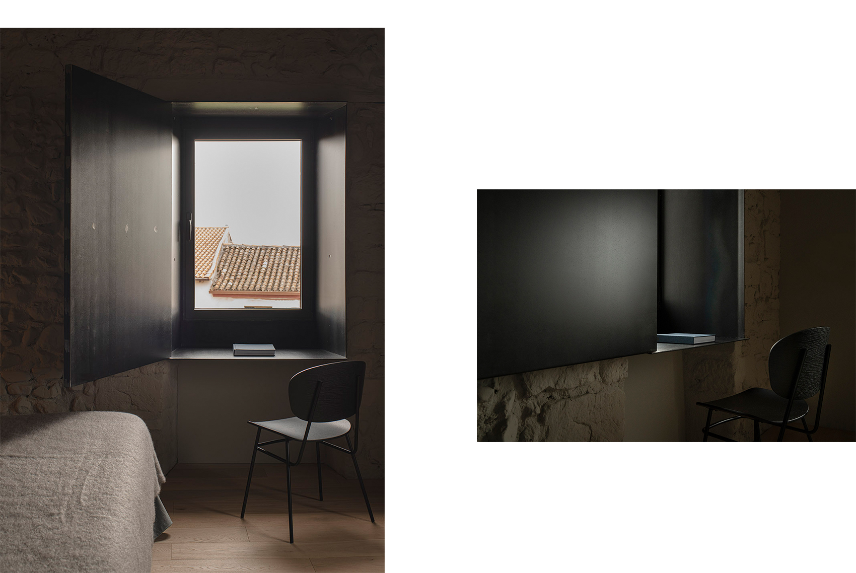
▼金属旋转门也为客房的设计提供了美学上的思路,metal pivoting doors are also part of the conceptual aesthetic of the rooms ©David Zarzoso
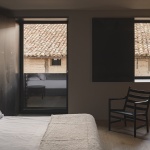
The poor condition of the façade openings has led to the use of 10mm blued iron structures to maintain their squareness, and aluminum windows have been combined in a similar finish. Metal pivoting doors not only serve to contain the light but are part of the conceptual aesthetic of the rooms. These elements are always folded parallel to the facade and have ended up becoming decorative gestures used throughout the entire project, and both inside and outside.
▼门窗细节,details ©David Zarzoso
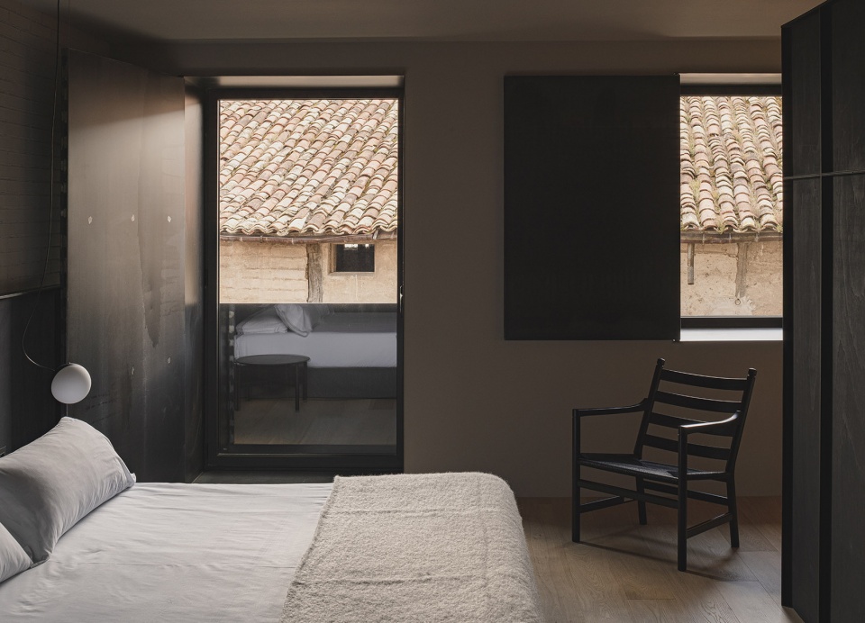
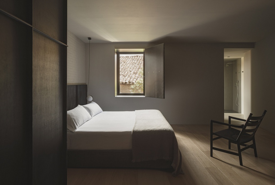
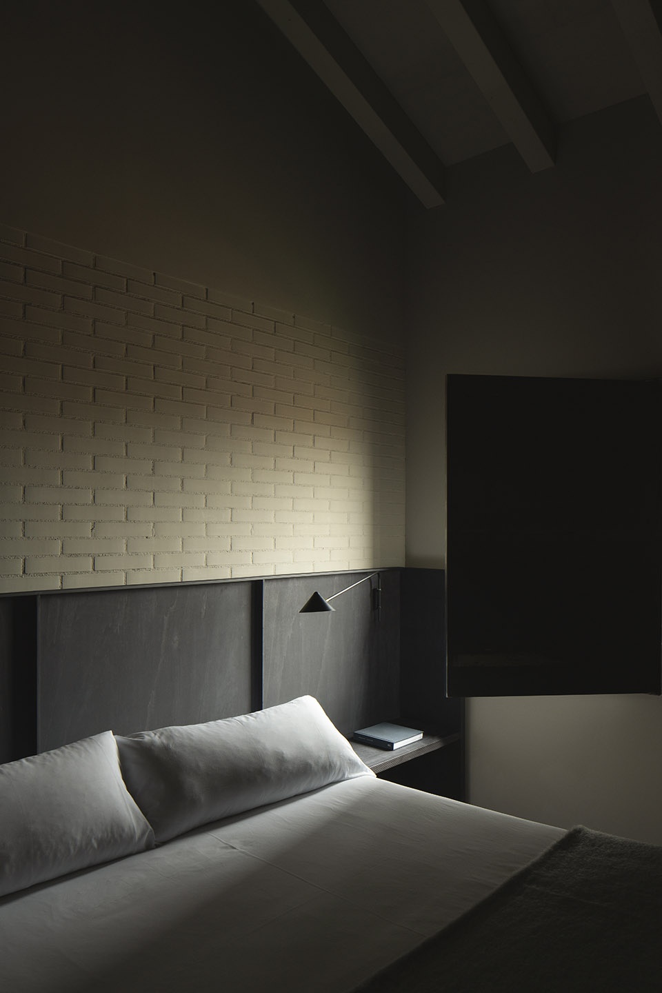
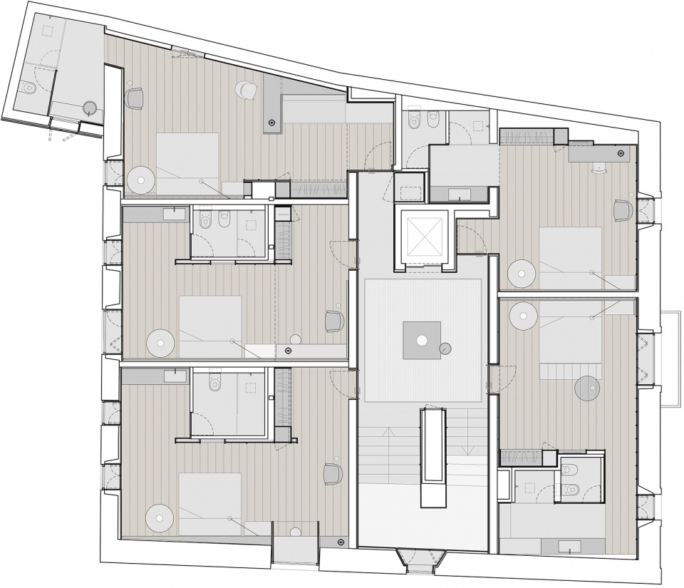
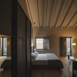
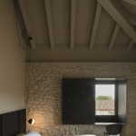
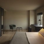
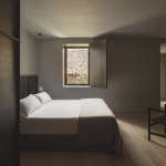
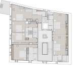
建筑上方还有另外两个楼层。第一个楼层包含5间客房,拥有类似的风格,但在细节和特征上略有不同:有些保留了原先的琢石墙壁,另一些则拥有裸露的砖墙或混凝土墙。为了避免过于复杂的观感,客房均采用了单色的装修,以统一材质上的差异。
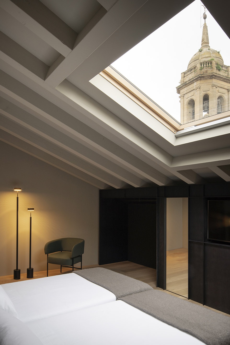
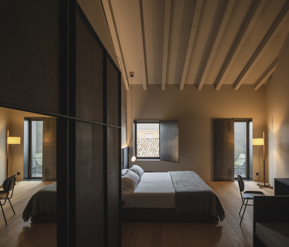
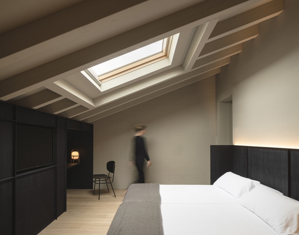
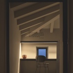
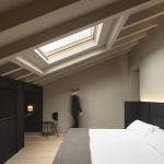
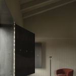
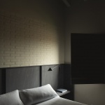
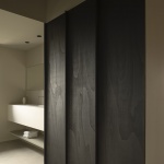
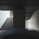
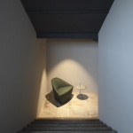
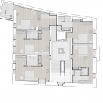
第二个楼层包含6个房间,拥有较开阔的层高。该楼层的房间均是大床套间,部分配有可调节的沙发床。遵循类似的设计手法,定制家具采用了黑色杨木,床头顶部和迷你酒吧的开口处还运用了相同的木质板条元素。半开放的衣柜兼具了稳重的感觉,让客人们可以轻松地拿取衣物。这两个楼层的天花板与一楼保持了一致,均覆盖着黑色的木质饰面,地下楼梯亦采用了这种设计,营造出一种小尺度的亲密氛围。
▼客房内部,guest room interior view ©David Zarzoso
▼客房细节,detailed views ©David Zarzoso
▼开窗与书桌相结合,the tables are integrated with the openings ©David Zarzoso
The building has two more floors. The first one has 5 rooms with a similar aesthetic but with different features and distribution. Some of them maintain the ashlar walls, while the others have left the exposed brick or the concrete itself used to rehabilitate the building. Avoiding the overelaborate atmospheres, the same monochromatic treatment has been used to unify the different textures.
The second floor has 6 rooms distinguished by a higher height. All of them have been designed as suites with a large bed and some with a sofa that doubles as a single bed. Following the same approach as the rest of the project, the custom-made furniture has been designed in black poplar wood, using small slats to mark specific elements of each room, either as the top of the head of the bed or the openings where the minibar is hidden. A semi-open but discreet wardrobe allows guests to have their clothes on hand. Like the ceilings on the ground floor, that of the distributors on the different levels and the lower staircase is covered with the same black stained wood material to lose the feeling of height.
▼顶楼客房,guest room on the upper floor ©David Zarzoso
▼套间,suite ©David Zarzoso
▼卧室,bedroom ©David Zarzoso
▼浴室,bathroom ©David Zarzoso
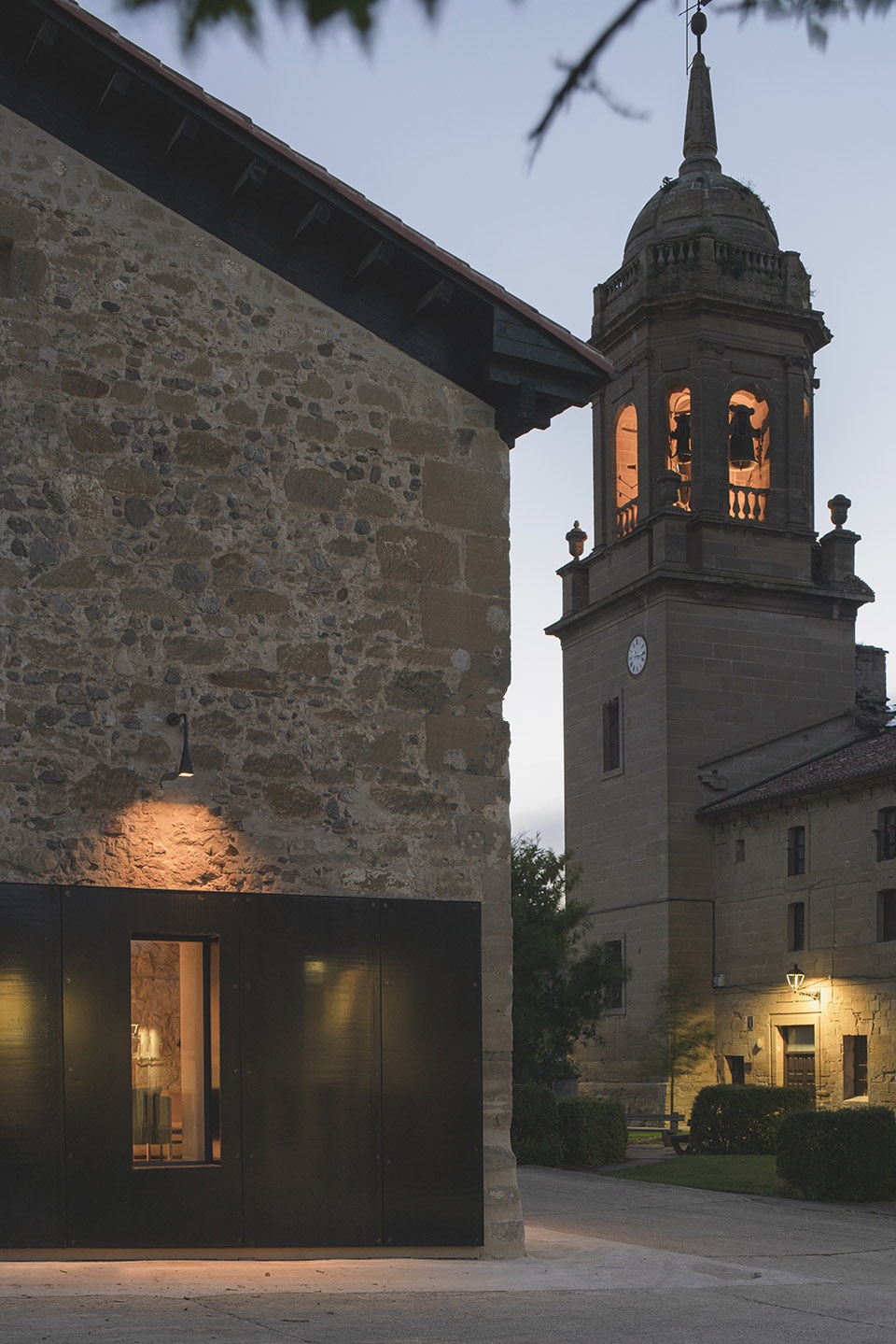
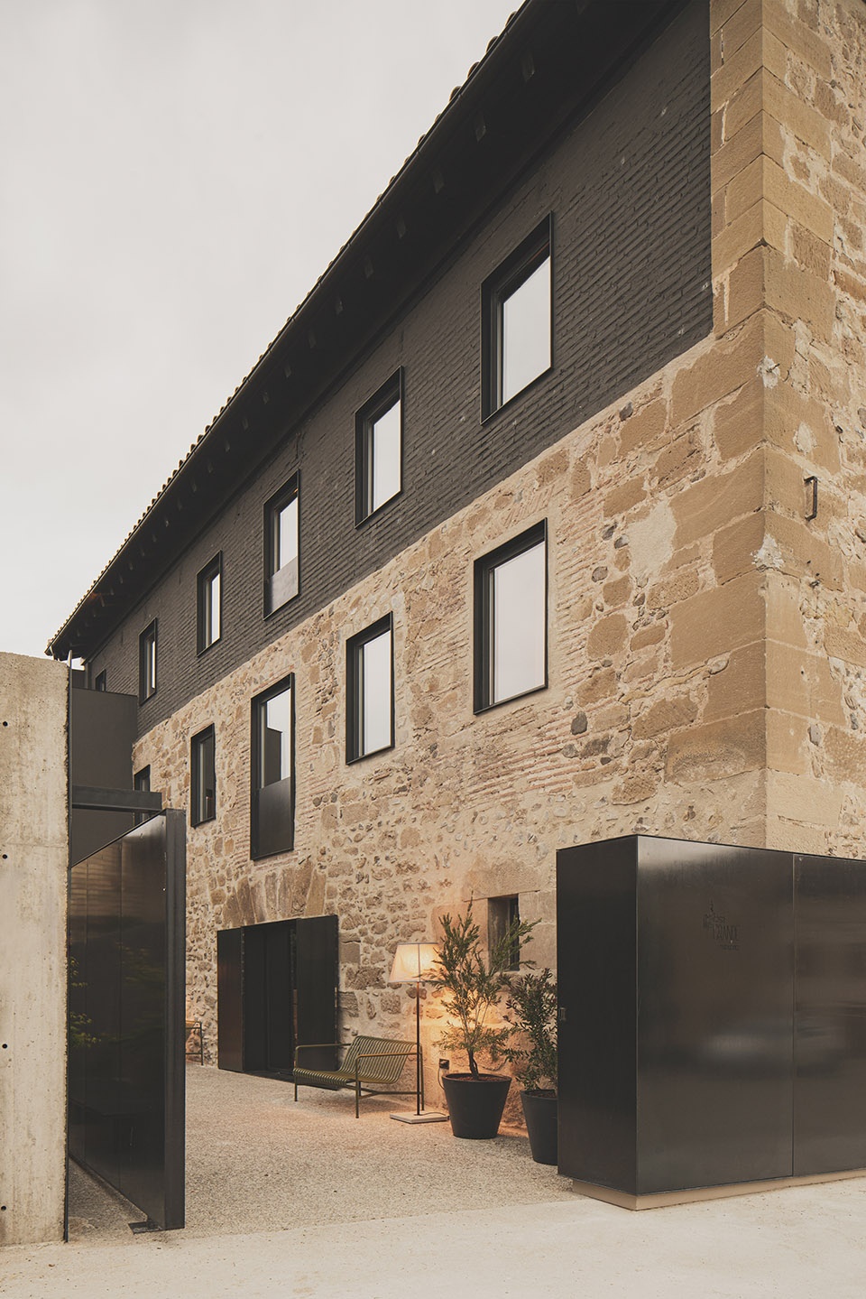
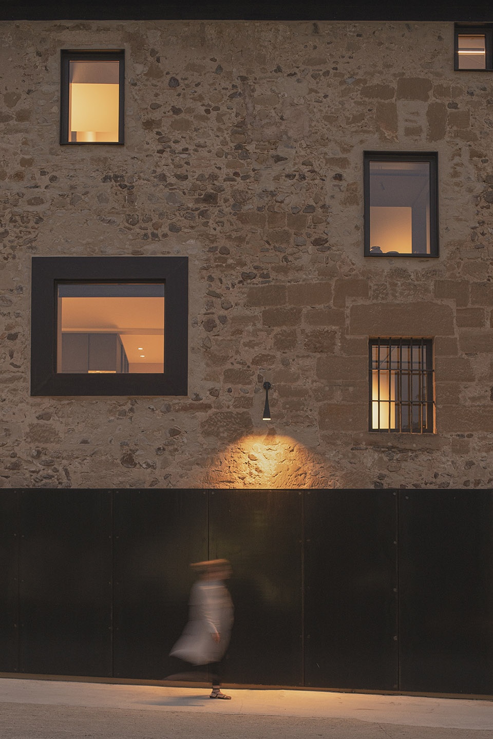
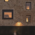
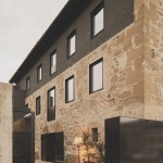
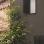
建筑的侧立面是项目中最具有记忆点的部分。原本混乱的门窗被重新归置在经过烤蓝处理的铁质表皮之下,金属旋转门也被结合在相同的立面之中,为客人提供了进入酒店露台的路径。这是一个具有双重意义的元素,一方面,它强调了以金属为主题的美学叙事,另一方面则隐藏了建筑中用于容纳机械设备的横向开口。该立面上还安装着彼得·卒姆托为Viabizzuno设计的Campanula灯具,使客人们在抵达酒店时就能立即感受到设计的理性与精致。酒店内部结合了一般的筒灯照明、能够突出修复墙面的线性照明以及带来私密氛围的装饰性照明。
The side façade, perhaps the most monumental part of the project, starts from a chaotic original distribution of the former windows that seeks to arrange them under a new skin of blued iron. It is the same surface that extends as a pivoting door to give access to the hotel terrace. This element has a double meaning, on the one hand, it reinforces the aesthetic narrative of the metal that has been used to design windows and balconies, but at the same time, it hides different lateral openings that house machinery, electrical wiring, etc. In this façade, the Campanula lamps, designed by the architect Peter Zumthor for Viabizzuno, have been placed to communicate to the visitors from the beginning the rationality and care with which the project has been built. Inside, there is general and integrated downlight lighting, secondary and linear lighting that aims to highlight the restored surfaces and the third kind of decorative lighting that defines the hotel’s intimate mood.
▼从入口望向立面,view to the facade from the entrance ©David Zarzoso
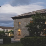
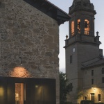
▼夜间立面细节,facade night view ©David Zarzoso
▼一层平面图,ground floor plan ©Francesc Rifé Studio
▼二层平面图,first floor plan ©Francesc Rifé Studio
▼三层平面图,second floor plan ©Francesc Rifé Studio
Dimensions: 706 square meters
Photos: David Zarzoso
More:Francesc Rifé Studio。更多关于他们:Francesc Rifé Studio on gooood
