非常感谢 LundHagem + Atelier Oslo 予gooood分享以下内容 。更多关于他们,请至:LundHagem on gooood; Atelier Oslo on gooood
Appreciation towards LundHagem + Atelier Oslo for providing the following description:
奥斯陆新图书馆的设计由LundHagem和Atelier Oslo事务所共同担任。图书馆馆长希望为公民带来一个可以尽情探索和举办各类活动的现代场所,通过开放且具有吸引力的建筑空间来鼓励人们不断地发现新事物。
The international architecture competition to design Oslo’s new main library was won by Lund Hagem and Atelier Oslo architects in 2009. The librarians wanted a house that would inspire visitors to explore all the new facilities and activities the modern library can offer. This motivated us to create an open and intriguing building in which you are constantly invited around the next corner, to discover new places.
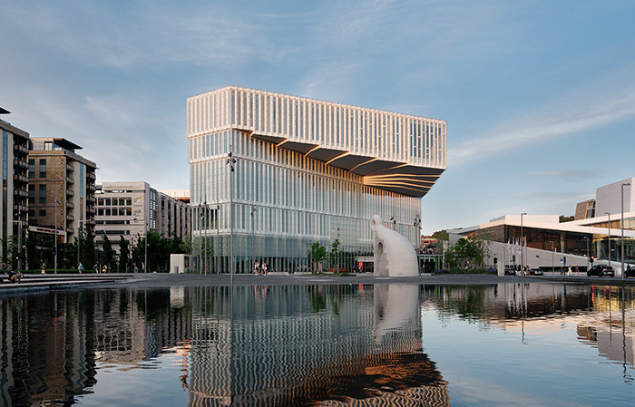
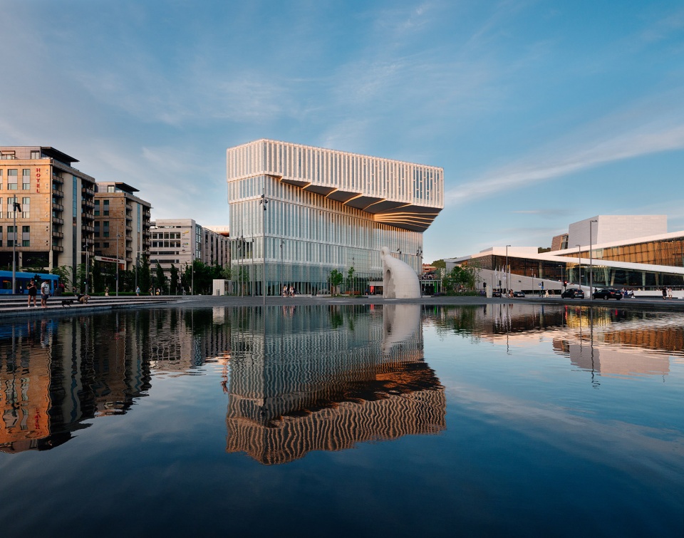
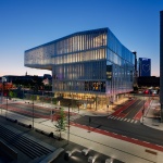
▼从图书馆广场望向建筑,From the library plaza ©Einar Aslaksen
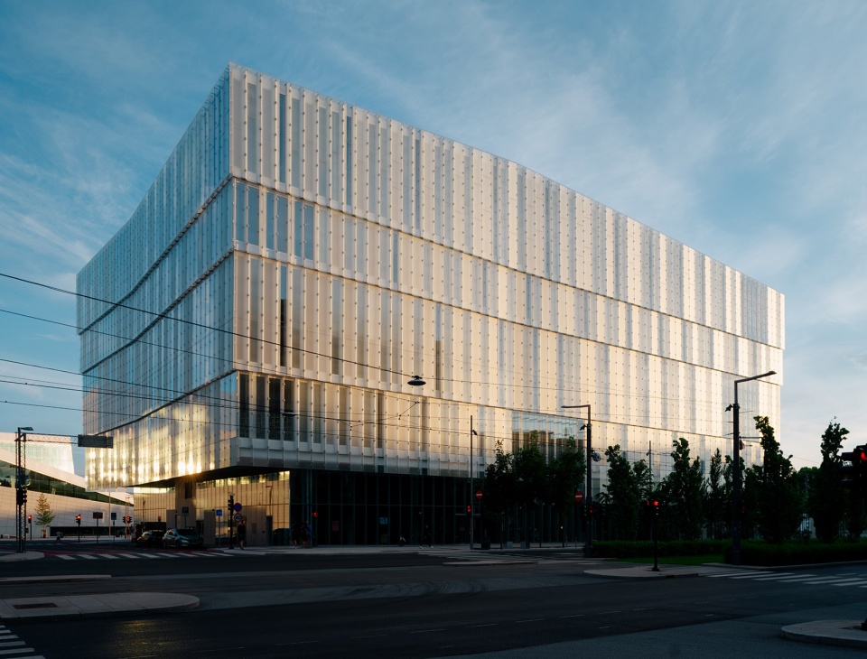
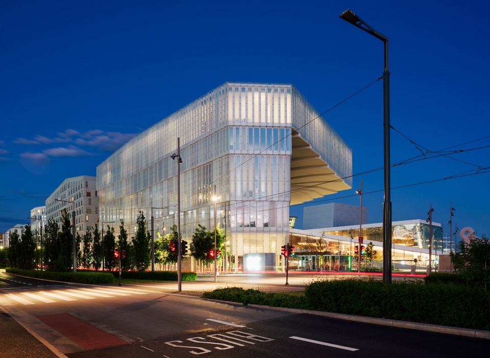
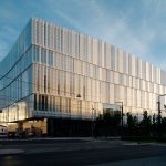
▼街道视角,Street view ©Einar Aslaksen
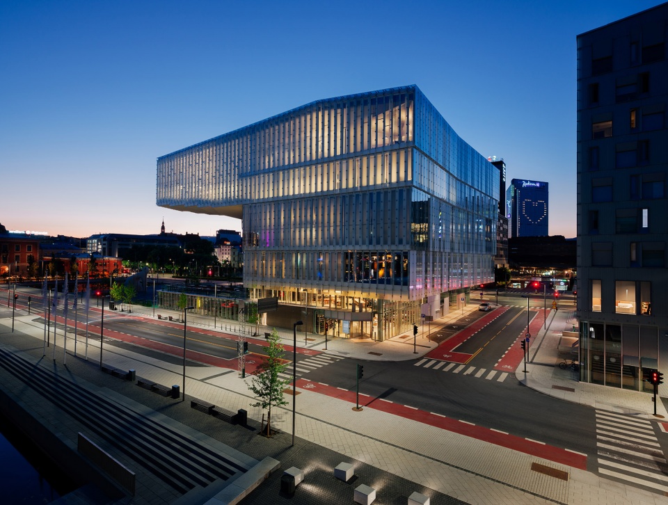
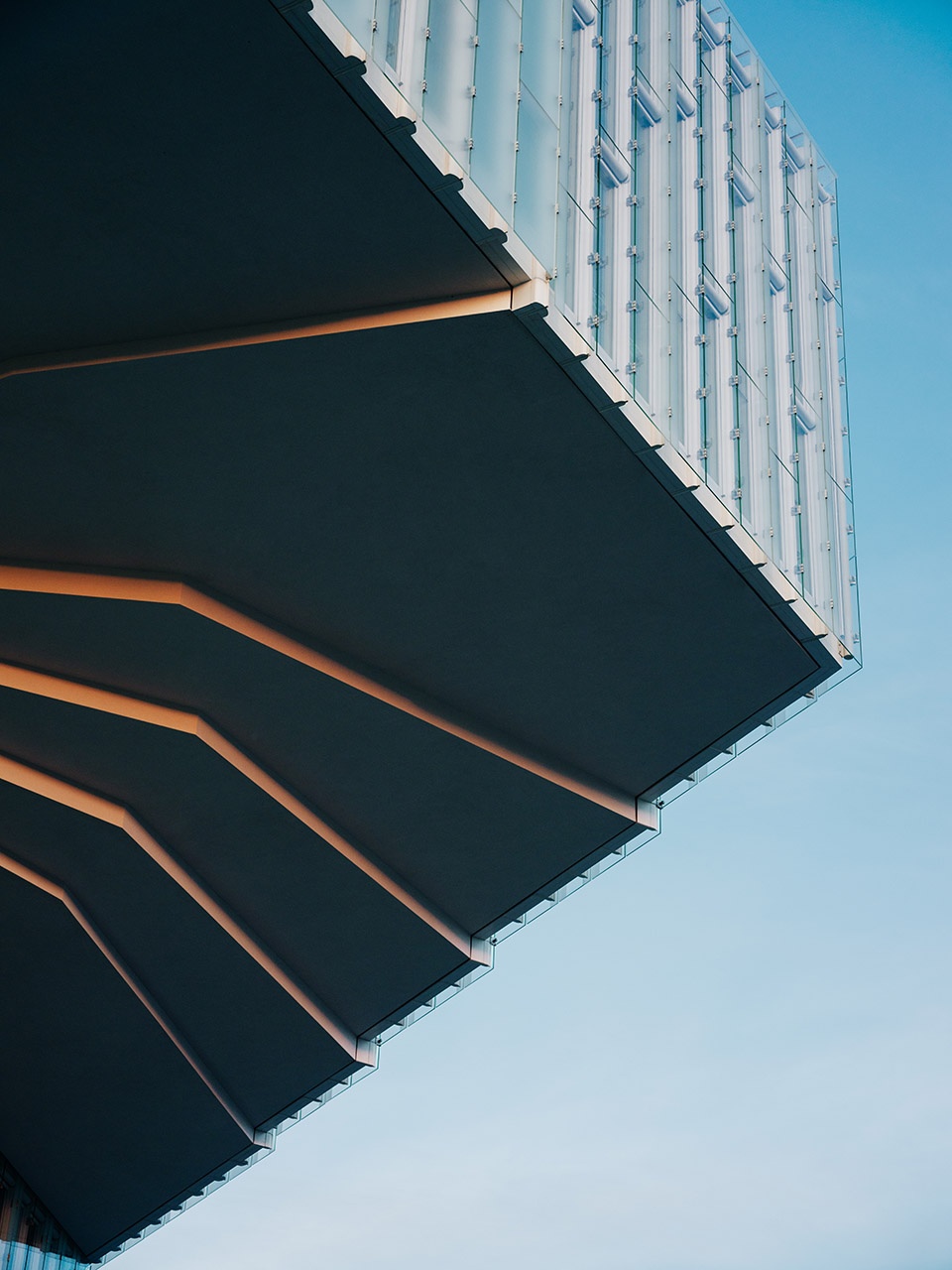
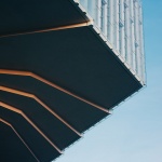
项目场地的面积相对较小,为了避免建造过多的楼层,图书馆的体量被设计为悬臂状:二层抬升于东面的街道,五层则高出城市广场近20米,同时为入口提供了荫蔽。巨大的悬臂不仅向城市展示了建筑的宏伟姿态,还保留了望向附近歌剧院的视野。屋顶的折叠几何形态起到了加强结构强度的作用。
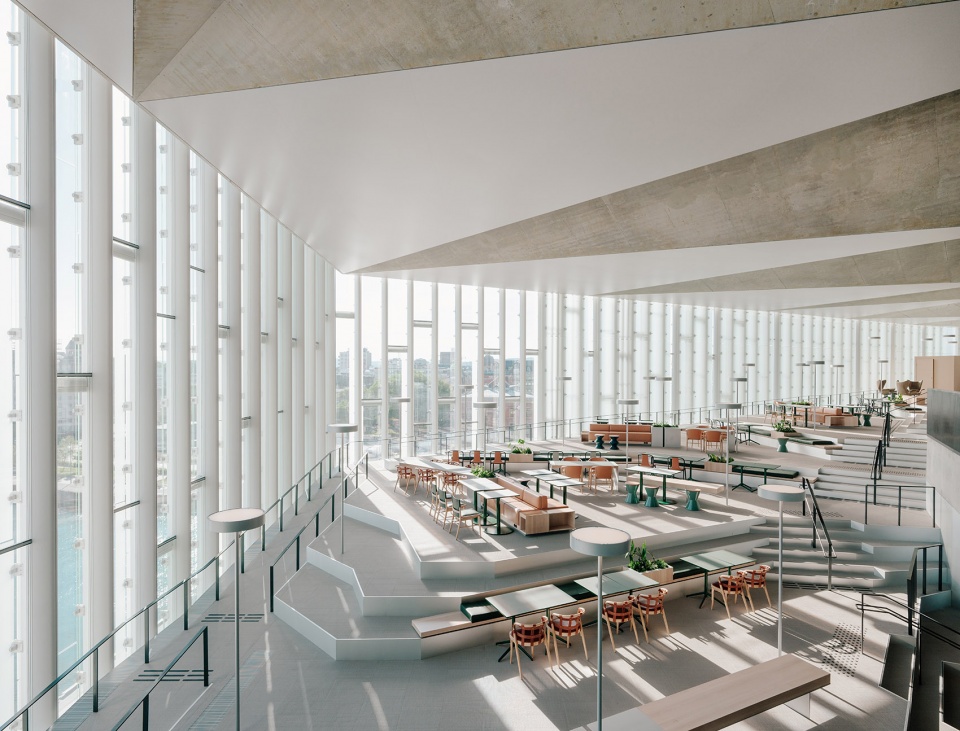
The site is relatively small. In order to avoid building too many floors, the building cantilevers out above its footprint: The first floor above the street to the east, and the fourth floor almost 20 meters out above the urban plaza, creating a protective covering for the entrance. This largest cantilever displays the building to the city and still preserves the line of sight to the neighbouring Opera. The cantilevered floors are suspended from the roof above. The roof has a characteristic folded geometry that provides structural strength.
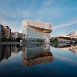
▼从歌剧院屋顶望向建筑,Seen from the Opera roof ©Einar Aslaksen
▼悬臂细部,Detail cantilever ©Einar Aslaksen
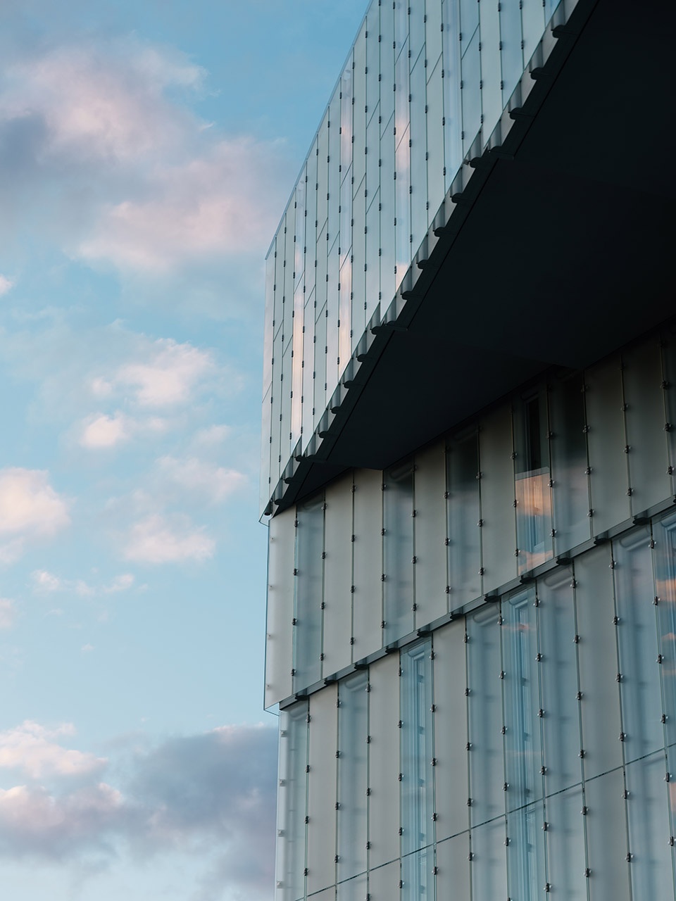
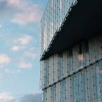
▼立面细部,Detail façade ©Einar Aslaksen
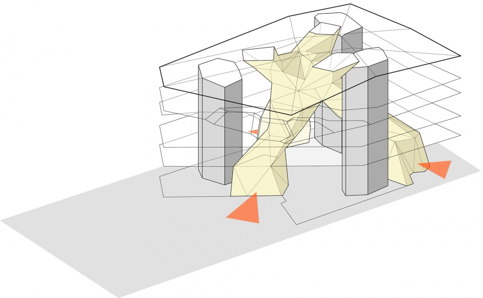
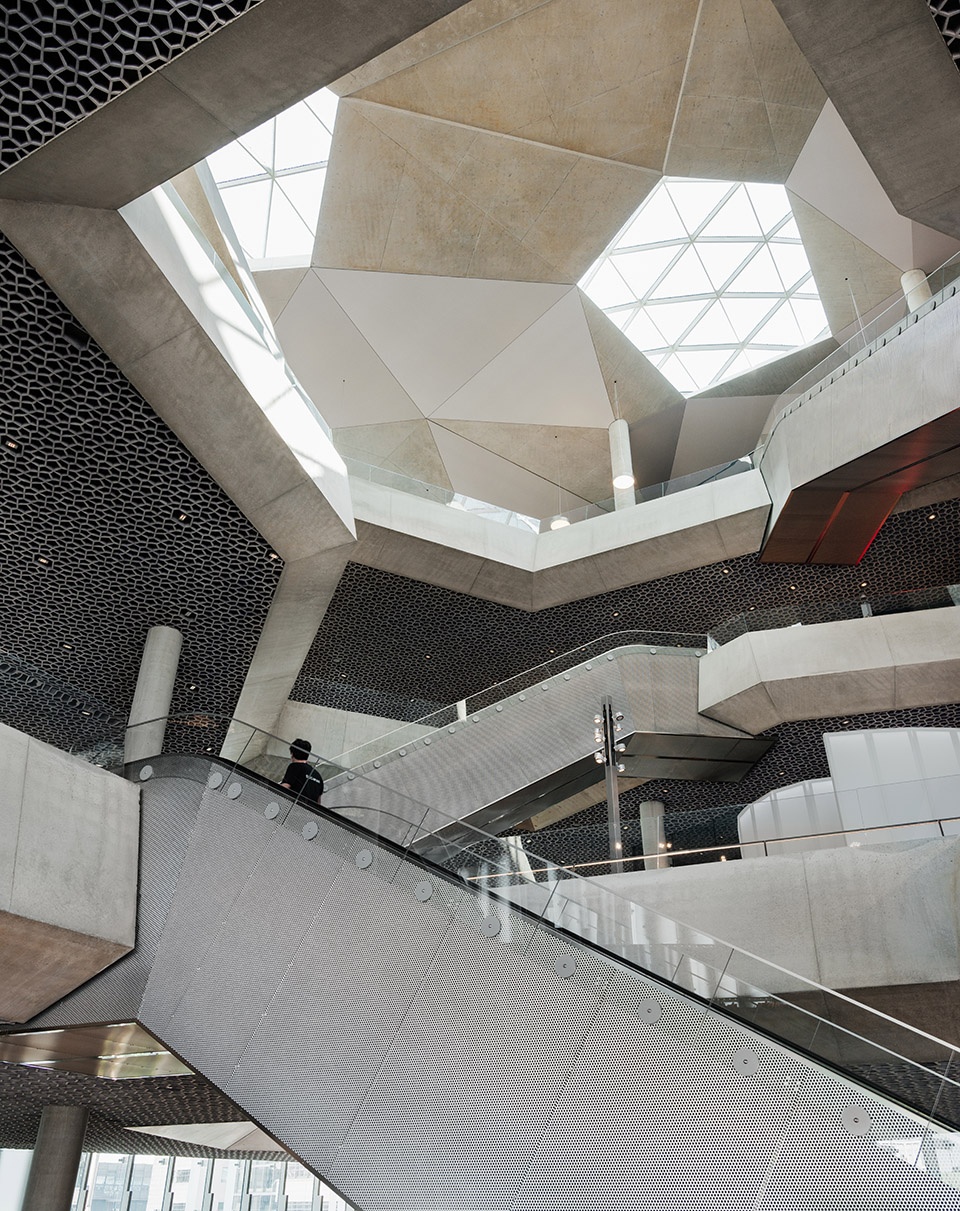
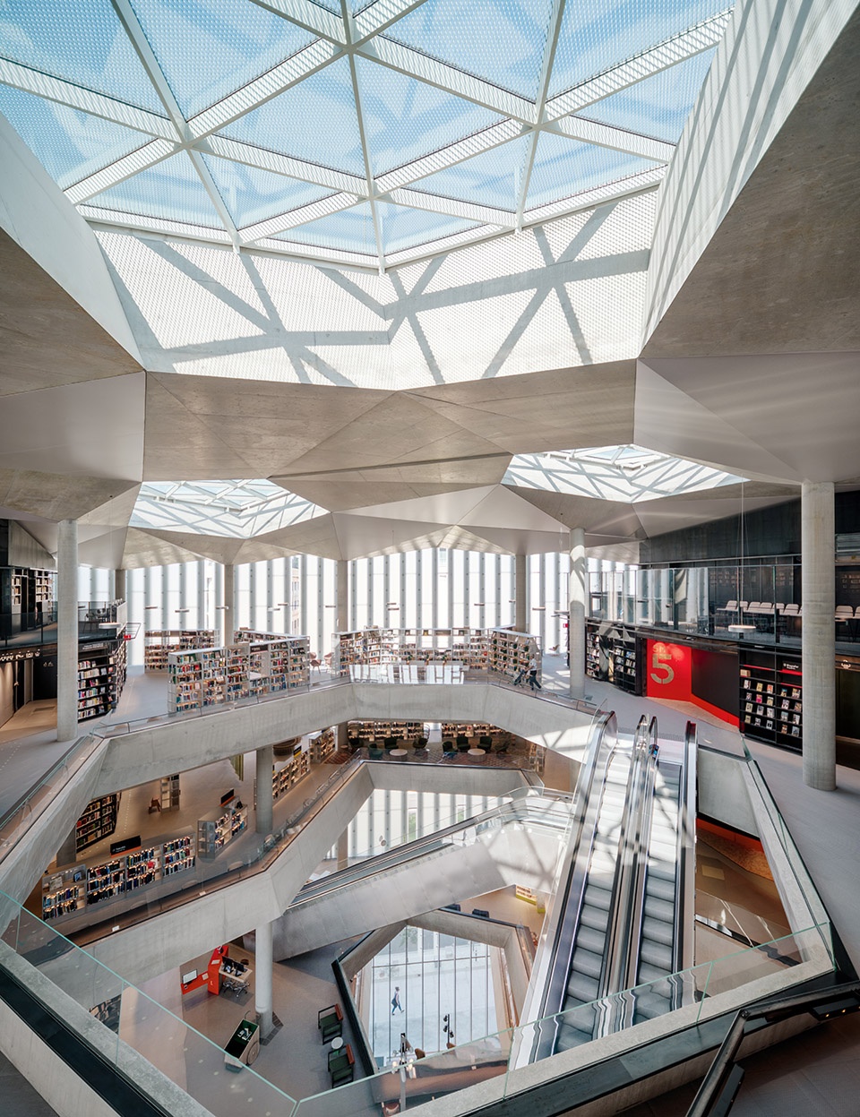
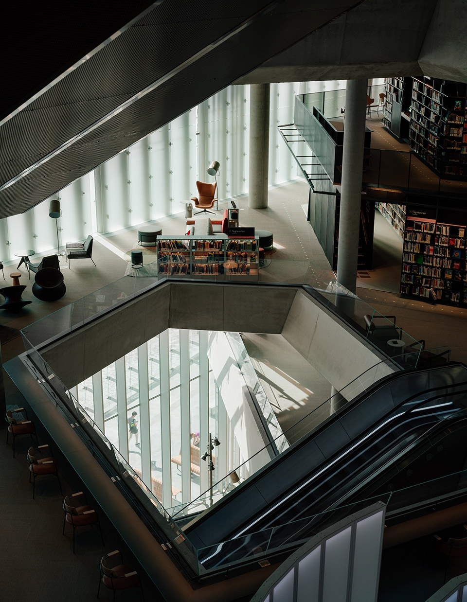
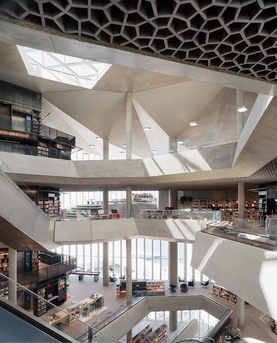
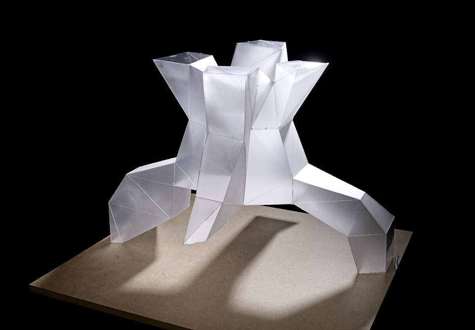
为了增强建筑的开放性并建立其与城市的联系,首层立面完全以玻璃围合。来访者可以从三个方向的入口进入。三道“光井”以三个入口为起点,呈对角线贯穿了整个建筑,带来图书馆不同区域的视野。除了连接各个楼层,光井还通过屋顶的三个大型天窗将日光引入室内。
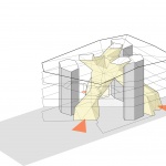
▼光井、入口与核心筒示意,diagram – light shafts, entrances and cores ©LundHagem and Atelier Oslol
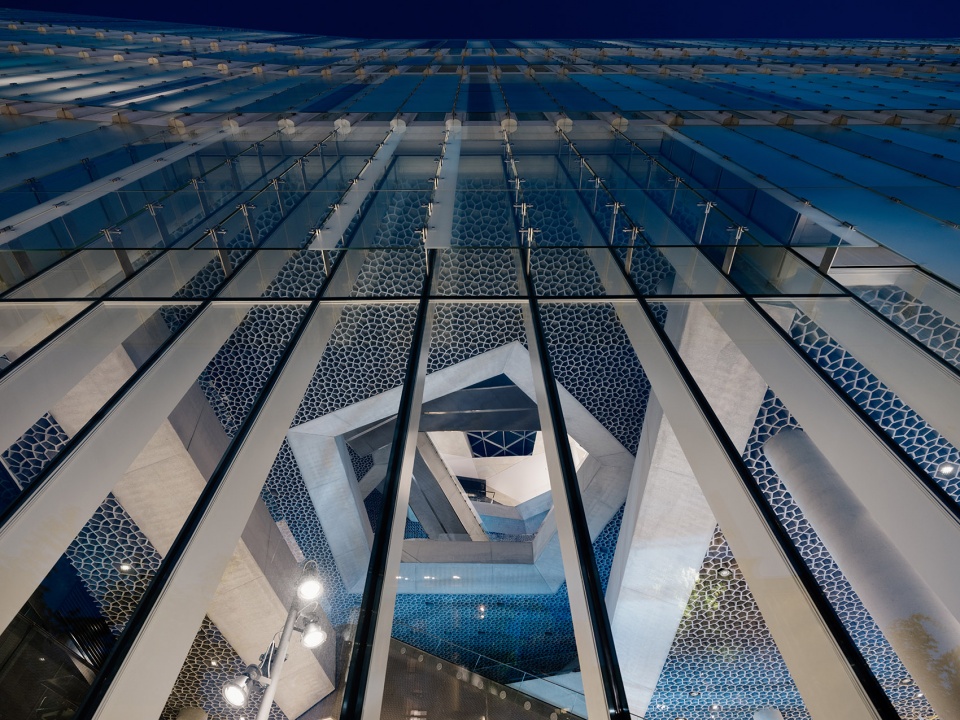
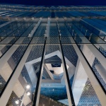
In order to create an enhanced feeling of openness and connection with the city, the ground floor facade is completely transparent. Visitors are received by three equivalent entrances, facing in different directions. Three ‘light shafts’ cut diagonally through the building from each of the entrances, giving a glimpse into different sections of the library. The light shafts connect the floors and distribute daylight downwards from three big skylights in the roof.
▼从入口望向室内上方的光井,Exterior looking up the light shafts and into the library ©Einar Aslaksen
▼沿着光井上升,Moving up the light shafts ©Einar Aslaksen
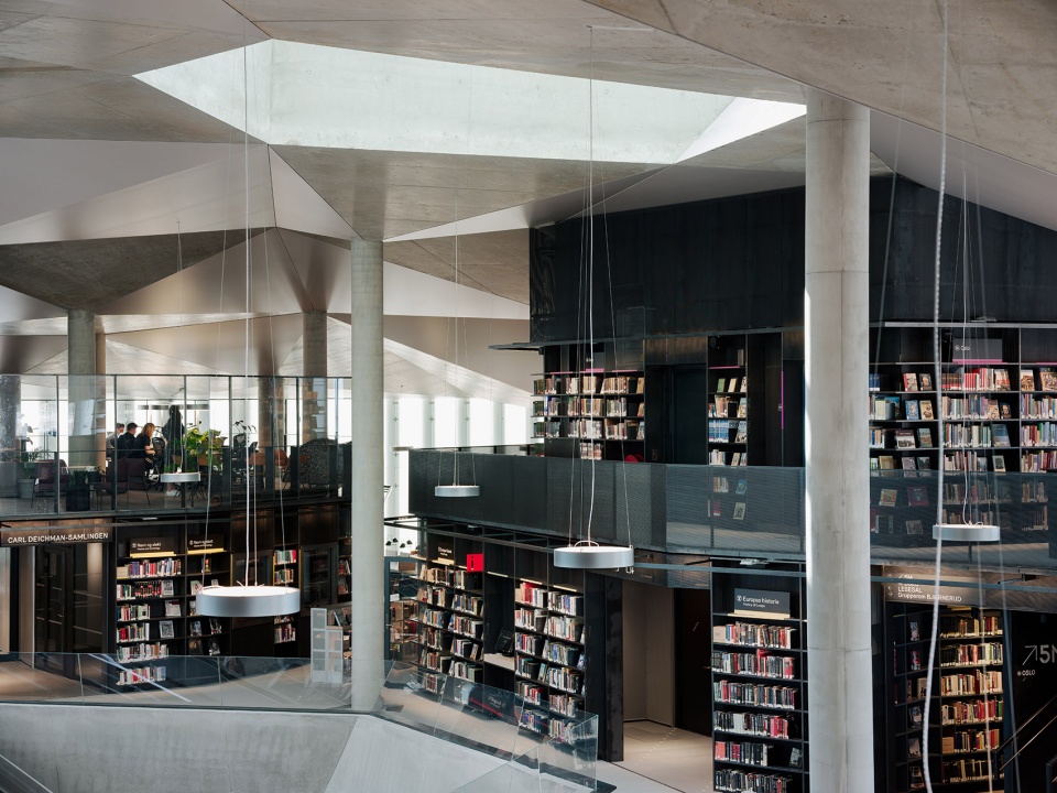
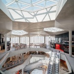
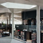
▼光井通过大型天窗将日光引入室内,The light shafts distribute daylight downwards from three big skylights in the roof ©Einar Aslaksen
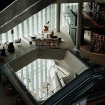
▼俯视光井,Looking down the light shafts ©Einar Aslaksen
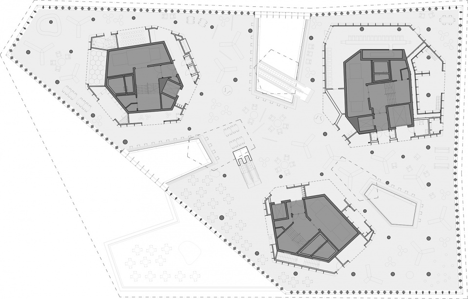
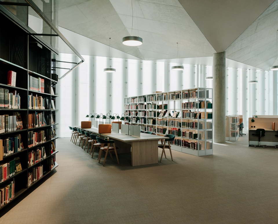
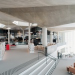
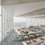
室内空间主要呈现为一个开放的公共广场,里面摆放着各类家具与活动设施。封闭空间和嵌入式空间围绕着三座独立的书架塔布置,解放了建筑的外立面,使阳光得以从各个方向流入室内。
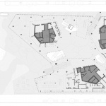
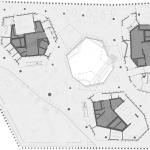
▼二层平面图,Deichman plan 1st floor
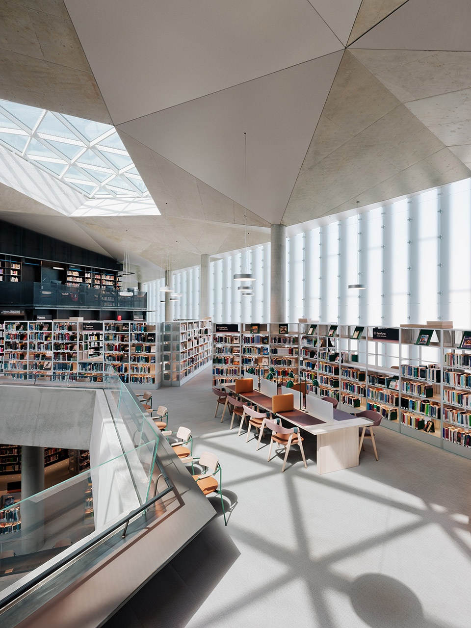
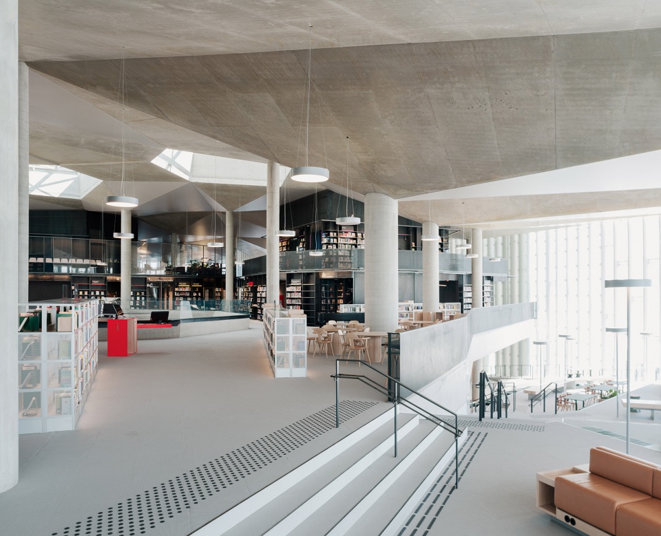
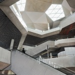
An open public space dominates the interior, with a variety of furniture and activities. Enclosed spaces and niches are organised around three free standing book towers, liberating the facades and allowing daylight to flow in from all directions.
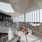
▼室内空间概览,Main interior space ©Einar Aslaksen
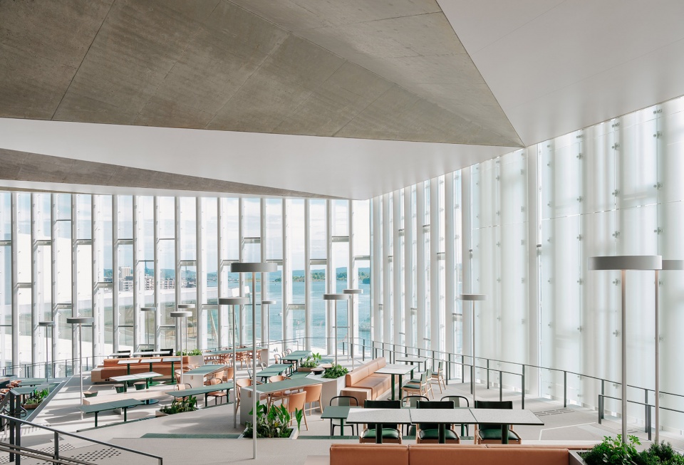
▼顶层空间,Top floor ©Einar Aslaksen
一系列房间和嵌入式空间为临时性的装置和展览带来多彩且氛围独特的舞台。开放区域更多地采用了中性的色彩和耐用的材料。围绕在光井周围以及折叠屋顶内部的混凝土结构拥有极高的持久度,为建筑赋予了永恒且独特的品质。
Rooms and niches create arenas for temporal installations and exhibitions, with a rich variety of colours and atmospheres. The open areas have more permanent surfaces in neutral colours and robust materials. The concrete structures around the light shafts and in the folded roof are lasting elements that give the building a permanent and recognizable quality.
▼悬臂平台区域过渡空间,Transition to cantilevered terraced area ©Einar Aslaksen
▼悬臂平台区域,Cantilevered terraced area ©Einar Aslaksen
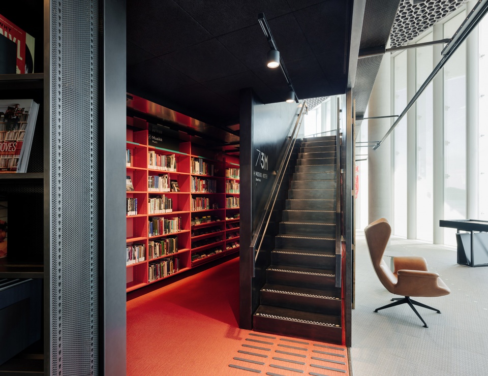
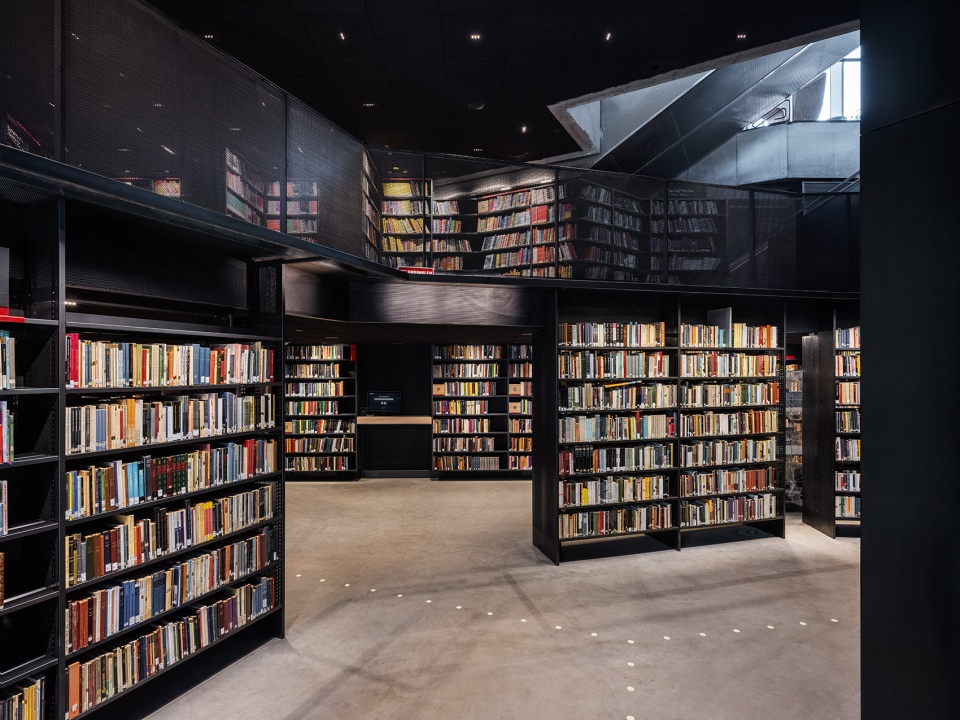
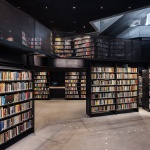
▼核心筒、书架和专用房间,Detail cores with bookshelves and specialized rooms ©Einar Aslaksen
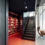
▼核心筒的嵌入式空间和通向夹层的楼梯,Niche in core with stair up to mezzanine ©Einar Aslaksen
▼地下书架区,Underground floor with bookshelves ©Einar Aslaksen
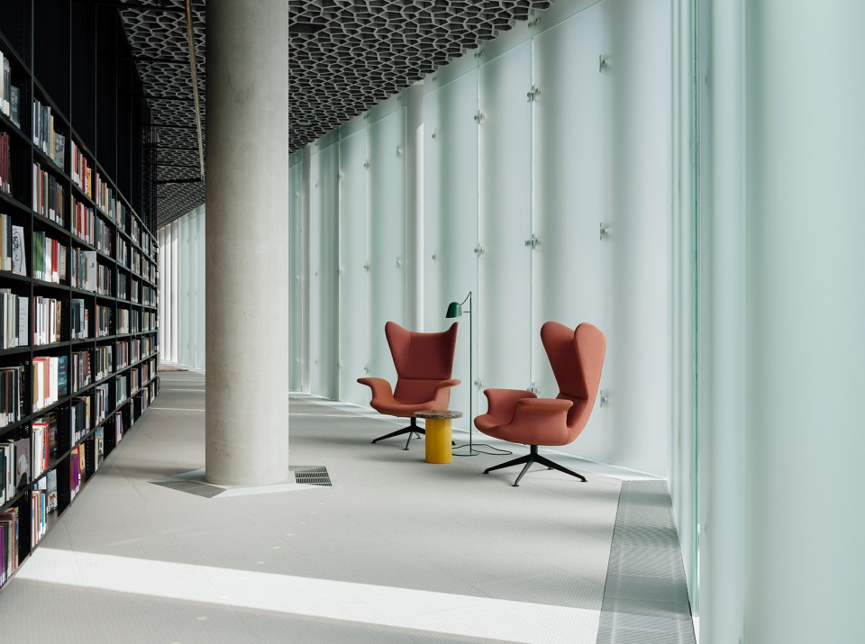
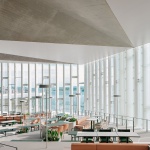
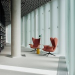
宽度较小的隔热板和玻璃板在立面上交替分布,兼顾了高效的隔热性能和均匀的采光。室内的漫反射玻璃缓和了隔热板带来的封闭感,营造出均匀柔和的氛围。外立面的设计相对更加封闭,以便将光井和图书馆的内部活动凸显出来。角落处的全景窗向不同方向敞开,为室内空间赋予了变化和张力。
The facade combines high insulation value and even distribution of daylight. Narrow insulated panels alternate with narrow glass panels. The diffused glass of the interior eases the impression of the closed panels, creating a soft and even interior light. The facades are relatively closed in order to strengthen the impression of the light shafts and the library’s inner life and activities. In the corners of the building panoramic windows open views in different directions, lending variation and tension to the interior.
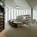
▼外围的安静区域,Calm space in the periphery ©Einar Aslaksen
▼阅读空间,Upper floor interior ©Einar Aslaksen
Deichman Bjørvika图书馆通过针对立面、通风和材料使用所提出的创新性解决方案成为了环境友好型的建筑。
Deichman Bjørvika is an environmentally friendly building with innovative solutions for facade, ventilation and use of materials.
▼从中央车站走近建筑,Aproaching from central station ©Einar Aslaksen
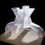
▼光井概念模型,Concept model from competition – light shafts ©LundHagem and Atelier Oslol
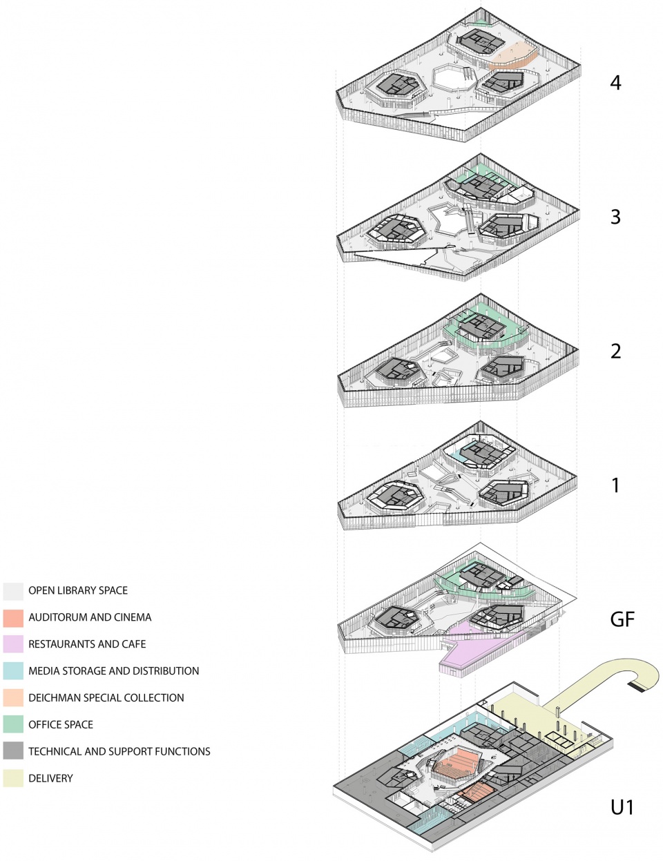
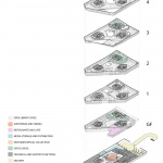
▼空间轴测图,Isometric plans with program ©LundHagem and Atelier Oslol
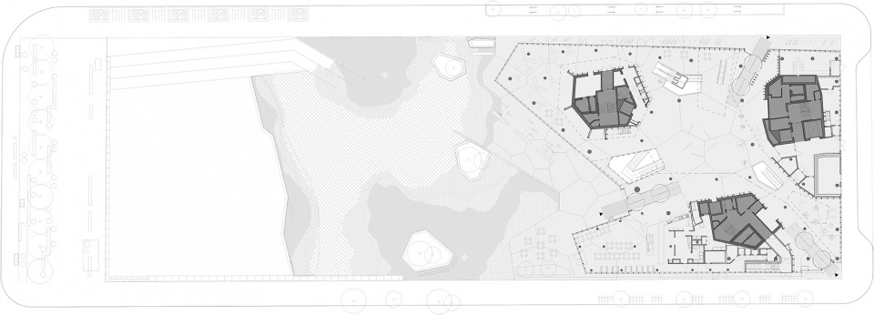
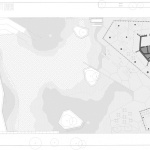
▼首层平面图,Deichman plan ground floor ©LundHagem and Atelier Oslol
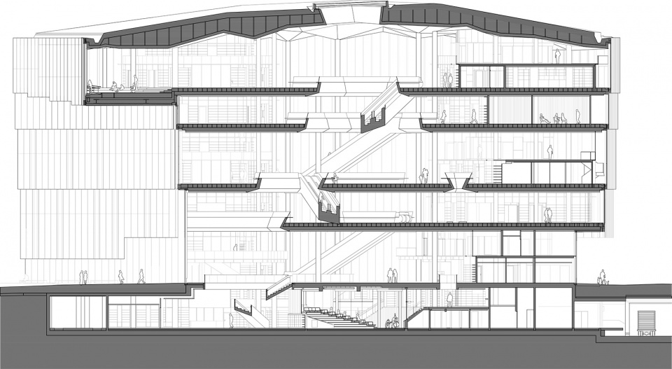
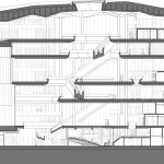
▼剖面图,Deichman section ©LundHagem and Atelier Oslol
Project name: DEICHMAN BJØRVIKA
Program: New main library for Oslo city
Client: Oslo municipality
Size: 19.600sqm gross area
Floors: 5 floors above terrain and one underground
Status: Completed. Opened for the public 18th of June 2020
Architects: LundHagem and Atelier Oslo architects
Interior architects: Scenario
Project management: AFRY Advansia
Structural engineering: Bollinger Grohman and Multiconsult
Consultants: Multiconsult, COWI, Rambøll, Asplan Viak / Kan Energi
Contractor core and shell: SKANSKA
Contractor facade: Roschmann Group
Contractor interior: AF Byggfornyelse
More: LundHagem + Atelier Oslo。更多关于他们,请至:LundHagem on gooood; Atelier Oslo on gooood
